Running a food and beverage business requires constant monitoring of costs, sales, margins, production volumes, and availability across multiple categories. Without a structured reporting system, managers often waste time pulling data manually, making decisions based on guesswork instead of facts.
This is where a Food and Beverage Dashboard in Excel becomes a game-changing solution. With the right design, it allows you to visualize performance, track profitability, and analyze trends across departments, products, and regions—all in one interactive file.
In this article, we will explore the features, benefits, best practices, real-world applications, and FAQs about this ready-to-use Excel template. By the end, you will know exactly how to use it for informed decision-making in your food and beverage operations.
Click to Purchases Food and Beverage Dashboard in Excel
What is a Food and Beverage Dashboard in Excel?
A Food and Beverage Dashboard in Excel is a prebuilt analytics template that organizes operational and financial data into a single, easy-to-navigate tool. Instead of juggling multiple reports, managers can track cost, revenue, margins, production, and availability across various dimensions such as department, product category, region, and month.
The dashboard uses Excel’s charts, slicers, pivot tables, and conditional formatting to present real-time insights. With just a few clicks, decision-makers can compare trends, monitor KPIs, and drill down into details.
Key Features of the Food and Beverage Dashboard
This dashboard comes with five analytical pages plus supporting data and utility sheets. Each page focuses on a specific business dimension:
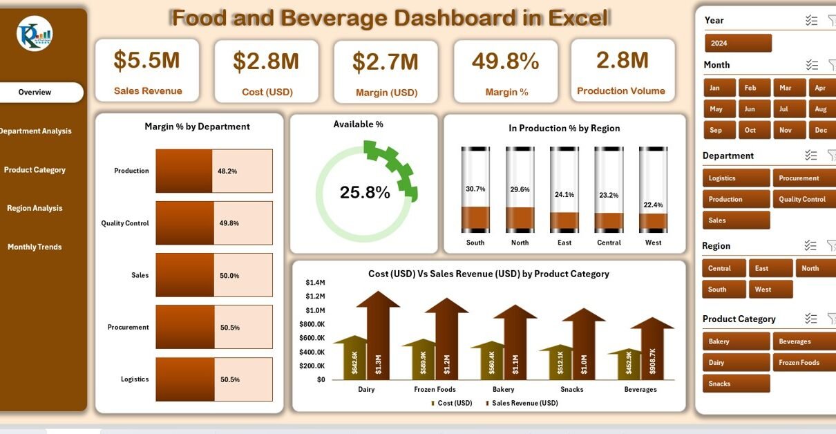
Overview Page
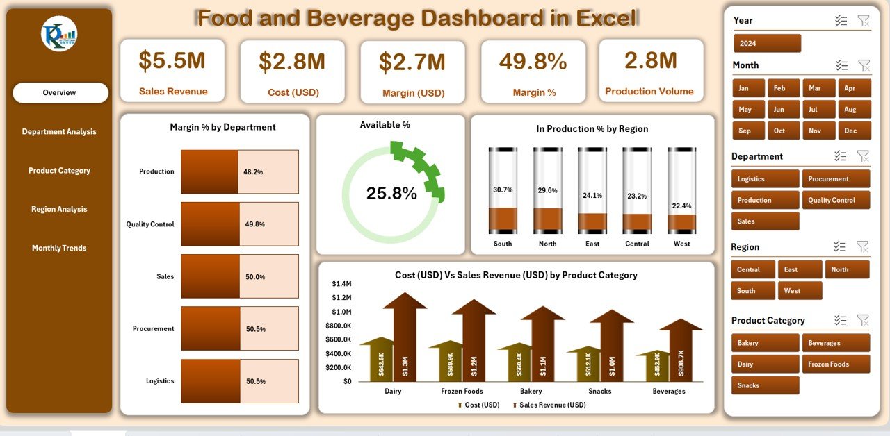
The Overview Page is the central hub of the dashboard. On the left side, you’ll find a page navigator, making it simple to switch between different analysis tabs. On the right side, slicers allow you to filter by department, region, product, or month.
Key visualizations include:
-
Margin % by Department – quickly shows profitability across business units.
-
Available % – highlights product availability versus demand.
-
In Production % by Region – gives insights into supply chain readiness.
-
Cost (USD) vs. Sales Revenue (USD) by Product Category – compares expenses against generated revenue.
Department Analysis
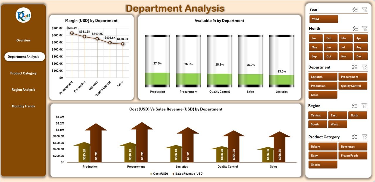
This page dives deeper into department-level performance. It helps managers see which departments are driving profitability and where costs are out of line.
Charts include:
-
Margin (USD) by Department – gross margin contribution of each unit.
-
Available % by Department – availability of key items per department.
-
Cost vs. Sales Revenue by Department – side-by-side comparison of expenditure and earnings.
Click to Purchases Food and Beverage Dashboard in Excel
Product Category Analysis
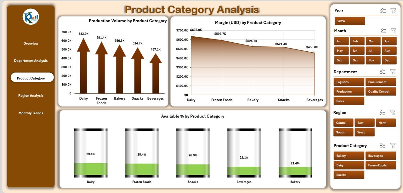
For businesses offering a wide range of products, this sheet reveals which categories generate the most profit and sales.
Charts include:
-
Production Volume by Product Category – measures output levels.
-
Margin (USD) by Product Category – shows profitability per category.
-
Available % by Product Category – ensures products are adequately stocked.
Region Analysis
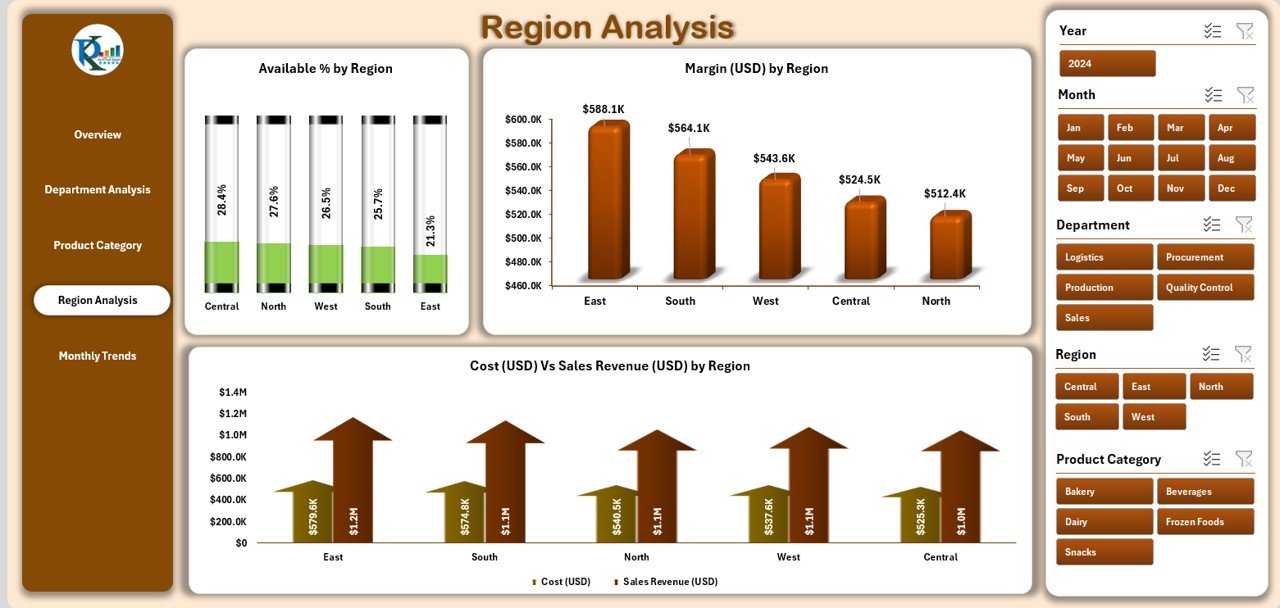
Geographical performance plays a huge role in food and beverage businesses. This page highlights strong and weak performing regions.
Charts include:
-
Available % by Region – checks whether regional outlets have enough stock.
-
Margin (USD) by Region – profit contribution by region.
-
Cost vs. Sales Revenue by Region – regional cost-efficiency insights.
Monthly Trends
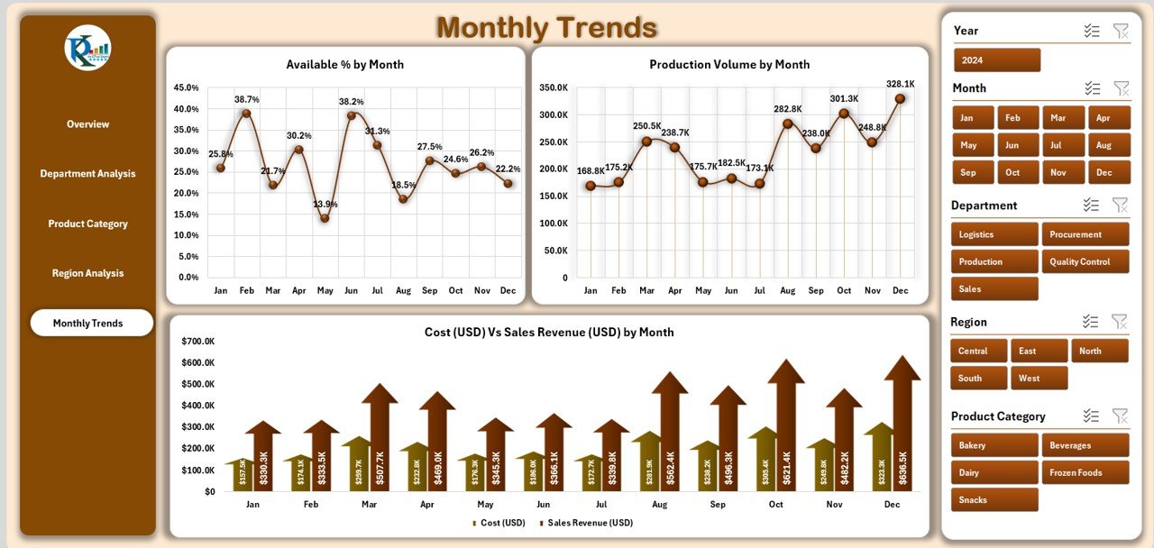
This sheet is perfect for identifying seasonal trends and growth patterns. Businesses can align marketing and production strategies accordingly.
Charts include:
-
Available % by Month – evaluates product availability trends.
-
Production Volume by Month – shows how much was produced monthly.
-
Cost vs. Sales Revenue by Month – tracks profitability fluctuations.
Data and Support Sheets
-
Data Sheet – where all operational and financial data is stored. Users can update this regularly to refresh dashboard insights.
-
Support Sheet – holds dropdown values, reference lists, and formula support to keep the dashboard dynamic.
Why Use a Food and Beverage Dashboard in Excel?
✅ Centralized Reporting – no need for multiple spreadsheets; everything is in one place.
✅ Interactive Analysis – use slicers to filter data instantly.
✅ Cost Control – monitor cost-to-revenue ratios and margins easily.
✅ Operational Insights – analyze product availability, production efficiency, and regional performance.
✅ Scalability – works for both small restaurants and large F&B companies.
Advantages of a Food and Beverage Dashboard in Excel
📊 Quick Decision-Making – managers can identify bottlenecks instantly.
💰 Improved Profitability – highlights the most profitable categories and departments.
🏭 Production Optimization – ensures production meets demand without overstocking.
🌍 Regional Control – track which markets perform better and where to focus efforts.
⏳ Time Savings – eliminates manual report preparation.
Opportunities for Improvement
Even though this Excel dashboard is powerful, businesses can enhance it further by:
🔄 Automating data imports from POS or ERP systems.
📈 Adding forecasting models to predict future sales and costs.
🖥️ Integrating with Power BI for more advanced visualizations.
📊 Expanding KPI coverage to include customer satisfaction, waste percentage, or supplier performance.
Best Practices for Using a Food and Beverage Dashboard in Excel
To maximize value from your dashboard, follow these practices:
✅ Update data regularly – daily or weekly, depending on your operations.
✅ Standardize data entry – maintain consistent formats in the data sheet.
✅ Use slicers effectively – filter data by region, department, or product category.
✅ Compare with targets – set performance benchmarks and measure actuals against them.
✅ Train staff – ensure managers know how to use and interpret dashboard insights.
Real-World Applications
The Food and Beverage Dashboard in Excel can be applied in multiple contexts:
🍽️ Restaurants and Cafés – track daily sales, food cost, and menu profitability.
🏨 Hotels and Resorts – manage departmental revenues (banquet, bar, restaurant).
🏭 Food Manufacturers – monitor production volume, cost efficiency, and demand.
🛒 Retailers and Distributors – analyze product category sales across multiple outlets.
How to Get Started with the Dashboard
-
Download the template and open it in Excel.
-
Load your data into the Data Sheet.
-
Navigate using the page navigator to access different analysis tabs.
-
Use slicers to filter data by region, department, or product.
-
Refresh PivotTables and charts to see updated insights.
Conclusion
The Food and Beverage Dashboard in Excel is a must-have tool for any business in the F&B industry. It provides a clear, interactive, and structured way to analyze performance across departments, products, regions, and months. With its intuitive design, managers can make smarter decisions, improve profitability, and respond quickly to market demands.
By combining cost tracking, revenue monitoring, availability analysis, and trend reporting, this dashboard transforms raw data into actionable insights. Whether you run a restaurant, a chain of cafés, or a food manufacturing company, this Excel dashboard can save you time, reduce errors, and help you stay competitive.
Frequently Asked Questions (FAQs)
1. Who can use the Food and Beverage Dashboard in Excel?
Anyone in the F&B industry—restaurant owners, hotel managers, distributors, or manufacturers—can benefit from this dashboard.
2. Do I need advanced Excel skills to use it?
No. The template is user-friendly and works with simple data updates and slicer selections.
3. Can this dashboard be customized?
Yes. You can add more KPIs, modify charts, or expand dimensions based on your needs.
4. How often should I update the data?
It depends on your business. Daily updates are best for restaurants, while weekly or monthly updates work for large distributors.
5. Can it integrate with other tools?
Yes. While it runs in Excel, you can link it with POS systems, ERP databases, or even Power BI for advanced analytics.
6. Is this dashboard suitable for small businesses?
Absolutely. Small businesses can use it to control costs and optimize menu or product category profitability.
Visit our YouTube channel to learn step-by-step video tutorials