Managing consulting projects, tracking client satisfaction, and analyzing revenue trends can become complex when data is scattered across multiple files. A Consulting Dashboard in Excel brings all these insights together in one interactive and visual platform. With a well-structured dashboard, consultants and managers can make faster decisions, monitor performance, and identify opportunities for improvement.
In this article, we will explore everything about the Consulting Dashboard in Excel—its structure, key features, advantages, best practices, and real-world applications. We will also answer the most frequently asked questions to help you get started with this powerful tool.
Click to Purchases Consulting Dashboard in Excel
What Is a Consulting Dashboard in Excel?
A Consulting Dashboard in Excel is a ready-to-use template designed to track and visualize consulting activities. Instead of relying on multiple spreadsheets or manual reports, the dashboard combines all critical data into easy-to-understand charts, tables, and KPIs.
It helps consultants monitor:
-
Project completion rates
-
Client satisfaction scores
-
Revenue by department, region, and consultant
-
Hours billed over time
-
Cancelled or delayed projects
The dashboard leverages Excel features such as pivot tables, slicers, conditional formatting, and charts to provide a dynamic and interactive experience.
Key Features of the Consulting Dashboard in Excel
This dashboard includes five analytical pages and a support sheet for smooth data management. Each page provides unique insights into consulting operations.
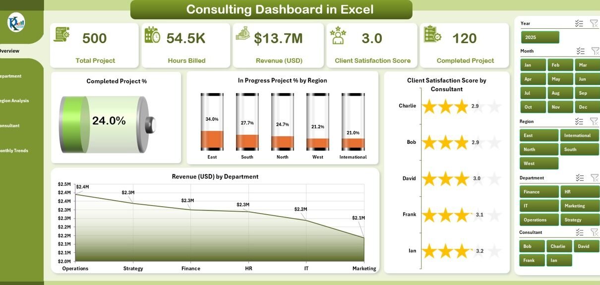
Overview Page
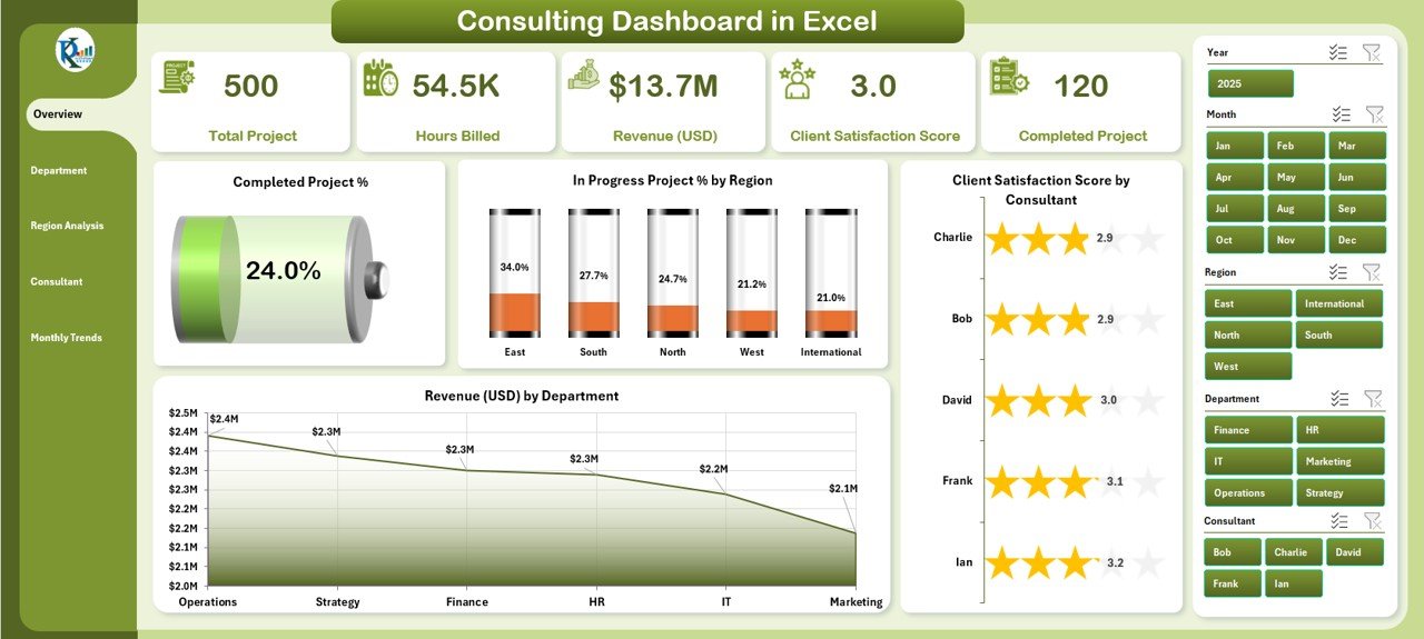
The Overview Page serves as the central hub of the dashboard. On this page, you will find:
-
Navigation panel on the left side for quick access to all sections.
-
Five KPI cards displaying important consulting metrics at a glance.
Four charts for high-level insights:
- Completed Project %
- In Progress Project % by Region
- Client Satisfaction Score by Consultant
- Revenue (USD) by Department
This page gives a snapshot of consulting performance across all critical areas.
Department Analysis
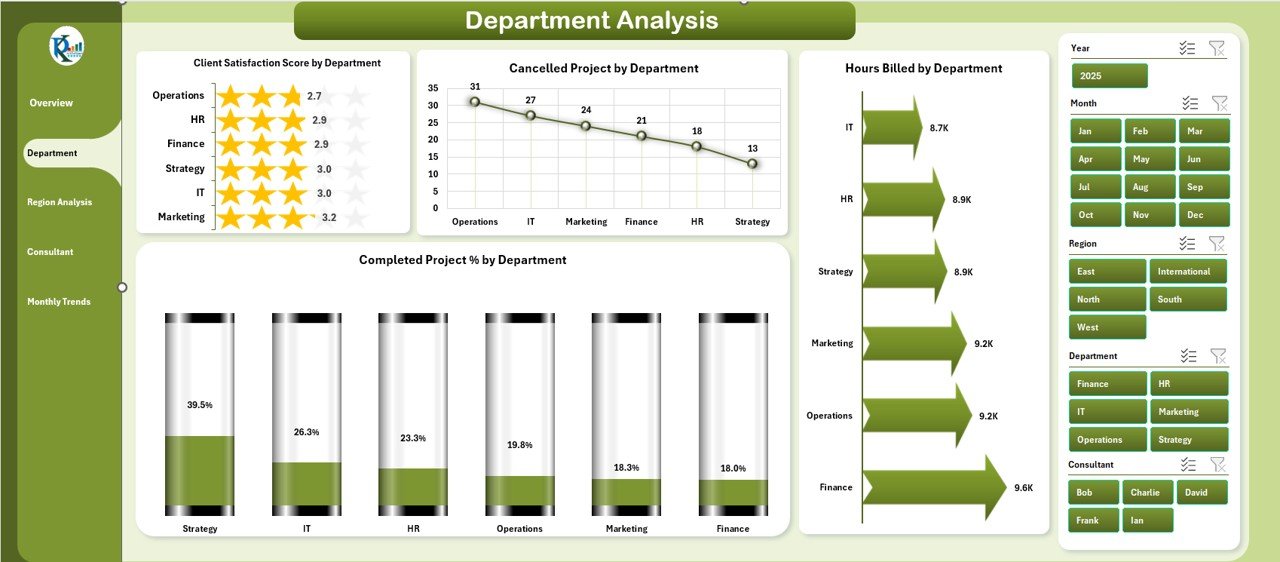
The Department Analysis page allows users to compare performance across different business units. It includes:
-
Client Satisfaction Score by Department
-
Cancelled Project % by Department
-
Hours Billed by Department
-
Completed Project % by Department
With this analysis, managers can easily identify which departments are driving success and which ones need more attention.
Click to Purchases Consulting Dashboard in Excel
Region Analysis
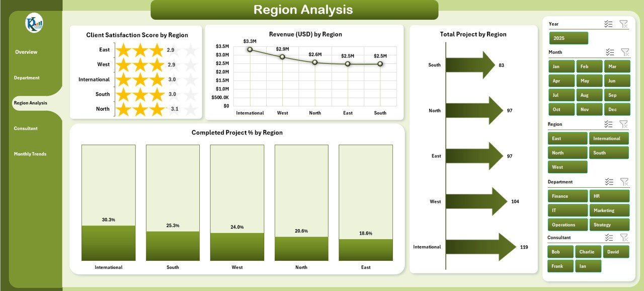
Consulting firms often operate across multiple regions. The Region Analysis page provides:
-
Client Satisfaction Score by Region
-
Revenue (USD) by Region
-
Total Projects by Region
-
Completed Project % by Region
By reviewing this data, businesses can understand regional strengths, allocate resources better, and plan for growth in specific markets.
Consultant Analysis
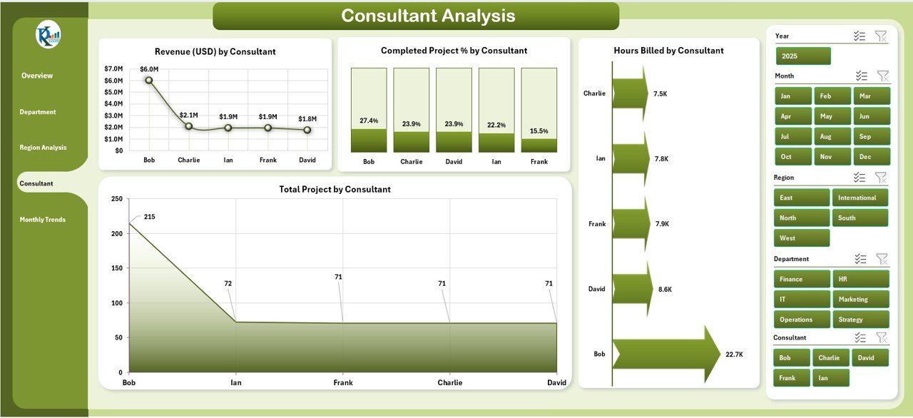
The Consultant Analysis page focuses on individual performance. It tracks:
-
Revenue (USD) by Consultant
-
Completed Project % by Consultant
-
Total Projects by Consultant
-
Hours Billed by Consultant
This analysis helps organizations recognize top-performing consultants, manage workload distribution, and plan training for underperformers.
Monthly Trends
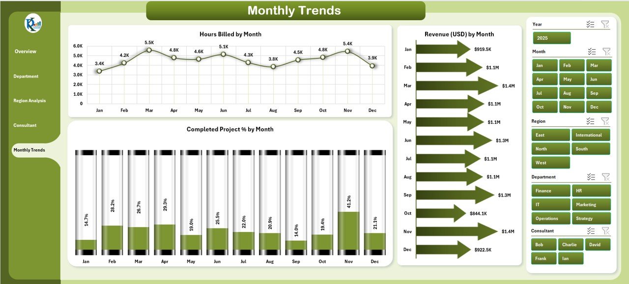
The Monthly Trends page provides time-based insights into consulting activities. It highlights:
-
Hours Billed by Month
-
Completed Project % by Month
-
Revenue (USD) by Month
Tracking monthly trends ensures businesses can forecast demand, spot seasonal patterns, and compare performance against previous months.
Support Sheet
The Support Sheet works in the background to power the dashboard. It stores raw data, lists, and references used across all visualizations. This ensures that the dashboard runs smoothly and remains dynamic.
Why Use a Consulting Dashboard in Excel?
Consulting firms and professionals deal with multiple projects, clients, and revenue streams. Without a centralized tool, monitoring performance becomes difficult. Here’s why a Consulting Dashboard in Excel is valuable:
-
Real-time insights: View updated project and revenue data instantly.
-
Data consolidation: Replace multiple reports with one dashboard.
-
Better decision-making: Spot trends and issues quickly.
-
Customization: Adapt the dashboard to your firm’s unique needs.
-
Cost-effectiveness: Excel is affordable and widely available.
Advantages of a Consulting Dashboard in Excel
A Consulting Dashboard brings numerous benefits to both consultants and managers.
✅ Improved Project Tracking – Monitor ongoing, completed, and cancelled projects in one place.
✅ Enhanced Client Satisfaction – Keep track of client ratings by consultant, department, or region.
✅ Revenue Insights – Analyze earnings by different segments for better financial planning.
✅ Time Management – Track hours billed to ensure optimal utilization of resources.
✅ Performance Comparison – Compare consultants, departments, or regions with ease.
✅ Data Visualization – Use charts, graphs, and slicers for quick insights.
✅ Forecasting Support – Monthly trends enable better forecasting and planning.
How to Use a Consulting Dashboard in Excel
Using the dashboard is simple and requires no advanced technical skills.
-
Input data in the support sheet: Add project details, client ratings, and billing hours.
-
Navigate using the left-side panel: Select the page you want to explore.
-
Filter with slicers: Choose a region, department, or consultant for focused insights.
-
Review KPI cards: Get quick updates on overall performance.
-
Analyze charts: Dive deeper into project completion, satisfaction, and revenue metrics.
Best Practices for the Consulting Dashboard in Excel
To get the most value out of your dashboard, follow these best practices:
🔹 Keep Data Updated – Enter data regularly to ensure accurate insights.
🔹 Use Consistent Formats – Standardize dates, project names, and client ratings.
🔹 Apply Conditional Formatting – Highlight key metrics with colors or arrows.
🔹 Leverage Slicers and Filters – Allow users to customize their views.
🔹 Focus on Key Metrics – Avoid clutter by tracking only meaningful KPIs.
🔹 Secure Data – Protect sheets with sensitive client or financial information.
🔹 Review Monthly – Use the trends page to adjust strategies based on performance.
Real-World Applications of a Consulting Dashboard
A Consulting Dashboard can be applied in different contexts:
-
Management Consulting Firms: Track revenue, client satisfaction, and project delivery.
-
IT Consulting: Monitor project timelines, resources, and billing hours.
-
Financial Consulting: Analyze revenue by client and compare departmental performance.
-
Independent Consultants: Showcase performance and insights to clients.
Challenges in Using a Consulting Dashboard
While powerful, dashboards come with certain challenges:
-
Data accuracy depends on regular updates.
-
Large datasets may slow down Excel.
-
Customization requires some Excel skills.
-
Overloaded dashboards may confuse users.
These challenges can be addressed by simplifying the dashboard design, training users, and integrating automation where possible.
Future of Consulting Dashboards in Excel
The role of dashboards is evolving. With the rise of automation, AI, and cloud tools, Excel dashboards are becoming more intelligent. Features such as Power Query, Power Pivot, and AI-driven analysis are transforming Excel into a powerful business intelligence tool.
In the future, dashboards may integrate seamlessly with external tools like Power BI, Google Data Studio, or CRM platforms for real-time insights.
Conclusion
A Consulting Dashboard in Excel is a practical and cost-effective solution for consultants and firms that want to monitor performance, improve decision-making, and enhance client satisfaction. By combining project, revenue, and satisfaction data into one visual platform, it saves time and boosts efficiency.
If you want a ready-to-use solution, this type of dashboard can be customized to fit your unique business needs and help you stay ahead in a competitive consulting market.
Frequently Asked Questions (FAQs)
1. What is a Consulting Dashboard in Excel?
It is a performance-tracking tool built in Excel that consolidates consulting data into interactive charts and KPIs.
2. Can I customize the dashboard for my business?
Yes, you can adjust KPIs, charts, and filters to match your firm’s needs.
3. Do I need advanced Excel skills to use it?
No, the dashboard is user-friendly and requires only basic Excel knowledge.
4. How often should I update the data?
You should update data regularly—weekly or monthly—for the best results.
5. Is Excel better than Power BI for dashboards?
Excel is cost-effective and easy to use, while Power BI is more advanced for real-time analytics. The choice depends on your business size and needs.
6. Can independent consultants use this dashboard?
Absolutely. It helps freelancers track projects, manage clients, and showcase results to potential customers.
7. What are the main KPIs in a Consulting Dashboard?
The key KPIs include project completion %, client satisfaction score, revenue by consultant or department, and hours billed.
Visit our YouTube channel to learn step-by-step video tutorials