In today’s fast-paced retail world, supermarkets deal with huge volumes of data every single day — from sales transactions and product returns to customer feedback and inventory levels. Managing this information manually is time-consuming and error-prone. That’s where the Supermarkets Dashboard in Excel comes in.
This ready-to-use Excel template gives store owners, managers, and analysts the power to monitor key performance indicators (KPIs), evaluate performance trends, and make informed business decisions — all in one central location.
In this article, we’ll explore what a Supermarkets Dashboard is, its key features, benefits, structure, and best practices for using it effectively.
Click to Purchases Supermarkets Dashboard in Excel
What Is a Supermarkets Dashboard in Excel?
A Supermarkets Dashboard in Excel is a comprehensive analytical tool designed to help supermarket managers visualize and track the most important metrics that impact profitability and performance.
It brings together various data sources — including sales records, customer ratings, and regional performance — and transforms them into easy-to-understand visuals.
Instead of sifting through hundreds of Excel rows, users can instantly view charts, trends, and insights that reveal what’s working well and where improvements are needed.
With this dashboard, you can:
-
Monitor daily, weekly, and monthly performance.
-
Track total sales, profit margins, and customer satisfaction levels.
-
Analyze performance by store, region, product category, and cashier.
-
Identify top-performing brands and best-selling items.
-
Support strategic decision-making through visual analytics.
Structure of the Supermarkets Dashboard in Excel
The Supermarkets Dashboard is structured into five analytical pages and one support sheet. Each page focuses on a specific dimension of supermarket operations, ensuring that you can analyze every aspect of your business with clarity.
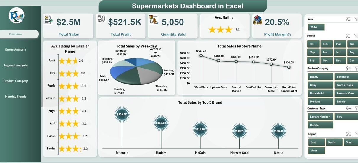
Overview Page
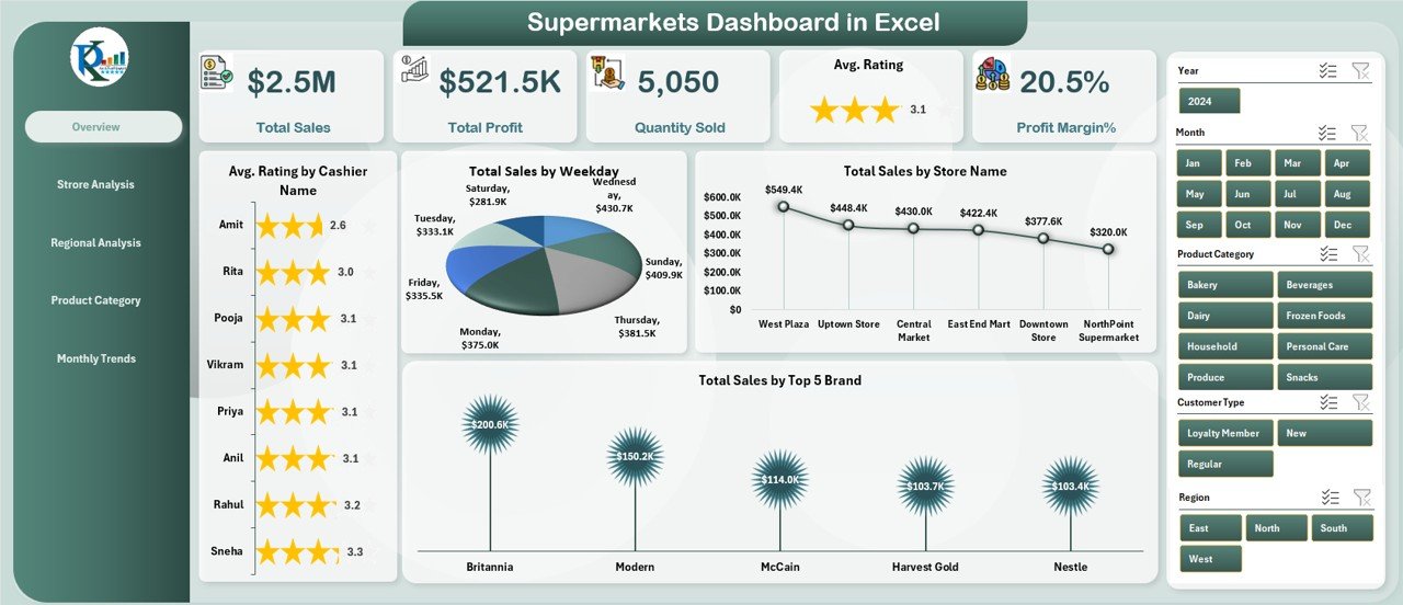
The Overview Page acts as the control center of the dashboard. On the left side, a page navigator allows users to switch between different analytical pages seamlessly.
On this page, you’ll find five performance cards summarizing the most critical KPIs — such as total sales, profit margin, number of stores, top-performing brands, and average rating.
To make data interpretation easy, the page includes four dynamic charts:
-
Average Rating by Cashier Name – evaluates customer satisfaction by cashier.
-
Total Sales by Weekday – identifies the busiest and slowest shopping days.
-
Total Sales by Store Name – helps compare performance across different stores.
-
Total Sales by Top 5 Brands – highlights the leading brands driving revenue.
The Overview Page gives an instant snapshot of business performance, allowing decision-makers to act quickly when trends shift.
Store Analysis Page
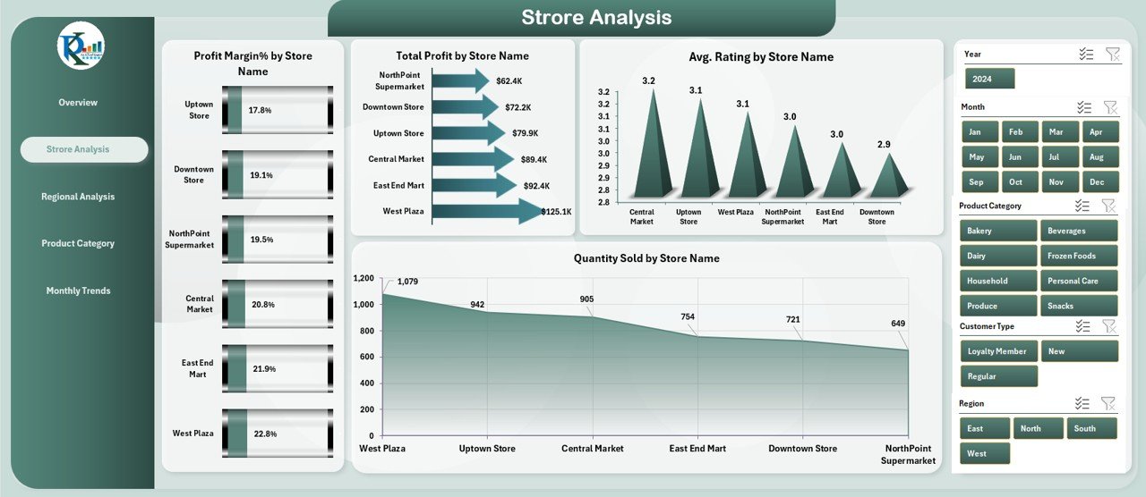
The Store Analysis Page focuses on evaluating the operational and financial performance of each supermarket location.
Here, users can view four well-designed charts:
-
Profit Margin (%) by Store Name – compares profitability across stores.
-
Total Profit by Store Name – shows which stores are generating the highest profits.
-
Average Rating by Store Name – tracks customer satisfaction per branch.
-
Quantity Sold by Store Name – measures sales volume per location.
By studying this page, you can easily identify high-performing outlets and pinpoint stores that may need operational improvements or promotional campaigns.
Click to Purchases Supermarkets Dashboard in Excel
Regional Analysis Page
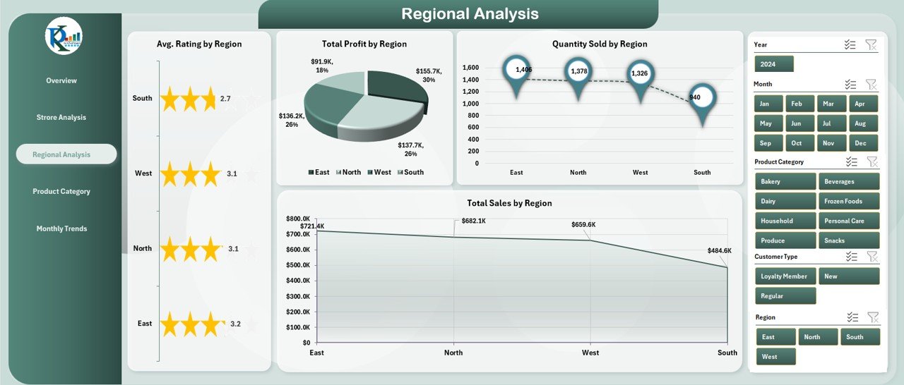
Supermarkets often operate across multiple cities or regions, making it vital to understand regional performance trends.
The Regional Analysis Page offers a comprehensive breakdown through four charts:
-
Average Rating by Region
-
Total Profit by Region
-
Quantity Sold by Region
-
Total Sales by Region
These visuals help managers compare performance across regions, uncover market potential, and make data-driven decisions about expansion or resource allocation.
For instance, if one region consistently reports higher profit margins, you can analyze what strategies contribute to that success and replicate them in underperforming areas.
Product Category Analysis Page
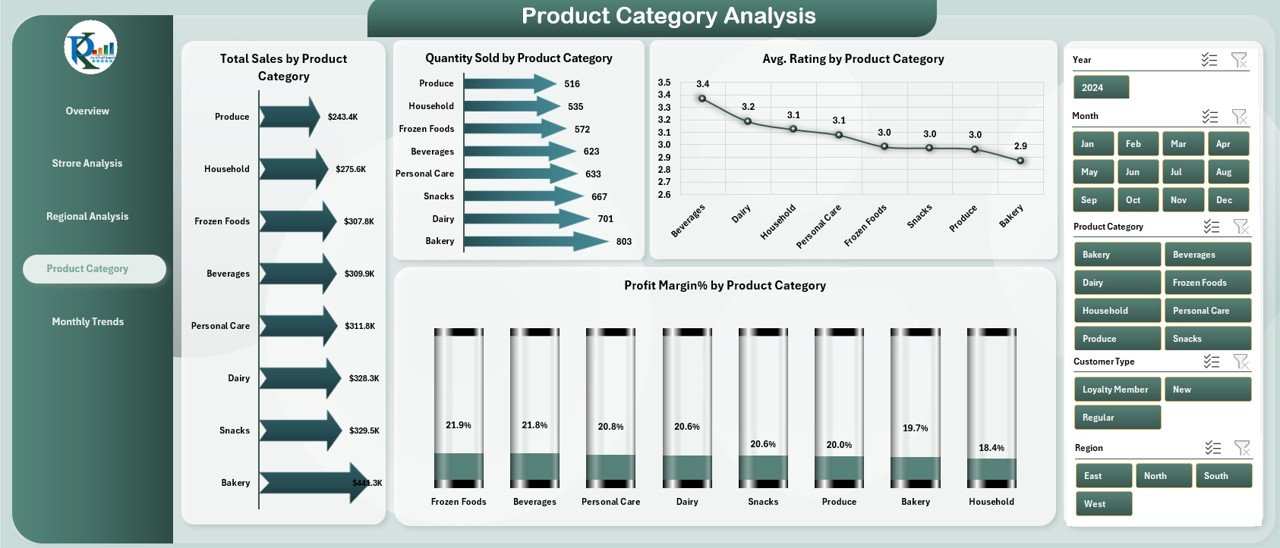
Every supermarket carries a vast range of product categories — from groceries and beverages to personal care and electronics.
The Product Category Analysis Page focuses on how each category contributes to total sales and profitability.
It includes four charts:
-
Total Sales by Product Category
-
Quantity Sold by Product Category
-
Average Rating by Product Category
-
Profit Margin (%) by Product Category
This analysis helps businesses understand which categories are most profitable, which products customers prefer, and which need marketing support or stock adjustments.
Monthly Trends Page
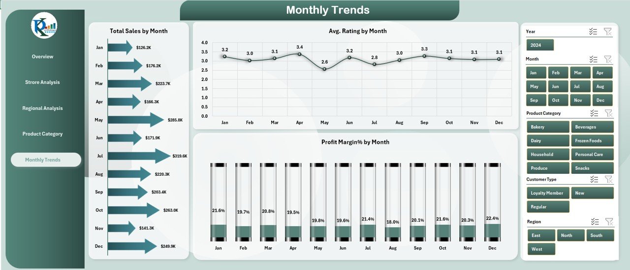
The Monthly Trends Page is designed to show how supermarket performance changes throughout the year.
It includes three time-based trend charts:
-
Total Sales by Month
-
Average Rating by Month
-
Profit Margin (%) by Month
This page makes it easy to detect seasonality, spot demand spikes, and plan for peak periods like holidays or sales events.
By tracking these trends, supermarket leaders can plan promotions, adjust staffing levels, and ensure adequate stock availability during high-demand months.
Support Sheet
The Support Sheet contains the underlying raw data and references that power the dashboard. It includes master tables for stores, regions, products, brands, and ratings.
This sheet acts as the data backbone, feeding information into pivot tables and charts across the dashboard pages.
Users can update the Support Sheet with new data at any time to automatically refresh visuals and maintain real-time accuracy.
Why Supermarkets Need a Dashboard in Excel
Modern supermarkets face intense competition, narrow margins, and changing consumer behavior. Relying solely on manual reports or intuition no longer works.
A Supermarkets Dashboard provides clarity, consistency, and control.
Here are some reasons why every retailer should adopt it:
📊 Centralized View – All data in one place for quick decision-making.
🔍 Real-Time Insights – Instantly spot performance gaps or opportunities.
🧠 Better Planning – Use trend data to forecast future sales and demands.
💡 Operational Efficiency – Identify bottlenecks in stores or supply chains.
🏆 Performance Accountability – Track KPIs for every store, region, and product.
How to Use the Supermarkets Dashboard in Excel
Using this dashboard doesn’t require any technical expertise. It’s built with simple drop-down filters, slicers, and pivot tables that anyone familiar with Excel can handle.
Here’s how to get started:
-
Enter or Import Data – Update the Support Sheet with your latest store, sales, and product information.
-
Refresh All Data Connections – Use Excel’s “Refresh All” command to update charts.
-
Navigate Using the Page Navigator – Quickly switch between Overview, Store, Region, Category, and Trend pages.
-
Use Filters & Slicers – Slice data by month, region, or store to focus your analysis.
-
Review KPIs Regularly – Track progress weekly or monthly to make timely decisions.
Because everything updates automatically, managers can stay informed without spending hours preparing reports.
Click to Purchases Supermarkets Dashboard in Excel
Advantages of Using the Supermarkets Dashboard in Excel
The benefits of implementing this dashboard go far beyond visualization. It transforms raw data into business intelligence that drives growth.
✅ 1. Better Decision-Making
Managers can identify top-performing stores, slow-moving products, and profitable categories instantly. This insight leads to faster, more informed business decisions.
✅ 2. Time Savings
Automated charts and pivot tables eliminate the need for manual reporting. Data refresh takes seconds, not hours.
✅ 3. Cost Efficiency
Unlike complex BI tools, this Excel-based solution is affordable and easy to maintain without extra software licenses.
✅ 4. Improved Accuracy
Since all calculations are automated, it reduces human error and ensures consistency in data interpretation.
✅ 5. Visual Clarity
Interactive charts and conditional formatting make trends and issues instantly visible.
✅ 6. Scalable for Any Size
Whether you manage a single store or a multi-region chain, the dashboard adapts easily to your dataset.
Opportunities for Improvement
Even though this dashboard offers a solid foundation, there are several ways to enhance it further:
📅 Automate Data Imports: Link it directly with your POS system or database for live updates.
📢 Add Customer Feedback Analysis: Integrate sentiment tracking for better customer insight.
📊 Include Forecasting Models: Use trend lines or regression tools to predict sales and stock requirements.
🧾 Add Expense Tracking: Monitor operational costs alongside revenue for complete financial visibility.
🌍 Enable Multi-Language Support: Useful for international supermarket chains.
Best Practices for Using the Supermarkets Dashboard in Excel
To get the most out of your dashboard, follow these best practices:
🔹 Keep Data Clean
Ensure that your Support Sheet data is properly formatted — consistent date formats, correct numeric types, and standardized store or region names.
🔹 Update Data Regularly
Refresh your data daily or weekly. This keeps your visuals accurate and ensures decision-makers are working with current information.
🔹 Use Filters Wisely
Apply slicers to focus on specific periods, stores, or product categories. Avoid overloading your visuals with unnecessary filters.
🔹 Review Trends Monthly
The Monthly Trends Page is ideal for long-term performance tracking. Schedule a monthly review meeting to discuss progress.
🔹 Back Up Your File
Since Excel dashboards are file-based, always maintain a backup copy before making structural changes.
🔹 Keep the Design Clean
Avoid cluttering the dashboard with unnecessary visuals. Simplicity improves readability and helps you focus on the KPIs that truly matter.
Real-World Use Cases
The Supermarkets Dashboard in Excel can be applied to multiple scenarios:
-
Branch Managers: Monitor their store’s performance and identify growth opportunities.
-
Regional Managers: Compare store results and align regional strategies.
-
Finance Teams: Track profit margins and identify cost-saving opportunities.
-
Marketing Teams: Evaluate the impact of promotions and campaigns.
-
Operations Leaders: Identify supply or staffing issues affecting performance.
Who Can Benefit from This Dashboard?
This tool isn’t just for analysts. It’s designed for:
🏬 Supermarket Owners
👩💼 Retail Managers
📈 Sales Analysts
💰 Finance Controllers
📦 Inventory Managers
📊 Data Analysts
Anyone involved in retail operations can use this dashboard to make smarter, faster, and more strategic decisions.
Integration Possibilities
Although this dashboard is fully functional in Excel, it can also integrate with other tools for enhanced reporting:
-
Power BI for interactive online dashboards.
-
Google Sheets for cloud-based collaboration.
-
Power Query for automated data extraction.
-
Power Automate for scheduled updates and alerts.
These integrations extend its power beyond Excel, making it a flexible part of any retail analytics workflow.
Conclusion
The Supermarkets Dashboard in Excel transforms complex retail data into actionable insights that drive growth, improve profitability, and enhance customer satisfaction.
❓ Frequently Asked Questions (FAQs)
1. What is the purpose of a Supermarkets Dashboard in Excel?
It helps track and visualize sales, profit margins, customer ratings, and product performance in one interactive Excel file.
2. Can beginners use this dashboard easily?
Yes! It’s built with simple drop-down filters and slicers, making it easy for anyone with basic Excel skills to use.
3. How often should I update the dashboard?
You can update it daily, weekly, or monthly depending on your reporting needs. Regular updates ensure accurate insights.
4. Can this dashboard handle data from multiple stores?
Absolutely. It’s designed to handle multi-store data, allowing you to compare performance across branches or regions.
5. Does this dashboard require any coding?
No coding knowledge is required. All calculations and charts are powered by Excel formulas and pivot tables.
6. Can I customize the visuals or KPIs?
Yes, you can easily add or remove KPIs, modify charts, or change color themes to suit your organization’s branding.
7. How is this dashboard different from other BI tools?
It’s cost-effective, user-friendly, and doesn’t require specialized software. Yet, it delivers professional analytics comparable to advanced BI platforms.
Visit our YouTube channel to learn step-by-step video tutorials