In today’s competitive business world, speed and efficiency are key drivers of customer satisfaction and profitability. One of the most critical performance metrics in supply chain and logistics operations is Order Cycle Time (OCT) — the total time taken from when a customer places an order to when they receive the product or service.
Monitoring and optimizing this metric helps businesses improve delivery performance, enhance customer experience, and reduce operational costs.
That’s where the Order Cycle Time KPI Dashboard in Power BI comes in. This ready-to-use, data-driven dashboard allows organizations to visualize, analyze, and monitor the full order-to-delivery process in real time.
Built in Microsoft Power BI and powered by Excel data, this dashboard provides interactive insights that help management teams identify inefficiencies, track trends, and make faster, more informed decisions.
Click to Purchases Order Cycle Time KPI Dashboard in Power BI
What Is an Order Cycle Time KPI Dashboard in Power BI?
An Order Cycle Time KPI Dashboard is an analytical solution that visualizes key performance indicators related to order processing speed and efficiency. It consolidates all order data into a single view, allowing managers to measure how long it takes to fulfill customer orders, compare actual performance against targets, and identify areas for improvement.
With Power BI’s interactive visuals, this dashboard transforms raw data into meaningful insights. Users can analyze performance by time period, product category, region, or department. They can also compare month-to-date (MTD) and year-to-date (YTD) figures with historical benchmarks to assess progress toward operational goals.
The dashboard is ideal for supply chain managers, logistics coordinators, and operations analysts who need a reliable tool to monitor cycle times, improve fulfillment accuracy, and boost productivity.
Key Features of the Order Cycle Time KPI Dashboard
The dashboard file in Power BI contains three pages — each serving a unique analytical purpose. Let’s explore them in detail.
1. Summary Page
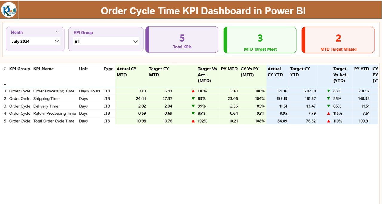
The Summary Page is the main landing page of the dashboard and provides a high-level view of KPI performance.
At the top of the page, you’ll find slicers that allow users to filter by Month and KPI Group. These slicers make it easy to switch between different time periods and performance categories without editing the report manually.
Below the slicers, there are three dynamic cards displaying:
-
Total KPIs Count – the total number of KPIs being tracked.
-
MTD Target Met Count – number of KPIs that achieved their MTD goals.
-
MTD Target Missed Count – number of KPIs that did not meet their MTD goals.
Next comes a detailed KPI table, which provides an in-depth breakdown for each performance indicator. The table includes:
-
KPI Number – unique sequence number of each KPI.
-
KPI Group – category or department to which the KPI belongs.
-
KPI Name – specific name of the performance metric.
-
Unit – unit of measurement (e.g., days, hours, %).
-
Type – KPI classification such as LTB (Lower the Better) or UTB (Upper the Better).
-
Actual CY MTD – current year’s month-to-date actual value.
-
Target CY MTD – current year’s month-to-date target value.
-
MTD Icon – visual indicator (▲ or ▼) in red or green showing whether performance met the target.
-
Target vs Actual (MTD) – performance ratio (Actual ÷ Target) expressed in percentage.
-
PY MTD – previous year’s MTD value for the same period.
-
CY vs PY (MTD) – comparison ratio between current and previous year’s MTD performance.
-
Actual CY YTD – current year’s year-to-date actual figure.
-
Target CY YTD – current year’s year-to-date target.
-
YTD Icon – red/green ▲▼ icon representing YTD performance.
-
Target vs Actual (YTD) – ratio of actual vs target for YTD data.
-
PY YTD – previous year’s YTD data for comparison.
-
CY vs PY (YTD) – comparative ratio between current and last year’s YTD results.
These metrics together offer a 360-degree performance snapshot, helping users evaluate progress and identify underperforming areas quickly.
2. KPI Trend Page
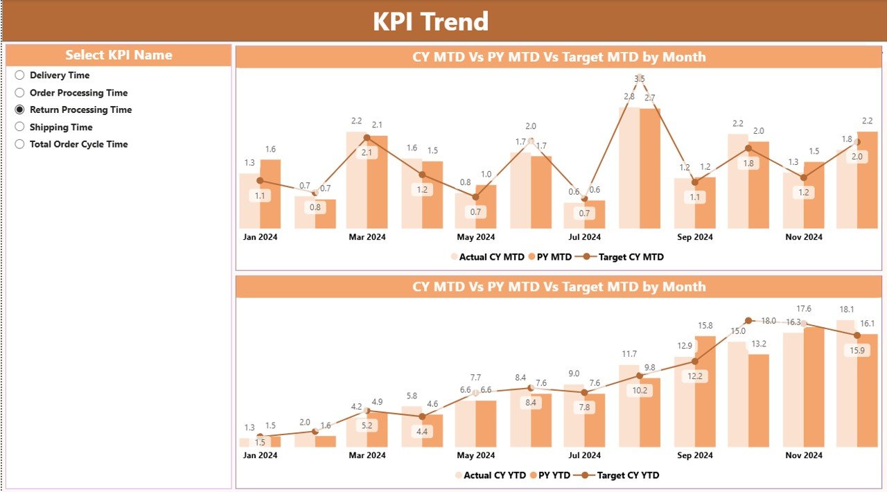
The KPI Trend Page dives deeper into performance visualization over time.
This page features two combo charts that display trends for both MTD and YTD values. Each chart includes three key data series:
-
Actual (Current Year)
-
Target (Current Year)
-
Actual (Previous Year)
A KPI Name slicer on the left allows users to focus on a specific KPI, such as “Average Order Cycle Time,” “Order Fulfillment Rate,” or “On-Time Delivery Percentage.”
With these visuals, users can easily identify whether performance is improving, stable, or declining compared to both targets and last year’s numbers. The combination of bar and line visuals ensures clarity and helps spot trends in one glance.
3. KPI Definition Page
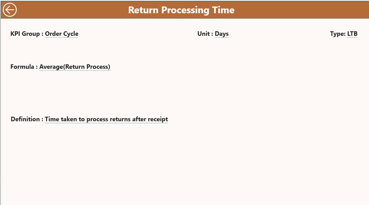
The KPI Definition Page acts as a drill-through page and is hidden by default.
When users right-click a KPI in the summary table, they can drill through to this page to see additional details such as:
-
KPI Formula
-
KPI Definition
-
KPI Group
-
Measurement Type (LTB/UTB)
This provides deeper context about each metric, ensuring transparency and consistency in reporting.
To return to the main dashboard, users can click the Back button conveniently located at the top-left corner of the page.
Click to Purchases Order Cycle Time KPI Dashboard in Power BI
Excel Data Source Structure
The Power BI dashboard draws its data from an Excel workbook with three key worksheet tabs:
1. Input_Actual Sheet
This sheet contains the actual KPI numbers for each month.
Columns include:
-
KPI Name
-
Month (use the first date of the month, e.g., 1-Jan-2024)
-
MTD Value
-
YTD Value
This sheet should be updated regularly with the latest performance data.
2. Input_Target Sheet
This sheet captures the target values for each KPI.
Columns include:
-
KPI Name
-
Month (first date of the month)
-
MTD Target
-
YTD Target
Keeping this sheet current allows the dashboard to automatically calculate and visualize the actual vs target performance.
3. KPI Definition Sheet
The final sheet contains metadata about each KPI, including:
-
KPI Number
-
KPI Group
-
KPI Name
-
Unit of Measurement
-
Formula
-
KPI Definition
-
Type (LTB or UTB)
This sheet helps ensure standardization and serves as a reference point for how each KPI is calculated and interpreted.
Why Is Order Cycle Time Important?
Order Cycle Time measures the total duration from order placement to order fulfillment. It includes all key stages — order entry, picking, packing, shipping, and delivery.
Monitoring this KPI is essential because:
-
It directly affects customer satisfaction.
-
It highlights bottlenecks in order processing.
-
It impacts inventory management and cash flow.
-
It helps reduce lead time, enhancing business agility.
Shorter order cycle times indicate streamlined operations and higher efficiency, while longer times suggest delays or inefficiencies that require immediate attention.
How Power BI Helps in Analyzing Order Cycle Time
Power BI turns complex data into intuitive visuals. Here’s how it helps organizations analyze Order Cycle Time effectively:
-
Automated Data Refresh – The dashboard pulls data from Excel and refreshes automatically, keeping insights up-to-date.
-
Interactive Visuals – Users can filter by month, region, product, or KPI group for flexible analysis.
-
Performance Comparison – Compare actual vs target and current vs previous year at both MTD and YTD levels.
-
Visual Indicators – Green/red icons highlight whether KPIs are on track, making performance interpretation effortless.
-
Drill-Through Analysis – Quickly explore KPI formulas and definitions for deeper understanding.
This integration between Excel and Power BI bridges the gap between static reporting and dynamic analytics.
Advantages of the Order Cycle Time KPI Dashboard
The Order Cycle Time KPI Dashboard in Power BI provides a host of business benefits:
✅ 1. Real-Time Visibility
Gain up-to-date insights on cycle time trends and KPI performance at a glance.
✅ 2. Enhanced Decision-Making
Leaders can make faster, data-backed decisions to improve order fulfillment and reduce delays.
✅ 3. Performance Tracking Over Time
Easily compare MTD and YTD data with historical records for trend analysis.
✅ 4. Simplified Reporting
Automated data visualization eliminates the need for manual report preparation.
✅ 5. Improved Operational Efficiency
Identifying bottlenecks helps streamline workflows, optimize processes, and shorten delivery times.
✅ 6. Cross-Functional Alignment
Departments such as operations, logistics, and sales can all view the same KPIs, promoting transparency and collaboration.
Best Practices for Using the Order Cycle Time KPI Dashboard
Implementing best practices ensures that the dashboard delivers maximum value:
⭐ 1. Maintain Data Accuracy
Always update your Excel sheets with verified actuals and targets. Inaccurate data leads to misleading insights.
⭐ 2. Use Consistent KPI Definitions
Ensure each KPI has a clear definition and formula. This promotes standard reporting across teams.
⭐ 3. Schedule Data Refreshes
Set Power BI to refresh data daily or weekly, depending on your reporting frequency.
⭐ 4. Monitor Exceptions
Pay close attention to KPIs that consistently miss targets. Analyze root causes using the trend charts.
⭐ 5. Customize Visuals
Adapt the dashboard visuals and color schemes to match your organization’s reporting preferences.
⭐ 6. Integrate with Other Data Sources
Combine this dashboard with CRM or ERP data for deeper business insights.
⭐ 7. Regularly Review and Improve
Use stakeholder feedback to enhance KPI definitions and visualization clarity.
Use Cases of the Dashboard
The Order Cycle Time KPI Dashboard in Power BI can be applied in multiple business environments:
-
E-Commerce: Track how fast orders move from purchase to delivery.
-
Manufacturing: Measure production order completion times.
-
Retail: Monitor store-level fulfillment and replenishment cycles.
-
Logistics: Evaluate carrier performance and shipping efficiency.
-
Distribution Centers: Optimize warehouse processing time and reduce backlogs.
This versatility makes it an indispensable tool for performance-driven organizations.
Step-by-Step Workflow
Here’s a simplified process of how the dashboard operates:
-
Data Collection – Collect actual and target values monthly in Excel.
-
Data Import – Connect Excel workbook to Power BI.
-
Dashboard Setup – Load data into Power BI and map fields properly.
-
Visual Creation – Power BI automatically generates visuals for analysis.
-
Review & Drill-Down – Analyze performance on Summary, Trend, and Definition pages.
-
Continuous Monitoring – Refresh and review data regularly for actionable insights.
This seamless workflow minimizes manual effort and maximizes insight generation.
Conclusion
Click to Purchases Order Cycle Time KPI Dashboard in Power BI
The Order Cycle Time KPI Dashboard in Power BI empowers businesses to monitor and improve order fulfillment performance with precision and speed. By combining Excel-based data entry with Power BI’s visualization capabilities, it provides an automated, interactive, and insightful performance monitoring system.
Whether you are in logistics, retail, or manufacturing, this dashboard helps you identify inefficiencies, compare actual vs target performance, and achieve operational excellence.
With this tool, organizations can accelerate deliveries, enhance customer satisfaction, and reduce costs — all while maintaining complete visibility across the entire order lifecycle.
Frequently Asked Questions (FAQs)
1. What is an Order Cycle Time KPI Dashboard?
It’s a Power BI dashboard that visualizes order processing performance metrics such as cycle time, fulfillment rates, and delivery accuracy using interactive charts and tables.
2. How does Power BI improve order cycle time analysis?
Power BI provides automated data updates, visual trend tracking, and performance comparison tools that help identify delays and bottlenecks across the supply chain.
3. Can this dashboard connect to real-time data sources?
Yes. Although this version uses Excel as the base, Power BI can connect to live databases, ERP systems, and APIs for real-time insights.
4. What types of KPIs can be tracked?
KPIs like Average Order Cycle Time, On-Time Delivery %, Order Fulfillment Rate, Picking Accuracy, and Processing Lead Time can all be tracked.
5. Who should use this dashboard?
It’s ideal for operations managers, logistics teams, supply chain analysts, and business executives who need clear visibility into order performance.
6. Can I customize this dashboard for my company?
Absolutely! You can edit visuals, add more KPIs, or integrate new data sources as per your business needs.
7. What is the difference between MTD and YTD in the dashboard?
MTD (Month-to-Date) shows performance for the current month, while YTD (Year-to-Date) reflects cumulative results since the start of the year.
Visit our YouTube channel to learn step-by-step video tutorials