In today’s competitive service-driven environment, organizations must ensure that their field operations run efficiently and effectively. Managing field teams, tracking service requests, and ensuring customer satisfaction can be challenging without real-time visibility into performance. That’s where a Field Service KPI Dashboard in Power BI becomes invaluable.
This dashboard helps organizations monitor critical performance indicators, analyze service trends, and identify areas for improvement. With Power BI’s visual capabilities, decision-makers can quickly spot operational bottlenecks, measure target achievements, and make data-backed decisions.
Click to Purchases Field Service KPI Dashboard in Power BI
What Is a Field Service KPI Dashboard in Power BI?
A Field Service KPI Dashboard in Power BI is an interactive, data-driven tool designed to monitor and analyze the key performance indicators (KPIs) of field operations. It combines Excel data inputs with Power BI’s dynamic visuals to present real-time insights into service performance.
The dashboard consolidates information from multiple data points—like job completion rate, technician productivity, customer response time, and maintenance compliance—into an intuitive interface. This allows field managers to measure how well the team is performing against set targets.
By using this dashboard, organizations can easily identify trends, compare current metrics with previous periods, and take corrective action promptly.
Structure of the Field Service KPI Dashboard
The Field Service KPI Dashboard in Power BI consists of three key pages, each designed for specific analysis and monitoring purposes:
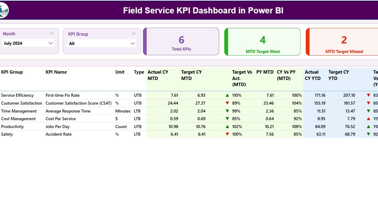
Summary Page
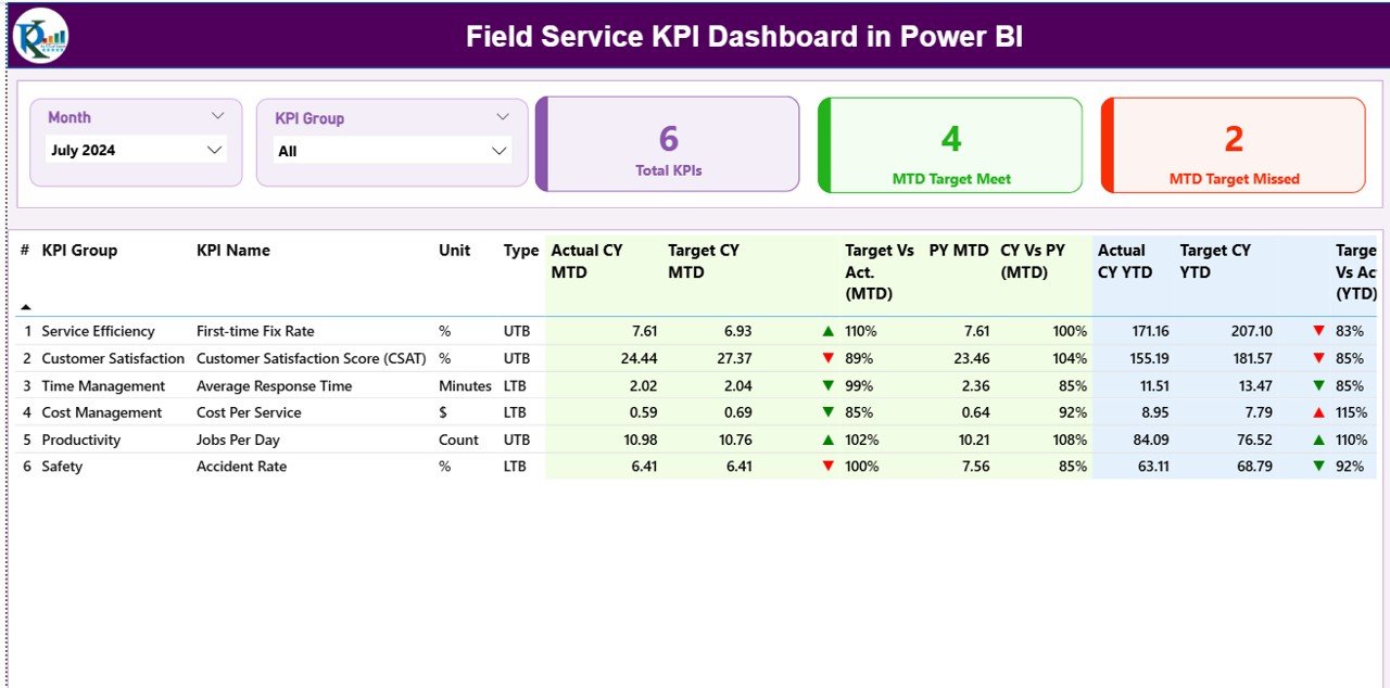
The Summary Page is the heart of the dashboard. It provides a high-level view of all KPIs and allows users to filter data by Month and KPI Group using slicers placed on the top.
At the top of this page, there are three KPI cards:
-
Total KPIs Count
-
MTD Target Met Count
-
MTD Target Missed Count
These cards instantly summarize the overall performance status.
Below the cards, a detailed table displays all KPIs with rich insights. Each row includes:
-
KPI Number: Sequential number of each KPI.
-
KPI Group: Category or department the KPI belongs to.
-
KPI Name: The specific key performance indicator name.
-
Unit: Measurement unit (e.g., %, Hours, Days, Count).
-
Type: Whether the KPI is Lower the Better (LTB) or Upper the Better (UTB).
-
Actual CY MTD: Current Year’s Month-to-Date actual performance value.
-
Target CY MTD: Target value for the same period.
-
MTD Icon: A red ▼ or green ▲ symbol showing if the KPI is meeting or missing its target.
-
Target vs Actual (MTD): Percentage calculation of Actual vs Target for MTD.
-
PY MTD: Last year’s MTD number for comparison.
-
CY vs PY (MTD): Current vs Previous Year comparison percentage for MTD.
-
Actual CY YTD: Current Year-to-Date actual value.
-
Target CY YTD: Target value for YTD.
-
YTD Icon: Visual icon to indicate YTD performance status.
-
Target vs Actual (YTD): Percentage of Actual vs Target YTD.
-
PY YTD: Previous Year’s YTD figure.
-
CY vs PY (YTD): Year-over-Year YTD comparison percentage.
This comprehensive table helps field service managers assess performance both monthly and cumulatively.
KPI Trend Page
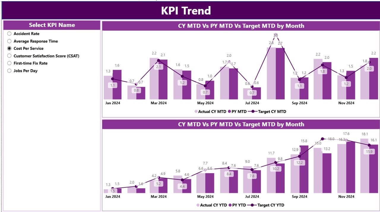
The KPI Trend Page provides detailed trend analysis using two combo charts that visualize performance patterns over time. Users can select any KPI name from a slicer placed on the left side of the page.
The charts display:
-
Actual CY, Previous Year, and Target Values for MTD and YTD.
-
Visual trendlines that make it easy to identify seasonal variations, growth, or decline in performance.
By comparing targets with actuals over different months, users can evaluate performance consistency and spot deviations early.
Click to Purchases Field Service KPI Dashboard in Power BI
3. KPI Definition Page
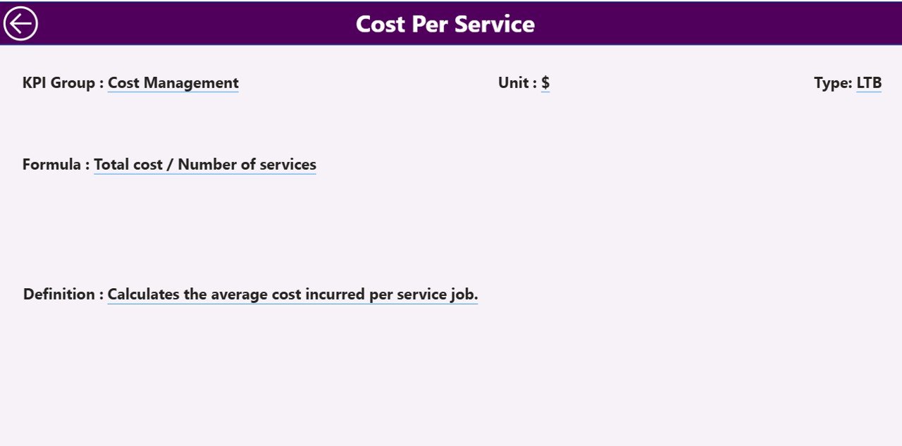
The KPI Definition Page is a hidden drill-through page, offering detailed definitions and formulas for each KPI. When a user drills through from the summary page, they can view:
-
KPI formula
-
Detailed definition
-
Unit of measurement
-
Type (LTB or UTB)
This ensures every team member understands how each KPI is measured. A Back Button at the top-left corner allows users to return to the Summary Page effortlessly.
Excel Data Source Structure
The dashboard uses Excel as its primary data source. The Excel workbook contains three key worksheets:
1. Input_Actual Sheet
This sheet records the actual performance data for each KPI.
Columns include:
-
KPI Name
-
Month (first date of the month)
-
MTD Actual
-
YTD Actual
This helps the dashboard fetch updated monthly and yearly values dynamically.
2. Input_Target Sheet
This sheet captures the target data corresponding to each KPI.
Columns include:
-
KPI Name
-
Month (first date of the month)
-
MTD Target
-
YTD Target
By maintaining both actual and target data, Power BI can automatically calculate performance comparisons.
3. KPI Definition Sheet
This worksheet contains all metadata and calculation logic behind KPIs.
Columns include:
-
KPI Number
-
KPI Group
-
KPI Name
-
Unit
-
Formula
-
Definition
-
Type (LTB or UTB)
The KPI Definition sheet acts as the foundation for understanding and documenting KPI logic.
Key Metrics Tracked in the Dashboard
The Field Service KPI Dashboard is designed to track critical metrics that reflect the efficiency and effectiveness of field operations. Some common examples include:
-
First-Time Fix Rate (FTFR): Percentage of issues resolved in the first visit.
-
Average Resolution Time: Average time taken to complete service requests.
-
Technician Utilization Rate: Percentage of working hours spent on productive tasks.
-
Customer Satisfaction Score (CSAT): Feedback-based measure of customer happiness.
-
Job Completion Rate: Ratio of completed jobs to total assigned jobs.
-
Repeat Visit Rate: Percentage of cases requiring multiple visits.
-
Work Order Backlog: Number of pending or delayed work orders.
-
Response Time: Time taken to respond to a new service request.
Tracking these KPIs gives a 360° view of service performance and helps identify improvement areas.
Advantages of Field Service KPI Dashboard in Power BI
Click to Purchases Field Service KPI Dashboard in Power BI
1. Real-Time Visibility
Managers can view up-to-date service performance with dynamic visualizations and slicers, helping them act fast.
2. Centralized Performance Tracking
The dashboard consolidates all key metrics in one place, eliminating manual data collation from multiple reports.
3. Data-Driven Decision Making
By comparing actuals with targets, managers can make informed decisions about resource allocation and scheduling.
4. Improved Productivity
Technician efficiency and workload distribution become easier to analyze, allowing managers to assign tasks optimally.
5. Historical and Trend Analysis
The KPI Trend page highlights past performance and allows forecasting based on historical trends.
6. Enhanced Customer Satisfaction
Faster response times and performance monitoring ensure customers receive consistent, high-quality service.
Opportunities for Improvement
Even though this dashboard offers extensive insights, organizations can enhance it further by:
-
Integrating IoT or GPS Data: For real-time technician tracking and automatic updates.
-
Adding Predictive Analytics: Using Power BI’s AI visuals to forecast delays or maintenance requirements.
-
Automating Data Refresh: Connecting Excel files to cloud storage like OneDrive or SharePoint for live updates.
-
Expanding KPI List: Including new metrics like service profitability or customer retention rate.
-
Including Region or Location Filters: For geographic analysis of field performance.
Best Practices for Using the Field Service KPI Dashboard
To get the most from your Field Service KPI Dashboard in Power BI, follow these proven best practices:
1. Maintain Clean and Consistent Data
Ensure that data in Excel is formatted correctly and updated regularly. Use standard naming conventions for KPIs and months.
2. Refresh Data Regularly
Keep your Power BI dashboard synchronized with the latest Excel file updates for accurate analysis.
3. Define Clear KPI Ownership
Assign responsibility for each KPI to specific departments or individuals to promote accountability.
4. Use Conditional Formatting Wisely
Leverage color codes (red for missed targets, green for achieved) to make visuals intuitive and impactful.
5. Automate Reports
Schedule automatic Power BI refreshes and export summaries to email reports for stakeholders.
6. Ensure Accessibility
Use Power BI Service to share dashboards securely with stakeholders across teams or locations.
7. Review and Refine KPIs
Continuously evaluate whether the tracked KPIs remain aligned with organizational goals and customer expectations.
How to Build a Field Service KPI Dashboard in Power BI
Here’s a quick outline of how you can create this dashboard step by step:
-
Prepare Excel Data:
-
Create three sheets (Actual, Target, KPI Definition).
-
Ensure consistent formats and unique KPI names.
-
-
Load Data into Power BI:
-
Import Excel file into Power BI Desktop.
-
Transform and clean data using Power Query Editor.
-
-
Create Relationships:
-
Link KPI Name across all sheets for unified filtering.
-
-
Design the Summary Page:
-
Add slicers for Month and KPI Group.
-
Create cards for Total KPIs, Target Met, and Target Missed.
-
Add a detailed table with all performance fields.
-
-
Build Trend Charts:
-
Use combo charts for MTD and YTD actuals vs targets.
-
-
Add Drill-Through Functionality:
-
Enable the KPI Definition page for detailed analysis.
-
-
Publish and Share:
-
Publish the dashboard to Power BI Service for web access.
-
Schedule refreshes to keep data live.
-
Who Can Benefit from the Field Service KPI Dashboard?
This dashboard is ideal for:
-
Service Managers: To track team performance and identify areas for coaching.
-
Operations Teams: To plan daily activities and monitor resource allocation.
-
Executives: To review performance metrics at a glance during meetings.
-
Analysts: To uncover trends, patterns, and improvement opportunities.
-
Field Technicians: To understand performance expectations and achievements.
Why Power BI Is Ideal for Field Service KPI Dashboards
Power BI offers multiple advantages for building field service dashboards:
-
Interactive Visuals: Make complex data understandable at a glance.
-
Drill-Down Capability: Users can move from summary to detail view effortlessly.
-
Data Integration: Supports Excel, SQL, SharePoint, and many other data sources.
-
Real-Time Analytics: Refresh data on demand or on schedule.
-
Customizable Reports: Tailor visuals to match your organization’s KPIs.
Conclusion
A Field Service KPI Dashboard in Power BI transforms how service-based organizations manage field operations. It consolidates multiple KPIs into one centralized, interactive platform, enabling managers to track performance, identify bottlenecks, and enhance service delivery.
By implementing this dashboard, companies can shift from reactive to proactive decision-making. The combination of Excel data inputs and Power BI’s powerful visualization tools makes this an essential solution for any organization striving for operational excellence in field services.
Frequently Asked Questions (FAQs)
1. What is the purpose of a Field Service KPI Dashboard?
It provides real-time insights into field operations, helping managers track key metrics like response time, resolution rate, and technician efficiency.
2. How does Power BI improve field service management?
Power BI offers interactive visuals, real-time updates, and easy-to-understand dashboards, helping teams make data-backed decisions quickly.
3. What type of data is needed for this dashboard?
You’ll need Excel data on actual performance, target values, and KPI definitions to feed the dashboard.
4. Can this dashboard be customized?
Yes, you can modify KPIs, visuals, and filters to suit your organization’s specific needs and goals.
5. How often should I update the data?
Ideally, update the Excel source monthly or automate refreshes via Power BI Service to ensure up-to-date reporting.
6. Who can access the dashboard?
Anyone with appropriate permissions in Power BI Service—such as managers, executives, or analysts—can access and interact with the dashboard.
7. What are the key KPIs to track in field service management?
KPIs like job completion rate, first-time fix rate, response time, and customer satisfaction score are vital for evaluating field service performance.
Visit our YouTube channel to learn step-by-step video tutorials