In today’s fast-moving digital era, Public Relations (PR) plays a key role in shaping brand image, driving engagement, and maintaining credibility. Every campaign, event, and media mention contributes to how the public perceives an organization. But without the right analytical tools, managing PR performance can feel like navigating in the dark.
That’s where the Public Relations (PR) Dashboard in Power BI comes in — a smart, interactive, and data-driven solution that transforms raw PR data into actionable insights.
This article explores everything you need to know about the PR Dashboard in Power BI — from its structure and pages to its benefits, best practices, and FAQs.
Click to Purchases Public Relations (PR) Dashboard in Power BI
What Is a Public Relations (PR) Dashboard in Power BI?
A Public Relations (PR) Dashboard in Power BI is a comprehensive visualization tool that tracks, analyzes, and reports PR performance metrics across multiple campaigns, channels, and regions.
It consolidates data from Excel or other sources to present key insights such as:
-
Positive and negative sentiment percentages
-
Media mentions and reach
-
Campaign cost efficiency
-
Regional and channel-based performance
With Power BI’s dynamic visuals and interactivity, PR managers, communication specialists, and marketing teams can understand what’s working, what’s not, and where to allocate resources for the best outcomes.
Key Features of the PR Dashboard in Power BI
This ready-to-use dashboard consists of five analytical pages, each providing a different perspective on your PR performance:
-
Overview Page
-
Channel Analysis
-
Region Analysis
-
Event Analysis
-
Monthly Trends
Each section of the dashboard is equipped with filters (slicers), KPI cards, and dynamic visuals for quick decision-making. Let’s explore them in detail.
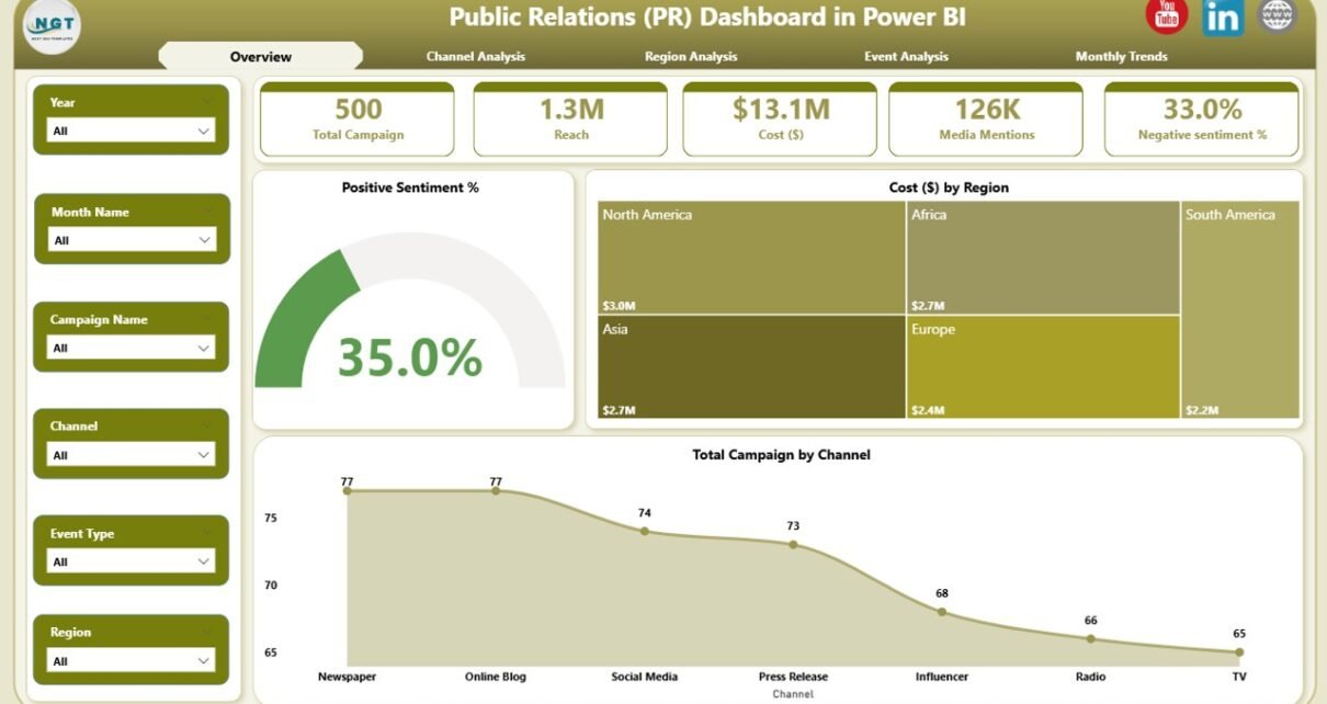
1. Overview Page — Your Command Center
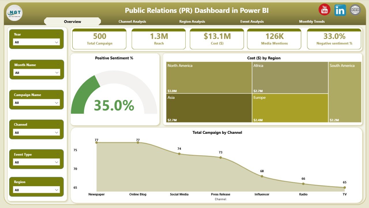
The Overview Page serves as the main summary page for all PR activities.
Key Highlights
-
Five KPI Cards: Instantly view metrics like Total Campaigns, Positive Sentiment %, Total Cost ($), and more.
-
Interactive Filters (Slicers): Filter data by region, channel, or event to narrow down insights.
Charts:
- Positive Sentiment % – Shows how well your brand is being perceived.
- Cost ($) by Region – Identifies areas with the highest PR spending.
- Total Campaigns by Channel – Displays which communication channels are being used most frequently.
Why It Matters
This page gives you a bird’s-eye view of your PR ecosystem, allowing you to track sentiment, spending, and campaign distribution in one glance. Decision-makers can instantly identify trends and adjust strategies.
2. Channel Analysis — Understanding Communication Impact
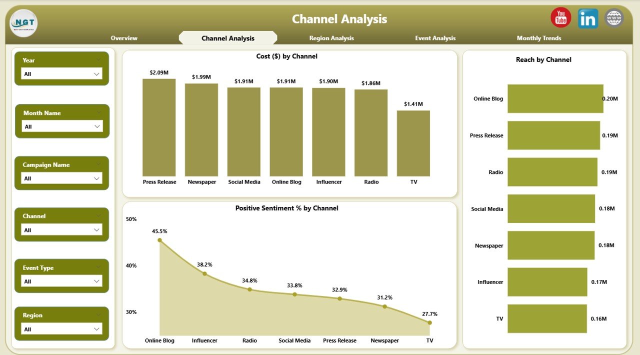
Every PR strategy relies on effective channels — from traditional media to social platforms. The Channel Analysis page helps you determine which ones perform best.
Key Components
-
Positive Sentiment % by Channel – Evaluates audience perception across each medium (e.g., TV, print, digital).
-
Cost ($) by Channel – Compares investments across platforms to assess cost-effectiveness.
-
Reach by Channel – Measures audience reach, helping you find high-impact platforms.
Insights You Gain
-
Identify which channels drive the most engagement.
-
Discover the best ROI on media spend.
-
Adjust future budgets toward high-performing platforms.
This analysis ensures your PR messaging reaches the right people, through the most efficient channels.
Click to Purchases Public Relations (PR) Dashboard in Power BI
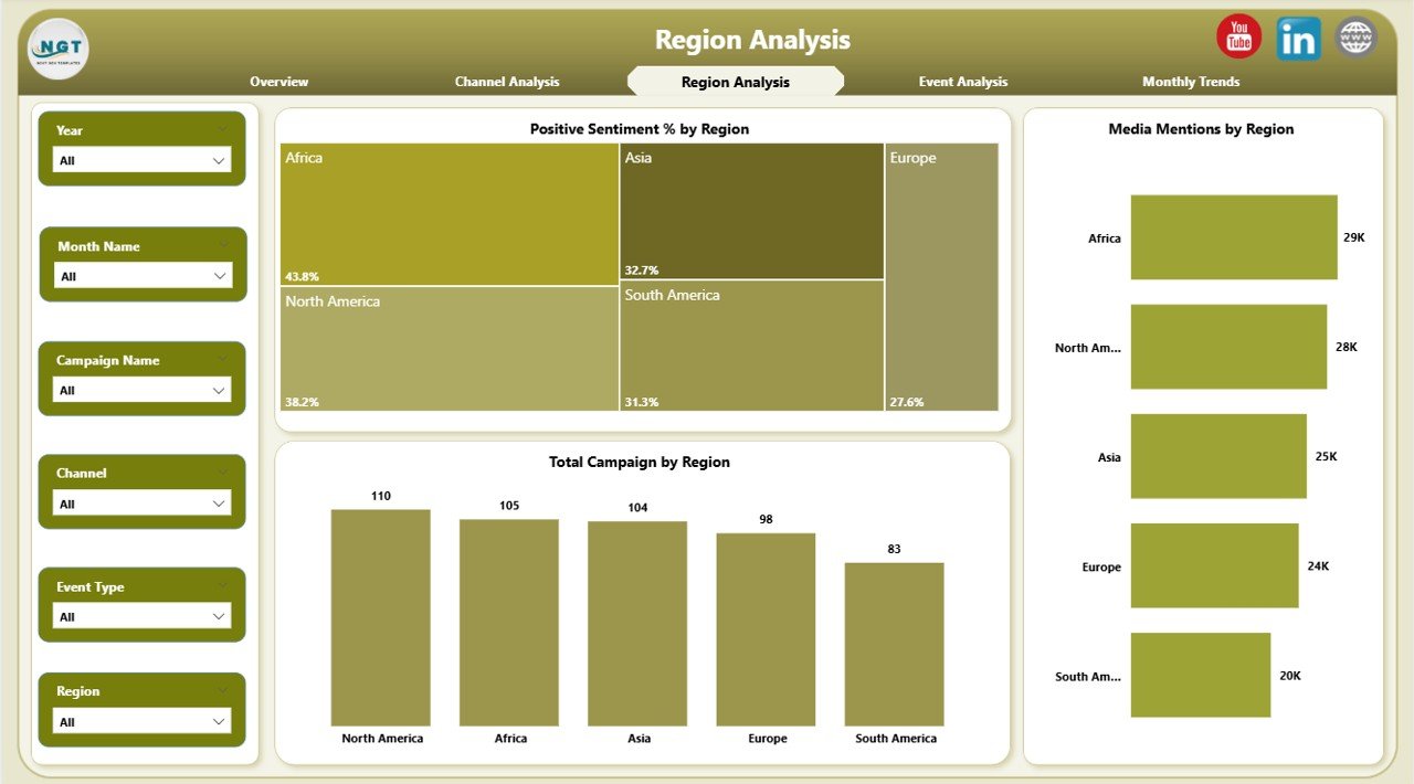
3. Region Analysis — Tracking Global PR Performance
For multinational or regional campaigns, performance can vary greatly from one area to another. The Region Analysis page gives you clarity.
Key Visuals
-
Positive Sentiment % by Region – Highlights where your brand enjoys the strongest reputation.
-
Media Mentions by Region – Displays how often your brand appears in news or digital media.
-
Cost ($) by Region – Tracks regional investment levels and correlates them with sentiment.
How This Helps
-
Quickly spot underperforming regions.
-
Optimize regional strategies and allocate budgets wisely.
-
Measure media visibility geographically.
Regional insights are vital for organizations expanding into new markets or managing localized campaigns.
4. Event Analysis — Measuring PR Event Success
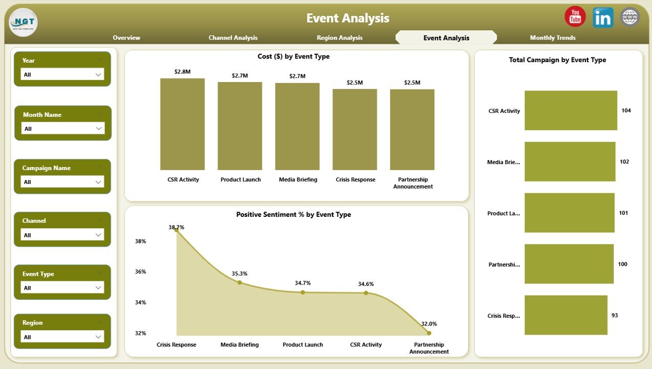
Events are an essential part of public relations — from product launches to press conferences. The Event Analysis page focuses on how these events impact perception and cost.
Main Charts
-
Cost ($) by Event Type – Understand spending across conferences, sponsorships, or online events.
-
Positive Sentiment % by Event Type – Assess how audiences responded emotionally.
-
Total Campaigns by Event Type – See how many PR activities were linked to each event category.
Benefits
-
Measure event ROI and audience satisfaction.
-
Identify which event types build stronger brand sentiment.
-
Improve future event planning and communication strategy.
5. Monthly Trends — Monitoring PR Performance Over Time
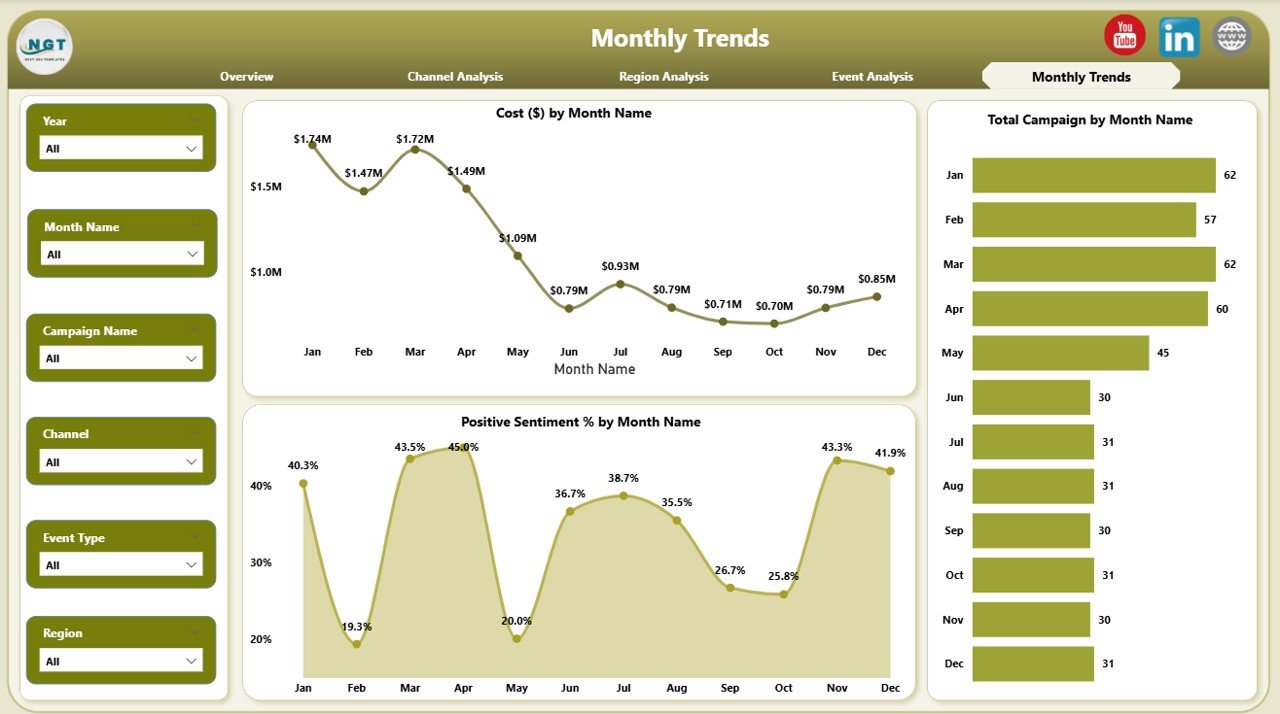
PR performance evolves month by month. The Monthly Trends page provides a timeline view of key metrics.
Core Charts
-
Cost ($) by Month Name – Tracks monthly spending trends.
-
Positive Sentiment % by Month Name – Monitors how public perception changes over time.
-
Total Campaigns by Month Name – Shows campaign frequency and consistency.
Analytical Value
-
Identify seasonality in PR effectiveness.
-
Forecast future costs and outcomes.
-
Monitor progress toward yearly goals.
This time-series view ensures proactive management rather than reactive correction.
Advantages of Using a Public Relations (PR) Dashboard in Power BI
Using Power BI for PR analytics offers numerous advantages beyond simple visualization.
1. Real-Time Insights
Power BI automatically updates from your data sources, giving you the most current insights without manual reporting.
2. Data Integration
Combine Excel files, media tracking tools, and social listening platforms into one unified dashboard.
3. Easy Customization
Tailor visuals, colors, and metrics to suit your brand or reporting standards.
4. Cost Efficiency
No need for expensive PR analytics software — Power BI provides enterprise-level analysis at a fraction of the cost.
5. Enhanced Collaboration
Share dashboards securely with stakeholders through Power BI Service, ensuring transparency and teamwork.
6. Informed Decision-Making
Instantly identify successful campaigns, optimize resources, and address negative sentiment before it escalates.
How to Build a PR Dashboard in Power BI
Building this dashboard follows a structured workflow:
-
Collect Data – Gather campaign data, costs, and sentiment results in Excel or CSV format.
-
Load into Power BI – Use Get Data to connect your file.
-
Data Cleaning – Transform and format your columns (e.g., Region, Channel, Event, Month).
-
Model Relationships – Define relationships between campaign, region, and sentiment tables.
-
Add Calculations – Use DAX measures for KPIs like Positive Sentiment % or Cost Efficiency Ratio.
-
Design Pages – Create visuals for Overview, Channel, Region, Event, and Monthly Trend pages.
-
Publish & Share – Upload your dashboard to Power BI Service for real-time collaboration.
Best Practices for the PR Dashboard in Power BI
To ensure maximum accuracy and usability, follow these best practices:
1. Keep the Design Clean
Avoid cluttered visuals. Use consistent color schemes for readability and brand alignment.
2. Use Descriptive Titles
Clearly label charts (e.g., Cost ($) by Region, Positive Sentiment by Month). It improves understanding for non-technical users.
3. Add Slicers Thoughtfully
Include only meaningful filters (e.g., by region or channel) to simplify the user experience.
4. Automate Data Refresh
Schedule automatic data updates in Power BI Service for real-time accuracy.
5. Focus on Actionable Insights
Highlight KPIs that drive strategic action — not vanity metrics.
6. Maintain Data Quality
Ensure data consistency in Excel before importing to Power BI to prevent inaccurate calculations.
7. Use Conditional Formatting
Apply up/down arrows or color indicators to show performance improvement or decline instantly.
8. Create Drill-Throughs
Allow users to click through visuals to explore detailed data, enhancing interactivity.
How Power BI Enhances PR Reporting
Power BI isn’t just about visualization; it empowers strategic storytelling.
-
Interactive Filters: Users can isolate campaigns, time frames, or regions instantly.
-
Dynamic Visuals: Bar, line, and pie charts make trends easy to understand.
-
Performance Monitoring: Conditional formatting highlights growth or decline.
-
Data Exporting: Export visuals or data to PowerPoint and Excel for management reports.
-
Scalability: Easily integrate new campaigns or data sources as your PR operations grow.
Conclusion
The Public Relations (PR) Dashboard in Power BI is more than a reporting tool — it’s a strategic command center for your brand reputation management.
It converts data into visual stories that highlight success, pinpoint inefficiencies, and predict outcomes. By integrating Excel data into Power BI, organizations can track PR sentiment, optimize costs, and evaluate campaign performance with unmatched clarity.
When used effectively, this dashboard transforms PR from a reactive communication function into a proactive, data-driven powerhouse that drives brand credibility and growth.
Frequently Asked Questions (FAQs)
1. What data sources can be used for the PR Dashboard in Power BI?
You can connect Excel, CSV files, Google Sheets, or APIs from media monitoring tools like Meltwater or Brandwatch.
2. Can non-technical users operate the PR Dashboard?
Yes. The dashboard uses an intuitive interface with filters, buttons, and visuals that anyone can explore easily.
3. How often should I update my PR data?
Ideally, set a daily or weekly refresh schedule to keep sentiment and media metrics current.
4. Can I track both digital and traditional media in this dashboard?
Absolutely. You can combine data from online platforms, print media, and event tracking sheets to get a unified view.
5. How can Power BI improve PR decision-making?
It helps visualize key performance indicators, measure campaign ROI, detect negative trends early, and allocate resources more effectively.
6. Is this dashboard customizable for different organizations?
Yes. You can modify visuals, KPIs, and themes to match your company’s branding and reporting style.
7. What are the key visuals to include in a PR Dashboard?
Include cards for KPIs, bar charts for cost and campaigns, and line charts for sentiment trends over time.
Visit our YouTube channel to learn step-by-step video tutorials