In today’s competitive business environment, managing channel sales effectively has become one of the most critical aspects of sustainable growth. Organizations that rely on channel partners, distributors, or resellers need a reliable way to measure performance, track key metrics, and make data-driven decisions.
That’s where the Channel Sales KPI Dashboard in Power BI comes in. This interactive and visually rich dashboard gives you a complete view of your channel performance, helping you analyze trends, track targets, and identify areas for improvement—all in real time.
Click to Purchases Channel Sales KPI Dashboard in Power BI
What Is a Channel Sales KPI Dashboard in Power BI?
A Channel Sales KPI Dashboard in Power BI is a dynamic reporting tool designed to monitor and evaluate sales performance through distribution and channel networks. Built using Microsoft Power BI and powered by data from Excel or other sources, this dashboard consolidates KPIs across multiple dimensions such as region, channel partner, product category, and time period.
It provides a unified view of sales data—showing both Month-to-Date (MTD) and Year-to-Date (YTD) metrics—allowing decision-makers to assess whether their channel partners are achieving sales targets and contributing effectively to business objectives.
The dashboard is not just a visualization tool—it’s a performance management system that aligns teams with organizational goals and provides actionable insights at every level.
Key Features of the Channel Sales KPI Dashboard
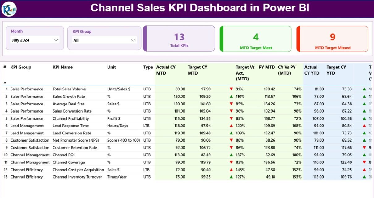
The Channel Sales KPI Dashboard in Power BI has been designed for clarity, interactivity, and insight. It includes three key pages:
1️⃣ Summary Page

The Summary Page acts as the main control center of the dashboard.
At the top, you’ll find slicers to filter data by Month and KPI Group, allowing users to focus on specific time frames or categories.
Below the slicers, the dashboard displays three key cards:
-
Total KPIs Count – Displays the total number of active KPIs being monitored.
-
MTD Target Met Count – Shows how many KPIs have met their Month-to-Date targets.
-
MTD Target Missed Count – Displays how many KPIs have not achieved their MTD targets.
This structured layout helps managers instantly identify performance gaps, benchmark progress, and prioritize corrective actions.
Click to Purchases Channel Sales KPI Dashboard in Power BI
2️⃣ KPI Trend Page
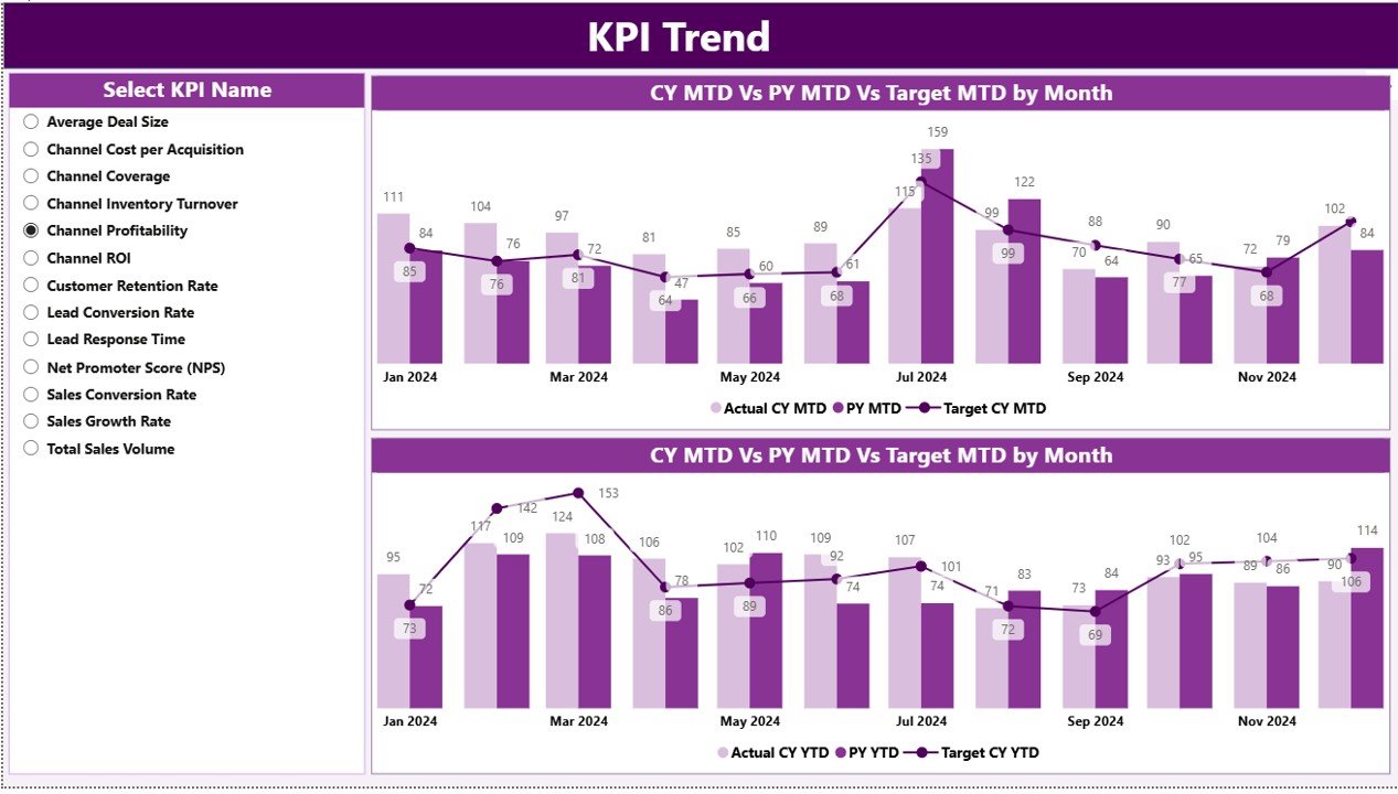
The KPI Trend Page focuses on time-based performance analysis.
It includes combo charts that display trends for Current Year, Previous Year, and Target across both MTD and YTD metrics.
A slicer on the left allows users to select a specific KPI name and view its historical performance, making it easy to spot seasonal fluctuations or growth patterns.
This page is especially valuable for understanding whether performance improvements are consistent or temporary—and for evaluating if strategic initiatives are delivering the expected results.
3️⃣ KPI Definition Page
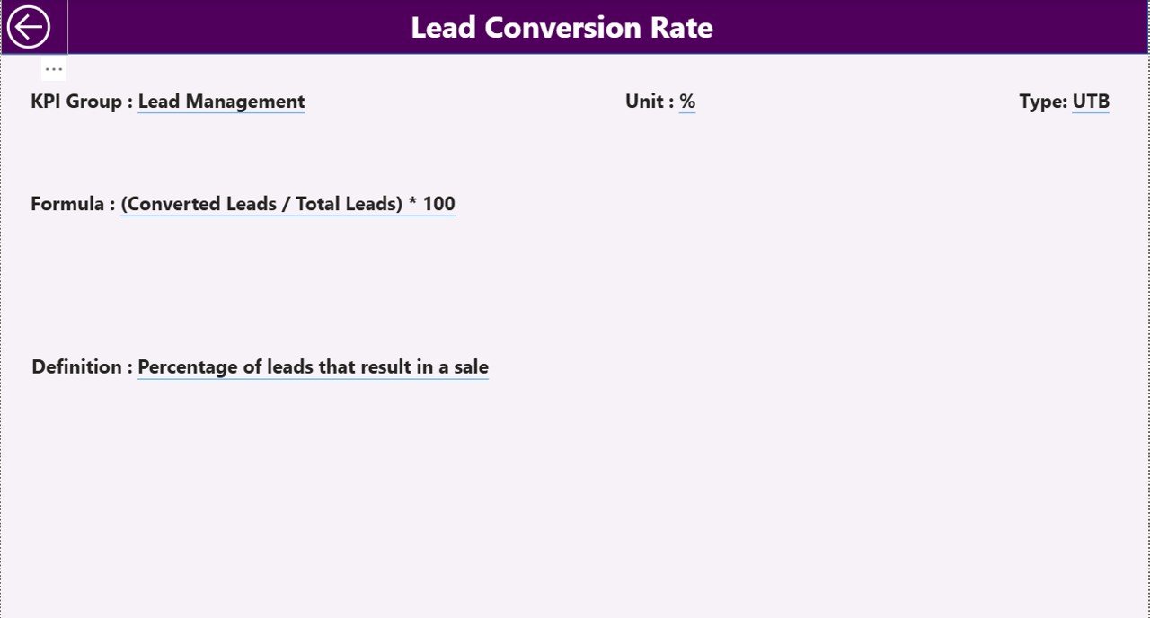
The KPI Definition Page serves as a drill-through page that provides detailed information about each KPI.
While this page remains hidden in the main view, users can drill through from the summary table to see details such as:
-
KPI Formula
-
KPI Definition
-
Calculation Method
-
Type (LTB or UTB)
A back button at the top-left corner enables users to easily return to the main dashboard. This drill-through functionality ensures that while the main dashboard remains concise, deeper insights are just one click away.
Excel Data Source Structure
The Channel Sales KPI Dashboard connects to an Excel file that contains three key sheets:
1️⃣ Input_Actual Sheet
In this sheet, users fill in:
-
KPI Name
-
Month (using the first date of each month, e.g., 01-Jan-2024)
-
MTD (Month-to-Date) values
-
YTD (Year-to-Date) values
This sheet captures real performance numbers that Power BI uses to calculate KPIs and visualize trends.
2️⃣ Input_Target Sheet
Here, users input:
-
KPI Name
-
Month (again, use the first day of the month for consistency)
-
Target MTD values
-
Target YTD values
This sheet establishes the performance benchmarks that the dashboard compares against actual results.
3️⃣ KPI Definition Sheet
Click to Purchases Channel Sales KPI Dashboard in Power BI
This sheet acts as the foundation of the dashboard’s logic. It contains:
-
KPI Number – Unique identifier for each KPI.
-
KPI Group – Category or department to which the KPI belongs.
-
KPI Name – The descriptive name of the KPI.
-
Unit – The measurement unit.
-
Formula – The calculation logic used to derive KPI values.
-
Definition – Explanation of what the KPI measures and why it matters.
-
Type (LTB/UTB) – Indicates whether higher or lower values are preferable.
Once populated, this sheet allows Power BI to dynamically calculate and compare KPIs across time periods.
Why Use Power BI for Channel Sales Analysis?
Microsoft Power BI stands out as one of the most effective tools for channel sales performance tracking. Its ability to integrate with Excel, databases, and APIs allows seamless automation of reporting.
Here’s why Power BI is ideal for channel sales analysis:
-
Interactive Dashboards – Users can slice and dice data by month, channel partner, or region instantly.
-
Real-Time Insights – Data updates automatically, ensuring reports always show the latest results.
-
Drill-Down Functionality – Users can dig deeper into KPI definitions or trends in seconds.
-
Dynamic Visuals – Charts, cards, and icons make the data easier to interpret.
-
Data Accuracy – Reduces manual errors and increases confidence in decision-making.
By combining Power BI’s analytical capabilities with structured Excel data, organizations can move from static reporting to dynamic performance intelligence.
Advantages of the Channel Sales KPI Dashboard in Power BI
1. Centralized Data Visualization
The dashboard consolidates all KPIs into one place, reducing the need to navigate multiple spreadsheets or reports.
2. Real-Time Performance Tracking
It updates automatically, enabling decision-makers to track performance daily, weekly, or monthly without manual refreshes.
3. Improved Decision-Making
Clear visuals and calculated metrics help identify which channels are underperforming and which are driving growth.
4. Target vs Actual Comparison
Built-in indicators and charts simplify performance comparison, showing how close (or far) teams are from their goals.
5. Enhanced Accountability
Because every KPI has a defined owner, formula, and target, managers can assign accountability more effectively.
6. Historical Trend Analysis
The KPI Trend page allows users to see how performance has evolved over time, helping to forecast future outcomes.
7. User-Friendly Interface
Simple slicers, drill-through options, and color-coded icons make the dashboard intuitive even for non-technical users.
Best Practices for Using the Channel Sales KPI Dashboard
To get the best results from your Channel Sales KPI Dashboard in Power BI, follow these best practices:
1. Keep Data Clean and Consistent
Ensure that KPI names, months, and units remain uniform in all Excel sheets. Inconsistent data can break relationships in Power BI.
2. Define Clear KPI Ownership
Each KPI should have a responsible person or department. This increases clarity and drives accountability.
3. Regularly Update Data
Update the Excel source files consistently (daily, weekly, or monthly) to keep insights accurate and relevant.
4. Use Meaningful KPI Groups
Organize KPIs by department, region, or product line to make analysis more structured and actionable.
5. Review and Refine KPI Definitions
Revisit KPI formulas and definitions periodically to ensure they still align with business goals.
6. Leverage Power BI Filters and Bookmarks
Create custom filters or bookmarks for recurring reports (e.g., “Top Performing Regions” or “Low-Performing KPIs”).
7. Automate Data Refreshes
Schedule automatic data refreshes within Power BI Service to keep your dashboard updated without manual intervention.
How the Dashboard Supports Business Decision-Making
The Channel Sales KPI Dashboard helps organizations answer critical questions such as:
-
Which channel partners are meeting sales goals?
-
How does this month’s performance compare to last year’s?
-
Which KPIs consistently fall short of targets?
-
Where should we focus improvement efforts?
By providing real-time, visual, and data-driven answers, the dashboard transforms raw numbers into strategic insights.
It empowers sales directors, regional managers, and analysts to:
-
Identify weak links in the distribution network.
-
Allocate resources more effectively.
-
Set realistic but ambitious sales targets.
-
Foster transparency between internal teams and channel partners.
Conclusion
The Channel Sales KPI Dashboard in Power BI is more than just a visualization tool—it’s a complete performance management solution for businesses that rely on multi-channel distribution.
By consolidating KPIs, automating comparisons, and enabling detailed trend analysis, it helps organizations move from reactive reporting to proactive decision-making. Whether you manage a small sales network or a global distribution system, this dashboard ensures that every channel partner’s contribution is visible, measurable, and optimized for growth.
Frequently Asked Questions (FAQs)
1. What is the purpose of a Channel Sales KPI Dashboard?
The purpose is to track, analyze, and compare sales performance across various channels and partners. It helps businesses ensure that all sales contributors align with corporate targets.
2. Can I customize KPIs in the dashboard?
Yes. You can define, modify, or add new KPIs in the Excel file. Power BI will automatically update the dashboard once refreshed.
3. What data sources can I use apart from Excel?
While the default setup uses Excel, Power BI can connect to SQL databases, Google Sheets, CRM systems, or APIs for automated data integration.
4. What are common KPIs used in Channel Sales?
Typical KPIs include Revenue Growth %, Sales Target Achievement %, Average Order Value, Channel Partner Performance, Customer Acquisition Cost, and Profit Margin %.
5. How often should I update the data?
For best results, update data monthly or weekly. Businesses with daily transactions can automate refreshes for real-time monitoring.
6. Is Power BI suitable for non-technical users?
Absolutely. Power BI’s drag-and-drop visuals, slicers, and navigation make it easy for managers and executives to interpret insights without technical expertise.
7. Can I view the dashboard on mobile devices?
Yes, Power BI dashboards are responsive. You can access them on smartphones and tablets using the Power BI mobile app.
8. What does LTB and UTB mean in KPIs?
LTB stands for Lower the Better (e.g., cost, defects) while UTB means Upper the Better (e.g., sales, satisfaction). This distinction helps in evaluating KPI performance correctly.
Visit our YouTube channel to learn step-by-step video tutorials