In today’s competitive marketplace, distributors play a critical role in ensuring that products reach customers efficiently and profitably. Managing and tracking distributor performance manually can be time-consuming and prone to errors. That’s where the Distributor Performance KPI Dashboard in Power BI becomes a game-changer.
This ready-to-use dashboard allows business managers, sales heads, and supply-chain professionals to visualize key performance indicators (KPIs), monitor real-time metrics, and make data-driven decisions with confidence.
Click to Purchases Distributor Performance KPI Dashboard in Power BI
What Is a Distributor Performance KPI Dashboard in Power BI?
A Distributor Performance KPI Dashboard in Power BI is an interactive reporting solution that consolidates distributor-related data into a visual, easy-to-understand interface.
It brings together information from multiple sources — such as sales data, target sheets, and KPI definitions — to provide a comprehensive overview of performance across all distributors. Instead of dealing with static spreadsheets, users can interact with slicers, drill-through pages, and charts to analyze trends, identify gaps, and track achievements.
In simple terms, this dashboard transforms raw Excel data into powerful visual insights for smarter decision-making.
Why Is Distributor Performance Tracking Important?
Effective distributor management ensures timely product delivery, improved customer satisfaction, and optimized sales coverage. However, tracking distributor performance manually often leads to missed targets, inconsistent data, and delayed insights.
Here’s why tracking KPIs through a Power BI dashboard is essential:
-
Real-time visibility into sales and target performance.
-
Accurate distributor benchmarking across regions and categories.
-
Improved accountability through measurable and transparent metrics.
-
Better forecasting by comparing month-to-date (MTD) and year-to-date (YTD) results.
-
Quick performance corrections through data-driven insights.
When businesses measure distributor KPIs consistently, they can make timely adjustments that improve operational efficiency and profitability.
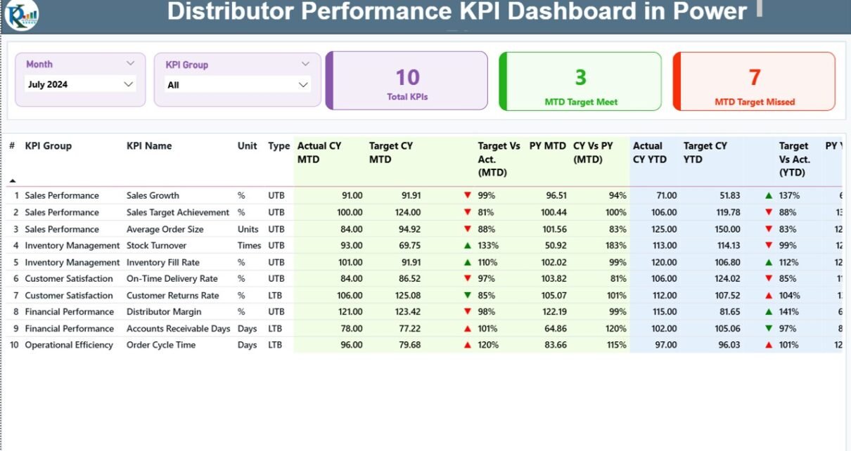
Structure of the Distributor Performance KPI Dashboard
The dashboard consists of three main pages within the Power BI desktop file — each designed for a specific analytical purpose.
1. Summary Page
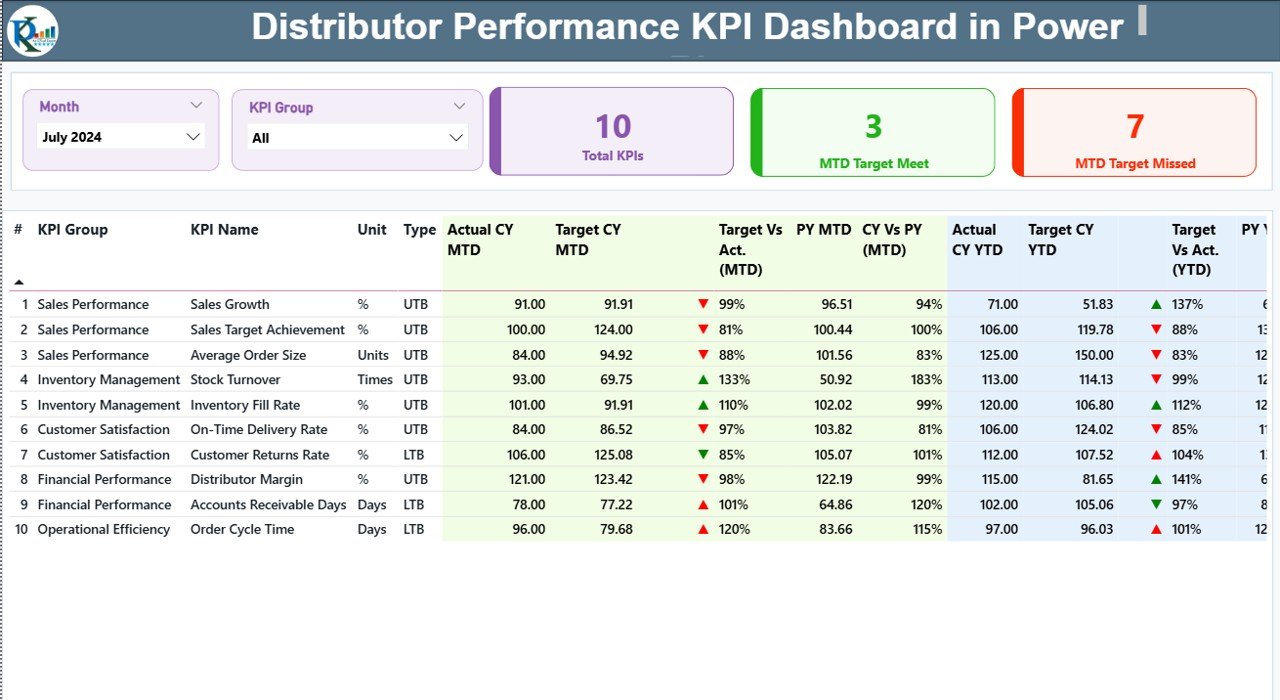
This is the primary interface where users spend most of their time. It offers a holistic view of all distributor performance metrics and helps users identify which KPIs are on track or need attention.
Key elements include:
-
Month and KPI Group slicers: Allow users to select specific months or KPI categories for analysis.
-
Performance Cards: Display total KPIs, MTD Target Met count, and MTD Target Missed count.
Detailed KPI Table:
- KPI Number: Sequential identifier of each KPI.
- KPI Group: Categorizes KPIs (e.g., Sales, Operations, Finance).
- KPI Name: Descriptive title of the performance metric.
- Unit: Measurement unit (e.g., %, USD, Units).
- Type: Indicates “LTB” (Lower the Better) or “UTB” (Upper the Better).
- Actual CY MTD / Target CY MTD: Current Month-to-Date performance versus target.
- MTD Icons: Red ▼ or green ▲ icons visually indicate KPI performance status.
- Target vs. Actual (MTD): Percentage ratio calculated as Actual ÷ Target for MTD.
- PY MTD: Previous Year’s Month-to-Date performance.
- CY vs. PY (MTD): Comparison of current versus previous year MTD values.
- Actual CY YTD / Target CY YTD: Year-to-Date actuals and targets.
- YTD Icons: Similar visual indicators for YTD metrics.
- Target vs. Actual (YTD): Actual ÷ Target for YTD.
- PY YTD: Previous Year YTD performance.
- CY vs. PY (YTD): Comparison between current and last year YTD performance.
This page helps users quickly identify where distributors meet or miss their targets and what areas need strategic focus.
Click to Purchases Distributor Performance KPI Dashboard in Power BI
2. KPI Trend Page
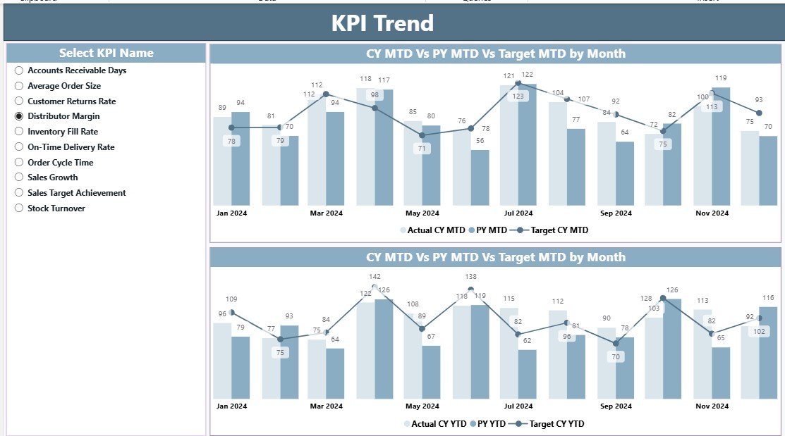
The KPI Trend page helps users analyze historical and comparative performance data.
Here’s what it includes:
-
KPI Selector: A slicer on the left side allows users to choose any specific KPI.
-
Combo Charts: Dual-axis charts displaying Actual CY, Target CY, and Previous Year values for both MTD and YTD.
-
Visual Comparison: Enables easy understanding of performance trends over time.
This page is ideal for understanding long-term distributor patterns, seasonal variations, and areas that need improvement.
3. KPI Definition Page
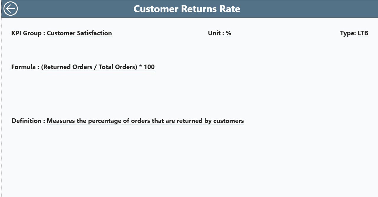
The KPI Definition page acts as a drill-through reference sheet, allowing users to view detailed information about each KPI.
This hidden page contains:
-
KPI formulas
-
KPI definitions
-
KPI units
-
Type (LTB or UTB)
Users can drill through from the Summary Page to explore any KPI’s background, meaning, and calculation logic. A convenient “Back” button on the top left corner helps users return to the main page instantly.
Excel Data Source for the Dashboard
The dashboard uses an Excel workbook as its backend data source. It includes three essential worksheets that feed the Power BI visuals:
1. Input_Actual Sheet
This sheet captures all actual performance data.
Columns include:
-
KPI Name
-
Month (first day of the month for consistency)
-
MTD values
-
YTD values
2. Input_Target Sheet
This sheet records all target values for each KPI, month, and time period.
Columns include:
-
KPI Name
-
Month (same format as the Actual sheet)
-
MTD target
-
YTD target
3. KPI Definition Sheet
This sheet defines each KPI clearly, ensuring consistency across reports.
It includes:
-
KPI Number
-
KPI Group
-
KPI Name
-
Unit
-
Formula
-
Definition
-
Type (LTB or UTB)
By maintaining accurate and structured Excel data, users ensure the Power BI dashboard updates automatically and displays reliable insights.
How Does the Distributor Performance KPI Dashboard Work?
The dashboard automatically processes Excel data through Power BI’s data model. Each KPI compares Actual vs. Target and Current vs. Previous Year results. Conditional formatting adds green upward arrows for positive performance and red downward arrows for underperformance.
Using DAX formulas, Power BI calculates ratios like:
-
Target vs. Actual (MTD) = Actual CY MTD ÷ Target CY MTD
-
CY vs. PY (MTD) = Actual CY MTD ÷ PY MTD
-
Target vs. Actual (YTD) = Actual CY YTD ÷ Target CY YTD
-
CY vs. PY (YTD) = Actual CY YTD ÷ PY YTD
These indicators update dynamically whenever the data source refreshes, allowing real-time monitoring of distributor effectiveness.
Advantages of Distributor Performance KPI Dashboard in Power BI
Using this dashboard offers numerous business advantages. Let’s explore them below:
1. Real-Time Performance Monitoring
Power BI connects directly to Excel or other data sources, providing real-time updates. You can view live distributor performance metrics without manual refreshes.
2. Data-Driven Decision Making
Visual charts and KPIs simplify interpretation. Managers can identify which distributors exceed targets and which need support.
3. Improved Operational Efficiency
Automated dashboards reduce the time spent on manual reporting. This means more time for strategic analysis and corrective action.
4. Enhanced Transparency and Accountability
Each KPI is linked to measurable data, ensuring every distributor’s performance is transparent and comparable.
5. Customizable and Scalable Design
You can easily add new KPIs, modify slicers, or integrate additional data sources. Power BI’s flexibility makes it suitable for any organization size.
6. Strong Historical and Predictive Insights
By comparing current versus previous year data, organizations can forecast future performance and set more realistic targets.
How to Use the Dashboard Effectively
To maximize the benefits of the Distributor Performance KPI Dashboard, follow these steps:
- Update the Excel Data Regularly: Ensure Actual and Target sheets are current.
- Maintain Accurate KPI Definitions: Keep the KPI Definition sheet consistent to avoid data errors.
- Refresh Power BI Connections: Regularly refresh the dataset to get updated visuals.
- Use Slicers Smartly: Filter by month or KPI group for focused analysis.
- Drill Through for Details: Use the KPI Definition page to understand formula logic.
- Review Trend Charts Frequently: Analyze YTD and MTD trends to forecast upcoming challenges.
Best Practices for the Distributor Performance KPI Dashboard
Following best practices ensures your dashboard remains accurate, efficient, and insightful.
1. Keep Data Clean and Consistent
Avoid duplicate KPI names or inconsistent month formats. Clean data ensures smooth refresh cycles and accurate visuals.
2. Use Meaningful KPI Groups
Group KPIs logically — e.g., Sales, Inventory, Customer Service, and Finance — for easier interpretation.
3. Maintain Color Consistency
Use red for underperformance and green for success throughout the dashboard. Consistent visuals improve readability.
4. Leverage Power BI’s Drill-Through and Tooltips
These features enhance user experience and provide context without cluttering visuals.
5. Automate Data Refresh
Schedule Power BI refreshes so that data always stays up-to-date without manual effort.
6. Validate KPI Formulas Regularly
Ensure that all KPI calculations align with business goals and reflect accurate performance logic.
Common Mistakes to Avoid
While implementing this dashboard, many users make small but critical mistakes. Avoid these to maintain data accuracy:
-
Not aligning Actual and Target KPI names.
-
Forgetting to include the first-day-of-month format in Excel.
-
Ignoring refresh errors or incorrect DAX measures.
-
Overcrowding visuals with unnecessary KPIs.
-
Not labeling charts or using inconsistent units.
Conclusion
The Distributor Performance KPI Dashboard in Power BI empowers organizations to evaluate and optimize distributor performance effectively. It brings together data visualization, real-time tracking, and actionable insights — all within one powerful tool.
Whether you manage ten distributors or a thousand, this dashboard provides the clarity needed to improve sales performance, boost accountability, and achieve operational excellence.
With a structured design, dynamic slicers, and trend analysis features, Power BI transforms traditional reporting into a modern, data-driven management system.
Frequently Asked Questions (FAQs)
1. What is the main purpose of the Distributor Performance KPI Dashboard?
The main goal is to monitor and analyze distributor performance against set KPIs such as sales, delivery efficiency, and customer satisfaction. It helps managers make timely, data-driven decisions.
2. How does the dashboard handle Month-to-Date (MTD) and Year-to-Date (YTD) data?
The dashboard calculates both MTD and YTD metrics automatically by comparing actual and target data. It also shows previous year values for performance benchmarking.
3. Can I customize the KPIs in this dashboard?
Yes. You can edit the KPI Definition sheet in Excel and refresh Power BI. The dashboard will automatically update with the new KPIs.
4. Do I need coding knowledge to use this dashboard?
No. This dashboard is designed for business users. You only need basic Excel and Power BI skills to manage it effectively.
5. How often should I update the Excel data?
Ideally, update the Excel sheets monthly or weekly, depending on how frequently distributor performance changes.
6. Can I connect this dashboard to other databases besides Excel?
Yes. Power BI supports connections to SQL databases, cloud sources, and APIs for seamless integration.
7. What does “LTB” and “UTB” mean in the KPI type?
LTB means “Lower the Better,” suitable for metrics like defect rate or delivery time. UTB means “Upper the Better,” suitable for metrics like sales volume or profit margin.
8. What visual indicators are used to show KPI performance?
The dashboard uses green upward arrows (▲) for positive performance and red downward arrows (▼) for underperformance.
9. How does this dashboard help in decision-making?
By offering instant visibility into distributor metrics, the dashboard enables leaders to identify trends, measure progress, and make strategic adjustments.
10. Can small businesses use this dashboard?
Absolutely. The dashboard is scalable and can be tailored for both small and large distribution networks.
Visit our YouTube channel to learn step-by-step video tutorials