Managing rainfall data across multiple regions, seasons, and states has always been a challenge for environmental agencies, meteorologists, and agricultural planners. Disjointed spreadsheets, manual chart updates, and static PDF reports simply cannot keep pace with the dynamic nature of precipitation data. That is exactly why the Rainfall Report Management Dashboard in Power BI was built — to give you a centralized, visually rich, and fully interactive solution that transforms raw rainfall figures into actionable insights.
This professionally designed Power BI dashboard template features five dedicated analysis pages, dynamic KPI cards, and interactive slicers that let you drill into rainfall types, seasonal trends, state comparisons, and monthly breakdowns — all with a few clicks. Whether you are preparing flood risk assessments, aligning irrigation schedules, or publishing climate research, this dashboard delivers the clarity your data deserves.
👉 Click here to Purchase the Rainfall Report Management Dashboard in Power BI
Key Features of Rainfall Report Management Dashboard in Power BI
What makes this Power BI template stand out from a generic chart collection is the depth and intentionality of its design. Here is what you get:
- 5 Purpose-Built Dashboard Pages — Each page addresses a different analytical need, from high-level overview to rainfall type classification, seasonal patterns, state comparisons, and monthly breakdowns, so you never have to scroll through irrelevant data.
- Dynamic KPI Cards — The overview page displays Total Record, Rainfall (mm), Rainy Days, and Max Temp (°C) — all updating automatically when you apply filters.
- Rainfall Type Analysis — Break down minimum temperatures, expected rainfall, and rainy days by rainfall type to understand how different precipitation categories behave.
- Seasonal Trend Tracking — Visualize verified record percentages, average rainfall, and rainy days by season to identify seasonal cycles and plan accordingly.
- State-Level Comparison — Compare verified record percentages, maximum temperatures, and expected rainfall across states side by side to pinpoint regions with unusual precipitation patterns.
- Monthly Granularity — Track cumulative rainfall, total records, and rainy days by month name for fine-grained temporal analysis.
- Interactive Slicers and Cross-Filtering — Filter the entire dashboard by region, state, season, data source, rainfall type, and month simultaneously, and watch all charts update in real time.
- Professional, Clean Visual Design — Consistent color coding, legible typography, and a modern layout make this dashboard ready for boardroom presentations and public reports alike.
- Fully Customizable — Connect your own dataset, adjust color themes, rename metrics, and add new data sources without needing advanced DAX knowledge.
Dashboard Pages Explanation
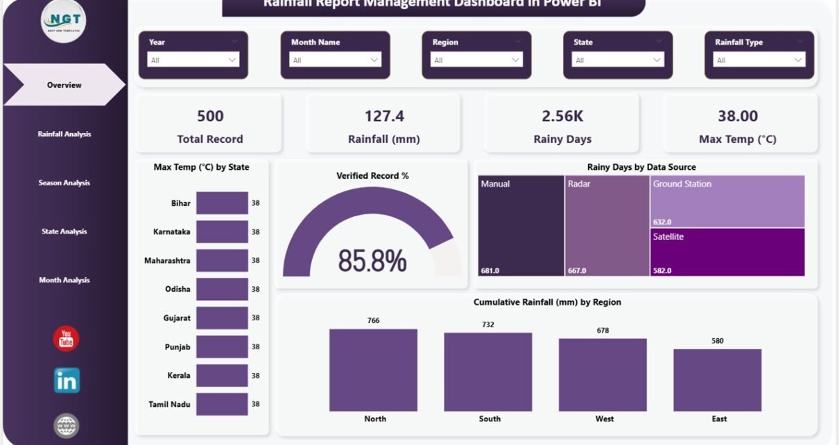
Page 1 – Overview Page
The overview page is your command center for rainfall monitoring. At the top, four dynamic KPI cards display the most critical metrics at a glance: Total Record, Rainfall (mm), Rainy Days, and Max Temp (°C). Below the KPI strip, interactive charts present Max Temp (°C) by State showing temperature distribution across different locations, Verified Record % indicating overall data quality and completeness, Rainy Days by Data Source comparing contributions from different data origins, and Cumulative Rainfall (mm) by Region tracking total precipitation across geographical zones. Multiple slicers are available to apply filters and explore the dashboard quickly. The combination of summary cards and analysis charts gives decision-makers the complete picture without having to dig into multiple reports.
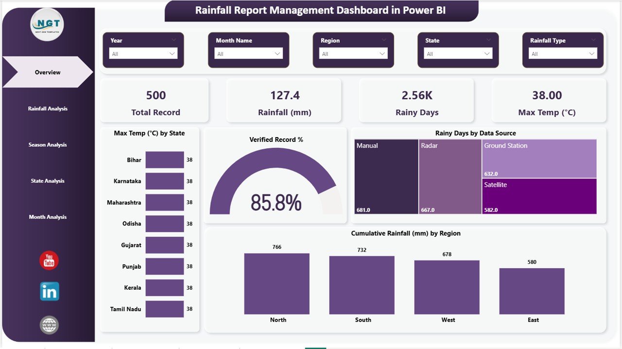
Overview Page
Page 2 – Rainfall Analysis
Dive deep into rainfall type classifications on the Rainfall Analysis page. Charts here cover Min Temp (°C) by Rainfall Type revealing temperature patterns associated with different precipitation categories, Expected Rainfall (mm) by Rainfall Type comparing anticipated precipitation volumes across classification groups, and Rainy Days by Rainfall Type showing how frequently each type occurs throughout the dataset. This page is essential for understanding the relationship between rainfall classification and weather metrics, enabling researchers and planners to identify which rainfall types contribute most to total precipitation and which are associated with extreme temperature conditions.
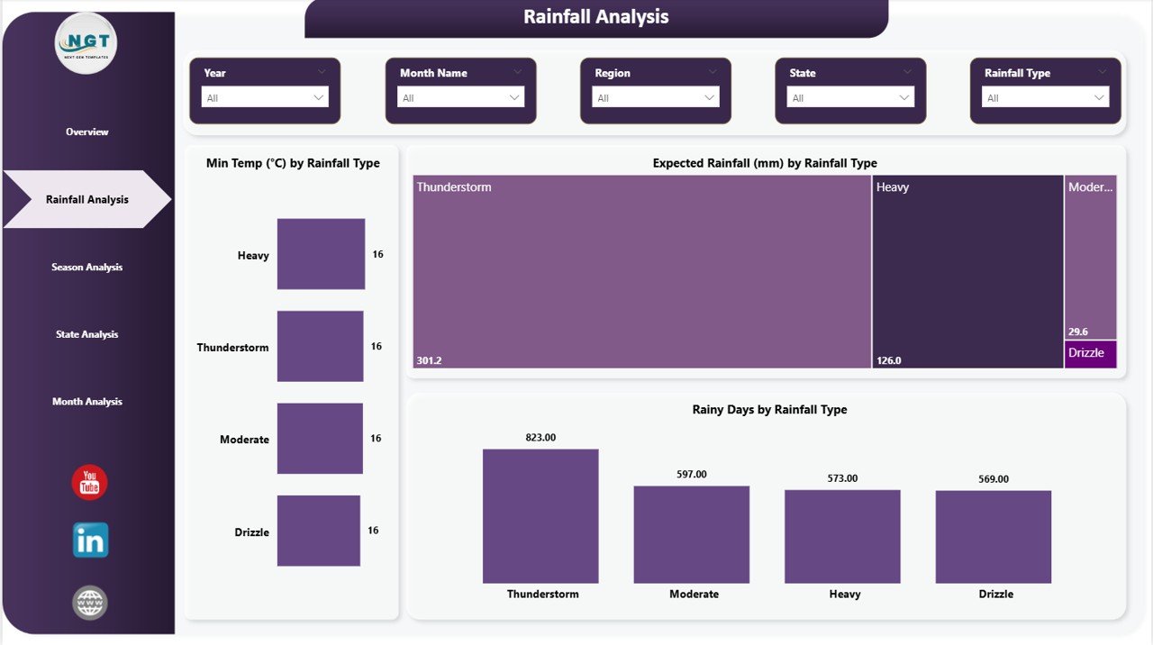
Rainfall Analysis
Page 3 – Season Analysis
Understanding how rainfall behaves throughout the seasons is critical for planning. This page delivers Verified Record % by Season indicating data completeness and reliability for each seasonal period, Avg Rainfall (mm) by Season comparing average precipitation across spring, summer, monsoon, autumn, and winter, and Rainy Days by Season showing how wet days are distributed throughout the year. Crop planners can align planting windows with historically wet or dry seasons. Water reservoir managers can anticipate low-inflow periods. Climate researchers can identify whether monsoon patterns are shifting. The seasonal breakdown makes it easy to see whether this year’s rainfall is tracking above or below historical norms.
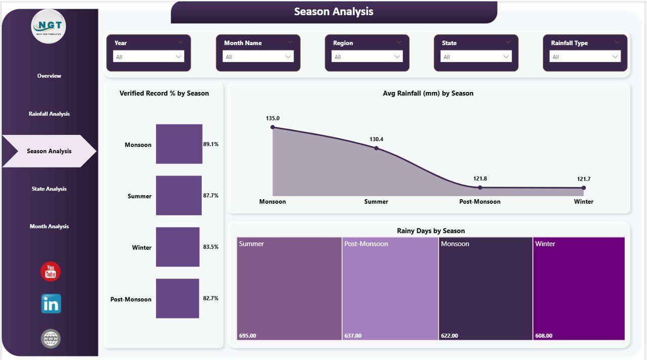
Season Analysis
Page 4 – State Analysis
Zoom into state-level rainfall performance with the State Analysis page, which features Verified Record % by State showing data reliability and completeness across each state, Max Temp (°C) by State comparing peak temperatures geographically to identify heat-prone regions, and Expected Rainfall (mm) by State tracking anticipated precipitation totals by location. This page is particularly valuable for government environmental departments, regional planners, and agricultural agencies who need to assess state-wise performance. The comparative view makes it easy to identify which states receive the most or least rainfall and where data verification gaps exist, providing the evidence base for policy recommendations and resource allocation decisions.
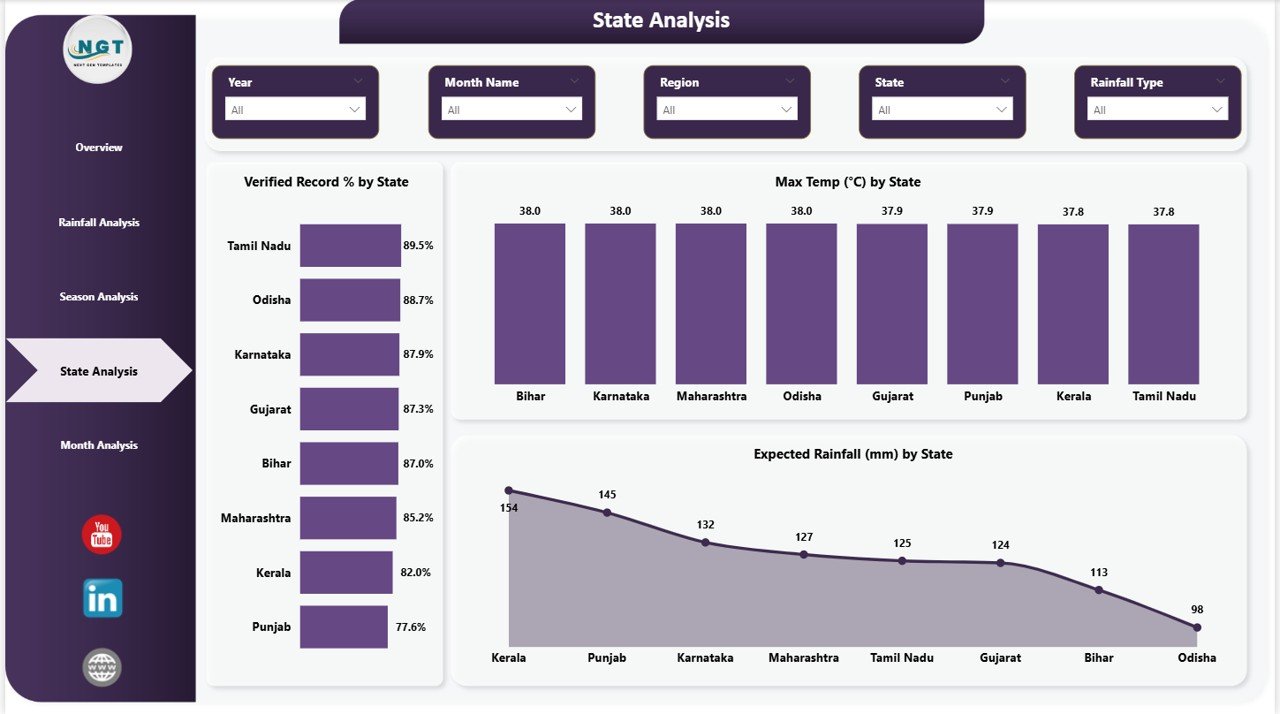
State Analysis
Page 5 – Month Analysis
For analysts who need the finest level of temporal detail, the Month Analysis page provides Cumulative Rainfall (mm) by Month Name showing how total precipitation accumulates across each calendar month, Total Record by Month Name displaying data volume distribution over the year to identify months with the most observations, and Rainy Days by Month Name tracking the frequency of wet days month by month. Hydrologists can use the monthly charts to model seasonal flood return periods. Disaster preparedness officers can track the concentration of rainy days in specific months. Construction project managers can assess site-specific rainfall risk by month. This page transforms raw monthly observations into structured, decision-ready intelligence.
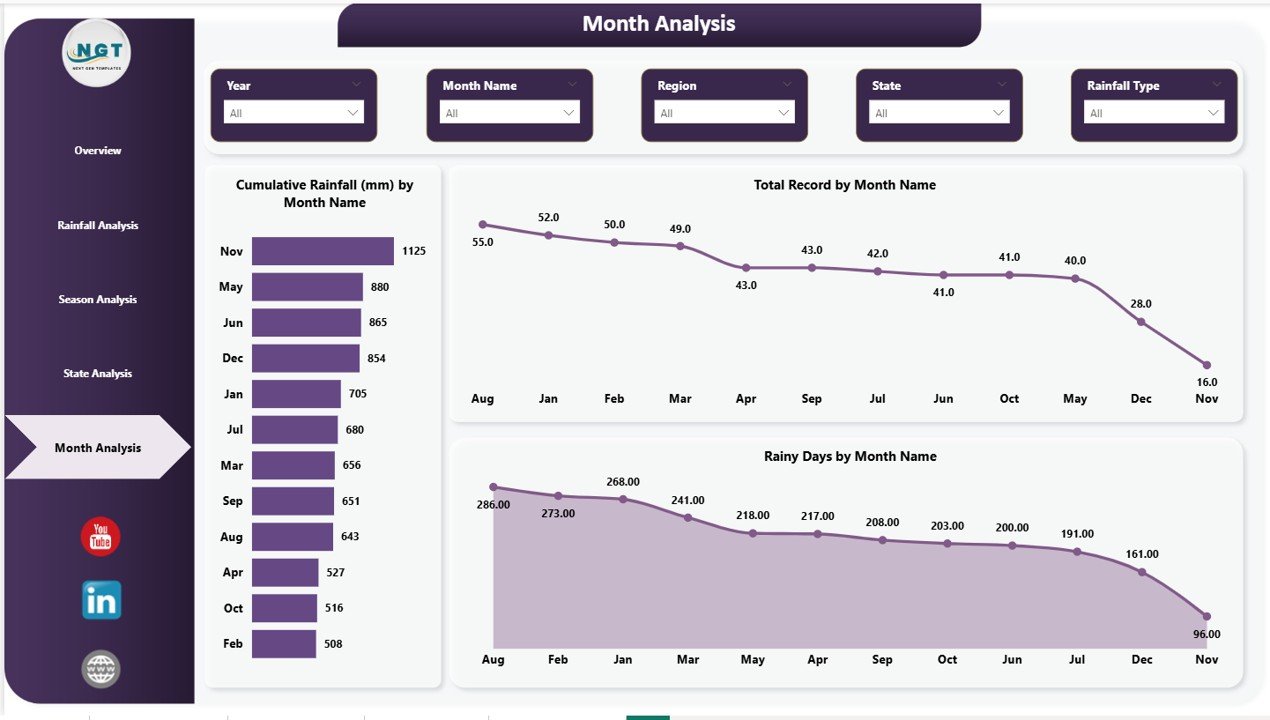
Month Analysis
Advantages of Rainfall Report Management Dashboard in Power BI
- Saves Hours of Reporting Time — Automated visualizations eliminate the need to manually build charts and tables for every reporting cycle, freeing your team to focus on interpretation rather than data preparation.
- Centralizes All Rainfall Data — Instead of maintaining separate spreadsheets for each state or region, this single Power BI file consolidates everything into one dynamic, searchable source of truth.
- Supports Evidence-Based Decision Making — Interactive trend charts and KPI summaries give managers and policymakers the visual evidence they need to justify resource allocation, infrastructure investment, and risk response plans.
- Scales With Your Data — Whether you are monitoring 10 rain gauges or 500 stations across multiple states, the dashboard structure handles growing datasets without performance degradation.
- Accessible to Non-Technical Users — The intuitive slicer panel and clean visual layout mean stakeholders with no Power BI experience can explore the data independently, reducing the reporting bottleneck on your analytics team.
- Compatible With Power BI Service — Publish to the cloud and set up automated data refresh so your entire organization always has access to the latest rainfall figures without manual file sharing.
Opportunities for Improvement
- Forecast Integration — The current template visualizes historical data. Adding a predictive analytics layer using Power BI’s built-in forecasting or connecting to a weather API would extend its utility for real-time planning.
- Alert Thresholds — Incorporating conditional formatting alerts or KPI status indicators (e.g., red when rainfall drops below a drought threshold) would make the overview page even more actionable for monitoring teams.
- Map Visualizations — Replacing tabular state breakdowns with a geographic map visual would make spatial patterns in rainfall distribution instantly intuitive for presentations to non-technical audiences.
- Mobile Layout — Designing a mobile-optimized report layout would allow field teams and station operators to check live rainfall stats from their phones during monitoring rounds.
Best Practices for Using This Dashboard
- Standardize Your Data Format — Ensure your rainfall dataset uses consistent column names (Date, Region, State, Rainfall mm, Temperature, Season) before connecting it to the template. Inconsistent formatting is the most common cause of refresh errors.
- Use Date Hierarchy Slicers — Take advantage of Power BI’s date hierarchy to drill from year to quarter to month within the trend charts, rather than filtering to fixed periods.
- Schedule Automatic Data Refresh — If your rainfall data is stored in an Excel file on SharePoint, OneDrive, or a cloud database, configure Power BI Service to refresh daily so your team always works with current data. Learn more at Microsoft Learn – Refresh Data in Power BI.
- Combine Pages for Reports — Export individual pages as PNG or PDF using Power BI’s export feature to embed specific visuals directly into email reports or Word documents without sharing the full .pbix file.
- Archive Historical Snapshots — Before appending new annual data, save a snapshot of the previous year’s dashboard as a published report in Power BI Service. This preserves an auditable record without duplicating the main template.
- Add Contextual Annotations — Use Power BI’s built-in text boxes to annotate unusual rainfall events (e.g., cyclone impact months) directly on the trend charts, giving future viewers the context they need to interpret spikes correctly.
Explore Relevant Templates
If you found the Rainfall Report Management Dashboard useful, you might also enjoy these related Power BI and analytics templates from NextGenTemplates:
- Blood Banks Dashboard in Power BI — Track blood unit inventory, donor stats, and hospital supply levels in a multi-page Power BI dashboard.
- Blockchain Development Dashboard in Power BI — Monitor blockchain project KPIs, transaction metrics, and development progress in a visually rich Power BI report.
- Ceramic Manufacturing Dashboard in Power BI — Analyze production output, defect rates, and quality KPIs for manufacturing operations in Power BI.
Frequently Asked Questions
What file format does the Rainfall Report Management Dashboard come in?
The template is delivered as a .pbix file (Power BI Desktop file) inside a .zip archive. You will need Microsoft Power BI Desktop installed on your computer to open and use it. Power BI Desktop is free to download from the Microsoft Power BI website.
Can I connect my own rainfall data to this dashboard?
Yes. The dashboard is fully data-agnostic. Once you download the .pbix file, you can replace the sample dataset with your own data source — whether that is an Excel file, a CSV, a SQL database, or a SharePoint list. Simply update the data source connection in Power BI Desktop and click Refresh to populate all five pages with your real data.
How many regions or states can this dashboard handle?
The template is designed to scale with your data. There is no hard limit on the number of states or regions. Power BI’s data engine can handle hundreds of thousands of rows, so whether you are monitoring 20 local stations or 500 national gauges, the dashboard will perform reliably.
Do I need advanced Power BI or DAX skills to use this template?
No advanced skills are required to use the dashboard as-is. Basic familiarity with Power BI Desktop — such as how to connect a data source and click Refresh — is sufficient. If you want to add custom DAX measures or new calculated columns, some intermediate knowledge will be helpful, but the core template works out of the box.
Can I share this dashboard with my team or publish it to Power BI Service?
Yes. You can publish the .pbix file to Power BI Service and share it with your team through workspaces or reports. For automated data refresh in the cloud, you will need a Power BI Pro or Premium Per User license. Learn more about licensing at Microsoft Learn.
Is this dashboard suitable for academic and research use?
Absolutely. The Rainfall Report Management Dashboard in Power BI is well-suited for climate research, hydrology studies, environmental science projects, and university-level data visualization work. Its clean seasonal and state-level analysis charts align well with standard meteorological research methods.
Conclusion
The Rainfall Report Management Dashboard in Power BI is more than just a collection of charts — it is a complete analytical framework for understanding precipitation patterns at every level of detail. From the high-level KPI overview to granular monthly breakdowns, each of its five pages is designed to answer a specific set of questions that environmental agencies, agricultural planners, water resource managers, and climate researchers face every reporting cycle.
By centralizing your rainfall data into a single interactive Power BI file, you eliminate the fragmentation of scattered spreadsheets, reduce manual reporting effort, and equip your team with the visual clarity needed to make confident, data-driven decisions. Whether you are preparing for flood season, optimizing irrigation strategies, or publishing a climate impact study, this dashboard gives you the tools to present your findings with authority and precision.
👉 Click here to Purchase the Rainfall Report Management Dashboard in Power BI
For step-by-step video tutorials on Power BI dashboards, visit our YouTube channel: Youtube.com/@PK-AnExcelExpert