If you manage a modern workplace, you are probably paying for Microsoft Teams, Slack, Zoom and Google Workspace at the same time — and most IT leaders cannot say, off the top of their head, which one their teams actually use the most or which delivers the highest satisfaction per dollar spent. The Collaboration Platforms Dashboard in Excel answers those questions in one workbook, with 5 KPI cards, 18 pivot-driven charts, and slicers on every page that filter by department, region, platform, license type and year.
Setup takes under 10 minutes. Replace the sample rows in the Data Sheet, click Data → Refresh All, and every page recalculates automatically. This post walks through the five dashboard pages, the data model, how it compares to enterprise SaaS-management tools, and where it fits in a typical IT or finance reporting stack.
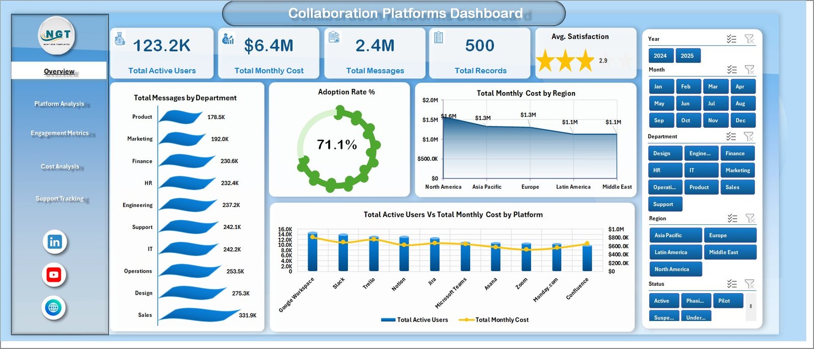
Collaboration Platforms Dashboard in Excel — Overview Page
Why a Collaboration Platforms Dashboard in Excel matters in 2026
The average mid-market company runs three or more collaboration platforms in parallel: Microsoft Teams for chat and meetings, Slack for engineering channels, Zoom for external sales calls, plus tools like Asana, Notion or Webex. Each one charges per active user, per month, and each one generates its own admin console with its own export format.
Without a single view, three things go wrong every quarter:
- Finance approves renewals without knowing which platforms have idle licenses;
- IT cannot show the CFO real cost-per-active-user numbers by region or department;
- HR has no data to back conversations about employee engagement on each tool.
The Collaboration Platforms Dashboard in Excel consolidates the data once, in a familiar tool, so anyone with Excel can answer those questions in seconds. According to Microsoft’s own Teams admin reporting documentation, native usage reports are siloed per tenant — combining them with Slack and Zoom exports in a unified view is exactly what this template is built for.
Key Features of the Collaboration Platforms Dashboard in Excel
The workbook is designed around three principles: one source of truth (the Data Sheet), one engine (the hidden Support Sheet of pivots) and five clean output pages any executive can read.
- 5 KPI cards on the Overview page — Total Active Users, Total Monthly Cost, Total Messages, Total Records and Avg. Satisfaction recalculate the moment new rows hit the Data Sheet.
- 18 pivot-driven charts across 5 pages covering adoption, platform comparison, engagement, cost and support tickets.
- Slicers on every page for Department, Region, Platform, License Type and Year — pick any combination and the page rewires itself.
- Dedicated Cost Analysis page breaks down monthly spend by platform, region, department and month, the four views finance needs for renewal negotiations.
- Support Tracking page compares Total Support Tickets vs Total Resolved Tickets by platform, department and month — a built-in collaboration helpdesk scorecard.
- One-click refresh — no VBA, no Power Query, no add-ins. Just Refresh All.
- Works offline in Excel 2016 and later on Windows and Mac, so data stays inside your tenant.
Dashboard Pages Explanation
Page 1 — Overview
The Overview page is the executive summary. It surfaces five KPI cards across the top — Total Active Users, Total Monthly Cost, Total Messages, Total Records and Avg. Satisfaction — followed by four charts that answer the most common board-level questions about collaboration platforms.
- Total Messages by Department — which teams talk the most across all your tools combined.
- Adoption Rate % — what percentage of licensed users are actually active on each platform.
- Total Monthly Cost by Region — where collaboration spend is concentrated geographically.
- Total Active Users vs Total Monthly Cost by Platform — your platform-by-platform efficiency ratio in one chart.
Page 2 — Platform Analysis
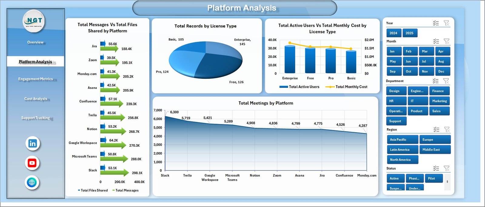
Platform Analysis Page
Platform Analysis is where you compare Microsoft Teams, Slack, Zoom and any other tool head-to-head:
- Total Messages vs Total Files Shared by Platform — distinguishes platforms used for chatting from those used for collaboration.
- Total Records by License Type — Enterprise, Business, Standard or Free, so you can see where your seats are concentrated.
- Total Active Users vs Total Monthly Cost by License Type — the easiest way to spot over-licensed users.
- Total Meetings by Platform — answers the perennial “should we consolidate on Teams or Zoom?” question.
Page 3 — Engagement Metrics
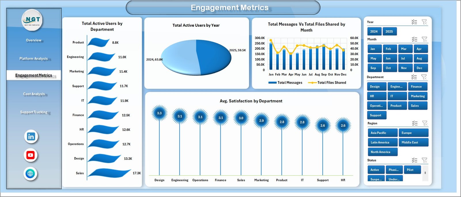
Engagement Metrics Page
The Engagement Metrics page is built for HR and internal-comms teams as much as IT. It shows Total Active Users by Department, Total Active Users by Year (great for spotting post-pandemic drift), Total Messages vs Total Files Shared by Month and Avg. Satisfaction by Department. Departments with low satisfaction and high message volume are usually the first place to investigate burnout signals.
Page 4 — Cost Analysis
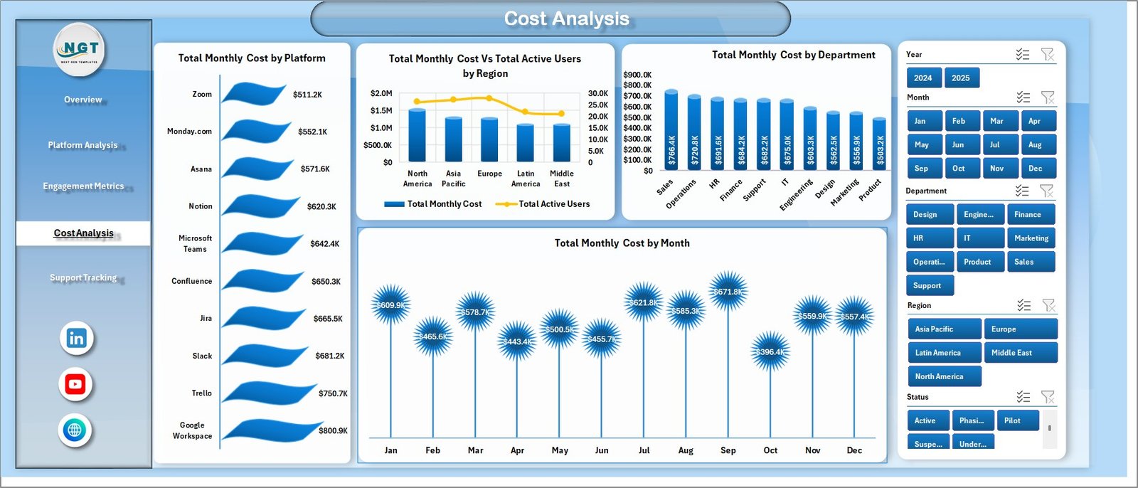
Cost Analysis Page
Finance lives here. The Cost Analysis page shows Total Monthly Cost by Platform, Total Monthly Cost vs Total Active Users by Region (the cost-per-active-user view), Total Monthly Cost by Department and Total Monthly Cost by Month. Use this page to walk into a vendor renewal meeting with hard numbers instead of estimates.
Page 5 — Support Tracking

Support Tracking Page
The Support Tracking page closes the loop with three operational charts: Total Support Tickets vs Total Resolved Tickets by Platform, Total Support Tickets by Department, and Total Support Tickets vs Total Resolved Tickets by Month. If Slack tickets pile up unresolved every month, this is where you see the trend before users start escalating.
Data Sheet and Support Sheet
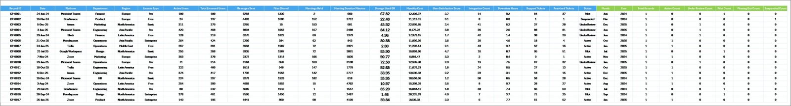
Data Sheet tab
The Data Sheet is the only place you ever touch. Paste or append your platform usage rows in the same column structure — Platform, License Type, Department, Region, Active Users, Messages, Files Shared, Monthly Cost, Meetings, Support Tickets, Resolved Tickets, Satisfaction Score, Year, Month — and the dashboard does the rest.
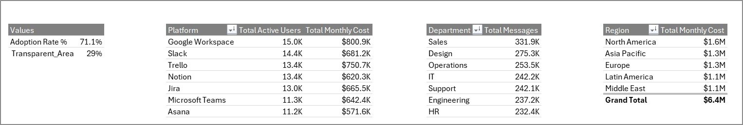
Support sheet tab
The Support Sheet holds every pivot table that drives the dashboard charts. Click Data → Refresh All after editing the Data Sheet and you can keep this tab hidden in production so end users only see clean output pages.
Collaboration Platforms Dashboard vs. Power BI vs. Paid SaaS Management Tools — Feature Comparison
| Feature | Collaboration Platforms Dashboard in Excel | Power BI SaaS-Management Report | Productiv / Zylo / BetterCloud |
|---|---|---|---|
| Cost | $17.99 one-time | $9.99/user/month + build time | $15k-$50k/year |
| Platform | Microsoft Excel 2016+ | Power BI Desktop + Service | Web SaaS |
| Setup time | Under 10 minutes | 2-6 weeks of DAX modelling | 4-12 weeks onboarding |
| Works offline | ✅ Yes | Partial | ❌ No |
| 5 pre-built KPI cards | ✅ Yes | Build from scratch | ✅ Yes |
| Cost analysis by region & dept | ✅ Yes | Build from scratch | ✅ Yes |
| Year-1 cost at 5 users | $17.99 | ~$600 | $15,000+ |
| Data stays in your tenant | ✅ Yes (local file) | Yes (with policies) | ❌ Vendor SaaS |
For IT and finance teams that want visibility into Teams, Slack, Zoom and Google Workspace adoption and cost without paying $25k a year, the Collaboration Platforms Dashboard in Excel sits in the sweet spot.
Who Should Use This Template
Perfect for:
- IT operations and ITSM leads at 50-2,000 person companies tracking three or more collaboration platforms;
- Finance controllers preparing quarterly SaaS spend reviews and vendor renewal negotiations;
- HR and internal-comms teams measuring engagement on Teams, Slack and Zoom;
- Consultants and MSPs delivering SaaS rationalisation reports to clients.
Not a fit if:
- You need real-time API integrations with Microsoft 365 admin centre or Slack Enterprise Grid — buy a paid SaaS management platform instead;
- You need automated user provisioning or de-provisioning (this template is reporting, not action);
- You operate a Mac-only shop without any Microsoft Excel desktop install at all.
Real-World Use Cases
Priya runs IT operations at a 400-person fintech in Bengaluru. She loads the Collaboration Platforms Dashboard in Excel each month with exports from Teams Admin Center, Slack Analytics and the Zoom dashboard. In month two the Cost Analysis page showed 38 unused Zoom Pro licenses sitting on her bill. She cancelled them and saved roughly $7,200 a year — paying the template back 400 times over.
Marco is a CIO at a manufacturing group with sites in Italy, Germany and Mexico. The Region slicer on the Cost Analysis page revealed Mexico ran 60% higher cost per active user on Microsoft Teams Phone than Germany. He used that single chart to renegotiate the regional contract.
Aisha is an independent IT consultant. She drops each client’s exported usage CSV into the Data Sheet, refreshes, screenshots the five pages and ships a polished SaaS-adoption report in under an hour — without a Productiv or BetterCloud subscription anywhere in her stack.
Advantages of the Collaboration Platforms Dashboard in Excel
- One-time cost vs subscription fatigue — pay $17.99 once instead of $15k+ per year.
- Familiar tool — everyone in IT and finance already knows Excel, so no training required.
- Five clean pages answer the questions stakeholders actually ask, not 47 vanity charts.
- Slicers everywhere let one workbook serve IT, HR, Finance and individual department leads.
- Offline by default — your collaboration usage data never leaves your laptop or shared drive.
Opportunities for Improvement
Honest transparency matters. Three things the Collaboration Platforms Dashboard in Excel does not do today:
- It does not connect to Teams, Slack or Zoom APIs directly — you export CSVs manually and paste them in. For weekly reporting that is fine; for hourly visibility you need a real SaaS-management platform.
- It does not include forecasting or what-if scenario tabs. The roadmap includes an MTD/YTD variant.
- Excel Online and Excel for Mac handle the workbook well, but slicers and Refresh All behave best on Windows desktop Excel, which remains the recommended environment.
Best Practices
- Standardise your export cadence. Pull Teams, Slack and Zoom usage reports on the same day each month so the Data Sheet stays aligned.
- Keep the Support Sheet hidden in production. End users only need to see the five output pages.
- Use the License Type column aggressively. Tagging seats as Enterprise vs Business vs Free is what unlocks the most useful cost insights.
- Refresh All after every Data Sheet edit. If a chart looks stale, it almost always means someone forgot the Refresh step.
- Snapshot the Overview page monthly as a PNG and append it to a running deck — board members love the trend.
Explore Relevant Templates
📊 API Development Dashboard in Excel — pair with this dashboard to track internal API usage alongside collaboration platforms.
📊 API Development KPI Dashboard in Excel — MTD/YTD KPI view for engineering leadership.
📊 DevOps KPI Dashboard in Google Sheets — the cross-platform companion if your DevOps team lives in Google Workspace.
📊 Buy-Now-Pay-Later Platforms Dashboard in Excel — same multi-platform analytics pattern applied to BNPL providers.
📁 Browse the full Excel Dashboard Templates catalogue for more IT, HR and Finance dashboards.
Frequently Asked Questions
What KPIs does the Collaboration Platforms Dashboard in Excel track?
The Collaboration Platforms Dashboard in Excel tracks five executive KPIs — Total Active Users, Total Monthly Cost, Total Messages, Total Records and Avg. Satisfaction — plus 18 pivot-driven charts covering adoption, cost, engagement and support tickets across every platform, department, region and license type in your data.
Which collaboration platforms can I analyse with this template?
Any platform you list in the Data Sheet. Customers typically track Microsoft Teams, Slack, Zoom, Google Workspace, Webex and Asana, but the Platform column is free text so you can include any internal tool. The Collaboration Platforms Dashboard in Excel groups everything in pivot tables automatically.
How long does it take to set up the Collaboration Platforms Dashboard in Excel?
Under 10 minutes for most users. Open the file, paste your usage data into the Data Sheet keeping the column structure, click Data → Refresh All and the entire dashboard recalculates. No formulas, macros or Power Query edits are required.
How does this compare to Productiv, Zylo or BetterCloud?
The Collaboration Platforms Dashboard in Excel costs $17.99 once instead of $15,000-$50,000 a year. You give up live API connectors and automated provisioning, but you keep all reporting locally, get the same KPI views, and own the file forever — ideal for SMBs and finance-led reviews.
Can I add new platforms or KPIs to the Collaboration Platforms Dashboard in Excel?
Yes. Add new platform names directly in the Data Sheet Platform column and they appear in every pivot and slicer after Refresh All. To add a new KPI, drop a measure into the Support Sheet pivots and link a fresh chart on whichever page makes sense.
Does the Collaboration Platforms Dashboard in Excel work in Excel for Mac or Excel Online?
Yes. The dashboard opens in Excel for Mac and Excel Online. Pivot tables and most charts render correctly online, but slicers and Refresh All behave best in the Windows desktop application, which is the recommended environment.
About the Author
Built by PK — Microsoft Certified Professional with 15+ years of Excel, Google Sheets and Power BI experience. Founder of NextGenTemplates, reaching 300K+ subscribers across YouTube channels. Every template is hand-built and tested before release.
Conclusion
The Collaboration Platforms Dashboard in Excel turns three or four messy admin-center exports into one clean executive view. Five KPI cards, eighteen charts, slicers on every page, a hidden pivot engine, and total cost of ownership lower than a single month of any paid SaaS-management tool. If your IT or finance team has ever struggled to answer “are we getting our money’s worth on Teams and Slack?” — this is the file you want open in the meeting.
👉 Click here to Purchase the Collaboration Platforms Dashboard in Excel
✅ Instant download · One-time payment · No subscription · Lifetime access
🎥 Visit our YouTube channel for step-by-step Excel tutorials: Youtube.com/@PK-AnExcelExpert
📅 Last updated: May 2026