If your IT department is managing Microsoft Teams, Slack, Zoom and Google Workspace at the same time — and most enterprises are — the question your CFO keeps asking is: “Which platform are we actually using, and where is the money going?” The Collaboration Platforms Dashboard in Power BI answers that in one .pbix file, with 5 KPI cards, 16 interactive visuals and slicers on every page that filter by department, region, platform, licence type and year.
Setup takes under 10 minutes. Open the .pbix file in Power BI Desktop (free from Microsoft), point it at your collaboration usage export, click Refresh, and every page recalculates automatically. This post walks through the five dashboard pages, the data model, how it compares to enterprise SaaS Management Platforms, and the real-world IT decisions it supports.

🔑 Key Features at a Glance
- 5 KPI Cards on the Overview Page — Total Monthly Cost, Total Messages Sent, Total Meetings, Total Files Shared, Total Active Users.
- 16 Interactive Visuals — 4 charts on Overview plus 3 on each of the four analysis pages.
- Slicers on Every Page — Filter by Department, Region, Platform, Licence Type and Year.
- Native Power BI Desktop — No Power BI Pro or Premium subscription required.
- One-time $17.99 purchase — No per-user fees, no monthly subscription, lifetime access.
📊 Dashboard Pages Walkthrough
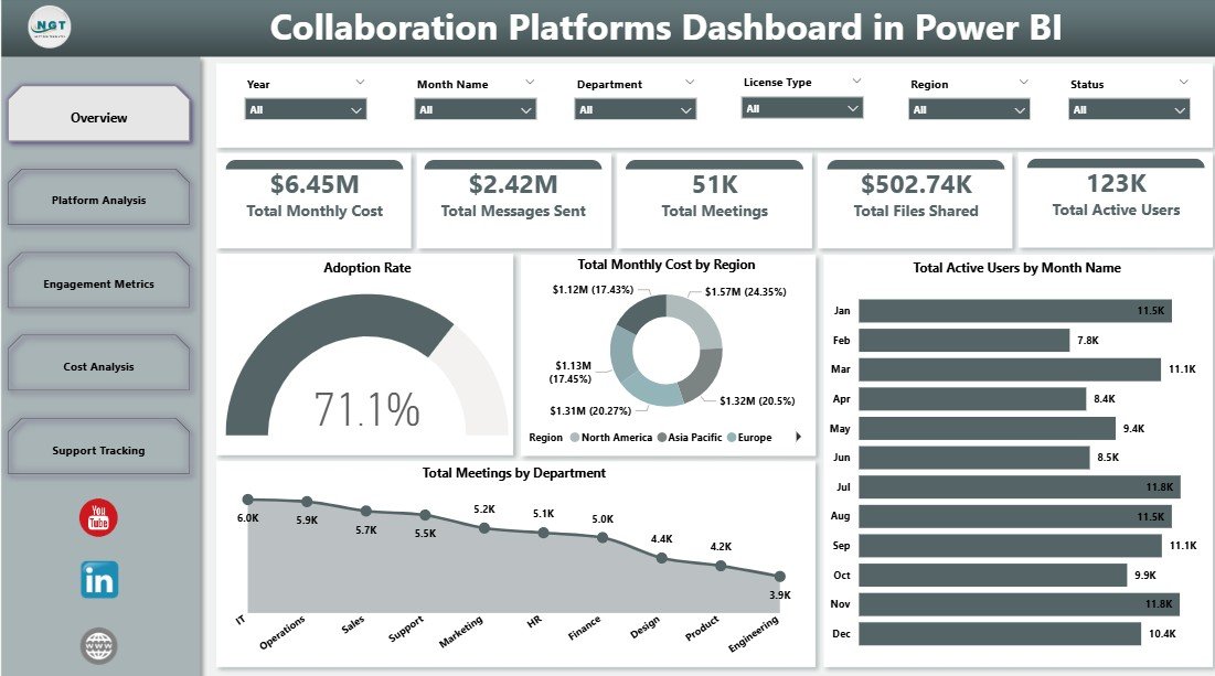
Page 1 — Overview
The Overview page is your one-screen executive summary. Five KPI cards (Total Monthly Cost, Total Messages Sent, Total Meetings, Total Files Shared, Total Active Users) sit at the top, followed by four charts: Adoption Rate (gauge tracking platform-wide adoption against target), Total Monthly Cost by Region (regional spend distribution highlighting cost-heavy geographies), Total Active Users by Month Name (twelve-month engagement trend revealing seasonality), and Total Meetings by Department (which teams collaborate the most via formal meetings). Slicers on this page let you isolate any combination of Department, Region, Platform, Licence Type or Year.
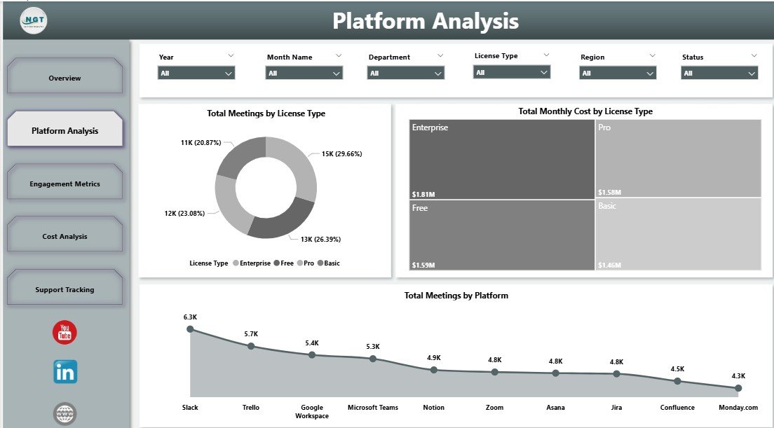
Page 2 — Platform Analysis
Platform Analysis benchmarks your subscription mix. Three charts — Total Meetings by Licence Type, Total Monthly Cost by Licence Type and Total Meetings by Platform — reveal whether you are paying premium prices for low-usage Enterprise seats, and which platforms (Teams, Slack, Zoom, Google Meet) are doing the heavy lifting. This is the page you bring into licence-renewal negotiations.
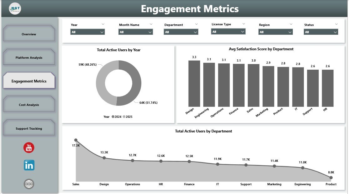
Page 3 — Engagement Metrics
Engagement Metrics measures who is actually using collaboration tools and how they feel about them. Total Active Users by Year shows multi-year adoption growth or decline. Avg Satisfaction Score by Department highlights which teams rate collaboration tools highest and lowest (typically captured via quarterly internal surveys). Total Active Users by Department shows where adoption is concentrated. Use this page during quarterly business reviews to identify disengaged teams before churn shows up in HR survey results.
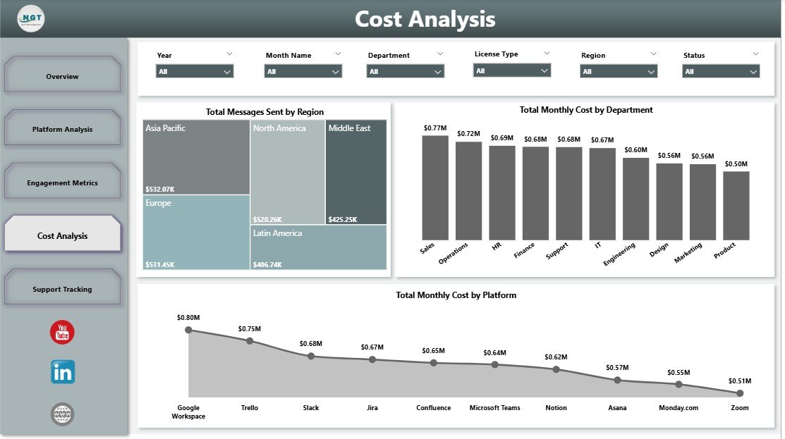
Page 4 — Cost Analysis
Cost Analysis answers the CFO’s question — “where is the money going?” — with three views: Total Messages Sent by Region (where communication volume actually happens), Total Monthly Cost by Department (which cost centres consume the most licence budget), and Total Monthly Cost by Platform (whether Teams, Slack or Zoom is your biggest line item). Filter by Year or Licence Type to model renewal-period scenarios before signing the next contract.
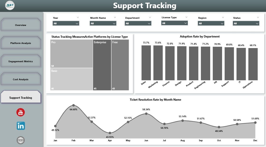
Page 5 — Support Tracking
Support Tracking ties usage to service-desk health. Active Platforms by Licence Type shows how many platforms each licence tier touches (a proxy for licence sprawl). Adoption Rate by Department highlights which teams are sticky and which have stalled. Ticket Resolution Rate by Month Name shows whether IT support is keeping up with collaboration-related issues. Bring this page into IT Steering Committee meetings to align service desk capacity with platform adoption.
📐 Power BI Dashboard vs. Tableau / Qlik vs. SaaS Management Platforms
| Feature | This Power BI Dashboard | Tableau / Qlik (custom build) | Productiv / Zylo / BetterCloud |
|---|---|---|---|
| Cost | $17.99 one-time ✅ | $70/user/month + dev time | $25–$50/user/month |
| Platform | Power BI Desktop (free) | Tableau Desktop / Qlik Sense | SaaS web app |
| Setup time | Under 10 minutes | 2–6 weeks (custom build) | 1–3 weeks (onboarding) |
| 5-page IT-focused layout | Pre-built ✅ | Must design from scratch | Vendor-defined views only |
| Department / region / licence slicers | Included ✅ | Manual build | Some, limited |
| One-time payment | Yes ✅ | ❌ Subscription | ❌ Subscription |
| Year-1 cost (10 users) | $17.99 | $8,400+ | $3,000–$6,000 |
👥 Who Should Use This Dashboard?
IT Directors and CIOs managing 50–5,000 seats across multiple collaboration platforms. SaaS / IT Operations Managers producing monthly collaboration-spend reports for Finance. Workplace Experience Leads tracking adoption and satisfaction by department. IT Consultants delivering quarterly platform optimisation reviews to client companies.
It is not the right fit for single-platform shops using only one collaboration tool, teams that need live SSO log-stream ingestion (use Productiv / Zylo for that), or organisations needing automated licence-reclamation workflows.
💼 Real-World Use Cases
Priya is the IT Operations Lead at a 1,200-person fintech. Using the Cost Analysis page, she compares Total Monthly Cost by Platform and discovers her company is paying for Zoom Enterprise on top of Microsoft Teams Phone — duplicate functionality across 400 seats. She consolidates onto Teams Phone at the next renewal and cuts $86,000 from the following year’s collaboration budget.
Marcus is the CIO at a manufacturing group with offices in three regions. He uses the Engagement Metrics page each quarter to track Avg Satisfaction Score by Department. After spotting that Operations rates collaboration platforms 2.1 points below Sales, he commissions a workflow audit, switches that team’s primary tool from Slack to Teams, and watches satisfaction rebound by the next quarterly review.
Aditi runs IT consulting engagements for mid-market clients. She drops each client’s usage export into the .pbix file and uses the Support Tracking page in deliverables — Active Platforms by Licence Type plus Adoption Rate by Department gives her a one-page diagnostic chart she charges $4,000 per engagement to produce.
✅ Advantages of the Power BI Version
The Power BI build has three advantages over the Excel sibling (which you can read about in this companion post on the Excel version):
- Better visual fidelity — Power BI’s native gauge, donut and column visuals look cleaner than Excel charts at executive-presentation size.
- Faster filtering on large datasets — Power BI’s tabular model handles 100k+ row collaboration exports without the lag Excel pivots produce.
- Publish-to-Service option — If you do have Power BI Pro, you can publish the report to Power BI Service and share via app workspaces. Excel cannot do that natively.
⚠️ Opportunities for Improvement
No template is perfect. A few honest limitations to flag before you buy:
- Manual data refresh — This is a Power BI Desktop report, not a live API connection. You re-export from Microsoft 365 admin, Slack analytics and Zoom admin each month and hit Refresh.
- No automated licence reclamation — The dashboard surfaces under-utilisation, but you act on it manually (or via your SaaS Management Platform).
- Satisfaction Score needs an input — The Avg Satisfaction Score by Department visual needs survey data; many teams pair this with a quarterly internal survey or import from an HR tool.
🎯 Best Practices for Using the Dashboard
- Refresh monthly — The first business day of each month is the natural cadence. Export from each platform’s admin console, replace the sample dataset, click Refresh.
- Bring it to renewal negotiations — Vendors discount aggressively when you can show actual usage data. Page 2 (Platform Analysis) is your evidence pack.
- Pair with quarterly satisfaction surveys — Page 3’s Avg Satisfaction Score visual is only useful if you feed it real survey data. Consider a one-question quarterly pulse: “On a scale of 1–10, how well do our collaboration tools support your work?”
- Filter before sharing screenshots — If you are sending pages to non-IT leadership, apply a Year filter and a Department filter first to keep the conversation focused.
🔗 Explore Relevant Templates
📊 Collaboration Platforms Dashboard in Excel — The same 5-page analysis built natively in Excel for teams that prefer pivot tables and slicers over Power BI Desktop.
💳 Buy-Now-Pay-Later Platforms Dashboard in Power BI — A similar multi-platform analytics build covering the BNPL space.
📋 Employee Satisfaction Survey Tracker in Excel — The companion template you can use to feed satisfaction-score data into the Engagement Metrics page.
❓ Frequently Asked Questions
What KPIs does the Collaboration Platforms Dashboard in Power BI track?
Five headline KPIs — Total Monthly Cost, Total Messages Sent, Total Meetings, Total Files Shared and Total Active Users — plus 16 chart-level metrics covering adoption rate, cost-by-platform, cost-by-licence-type, satisfaction by department, regional messaging volume and ticket resolution rate.
Do I need Power BI Pro or a paid Microsoft subscription?
No. The dashboard runs entirely in Power BI Desktop, which Microsoft offers as a free download. A Power BI Pro or Premium subscription is only needed if you want to publish the report to the Power BI Service for online sharing.
How does this compare to Productiv, Zylo or BetterCloud?
Those are SaaS Management Platforms costing $25–$50 per user per month with annual contracts. This dashboard is a one-time $17.99 reporting layer that you control: connect it to your existing exports from Microsoft 365 admin, Slack analytics, Zoom admin or Google Workspace, and it produces the same usage, cost and adoption views without the per-seat fee.
Can I customise platforms, departments and regions?
Yes. The dashboard reads from a data source you control, so you replace sample entries with your own platforms (Teams, Slack, Zoom, Webex, Discord, Google Meet), your real department names and your actual regional segmentation. All 16 visuals and slicers reflect your customised dataset after one Refresh.
How long does initial setup take?
Under 10 minutes. Download the .pbix file, open it in Power BI Desktop, point the dataset to your collaboration usage export, and click Refresh. No DAX writing, no Power BI development skills, no model-rebuilding required.
Does this work alongside our existing SaaS Management Platform?
Yes. Many IT teams use this dashboard as the executive-facing reporting layer on top of raw exports from Productiv, Zylo, BetterCloud or Microsoft 365 admin. The dashboard turns those exports into a board-ready 5-page report without exposing the full SMP to non-IT stakeholders.
👤 About the Author
Built by PK — Microsoft Certified Professional with 15+ years of Excel, Google Sheets and Power BI experience. Founder of NextGenTemplates, reaching 300K+ subscribers across three YouTube channels (@PK-AnExcelExpert, @NextGenTemplates, @NeoTechNavigators). Every template is hand-built and tested before release.
🎬 Conclusion
If your IT team needs a board-ready view of collaboration platform spend, adoption and satisfaction — without a six-week Tableau project or a $30,000-per-year SaaS Management Platform — the Collaboration Platforms Dashboard in Power BI is the fastest way to get there. Five pages, 16 visuals, $17.99 one-time, lifetime access.
👉 Get the Collaboration Platforms Dashboard in Power BI here
📅 Last updated: May 2026