A/B testing sits at the heart of modern digital decision-making. Whether you optimize websites, mobile apps, email campaigns, pricing strategies, or product features, you rely on experiments to prove what truly works. However, running experiments alone does not guarantee success. You also need clear, consistent, and actionable performance tracking.
That is exactly where an A/B Testing KPI Dashboard in Power BI delivers exceptional value.
Instead of managing scattered spreadsheets, disconnected charts, and manual reports, this dashboard centralizes every important KPI into one interactive, visual, and decision-ready system. As a result, teams gain instant clarity on test performance, target achievement, and historical comparison—both month-to-date and year-to-date.
Click to Purchases A/B Testing KPI Dashboard in Power BI
In this in-depth, SEO-friendly guide, you will learn what an A/B Testing KPI Dashboard in Power BI is, why it matters, how it works, page-by-page explanations, advantages, best practices, and frequently asked questions. Moreover, this article expands your provided information with practical insights so you can confidently implement the dashboard in real-world experimentation programs.
What Is an A/B Testing KPI Dashboard in Power BI?
An A/B Testing KPI Dashboard in Power BI is a centralized analytical solution designed to track, compare, and visualize key performance indicators related to experimentation programs.
Instead of reviewing raw A/B test results in isolation, this dashboard converts experimental data into structured KPIs such as conversion rate improvement, revenue uplift, engagement change, error reduction, and test success ratios.
Because the dashboard runs on Microsoft Power BI, it delivers interactive filtering, drill-through analysis, and dynamic visuals. At the same time, it uses Excel as the data source, which keeps data entry simple and flexible.
As a result, marketing teams, product managers, growth analysts, and CRO specialists can measure experiment performance with speed and confidence.
Why Do Businesses Need an A/B Testing KPI Dashboard in Power BI?
Why Do Traditional A/B Testing Reports Fall Short?
Many teams still rely on:
-
Individual experiment spreadsheets
-
Static slides for leadership updates
-
Tool-specific dashboards without standard KPIs
However, these methods create problems. First, results stay fragmented. Second, comparisons across months or years become difficult. Third, leadership struggles to see overall experimentation health.
How Does a KPI Dashboard Solve These Problems?
An A/B Testing KPI Dashboard in Power BI solves these issues by:
-
Standardizing KPI definitions across all tests
-
Comparing Actual vs Target consistently
-
Tracking MTD and YTD performance
-
Highlighting success and failure instantly using visual indicators
Therefore, decisions become faster, clearer, and more reliable.
How Does the A/B Testing KPI Dashboard in Power BI Work?
The dashboard follows a simple but powerful flow.
-
You enter actual and target KPI values in Excel
-
Power BI processes the data model
-
KPIs calculate MTD and YTD performance
-
Visuals update automatically
-
Decision-makers analyze results instantly
Because of this structure, even non-technical users can operate the dashboard with ease.
What Are the Key Pages in the A/B Testing KPI Dashboard in Power BI?
The dashboard includes three professionally designed pages, each serving a specific analytical purpose.
1) What Does the Summary Page Show?
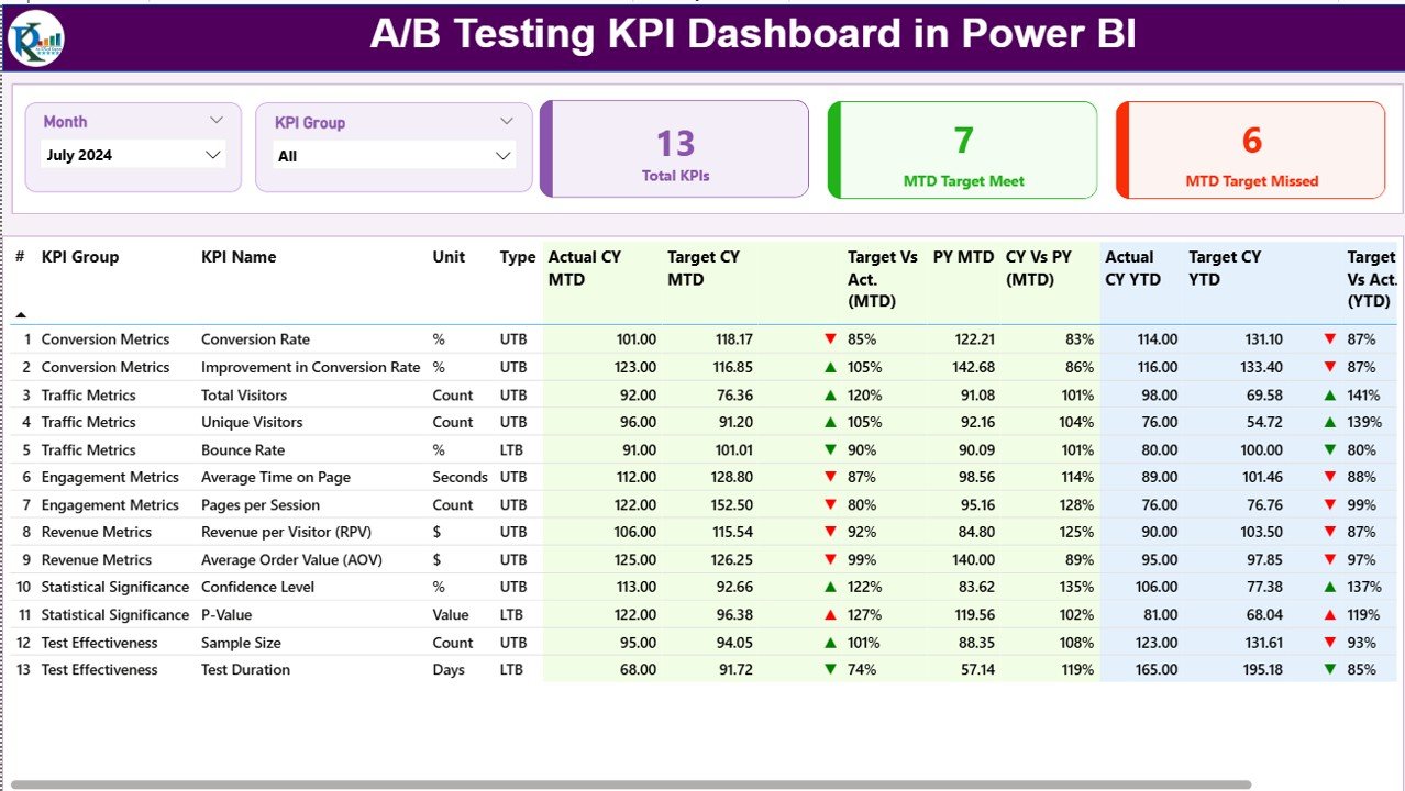
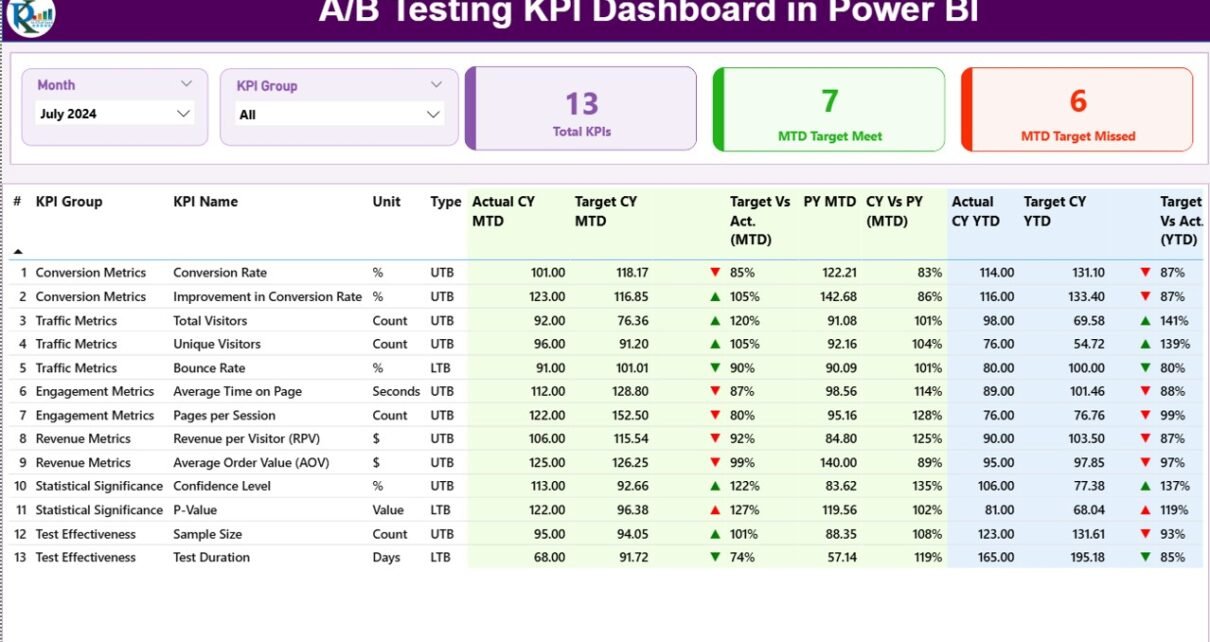
The Summary Page acts as the command center of the dashboard.
Which Filters Appear on the Summary Page?
At the top of the page, you see:
-
Month slicer – to analyze specific months
-
KPI Group slicer – to focus on categories such as Conversion, Revenue, Engagement, or Performance
Because of these slicers, users can narrow insights instantly without rebuilding reports.
Which KPI Cards Appear on the Summary Page?
The Summary Page displays three high-impact KPI cards:
-
Total KPIs Count – total number of tracked A/B testing KPIs
-
MTD Target Met Count – KPIs that achieved or exceeded targets
-
MTD Target Missed Count – KPIs that failed to meet targets
These cards provide an immediate health check of experimentation performance.
What Information Appears in the Detailed KPI Table?
Click to Purchases A/B Testing KPI Dashboard in Power BI
Below the cards, the dashboard displays a comprehensive KPI table containing:
-
KPI Number – unique sequence identifier
-
KPI Group – category of the KPI
-
KPI Name – descriptive KPI title
-
Unit – unit of measurement (%, count, ratio, revenue, etc.)
-
Type – UTB (Upper the Better) or LTB (Lower the Better)
How Does the Dashboard Track MTD Performance?
For Month-to-Date analysis, the table shows:
-
Actual CY MTD – current year actual MTD value
-
Target CY MTD – current year target MTD value
-
MTD Icon – ▲ green or ▼ red indicator
-
Target vs Actual (MTD) – calculated as
-
Actual MTD / Target MTD
-
-
PY MTD – previous year MTD value
-
CY vs PY (MTD) – calculated as
-
Current Year MTD / Previous Year MTD
-
Because of conditional formatting, users instantly see whether performance improves or declines.
How Does the Dashboard Track YTD Performance?
For Year-to-Date tracking, the table includes:
-
Actual CY YTD
-
Target CY YTD
-
YTD Icon – ▲ or ▼ status indicator
-
Target vs Actual (YTD)
-
PY YTD
-
CY vs PY (YTD)
Therefore, teams can evaluate both short-term momentum and long-term experimentation impact.
2) What Insights Does the KPI Trend Page Provide?
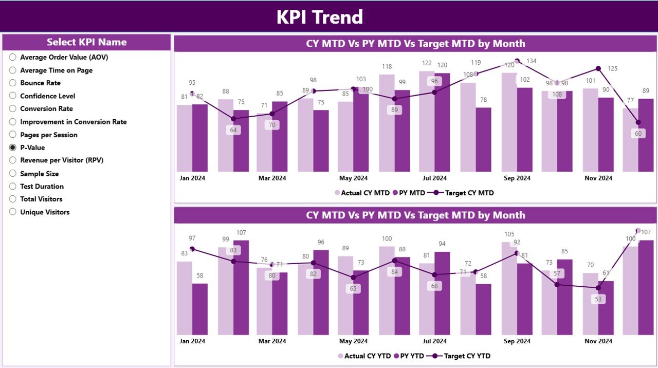
The KPI Trend Page focuses on performance over time.
How Do Users Interact with the KPI Trend Page?
On the left side, users select a KPI Name slicer. Once selected, all charts update automatically.
Which Charts Appear on the KPI Trend Page?
This page displays two powerful combo charts:
-
MTD Trend Chart
-
Actual Current Year
-
Target
-
Previous Year
-
-
YTD Trend Chart
-
Actual Current Year
-
Target
-
Previous Year
-
Because combo charts show bars and lines together, users clearly see gaps, progress, and consistency.
Why Is Trend Analysis Important in A/B Testing?
A/B testing success does not depend on one winning test. Instead, it depends on consistent improvement over time. Therefore, trend analysis helps teams:
-
Identify sustainable gains
-
Detect performance volatility
-
Validate long-term optimization strategies
3) What Is the Purpose of the KPI Definition Page?
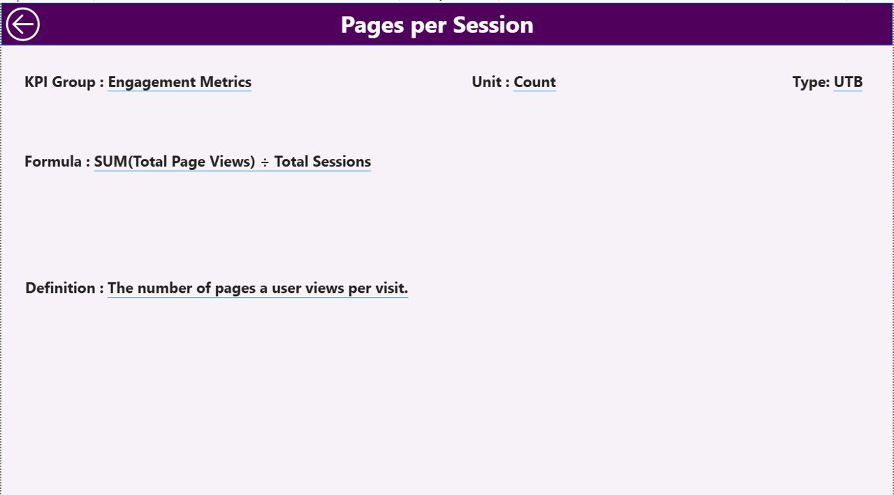
The KPI Definition Page serves as a hidden drill-through reference page.
What Information Does the KPI Definition Page Contain?
This page displays:
-
KPI Number
-
KPI Group
-
KPI Name
-
Unit
-
Formula
-
KPI Definition
-
KPI Type (UTB or LTB)
Whenever users drill through from the Summary Page, they instantly understand what each KPI measures and how calculations work.
How Do Users Navigate Back?
A Back button appears at the top-left corner. With one click, users return to the Summary Page without losing context.
What Excel Data Powers the A/B Testing KPI Dashboard?
The dashboard uses Excel as the data source, which makes setup and maintenance easy.
Which Excel Sheets Are Required?
You need to maintain three worksheets.
1) Input_Actual Sheet
In this sheet, you enter:
-
KPI Name
-
Month (first date of the month)
-
Actual MTD value
-
Actual YTD value
This sheet captures real performance results from experiments.
2) Input_Target Sheet
In this sheet, you enter:
-
KPI Name
-
Month (first date of the month)
-
Target MTD value
-
Target YTD value
Targets ensure structured goal tracking.
3) KPI Definition Sheet
This sheet defines KPI metadata:
-
KPI Number
-
KPI Group
-
KPI Name
-
Unit
-
Formula
-
Definition
-
Type (UTB or LTB)
Because of this structure, KPI logic remains transparent and standardized.
Which KPIs Can You Track Using This Dashboard?
Click to Purchases A/B Testing KPI Dashboard in Power BI
You can track a wide range of A/B testing KPIs, such as:
-
Conversion Rate Lift (%)
-
Revenue Uplift (%)
-
Click-Through Rate Improvement
-
Bounce Rate Reduction
-
Average Order Value Increase
-
Engagement Time Change
-
Error Rate Reduction
-
Feature Adoption Rate
-
Test Win Rate
Therefore, the dashboard supports marketing, product, UX, and growth experiments equally well.
Advantages of A/B Testing KPI Dashboard in Power BI
Why Should Teams Use This Dashboard?
-
✅ Centralized KPI tracking for all experiments
-
✅ Clear MTD and YTD comparisons
-
✅ Instant performance status using icons
-
✅ Historical comparison with previous year
-
✅ Drill-through clarity for KPI definitions
-
✅ Excel-based data input for simplicity
-
✅ Scalable design for growing experimentation programs
Because of these advantages, teams move from opinion-based decisions to evidence-based optimization.
How Does This Dashboard Improve Decision-Making?
This dashboard improves decisions by:
-
Highlighting underperforming KPIs early
-
Confirming successful experiments quickly
-
Aligning teams on standardized metrics
-
Supporting leadership reporting with confidence
As a result, experimentation maturity improves across the organization.
Best Practices for the A/B Testing KPI Dashboard in Power BI
How Can You Get the Most Value from This Dashboard?
Follow these best practices to maximize impact.
1) Define KPIs Clearly Before Tracking
Always document formulas and definitions in the KPI Definition sheet. This practice avoids confusion and ensures consistent interpretation.
2) Update Data Monthly Without Delay
Regular updates keep insights relevant. Therefore, schedule a monthly data refresh process.
3) Use UTB and LTB Types Correctly
Mark KPIs correctly as:
-
UTB when higher values indicate success
-
LTB when lower values indicate success
This step ensures icons display correctly.
4) Review Trends, Not Just Single Months
Always analyze MTD together with YTD trends. Short-term wins may not always sustain long-term growth.
5) Use Drill-Through for Knowledge Sharing
Encourage teams to explore KPI definitions. Shared understanding improves collaboration.
6) Align Targets with Business Goals
Set realistic but ambitious targets. Well-defined targets improve accountability and focus.
Who Should Use an A/B Testing KPI Dashboard in Power BI?
This dashboard suits:
-
Growth marketing teams
-
Conversion rate optimization specialists
-
Product managers
-
UX researchers
-
Digital analysts
-
E-commerce teams
-
SaaS product teams
If your organization runs experiments, this dashboard fits your workflow.
How Does This Dashboard Scale with Growing Experiments?
As experimentation grows, the dashboard scales effortlessly. You simply:
-
Add new KPIs
-
Extend Excel data
-
Refresh Power BI
No redesign required. Therefore, the dashboard remains future-proof.
Conclusion: Why Is an A/B Testing KPI Dashboard in Power BI Essential?
An A/B Testing KPI Dashboard in Power BI transforms experimentation from scattered analysis into a structured performance system. It combines clarity, consistency, and speed.
Because it tracks MTD and YTD results, compares targets, highlights trends, and explains KPIs clearly, teams gain full control over optimization efforts. As a result, decisions improve, experiments scale, and business outcomes grow.
If you want to elevate your experimentation strategy, this dashboard becomes an essential analytical asset.
Frequently Asked Questions (FAQs)
What Is an A/B Testing KPI Dashboard in Power BI?
It is an interactive Power BI dashboard that tracks, compares, and visualizes A/B testing KPIs using Excel as the data source.
Do I Need Advanced Power BI Skills to Use This Dashboard?
No. Users only update Excel data and interact with slicers. The dashboard handles calculations automatically.
Can I Customize KPIs in the Dashboard?
Yes. You can add, modify, or remove KPIs by updating the Excel sheets.
Does the Dashboard Support Historical Comparison?
Yes. It compares current year MTD and YTD results with previous year values.
Can This Dashboard Support Multiple Teams?
Yes. You can group KPIs by team, channel, or experiment category using the KPI Group field.
Is Excel the Only Data Source?
The default setup uses Excel. However, advanced users can extend it with databases or other sources if required.
How Often Should I Update the Dashboard?
Monthly updates work best. However, you can update more frequently if your experimentation cycle requires it.
Visit our YouTube channel to learn step-by-step video tutorials