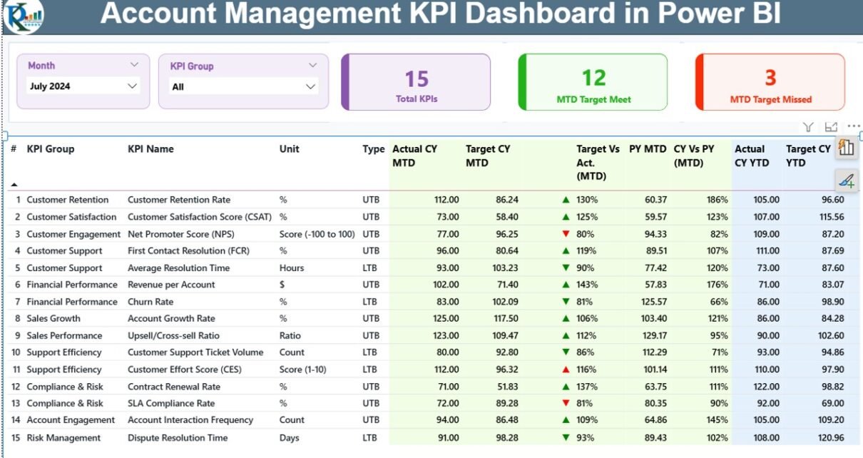
Monitoring account performance becomes difficult when data lives in multiple files, scattered reports, or outdated summaries. Even small account management teams handle many KPIs every month, and this often leads to delays, guesswork, and inefficient decisions. However, you can change this situation with a clean, simple, and smart reporting tool.
An Account Management KPI Dashboard in Power BI helps teams track KPIs in real time. It shows the current performance, highlights gaps, and allows managers to compare results with targets and previous years. Because Power BI shows the numbers visually, you understand trends much faster and make decisions with confidence.
In this in-depth guide, you will learn what this dashboard is, why it matters, how each page works, and how companies use it to improve performance. You will also explore advantages, best practices, and answers to common questions.
Click to Purchases Account Management KPI Dashboard in Power BI
What Is an Account Management KPI Dashboard in Power BI?
An Account Management KPI Dashboard in Power BI is a ready-to-use analytical solution that tracks all important account performance metrics. It monitors MTD and YTD performance, highlights KPIs that meet or miss targets, and compares current results with previous year numbers. The dashboard uses clean visuals, slicers, tables, and icons to show the complete performance picture.
Because the dashboard is built in Power BI, you can automate data refresh, control access, and interact with reports through filters and drill-through features. As a result, teams save time and focus more on insights instead of manual reporting.
Why Do Businesses Need an Account Management KPI Dashboard?
Account management teams deal with many tasks—client communication, renewals, cross-selling, upselling, service coordination, ticket handling, and performance reporting. Without a proper dashboard:
-
Numbers stay disconnected
-
Managers rely on manual updates
-
Teams lose clarity about monthly progress
-
Decision-making slows down
A Power BI dashboard solves all these issues at once. It brings all KPIs into one view and shows the overall performance clearly.
Key Features of the Account Management KPI Dashboard in Power BI
This dashboard comes with three well-structured pages, each built for a specific purpose. Let us explore each page in detail.
1. Summary Page – The Main Performance View
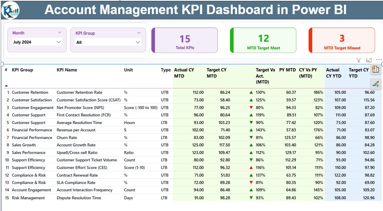
The Summary Page acts as the heart of the dashboard. It shows all important KPIs with monthly and yearly comparisons.
Top Filters and Slicers
You get two slicers at the top:
-
Month Slicer – Select any month to view MTD performance
-
KPI Group Slicer – Filter KPIs by category
Both slicers update every chart and number in real time.
Quick Summary Cards
Below the slicers, three important cards appear:
-
Total KPIs Count
-
MTD Target Met Count
-
MTD Target Missed Count
These cards give a quick performance snapshot.
Detailed KPI Table
The table shows every KPI with deep information. Each KPI includes:
-
KPI Number – Sequence ID for each KPI
-
KPI Group – Category (Revenue, Client Satisfaction, Ticket Handling, etc.)
-
KPI Name – The specific performance metric
-
Unit – Measurement unit
-
Type – LTB (Lower the Better) or UTB (Upper the Better)
-
Actual CY MTD – Current Year MTD value
-
Target CY MTD – Monthly target value
-
MTD Icon – Green ▲ or Red ▼ icon showing status
-
Target vs Actual (MTD) – Percentage comparison (Actual / Target)
-
PY MTD – Previous Year MTD values
-
CY vs PY (MTD) – Comparison with previous year
-
Actual CY YTD – Current Year YTD value
-
Target CY YTD – Yearly target
-
YTD Icon – ▲ or ▼ status icon
-
Target vs Actual (YTD) – YTD target achievement
-
PY YTD – Previous year YTD values
-
CY vs PY (YTD) – YTD comparison with previous year
Icons for Instant Understanding
Click to Purchases Account Management KPI Dashboard in Power BI
The green ▲ symbol means performance meets or exceeds target.
The red ▼ symbol means performance is below target.
This simple visual approach allows faster decisions.
2. KPI Trend Page – Visual Analysis of Growth
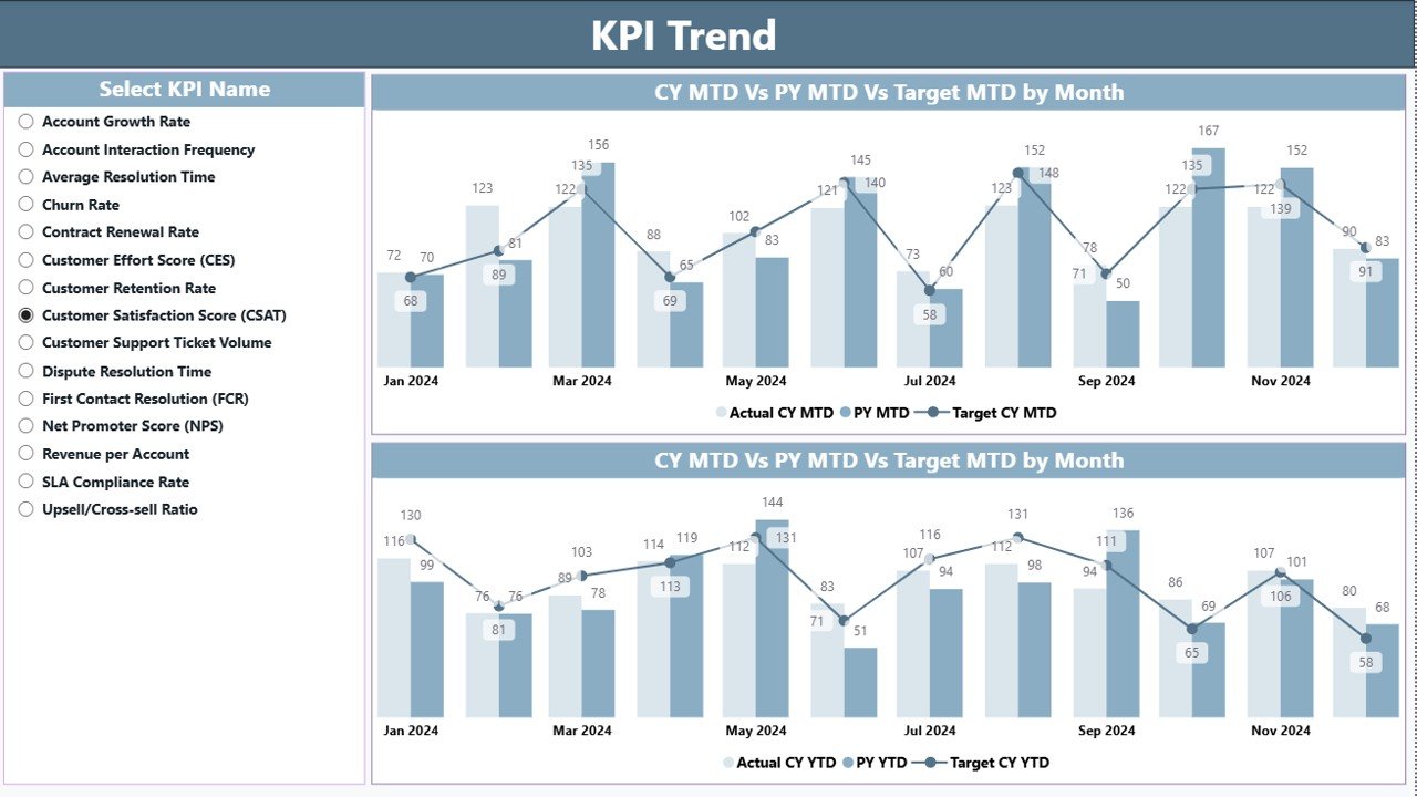
The KPI Trend Page shows clear performance trends for each KPI. It helps teams understand long-term patterns.
KPI Selector
A slicer on the left lets you choose any KPI by name. The charts update instantly.
Two Combo Charts
The page displays two powerful charts:
-
MTD Trend Chart – Shows this year, last year, and target for each month
-
YTD Trend Chart – Shows cumulative progress compared to last year
These charts help you understand seasonal patterns, monthly growth, and performance gaps.
3. KPI Definition Page – Detailed Explanation
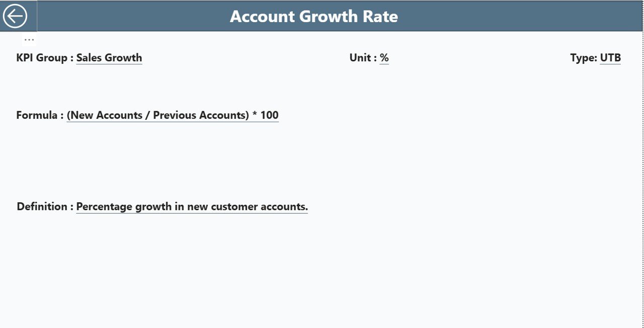
This is a hidden drill-through page that shows complete KPI details. From the Summary Page, you can right-click on any KPI and open this page.
It shows:
-
KPI Number
-
KPI Group
-
KPI Name
-
Unit
-
Formula
-
Definition
-
Type (LTB or UTB)
A Back button at the top-left helps you return to the Summary Page easily.
How the Excel Data Source Supports the Dashboard
The dashboard uses an Excel file to store the raw data. It contains three worksheets, and each serves a unique role.
➤ 1. Input_Actual Sheet
This sheet stores all actual performance numbers. You fill:
-
KPI Name
-
Month (first date of each month)
-
MTD values
-
YTD values
Power BI reads this data to calculate performance results.
➤ 2. Input_Target Sheet
This sheet stores the target values. You fill:
-
KPI Name
-
Month
-
MTD target
-
YTD target
The dashboard compares actual values with targets to show KPI status.
➤ 3. KPI Definition Sheet
This sheet defines every KPI. It contains:
-
KPI Number
-
KPI Group
-
KPI Name
-
Unit
-
Formula
-
Definition
-
Type (UTB or LTB)
This information supports drill-through pages and detailed analysis.
Advantages of an Account Management KPI Dashboard in Power BI
Click to Purchases Account Management KPI Dashboard in Power BI
A well-designed dashboard can transform how account teams work. Let’s explore the top benefits.
1. Clear and Real-Time Performance Visibility
Managers see real-time results for every KPI. They know which KPIs meet targets and which ones need attention.
2. Faster and Better Decision-Making
Since the numbers update instantly, teams take action quickly. You don’t wait for manual reports.
3. Easy Comparison With Previous Years
The dashboard shows CY vs PY analysis for both MTD and YTD. This helps identify growth trends and seasonal changes.
4. Less Manual Work and More Focus on Strategy
No more manual Excel reporting. Power BI automates everything and saves many hours each month.
5. Smarter Client Management
Account managers see every KPI trend and make better decisions for retention, upselling, and renewals.
6. Professional Reporting for Leadership Teams
The dashboard presents clean visuals. Leaders get a single view of account performance with accurate numbers.
Best Practices for Using the Account Management KPI Dashboard
You can follow these best practices to get the most value from the dashboard.
1. Update Data on Time
Fill the Actual and Target sheets regularly. Timely updates keep results meaningful.
2. Use Clean KPI Definitions
Keep formula and definition simple and clear. This avoids confusion during reporting.
3. Review MTD and YTD Together
MTD shows short-term performance.
YTD shows long-term direction.
Analyzing both views gives a complete picture.
4. Compare Results With Previous Year Trends
CY vs PY helps you understand improvement patterns. Use these insights for monthly planning.
5. Use Slicers for Deep Insights
Filters for Month and KPI Group help you focus on specific areas.
6. Drill Through for KPI Details
Use the hidden KPI Definition page to explore formulas, definitions, and KPI logic.
7. Share Live Dashboards With the Team
Power BI allows sharing through workspaces. Everyone sees updated numbers instantly.
How Companies Use This Dashboard
Business teams use the dashboard in many ways, such as:
-
Measuring account performance monthly
-
Tracking retention and renewal trends
-
Understanding service delivery gaps
-
Improving client communication
-
Planning account strategies
-
Reviewing team performance
-
Presenting insights to senior leaders
This dashboard becomes a daily tool for account managers and analysts.
Conclusion
The Account Management KPI Dashboard in Power BI creates a powerful reporting system for any business. It brings all KPIs under one view, tracks monthly and yearly performance, and highlights gaps instantly. Teams save time, make better decisions, and communicate clearly with clients and leadership.
With slicers, combo charts, summary cards, and drill-through pages, this dashboard becomes a complete performance tracking solution. When you keep the data updated, the dashboard gives you clear and reliable insights every month.
Frequently Asked Questions (FAQs)
1. What is an Account Management KPI Dashboard in Power BI?
It is a visual tool that tracks MTD and YTD performance for every KPI. It compares actual numbers with targets and previous year values to help teams make quick decisions.
2. What data do I need to run the dashboard?
You need three sheets: Actual values, Target values, and KPI Definition details.
3. Can I customize the KPIs?
Yes. You can add, remove, or rename KPIs in the Excel definition sheet.
4. Does the dashboard update automatically?
Yes. When you refresh Power BI, it reads the latest Excel data.
5. Can teams use it for client reviews?
Yes. It works perfectly for client meetings, performance reviews, and account planning.
6. Does it show previous year comparison?
Yes. The dashboard displays CY vs PY for both MTD and YTD.
7. Can beginners use this dashboard easily?
Yes. The interface is simple, and the visuals make the information easy to understand.
8. How many KPI Groups can I add?
You can add unlimited groups because the slicer reads all groups from the Excel file.
9. Does the dashboard support mobile view?
Yes. Power BI allows you to create a mobile layout for better viewing.
10. Can Ishare the report with leadership?
Yes. You can publish it in Power BI Service and share it with decision-makers.
Visit our YouTube channel to learn step-by-step video tutorials
