In today’s data-driven organizations, efficient administration is not just about managing operations — it’s about making informed, real-time decisions that drive productivity, accountability, and performance. The Administration Dashboard in Power BI transforms complex administrative data into meaningful insights that help teams streamline workflows, monitor progress, and make decisions with confidence.
This ready-to-use Power BI Dashboard pulls its data from an Excel source file, making it easy to maintain and refresh. It brings together KPIs related to task completion, escalation, and priority tracking — all visualized through dynamic charts and interactive slicers.
Click to Purchases Administration Dashboard in Power BI
What Is an Administration Dashboard in Power BI?
An Administration Dashboard in Power BI is a visual analytics tool designed to help management teams monitor and analyze administrative performance metrics across departments, regions, and request types. It centralizes all data in one place, offering a real-time view of how efficiently administrative operations are functioning.
This dashboard provides visibility into performance indicators such as completion percentage, escalation rates, and high-priority requests. It helps decision-makers identify bottlenecks, compare trends across months or departments, and plan corrective actions proactively.
With Power BI’s powerful visuals and interactivity, even non-technical users can quickly understand performance data and make decisions backed by evidence.
Structure of the Administration Dashboard in Power BI
The Administration Dashboard in Power BI consists of five well-designed pages, each serving a unique analytical purpose. Let’s explore what each page offers.
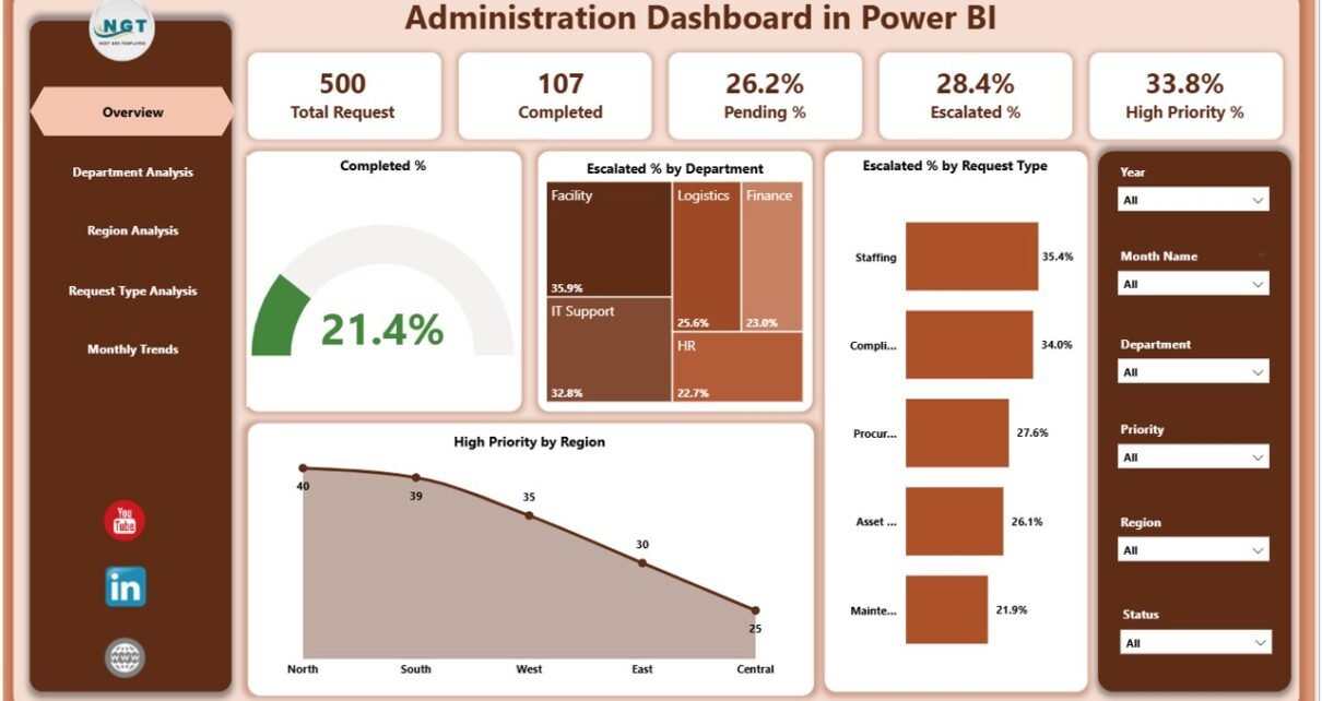
1️⃣ Overview Page
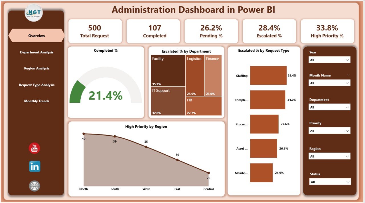
The Overview Page serves as the primary snapshot of administrative performance.
It includes key metrics and visualizations that summarize overall progress and highlight areas that need attention.
Key elements include:
-
Five KPI Cards:
These cards display quick stats such as Total Requests, Completed %, Escalated %, In Progress %, and High Priority %.
Each card updates automatically as data changes. -
Interactive Slicers:
Slicers allow users to filter the dashboard by Department, Region, Request Type, or Month, making data exploration smooth and intuitive.
Main Charts:
- Completed % Chart: Visualizes the proportion of completed tasks versus total requests.
- Escalated % by Department: Displays which departments have the most escalations.
- Escalated % by Request Type: Shows trends in escalation by category.
- High Priority by Region: Highlights areas with the highest volume of urgent requests.
This page provides a holistic overview, helping administrators monitor operational efficiency in real time.
Click to Purchases Administration Dashboard in Power BI
2️⃣ Department Analysis Page
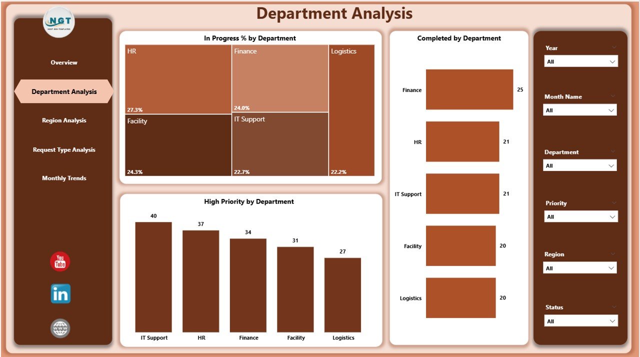
The Department Analysis Page dives deeper into performance across different departments.
Here, managers can evaluate which teams are performing efficiently and which may need process improvements.
Main visuals include:
-
In Progress % by Department: Tracks how many tasks are currently ongoing within each department.
-
Completed % by Department: Evaluates task closure rates, enabling cross-department comparisons.
-
High Priority by Department: Highlights which departments handle the most critical tasks or issues.
With these visuals, department heads can analyze workload distribution and optimize resource allocation.
3️⃣ Region Analysis Page
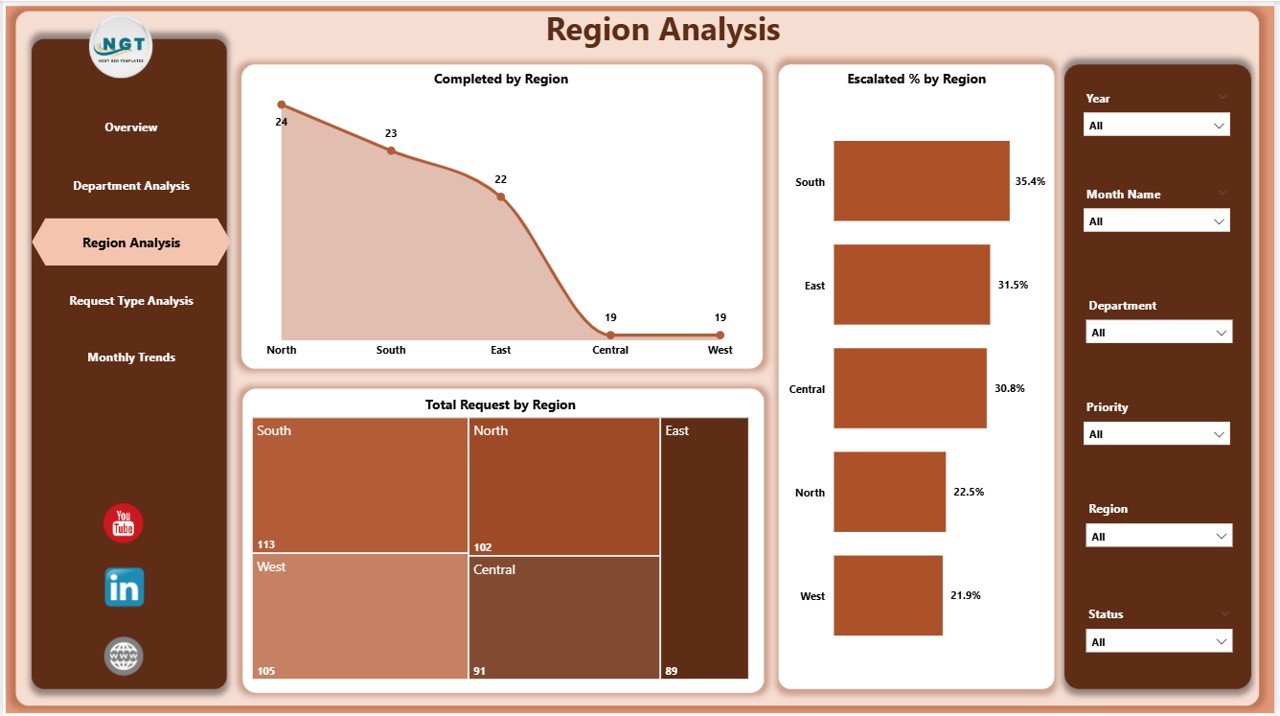
The Region Analysis Page focuses on geographical performance insights. It helps identify trends and patterns across multiple locations or offices.
Key visuals:
-
Completed % by Region: Shows how well each region performs in completing tasks on time.
-
Escalated % by Region: Identifies problem areas with high escalation rates.
-
Total Requests by Region: Gives an overview of request volume distribution across regions.
These insights enable regional managers to detect performance gaps and replicate best practices from high-performing areas.
4️⃣ Request Type Analysis Page
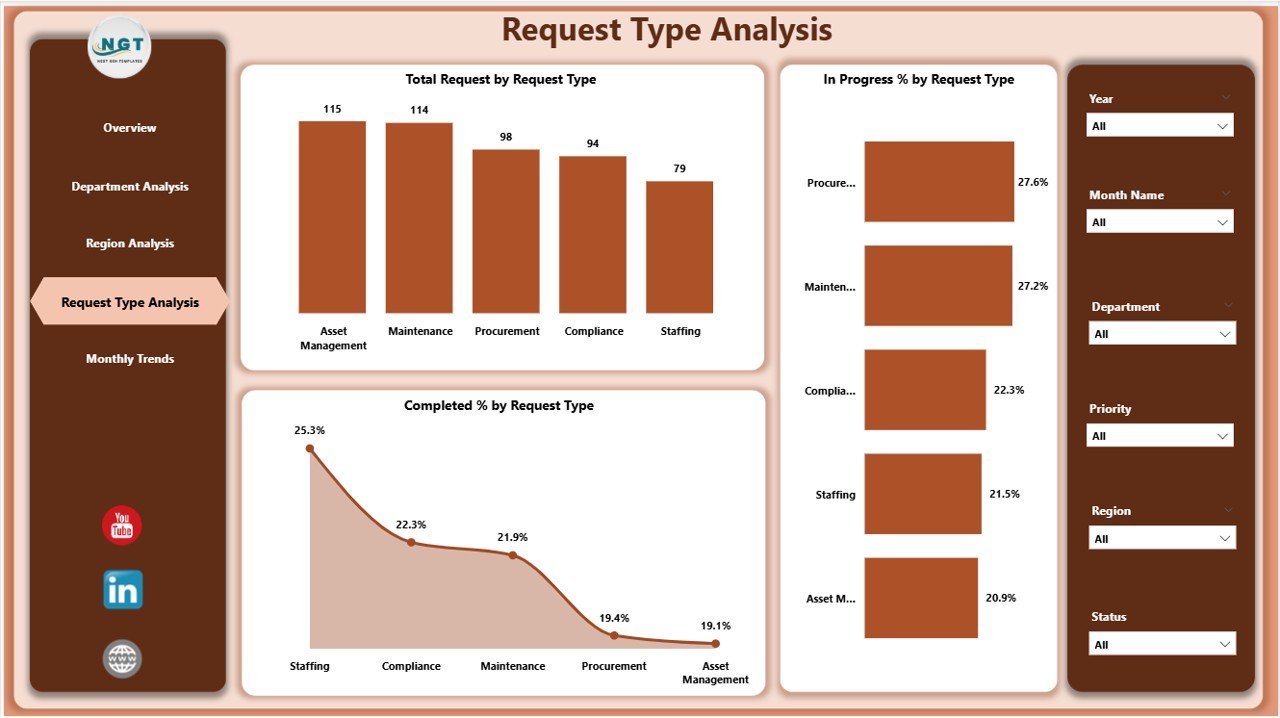
This page focuses on performance based on request types — such as maintenance requests, IT support, facility management, or administrative approvals.
Core visuals include:
-
Total Requests by Request Type: Provides a breakdown of request categories.
-
In Progress % by Request Type: Monitors ongoing requests in each type.
-
Completed % by Request Type: Compares completion efficiency across various request categories.
This segmentation helps management understand which types of requests dominate the workflow and where to allocate additional resources or automation efforts.
5️⃣ Monthly Trends Page
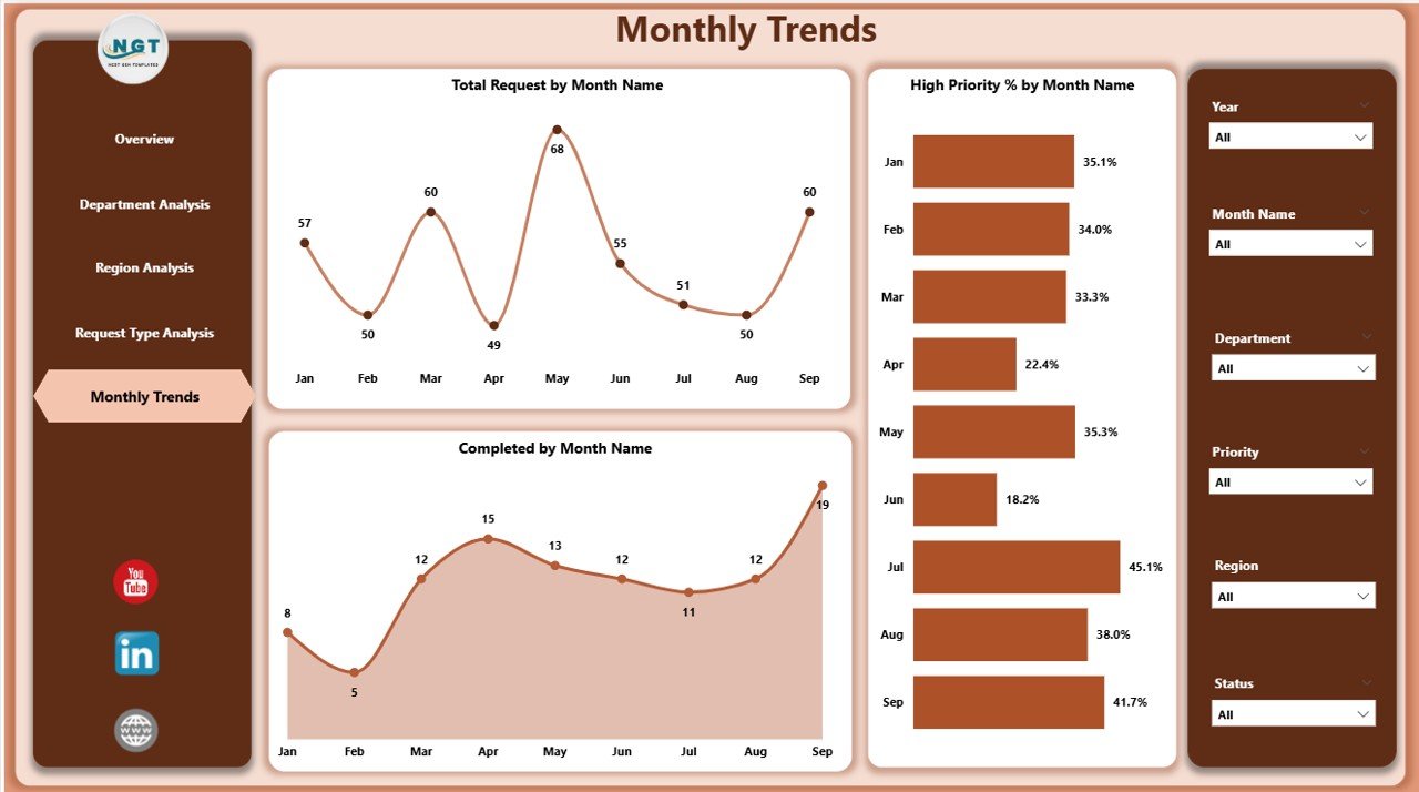
The Monthly Trends Page tracks performance over time, helping organizations monitor seasonality, recurring issues, and monthly improvements.
Visuals on this page:
-
Total Requests by Month: Shows workload patterns across the year.
-
Completed % by Month: Tracks progress rates and completion trends.
-
High Priority % by Month: Highlights fluctuations in urgent or critical tasks.
This page supports long-term planning and strategic decision-making by identifying consistent performance trends.
Click to Purchases Administration Dashboard in Power BI
Why Use an Administration Dashboard in Power BI?
Organizations often deal with vast administrative data scattered across multiple files and systems. Without a unified dashboard, understanding what’s happening in real time can be challenging.
The Administration Dashboard in Power BI brings all this data together, offering a clear and consolidated view.
Here’s why it’s invaluable:
📊 Centralized Data Visualization: View all critical metrics in one place.
⚙️ Automated Updates: Connects directly with Excel or other data sources for real-time refresh.
🎯 Performance Tracking: Instantly identify departments or regions that need improvement.
🔍 Trend Analysis: Detect patterns over time for strategic decisions.
📈 Interactive Insights: Filter, drill down, and explore data without technical complexity.
🧠 Decision Support: Make informed choices backed by reliable data.
Advantages of Administration Dashboard in Power BI
Implementing an Administration Dashboard in Power BI brings numerous advantages to organizations of all sizes.
✅ 1. Centralized Monitoring
All administrative KPIs and reports come together on a single screen. Users can view both high-level and detailed metrics, improving decision-making speed and accuracy.
✅ 2. Real-Time Insights
The dashboard refreshes automatically with the latest data from Excel or other integrated systems, ensuring decisions are always based on real-time information.
✅ 3. Department and Regional Comparisons
Decision-makers can easily compare the performance of multiple departments or regions to identify trends, inefficiencies, and best practices.
✅ 4. Simplified Communication
Visual charts make complex data easy to understand, promoting transparent communication between management, teams, and stakeholders.
✅ 5. Improved Productivity
By highlighting bottlenecks and escalations, the dashboard helps streamline processes and focus on priority areas, boosting overall productivity.
✅ 6. Scalability and Customization
Since the dashboard runs in Power BI, users can customize visuals, add filters, or connect to different datasets as their administrative needs evolve.
How to Use the Administration Dashboard Effectively
To get the most out of this Power BI template, follow these simple steps:
-
Load Your Data:
Import your Excel-based administrative data into Power BI. -
Refresh the Dashboard:
Click “Refresh” to update visuals with the latest figures. -
Use Slicers:
Apply slicers for Department, Region, Request Type, and Month to analyze data from different perspectives. -
Drill Down for Details:
Click on any chart element to drill into more granular data. -
Monitor KPIs Regularly:
Review your dashboard daily or weekly to ensure timely decision-making.
Opportunities for Improvement
Even with powerful dashboards, continuous improvement is key.
Here are a few ideas to enhance the Administration Dashboard in Power BI:
🔄 Add Predictive Analytics:
Incorporate forecasting visuals to predict upcoming workload or escalation trends.
🧾 Include Financial Metrics:
Combine operational KPIs with cost data for deeper administrative efficiency analysis.
📅 Automate Email Alerts:
Set up Power Automate workflows for escalation notifications.
🌐 Integrate with Other Tools:
Connect with HR, IT, or facility systems for a complete administrative overview.
🎨 Enhance Visual Appeal:
Customize visuals using Power BI themes and corporate branding.
💼 Use Cases of the Administration Dashboard in Power BI
This dashboard can be applied in various administrative environments:
-
Corporate Offices: Track administrative service requests, completion rates, and escalations.
-
Educational Institutions: Monitor maintenance requests, IT helpdesk issues, and regional campus operations.
-
Government Agencies: Manage public service requests, departmental performance, and priority issues.
-
Healthcare Organizations: Track internal administrative workflows, from facility maintenance to IT support.
-
Manufacturing Companies: Oversee internal service requests and plant-level administrative operations.
Best Practices for the Administration Dashboard in Power BI
To ensure accuracy and efficiency, follow these best practices:
🟩 1. Maintain Clean Data
Ensure your Excel or data source is regularly updated and formatted correctly. Remove duplicates or missing fields before refreshing the dashboard.
🟩 2. Standardize KPIs
Define KPI formulas and thresholds clearly. This ensures all departments interpret performance indicators consistently.
🟩 3. Refresh Data Regularly
Schedule data refreshes daily or weekly using Power BI’s automatic refresh feature to keep insights current.
🟩 4. Use Dynamic Filters
Implement slicers and filters for flexibility. This allows users to view data by department, region, or request type effortlessly.
🟩 5. Protect Sensitive Data
Set role-based access controls to ensure only authorized personnel can view sensitive metrics.
🟩 6. Leverage Drillthroughs
Use Power BI’s drillthrough feature to explore detailed insights behind summary visuals.
🟩 7. Keep Design Consistent
Maintain a uniform color scheme and layout across all pages to improve readability and professional appeal.
📊 Example Workflow
Here’s how the dashboard might be used in a real-world scenario:
-
Data Entry: Administrative staff logs service requests in an Excel sheet.
-
Data Connection: Power BI connects to the Excel file.
-
Visualization: KPIs and charts update instantly in the dashboard.
-
Decision-Making: Managers identify the top 3 departments with high escalation rates.
-
Action Plan: Leadership assigns additional resources to the underperforming departments.
-
Monitoring: Monthly trends page shows improvement over time.
This workflow helps teams close the feedback loop between monitoring and improvement.
Click to Purchases Administration Dashboard in Power BI
🧭 Conclusion
The Administration Dashboard in Power BI is more than just a reporting tool — it’s a strategic instrument for driving administrative excellence. It empowers organizations to visualize key performance metrics, monitor progress in real time, and ensure accountability across departments and regions.
❓ Frequently Asked Questions (FAQs)
1. What is the purpose of an Administration Dashboard in Power BI?
The dashboard helps organizations monitor administrative performance metrics, track requests, and analyze efficiency across departments and regions.
2. Can I connect the dashboard to data sources other than Excel?
Yes, you can connect Power BI to multiple data sources such as SharePoint, SQL Server, or cloud-based platforms like Google Sheets and OneDrive.
3. How often should I refresh the dashboard data?
Ideally, refresh your data daily or weekly depending on how frequently new requests are logged.
4. Can I customize visuals in this dashboard?
Absolutely! Power BI allows full customization — you can add new visuals, modify colors, and adjust layouts to match your company’s branding.
5. Who should use the Administration Dashboard?
It’s ideal for administrative managers, operations heads, and organizational leaders who need to oversee performance metrics and track request handling efficiency.
6. Does the dashboard require coding skills?
No. Power BI is a no-code platform for dashboard creation. Users can build and customize visuals through drag-and-drop features.
7. What makes this dashboard different from Excel reports?
Unlike static Excel reports, Power BI dashboards offer interactivity, real-time data refresh, and advanced visualization capabilities.
8. Can I share the dashboard with my team?
Yes, Power BI dashboards can be securely shared within your organization using Power BI Service or exported as PDF and PowerPoint reports.
Visit our YouTube channel to learn step-by-step video tutorials