In the art business, every sale tells a story. Every artwork carries value, style, emotion, and financial impact. However, when art gallery owners, managers, and analysts try to track sales, profit, acquisition cost, buyer behavior, and monthly trends through scattered files, the process becomes slow and confusing. As a result, they often miss important insights that could improve pricing, buyer targeting, and gallery performance.
So, how can art galleries organize all their important business data in one place and make better decisions with confidence?
The answer is the Art Galleries Dashboard in Power BI.
This ready-to-use dashboard helps art galleries monitor sales activity, profit, pricing performance, acquisition spending, buyer trends, and gallery performance in one interactive system. Moreover, it turns raw data into useful charts, KPI cards, and trend-based insights. Therefore, gallery owners and decision-makers can quickly understand what is working well and what needs attention.
In this detailed article, you will learn what the Art Galleries Dashboard in Power BI is, why it matters, what pages it includes, how it helps your gallery, and how to use it effectively for better reporting and business growth.
Click to buy Art Galleries Dashboard in Power BI
What Is an Art Galleries Dashboard in Power BI?
An Art Galleries Dashboard in Power BI is an interactive reporting tool that helps galleries track and analyze key business metrics in a visual and easy-to-understand format.
Instead of depending on manual spreadsheets and disconnected reports, this dashboard brings your important gallery data into one centralized view. Because of that, you can monitor performance faster, compare trends easily, and make smarter decisions without wasting time.
This dashboard focuses on important areas such as:
- Average selling price
- Total sales amount
- Profit
- Acquisition cost
- Number of sales
- Art category performance
- Buyer type behavior
- Artist nationality analysis
- Exhibition sales trends
- Payment method performance
- Regional acquisition cost
- Monthly sales movement
Therefore, this dashboard becomes a practical business intelligence tool for modern art galleries that want to improve visibility and performance.
Why Do Art Galleries Need a Dashboard in Power BI?
Running an art gallery involves much more than displaying beautiful artwork. You also need to manage pricing, sales, acquisition budgets, buyer preferences, and market trends. If you do not track these areas properly, small issues can grow into larger business problems.
For example, you may not know which art style sells at the highest average price. You may also struggle to see which buyer type brings the most value or which exhibition performs best. In addition, you may miss important monthly trends that affect future planning.
That is why this dashboard matters.
With the Art Galleries Dashboard in Power BI, you can:
- See your business performance in one place
- Track sales and profit instantly
- Compare categories, styles, and mediums
- Understand buyer behavior clearly
- Monitor market and regional acquisition costs
- Review gallery and exhibition performance
- Spot patterns across months
- Make faster and more confident business decisions
As a result, your gallery can improve planning, pricing, marketing, and overall financial performance.
What Are the Key Features of the Art Galleries Dashboard in Power BI?
This dashboard includes 5 interactive pages. Each page focuses on a different part of gallery operations and performance. Together, these pages create a complete reporting solution for gallery owners, sales teams, and business analysts.
Let us explore each page in detail.
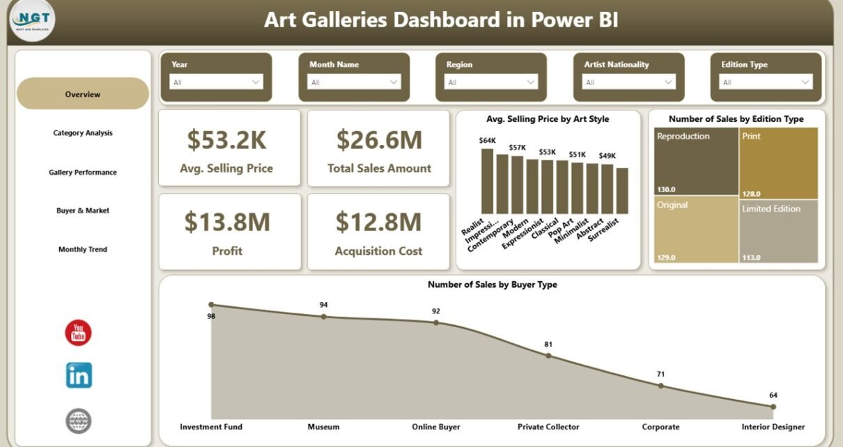
Overview Page
The Overview Page works as the main summary page of the dashboard. It gives users a quick and clear picture of overall gallery performance.
KPI Cards on the Overview Page
This page includes important KPI cards such as:
- Average Selling Price
- Total Sales Amount
- Profit
- Acquisition Cost
These KPIs help users understand the overall financial position of the gallery at a glance. For example, if total sales amount grows but profit stays low, the gallery may need to review acquisition costs or pricing strategy.
Charts on the Overview Page
This page also includes visual charts such as:
- Average Selling Price by Art Style
- Number of Sales by Edition Type
- Number of Sales by Buyer Type
These visuals help answer important questions like:
- Which art style commands a higher average selling price?
- Which edition type sells more often?
- Which buyer type contributes the most sales?
Therefore, the Overview Page becomes the starting point for fast business review and quick performance checks.

Click to buy Art Galleries Dashboard in Power BI
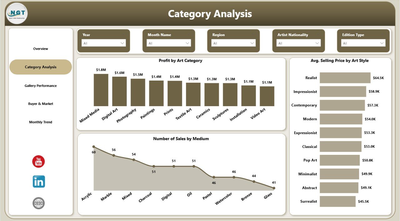
Category Analysis
The Category Analysis Page focuses on artwork categories, styles, and mediums. This page helps users understand which artistic segments perform better than others.
Charts on the Category Analysis Page
This page includes:
- Profit by Art Category
- Average Selling Price by Art Style
- Number of Sales by Medium
These charts provide valuable insights for product and sales strategy.
For example:
- If one art category generates strong profit, the gallery can increase focus on similar works.
- If a certain art style has a higher average selling price, the gallery can refine its acquisition and display strategy around that style.
- If one medium produces a higher number of sales, the gallery can promote that medium more actively.
Because of these insights, this page helps galleries align inventory, pricing, and promotion with actual market response.
Click to buy Art Galleries Dashboard in Power BI
Gallery Performance
The Gallery Performance Page shows how different gallery-related factors affect business outcomes. This page helps galleries evaluate how categories, artists, and exhibitions perform.
Charts on the Gallery Performance Page
This page includes:
- Profit by Art Category
- Average Selling Price by Artist Nationality
- Number of Sales by Exhibition Name
These charts help you answer business-critical questions such as:
- Which categories bring more profit in gallery operations?
- Which artist nationalities attract higher average selling prices?
- Which exhibitions generate more sales?
This is especially useful because art galleries often rely on carefully planned exhibitions and artist representation strategies. Therefore, when you know which exhibitions and artist backgrounds perform best, you can plan future events more effectively.
In addition, this page can support curatorial decisions. If a certain exhibition theme or artist group performs well, the gallery can use that insight for future planning.

Click to buy Art Galleries Dashboard in Power BI
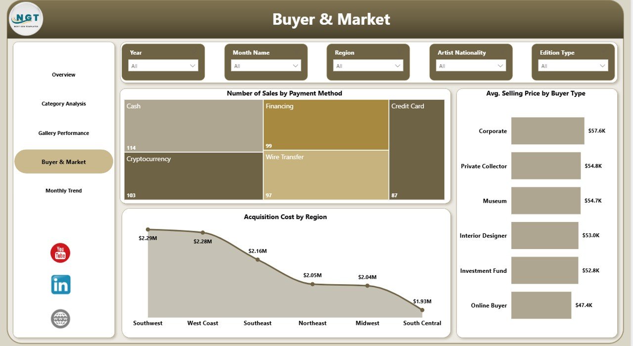
Buyer & Market
The Buyer & Market Page focuses on customer behavior and market-based cost analysis. This page helps you understand how buyers make purchases and how acquisition costs vary by region.
Charts on the Buyer & Market Page
This page includes:
- Number of Sales by Payment Method
- Average Selling Price by Buyer Type
- Acquisition Cost by Region
This page gives strong commercial insights.
For example:
- If one payment method dominates, the gallery can improve service around that payment process.
- If one buyer type pays a higher average selling price, the sales team can create more focused communication for that audience.
- If acquisition costs are too high in one region, management can review sourcing strategies for better cost control.
As a result, the Buyer & Market Page supports both sales planning and cost management.
Click to buy Art Galleries Dashboard in Power BI
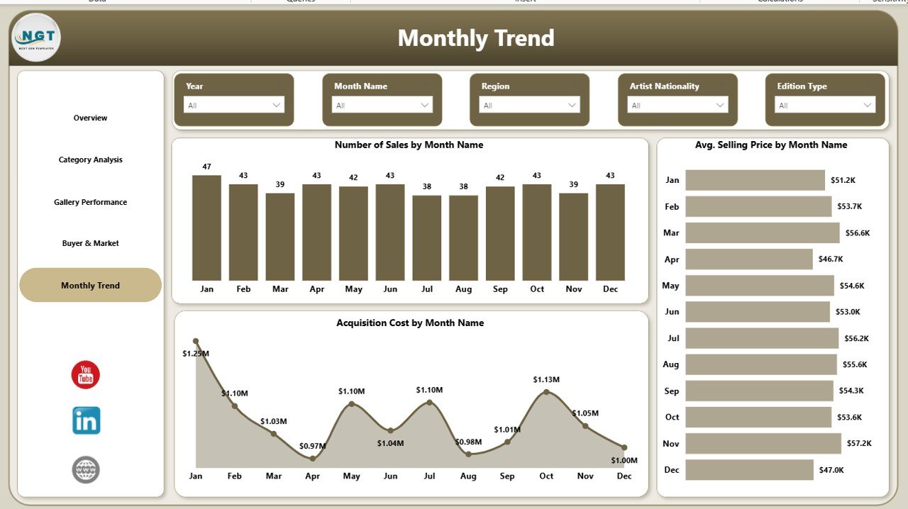
Monthly Trend
The Monthly Trend Page helps users track performance over time. Trend analysis matters because gallery performance can change based on season, event schedules, exhibitions, buyer activity, and market demand.
Charts on the Monthly Trend Page
This page includes:
- Number of Sales by Month Name
- Average Selling Price by Month Name
- Acquisition Cost by Month Name
These charts help users identify patterns such as:
- Which months bring more sales
- When average selling price increases or decreases
- How acquisition cost changes through the year
For example, if sales rise during a festival season or exhibition cycle, the gallery can prepare inventory and promotions in advance. Similarly, if acquisition cost rises in certain months, the gallery can plan purchases more wisely.
Therefore, this page supports forecasting, budgeting, and long-term planning.
Click to buy Art Galleries Dashboard in Power BI
How Does This Dashboard Improve Gallery Decision-Making?
A good dashboard does more than display charts. It helps people make decisions faster and with more confidence.
The Art Galleries Dashboard in Power BI improves decision-making by showing patterns that are hard to see in raw data. Instead of reading rows of numbers, users can understand performance through visuals, comparisons, and filters.
Here is how it helps:
It Saves Time
You do not need to combine multiple reports manually. Instead, you can open one dashboard and review all key metrics in a few minutes.
It Improves Pricing Decisions
By tracking average selling price by style, buyer type, nationality, and month, the gallery can refine pricing strategies based on real results.
It Strengthens Sales Planning
Sales by edition type, medium, buyer type, and exhibition name help the team understand what drives transactions.
It Supports Profit Management
Profit and acquisition cost tracking helps management protect margins and improve return on investment.
It Reveals Buyer Behavior
When you understand payment methods and buyer types, you can improve marketing and customer engagement.
It Supports Smarter Acquisitions
Regional acquisition cost insights help galleries purchase artwork more carefully and reduce unnecessary expenses.
Because of these benefits, the dashboard becomes a strategic tool, not just a reporting tool.
Advantages of Art Galleries Dashboard in Power BI
Every gallery wants better control, better planning, and better results. That is exactly where this dashboard adds value.
- Centralized Reporting
You can manage sales, profit, costs, buyers, and trends in one place.
- Better Visibility
The dashboard makes complex data easy to read through visual reports and KPI cards.
- Faster Decisions
Because all important metrics stay visible, you can react quickly to changes in sales or cost.
- Improved Profit Tracking
You can compare revenue-related indicators with acquisition cost and identify stronger profit areas.
- Better Inventory and Category Planning
Category, medium, and style analysis helps galleries choose the right artwork mix.
- Stronger Buyer Insights
Buyer type and payment method charts help the team understand purchase behavior.
- Better Exhibition Strategy
Exhibition-based sales analysis helps galleries plan future events with more confidence.
- Improved Monthly Planning
Trend charts help management prepare for seasonal changes and monthly opportunities.
- Professional Reporting Experience
Power BI provides an interactive and modern reporting interface that looks professional and works efficiently.
- Easy Filtering and Analysis
Users can apply slicers and filters to review data from different angles without changing the raw dataset.
Opportunities for Improvement in the Art Galleries Dashboard in Power BI
Although this dashboard already offers strong value, you can make it even more powerful with a few additional improvements.
Add More KPI Cards
You can include extra KPIs such as:
- Total number of artworks sold
- Gross margin percentage
- Repeat buyer rate
- Unsold inventory count
- Average acquisition cost per artwork
These additions would provide even deeper business understanding.
Add Artist-Level Analysis
A dedicated page for artist performance could show:
- Sales by artist
- Profit by artist
- Average selling price by artist
- Sales count by artist
This would help galleries manage artist representation more effectively.
Include Geographic Sales Insights
You can add maps or region-based visuals to show buyer location and sales distribution. This would improve market targeting.
Add Buyer Retention Tracking
If your data includes repeat customer records, you can monitor returning buyers and loyalty trends.
Include Forecasting
Power BI can support forecasting for future sales, profit, and monthly trends. This can help with planning exhibitions and budget allocation.
Add Artwork Inventory Status
An inventory-based page can show sold, reserved, displayed, and unsold pieces, which would improve operational planning.
These improvements can turn a strong dashboard into a complete gallery intelligence solution.
Best Practices for the Art Galleries Dashboard in Power BI
To get the best results from this dashboard, you should follow a few practical best practices.
- Keep Data Clean and Updated
Always use accurate and updated sales, cost, and acquisition data. Clean data leads to reliable insights.
- Use Standard Naming
Keep category names, art styles, mediums, and buyer types consistent. This helps avoid reporting confusion.
- Review the Dashboard Regularly
Check the dashboard weekly or monthly so that you can catch trends early and act quickly.
- Compare Profit with Acquisition Cost
Do not focus only on sales amount. Always compare revenue-related metrics with acquisition cost to protect margins.
- Analyze Buyer Types Carefully
Different buyer groups may respond to different price levels and artworks. Use these insights for better targeting.
- Use Monthly Trends for Planning
Look at seasonal patterns before planning exhibitions, sourcing, and promotions.
- Monitor High-Value Categories
Identify categories and styles with higher profit or selling price and build strategies around them.
- Test Pricing Strategies
Use average selling price insights to evaluate whether certain categories or styles support premium pricing.
- Share the Dashboard with Key Teams
Gallery managers, sales teams, and financial teams should all review the same data to stay aligned.
- Keep Improving the Dashboard
As your gallery grows, update the dashboard with new KPIs, pages, and filters that match your business needs.
Who Can Benefit from the Art Galleries Dashboard in Power BI?
This dashboard can help many people in the art gallery business.
Gallery Owners
They can monitor profitability, sales growth, and acquisition spending.
Gallery Managers
They can evaluate exhibitions, categories, and buyer trends more effectively.
Sales Teams
They can understand which buyer types, payment methods, and styles perform best.
Curators
They can review category and artist-related insights for better planning.
Financial Analysts
They can track cost, profit, and monthly financial movement clearly.
Marketing Teams
They can use buyer and market insights to improve targeting and campaign planning.
Therefore, this dashboard works well for both strategic and day-to-day gallery management.
How Should You Use the Art Galleries Dashboard in Power BI?
Using this dashboard is simple when your data structure is ready.
First, gather your sales and acquisition data in a clean format. Then connect the data to Power BI. After that, map the required fields such as art style, category, medium, exhibition name, buyer type, payment method, region, and month.
Once your data is loaded, the dashboard will start showing meaningful visuals. From there, users can apply filters, review KPIs, compare charts, and identify trends.
A simple workflow looks like this:
- Upload clean artwork sales and cost data
- Refresh the Power BI dashboard
- Review the Overview Page first
- Move to detailed pages for deeper analysis
- Compare trends across categories, buyers, and months
- Use findings for pricing, acquisition, and sales planning
Because of this structured flow, the dashboard helps users move from raw data to action quickly.
Why Is Power BI a Good Choice for Art Gallery Reporting?
Power BI offers several benefits for gallery reporting.
- It creates interactive dashboards
- It supports visual storytelling with data
- It handles large datasets better than manual reports
- It allows filters and slicers for deeper analysis
- It refreshes reports quickly
- It provides a modern and professional reporting experience
In addition, Power BI helps teams share insights more easily. Therefore, it is a smart tool for galleries that want to move beyond static spreadsheets and build a stronger reporting culture.
Conclusion
The Art Galleries Dashboard in Power BI is a practical and powerful tool for modern art gallery management. It helps galleries track average selling price, total sales amount, profit, acquisition cost, buyer behavior, category performance, exhibition results, and monthly trends in one interactive reporting system.
Moreover, it simplifies complex data and turns it into clear business insights. As a result, gallery owners and managers can make smarter decisions, improve pricing strategy, manage costs better, and plan future exhibitions with more confidence.
If your gallery wants to reduce reporting confusion, improve visibility, and grow with data-driven decisions, this dashboard can become a valuable part of your business toolkit.
Frequently Asked Questions About Art Galleries Dashboard in Power BI
- What is an Art Galleries Dashboard in Power BI?
It is an interactive Power BI dashboard that helps art galleries track sales, profit, acquisition cost, buyer behavior, and monthly trends in one place.
- Who should use this dashboard?
Gallery owners, managers, sales teams, curators, analysts, and marketing teams can all benefit from this dashboard.
- What are the main KPIs in this dashboard?
The main KPIs include average selling price, total sales amount, profit, and acquisition cost.
- How many pages does this dashboard include?
This dashboard includes 5 pages: Overview, Category Analysis, Gallery Performance, Buyer & Market, and Monthly Trend.
- Can this dashboard help improve pricing strategy?
Yes. It shows average selling price by art style, buyer type, artist nationality, and month, which helps improve pricing decisions.
- Can I track buyer behavior with this dashboard?
Yes. The dashboard includes buyer type and payment method analysis to help you understand customer behavior better.
- Does this dashboard support monthly trend analysis?
Yes. It includes monthly charts for number of sales, average selling price, and acquisition cost.
- Why should I use Power BI for gallery reporting?
Power BI offers interactive visuals, easy filtering, strong data handling, and professional reporting features that improve decision-making.
- Can I customize this dashboard?
Yes. You can add more KPIs, extra pages, artist-level analysis, geographic insights, and inventory tracking based on your needs.
- How does this dashboard help improve profitability?
It helps you compare sales and acquisition cost, identify profitable categories, and make better pricing and sourcing decisions.
Visit our YouTube channel to learn step-by-step video tutorials
Watch the step-by-step video tutorial:
Click to buy Art Galleries Dashboard in Power BI