Asset management companies handle large portfolios, investment strategies, client relationships, compliance tasks, and performance monitoring every day. Because these firms work with sensitive financial data and strict reporting deadlines, decision-makers need clear insights at the right time. A KPI Dashboard in Excel gives them this advantage. It allows teams to monitor month-to-date (MTD), year-to-date (YTD), and previous-year performance with simple visuals and trend charts.
In this article, you will learn how the Asset Management Companies KPI Dashboard in Excel works, why it matters, and how your team can benefit from its structured flow and clean design. You will also explore its worksheets, trend pages, KPI definitions, advantages, best practices, and frequently asked questions.
Click to Purchases Asset Management Companies KPI Dashboard in Excel
What Is an Asset Management Companies KPI Dashboard in Excel?
An Asset Management Companies KPI Dashboard in Excel is a ready-to-use reporting tool that tracks essential performance indicators for asset managers. This includes operational KPIs, financial KPIs, risk-related KPIs, compliance KPIs, investment performance KPIs, and client-service KPIs.
The dashboard brings all KPIs together from multiple sheets and presents them in a single interactive interface. Users can select a month from a dropdown menu and instantly see updated MTD and YTD performance. By comparing actuals, targets, and previous year values, teams understand trends and make informed decisions.
Because the dashboard runs in Microsoft Excel, no advanced technical skills are required. Even beginners can use it seamlessly.
Why Do Asset Management Companies Need a KPI Dashboard?
Asset management companies work in a highly regulated and competitive market. They need accurate insights regarding:
-
Fund performance
-
Portfolio returns
-
Risk ratios
-
Client onboarding timelines
-
Investment operations
-
Compliance requirements
-
Revenue vs. cost metrics
-
Asset growth trends
Without a dashboard, teams rely on scattered spreadsheets. That causes confusion, delays, and errors during review cycles. A KPI dashboard removes those problems and presents real-time performance clearly.
Click to Purchases Asset Management Companies KPI Dashboard in Excel
Key Features of the Asset Management Companies KPI Dashboard in Excel
This dashboard contains seven well-structured worksheets, each designed to support fast analysis and efficient reporting. Below is a detailed explanation of how each sheet works.
1. Home Sheet – Your Navigation Center
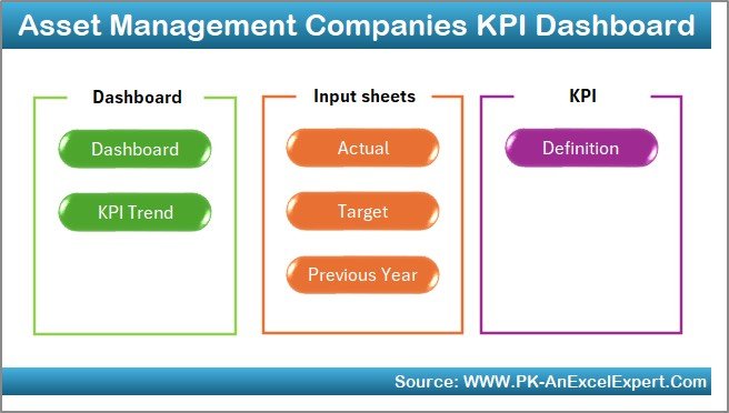
The Home Sheet works as the main index page. It provides six navigation buttons that allow users to jump to different sheets instantly. This design helps beginners navigate the file without searching for tabs manually.
Because this dashboard focuses on ease of use, the Home Sheet creates a smooth experience for all departments, including finance teams, compliance teams, investment analysts, and leadership.
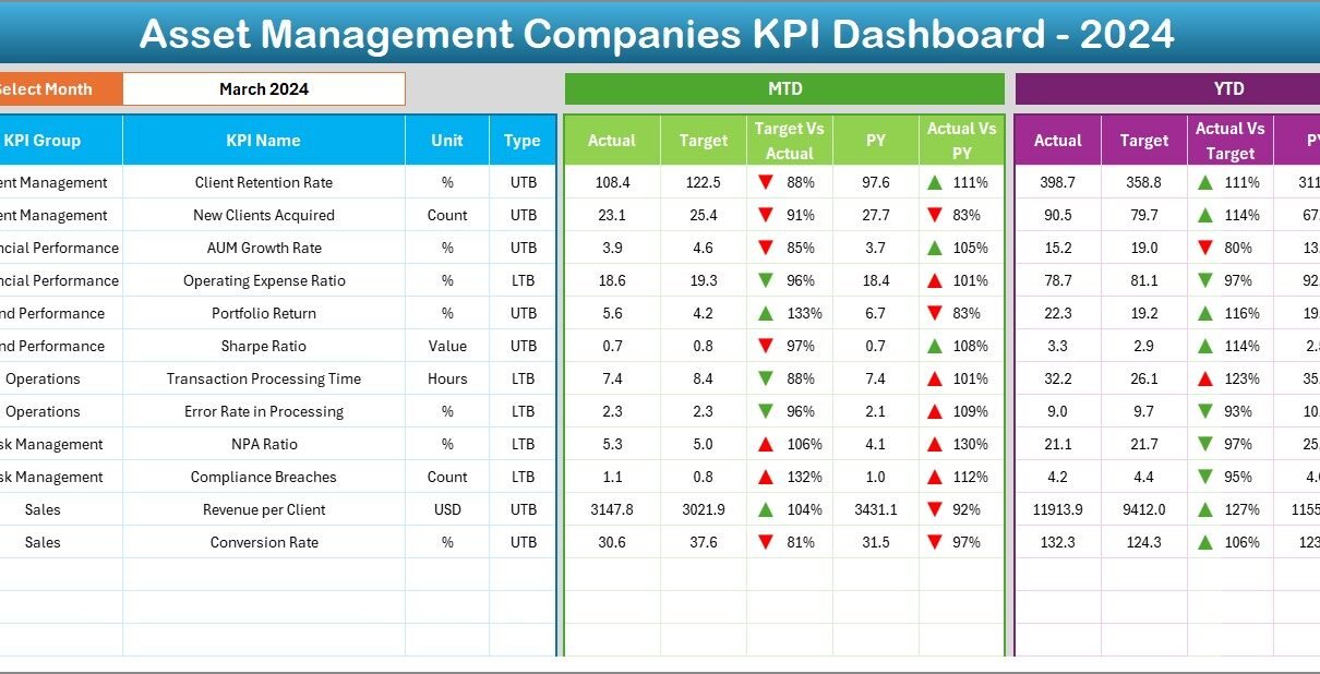
2. Dashboard Sheet – The Main Performance View
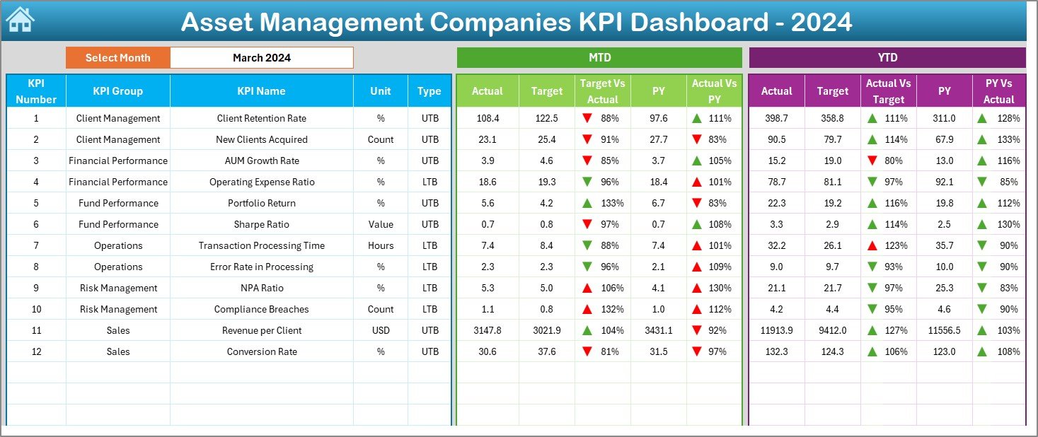
The Dashboard Sheet is the heart of the file. It presents MTD and YTD insights for every KPI in a clear and visual way. Users can select any month from the dropdown at cell D3, and the entire dashboard updates automatically.
MTD View Includes:
-
Actual MTD values
-
Target MTD values
-
Previous Year MTD data
-
Target vs Actual result
-
Current vs Previous Year MTD result
-
Red and green arrow icons showing performance direction
YTD View Includes:
-
Actual YTD values
-
Target YTD values
-
Previous Year YTD numbers
-
Target vs Actual percentage
-
Current vs Previous Year comparison
-
Conditional icons for performance
This sheet highlights the overall health of key KPIs. Asset managers can use this view to measure investment success, compliance adherence, operational quality, and revenue progress.
Click to Purchases Asset Management Companies KPI Dashboard in Excel
3. KPI Trend Sheet – Visual Movement of KPIs
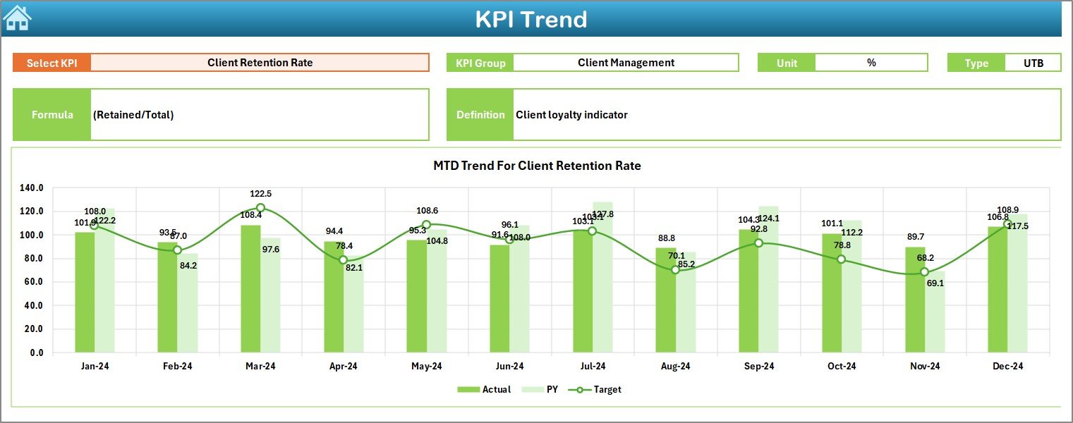
The KPI Trend Sheet helps users understand how performance shifts over time. Users select a KPI name from the dropdown in cell C3. The sheet then displays:
-
KPI Group
-
Unit of measurement
-
Type (LTB or UTB)
-
Formula
-
KPI definition
Along with this, the sheet includes two trend charts:
MTD Trend Chart
Shows the comparison between:
-
Actual MTD
-
Target MTD
-
Previous Year MTD
YTD Trend Chart
Shows the comparison between:
-
Actual YTD
-
Target YTD
-
Previous Year YTD
These trend charts reveal growth patterns, operational setbacks, market trends, and investment efficiency.
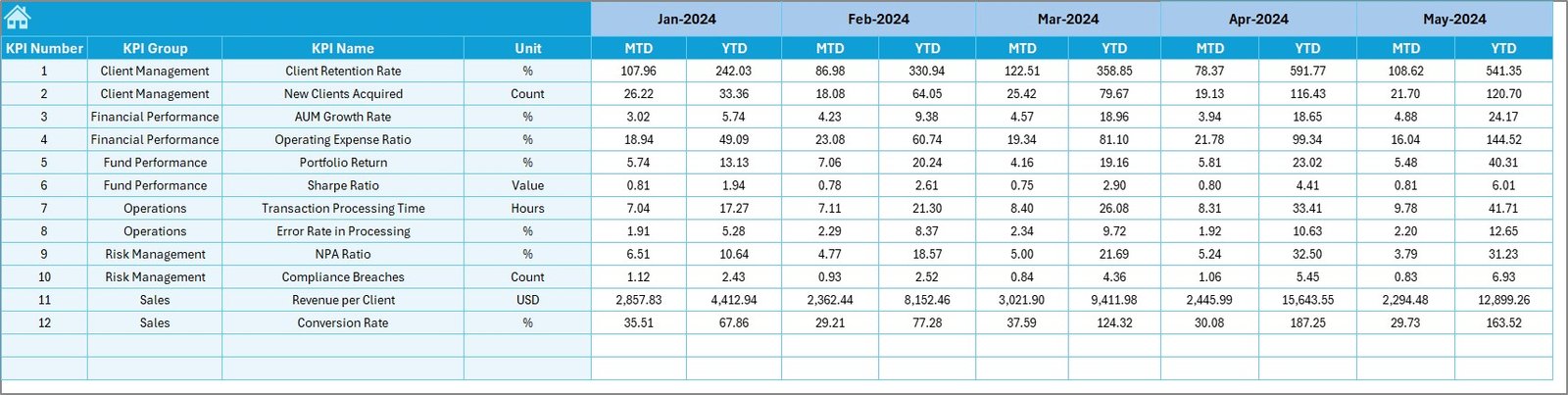
4. Actual Numbers Input Sheet – Enter Real Performance
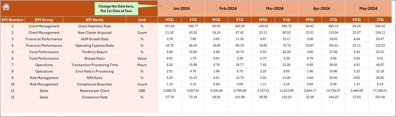
In this sheet, users update:
-
Actual MTD numbers
-
Actual YTD numbers
-
Month selection from cell E1
The dashboard reads all actual performance data from this sheet. Because the sheet uses simple columns and rows, teams can update monthly performance in minutes.
Click to Purchases Asset Management Companies KPI Dashboard in Excel
5. Target Sheet – Enter Monthly and Yearly Targets
Targets guide performance. The Target Sheet includes:
-
Each KPI name
-
MTD target
-
YTD target
-
Monthly breakdown
This sheet serves as the benchmark for the dashboard. All comparisons run through these target values.
6. Previous Year Number Sheet – For Historical Comparison
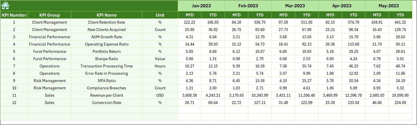
The Previous Year Sheet captures last year’s MTD and YTD readings for each KPI. Teams enter numbers exactly like they enter current year values.
Because historical comparison helps track growth, this sheet becomes important for investment performance reviews and strategy planning.
7. KPI Definition Sheet – The Foundation of Clarity
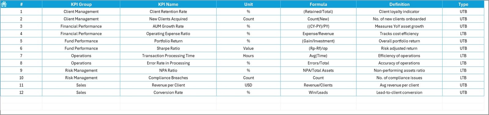
A strong dashboard needs clear KPI definitions. This sheet contains:
-
KPI Name
-
KPI Group
-
Unit
-
Formula
-
KPI Definition
-
Type (Lower the Better or Upper the Better)
When new team members join, this sheet helps them understand KPIs instantly.
Click to Purchases Asset Management Companies KPI Dashboard in Excel
Advantages of an Asset Management Companies KPI Dashboard in Excel
This dashboard offers many powerful advantages. Below are the most important ones.
1. Clear View of Financial and Operational Performance
Teams can monitor MTD and YTD numbers instantly. They understand how close they are to targets and how much they need to improve.
2. Quick Decision-Making
Arrow icons, percentage comparisons, and trend charts highlight which KPIs perform well and which need action. Managers can take decisions faster.
3. Centralized Reporting System
Instead of using multiple spreadsheets, the dashboard combines all metrics into one centralized file. That improves accuracy and eliminates duplication.
4. Easy Customization
Users can add new KPIs, change formulas, modify definitions, or update data without needing programming knowledge. Excel makes customization flexible.
5. Improved Portfolio and Client Management
When teams track KPIs regularly, they reduce risks, improve returns, and deliver better client experiences.
6. Increased Transparency Across Departments
Investment teams, operations teams, compliance teams, and managers use the same dashboard. This reduces confusion and boosts alignment.
7. Historical Trend Understanding
The KPI Trend sheet shows how KPIs perform over time. That helps teams predict growth, identify patterns, and plan future strategies.
Best Practices for Using the KPI Dashboard in Excel
To get maximum value from this dashboard, follow these best practices:
1. Update Data Monthly Without Delays
Accurate insights depend on timely updates. Update the Actual, Target, and Previous Year sheets every month.
2. Keep KPI Definitions Clear
Simple and precise definitions avoid confusion. Make sure all users understand what each KPI measures.
3. Validate Target Numbers Carefully
Targets should stay realistic and achievable. Teams should review targets annually to match business goals.
4. Train All Teams on Navigation
Because the dashboard uses multiple worksheets, training helps users navigate easily through Home → Dashboard → KPI Trend → Definitions.
5. Review Trends During Monthly Meetings
Trend charts show the real story behind numbers. Teams should review the KPI Trend sheet during monthly meetings.
6. Keep the Dashboard Consistent
Use the same format, formulas, and units across all KPIs. Consistency maintains dashboard integrity.
Conclusion
The Asset Management Companies KPI Dashboard in Excel helps teams track performance in a clear and organized way. It brings together actual values, target values, and historical values into one easy-to-read platform. With seven structured worksheets, trend charts, definitions, and comparison tools, the dashboard improves financial analysis, decision-making, and strategic planning.
Because the dashboard works in Excel, anyone can use it—no technical skills required. Whether you manage portfolios, compliance tasks, or operational processes, this dashboard supports better performance tracking and stronger financial outcomes.
Click to Purchases Asset Management Companies KPI Dashboard in Excel
Frequently Asked Questions (FAQs)
1. Who can use this KPI dashboard?
Investment managers, financial analysts, compliance teams, operations teams, and leadership teams can use it.
2. Can I add more KPIs?
Yes. You can add KPIs in the KPI Definition sheet and update targets and actual values accordingly.
3. Do I need advanced Excel skills?
No. The dashboard uses simple formulas and dropdowns, so beginners can use it easily.
4. How often should I update the data?
You should update data every month to keep the dashboard accurate and reliable.
5. Can we customize the dashboard layout?
Yes. You can change colors, charts, or KPI groups based on your company’s reporting needs.
Click to Purchases Asset Management Companies KPI Dashboard in Excel
Visit our YouTube channel to learn step-by-step video tutorials