The digital music industry has experienced massive growth over the last decade. Millions of users now listen to music, podcasts, and audio content through online streaming platforms every day. Services such as Spotify, Apple Music, YouTube Music, and Amazon Music have transformed how people consume audio content. Because of this rapid growth, companies must track large volumes of data related to streaming activity, revenue generation, user engagement, and content performance.
However, managing audio streaming data can quickly become difficult. Organizations often collect information from multiple sources including subscription systems, advertising platforms, licensing databases, and user engagement analytics tools. When businesses store this information in different spreadsheets or reports, decision-making becomes slow and complicated.
Click to Purchases Audio Streaming Services Dashboard in Power BI
Therefore, companies increasingly rely on interactive business intelligence dashboards to analyze their streaming data efficiently. One of the most powerful solutions for this purpose is the Audio Streaming Services Dashboard in Power BI.
The Audio Streaming Services Dashboard in Power BI is a ready-to-use analytics dashboard designed to help businesses monitor audio streaming performance through visual charts, KPIs, and interactive filters. Because Power BI processes data quickly and displays insights visually, businesses can easily identify trends, evaluate content performance, and make better strategic decisions.
In this article, you will learn everything about the Audio Streaming Services Dashboard in Power BI, including its structure, features, advantages, best practices, and frequently asked questions.
What Is an Audio Streaming Services Dashboard in Power BI?
An Audio Streaming Services Dashboard in Power BI is a business intelligence tool that analyzes streaming data using interactive visuals, charts, and key performance indicators.
The dashboard consolidates streaming data from multiple sources and presents it in a centralized view. As a result, decision-makers can monitor revenue, content performance, user engagement, and streaming trends without manually analyzing complex spreadsheets.
Typically, the dashboard tracks key metrics such as:
-
Total revenue generated from streaming
-
Advertising revenue
-
Subscription revenue
-
User ratings
-
Licensing costs
-
Total streams
-
Content performance by genre
-
Platform performance
-
Monthly streaming trends
Because Power BI automatically refreshes data and updates visualizations, the dashboard provides real-time insights into streaming service performance.
Why Do Audio Streaming Businesses Need a Power BI Dashboard?
Audio streaming platforms generate enormous amounts of data every day. For example, platforms track millions of user streams, subscription payments, advertising impressions, and content interactions.
Without a structured dashboard, analyzing this data becomes overwhelming. However, a Power BI dashboard simplifies this process in several ways.
Centralized Data Monitoring
First, the dashboard collects data from multiple sources and displays it in a single location. Therefore, teams can analyze performance quickly.
Faster Decision Making
Next, visual charts and KPI cards highlight important trends immediately. As a result, managers can make faster strategic decisions.
Improved Content Strategy
In addition, content performance analysis helps streaming companies identify which genres or audio formats perform best.
Better Revenue Tracking
Moreover, businesses can analyze both advertising revenue and subscription revenue across platforms.
Enhanced User Engagement Insights
Finally, listener engagement metrics reveal how users interact with content, which helps improve user experience.
Key Features of the Audio Streaming Services Dashboard in Power BI
The Audio Streaming Services Dashboard in Power BI includes five analytical pages. Each page focuses on a specific aspect of streaming performance. Therefore, users can easily explore detailed insights across different areas.
Click to Purchases Audio Streaming Services Dashboard in Power BI
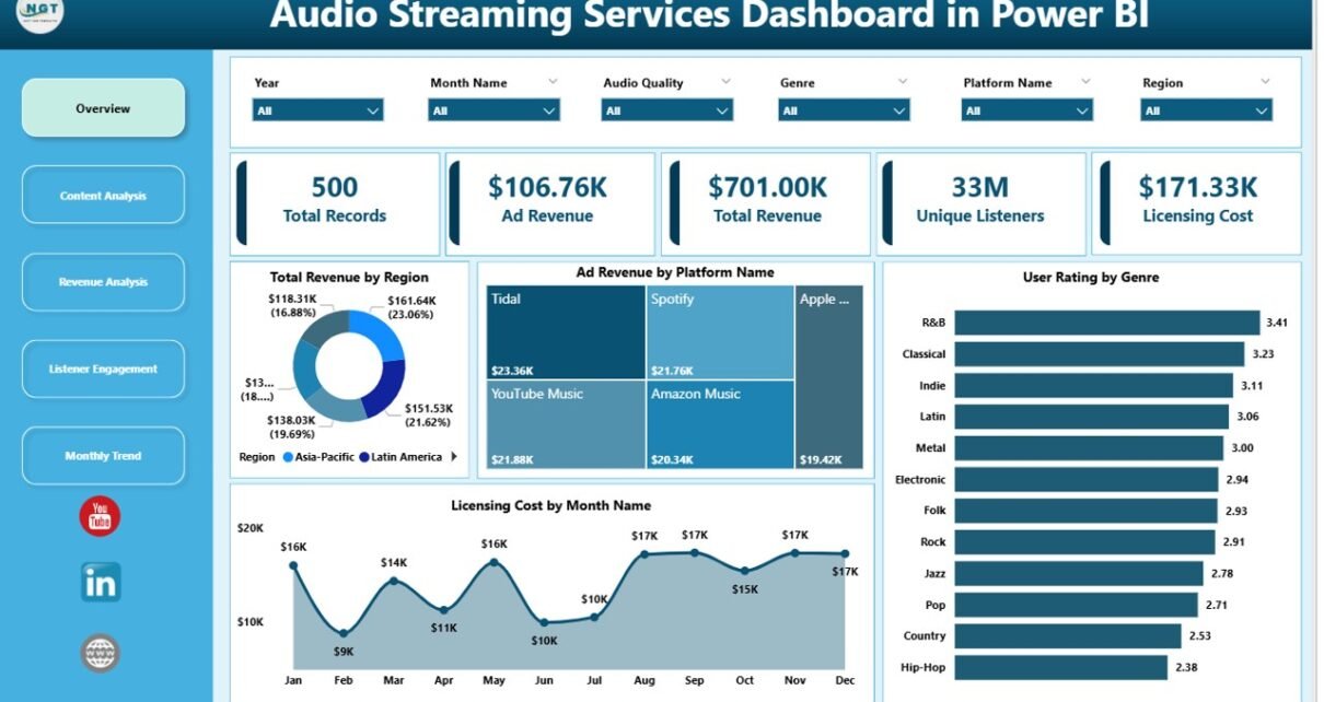
1. Overview Page
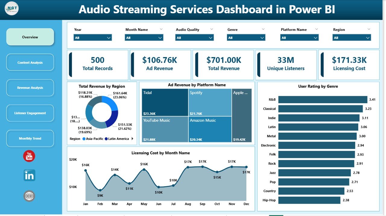
The Overview Page acts as the main dashboard where users get a quick summary of overall streaming performance.
This page contains slicers that allow users to filter data easily. Because filters update charts instantly, users can quickly analyze specific segments.
The page also includes several important KPI cards and charts:
-
Total Revenue by Region
-
Ad Revenue by Platform Name
-
User Rating by Genre
-
Licensing Cost by Month Name
These visuals help decision-makers understand overall revenue distribution, platform performance, and content popularity.
For example, managers can quickly identify which region generates the highest revenue or which genre receives the best user ratings.
2. Content Analysis Page
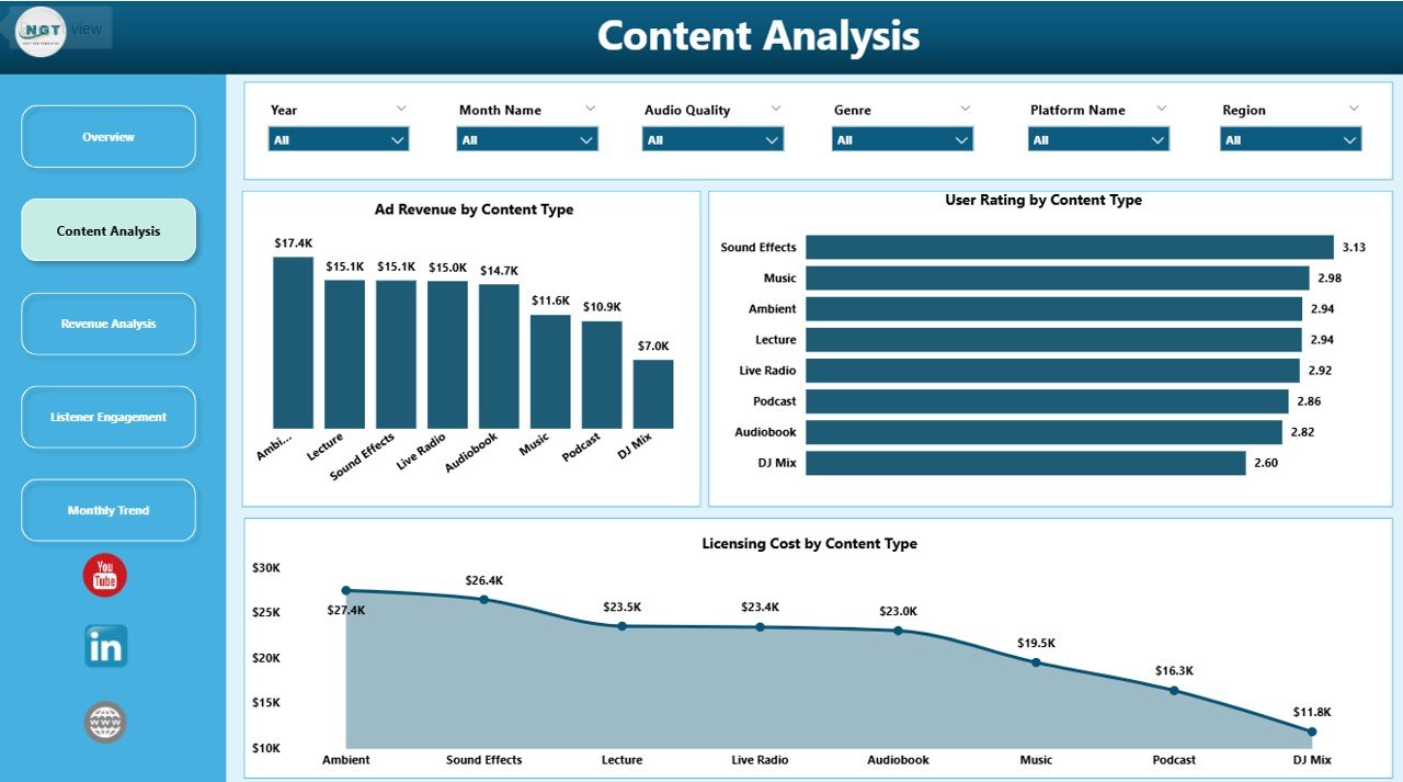
The Content Analysis Page focuses on how different types of audio content perform on the streaming platform.
This page also includes slicers to filter data based on content type or other parameters.
The charts included on this page are:
-
Ad Revenue by Content Type
-
User Rating by Content Type
-
Licensing Cost by Content Type
These visuals allow businesses to evaluate how different content categories perform financially and how listeners respond to them.
For instance, a company might discover that podcasts generate higher advertising revenue than music content. Similarly, user ratings may reveal that certain genres attract more listener engagement.
Therefore, businesses can refine their content acquisition and licensing strategies.
3. Revenue Analysis Page
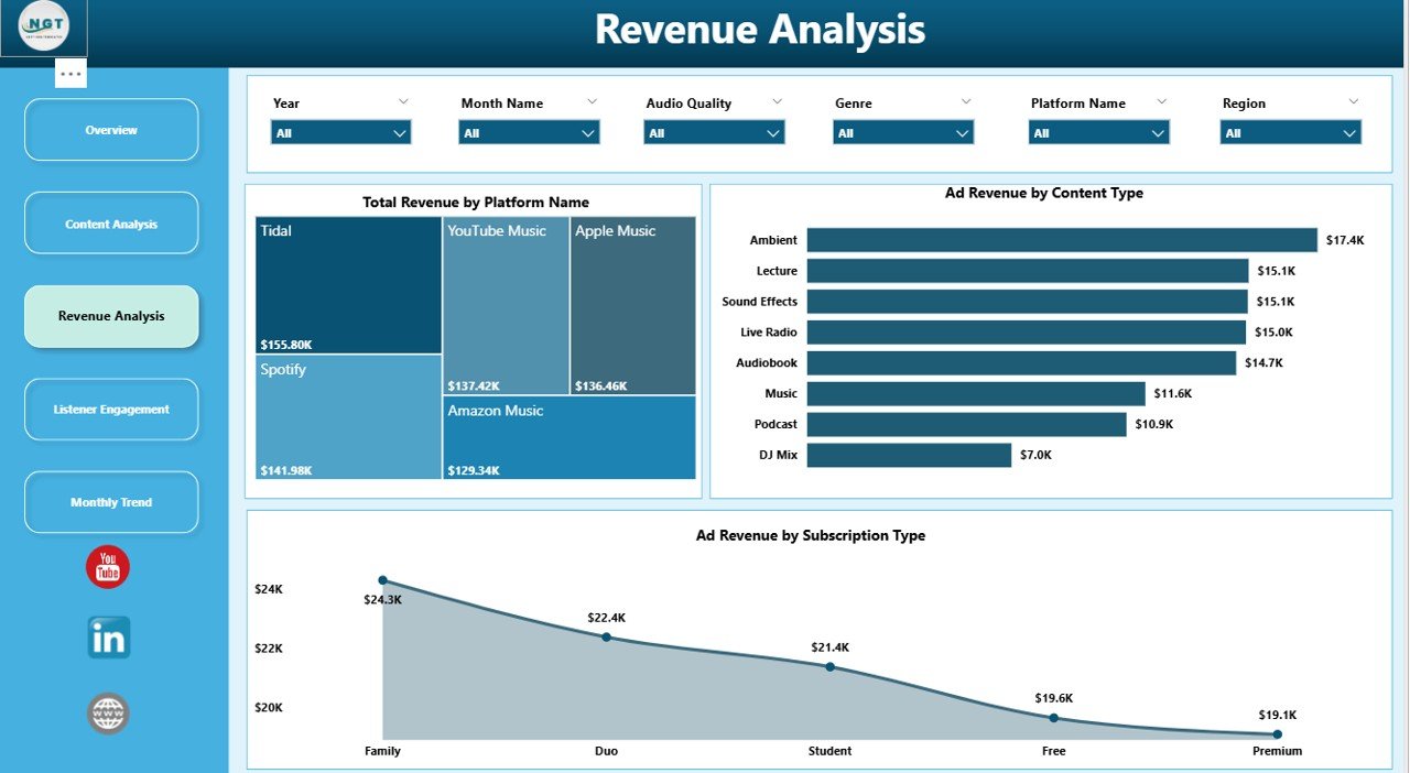
The Revenue Analysis Page provides deeper insights into how streaming services generate income.
This page contains charts that analyze revenue distribution across platforms and subscription types.
The charts include:
-
Total Revenue by Platform Name
-
Ad Revenue by Platform Name
-
Ad Revenue by Subscription Type
These visuals help organizations identify which platforms generate the most revenue and how different subscription models impact earnings.
For example, managers may find that premium subscriptions generate higher overall revenue, while free users contribute mainly through advertisements.
Consequently, businesses can adjust their pricing strategies and advertising models accordingly.
Click to Purchases Audio Streaming Services Dashboard in Power BI
4. Listener Engagement Page
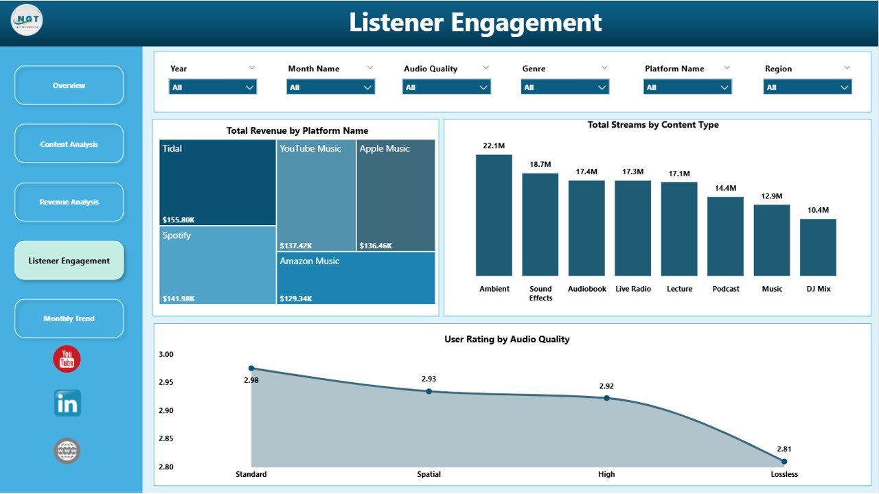
The Listener Engagement Page focuses on how users interact with audio content.
Understanding listener behavior plays a critical role in improving streaming services.
This page includes the following charts:
-
Total Revenue by Platform Name
-
Total Streams by Content Type
-
User Rating by Audio Quality
These visuals provide valuable insights into listener preferences.
For example, businesses can determine which content types attract the highest number of streams. Additionally, user ratings based on audio quality reveal whether streaming quality impacts listener satisfaction.
As a result, companies can optimize streaming infrastructure and improve user experience.
5. Month Analysis Page
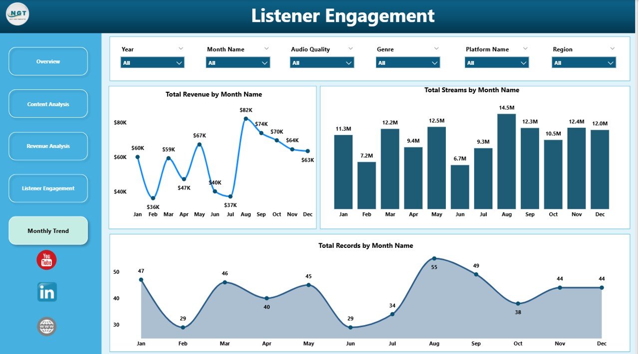
The Month Analysis Page focuses on time-based trends in streaming performance.
Seasonal listening patterns often influence streaming activity. Therefore, analyzing monthly trends helps companies plan marketing campaigns and content releases.
This page includes the following charts:
-
Total Revenue by Month
-
Total Streams by Month
-
Total Records by Month
These insights help companies identify peak streaming months and revenue fluctuations.
For instance, streaming activity may increase during holidays or special events. Consequently, businesses can align marketing campaigns with these trends.
Advantages of Audio Streaming Services Dashboard in Power BI
Using a Power BI dashboard for streaming analytics offers several advantages.
1. Real-Time Data Analysis
Power BI updates data automatically. Therefore, users can monitor streaming performance in real time.
2. Clear Data Visualization
Charts and visuals make complex data easier to understand. As a result, managers can identify trends quickly.
3. Better Revenue Tracking
The dashboard separates different revenue sources such as advertising and subscriptions. Therefore, businesses can analyze profitability more accurately.
4. Improved Content Strategy
Content analysis helps companies understand which genres or formats perform best.
Consequently, businesses can focus on producing and promoting popular content.
5. Faster Business Decisions
Because insights appear visually, decision-makers can act quickly.
This leads to faster improvements in pricing strategies, marketing campaigns, and content investments.
Click to Purchases Audio Streaming Services Dashboard in Power BI
Opportunities for Improvement in the Audio Streaming Dashboard
Although the dashboard provides powerful insights, businesses can enhance it further.
Integration with Real-Time Streaming Data
Connecting the dashboard to real-time APIs can improve monitoring capabilities.
Advanced Predictive Analytics
Machine learning models can forecast future streaming trends.
User Segmentation Analysis
Segmenting users based on demographics, location, or listening habits can reveal deeper insights.
Personalized Content Insights
Analyzing personalized recommendations can help improve user engagement.
Best Practices for the Audio Streaming Services Dashboard in Power BI
To maximize the value of the dashboard, organizations should follow several best practices.
1. Use Clean and Structured Data
Clean data ensures accurate analytics. Therefore, organizations should validate data regularly.
2. Focus on Key Performance Indicators
Too many metrics can overwhelm users. Instead, focus on the most important KPIs.
3. Use Interactive Filters
Slicers allow users to analyze specific segments of data quickly.
Therefore, businesses should include filters for region, content type, platform, and subscription type.
4. Monitor Data Regularly
Regular analysis helps identify trends early.
As a result, businesses can react quickly to changes in streaming performance.
5. Optimize Dashboard Layout
Clear layouts improve usability.
Therefore, important KPIs should appear at the top of the dashboard.
How Does Power BI Improve Audio Streaming Analytics?
Power BI enhances streaming analytics in several ways.
Interactive Data Exploration
Users can click on visuals to explore deeper insights.
Automated Data Refresh
Power BI refreshes data automatically, which ensures reports remain updated.
Multi-Source Data Integration
The dashboard can connect to various data sources such as databases, APIs, and spreadsheets.
Advanced Visualization Tools
Power BI provides numerous chart types that improve data storytelling.
Secure Data Sharing
Organizations can share dashboards securely across teams and departments.
Who Can Benefit from the Audio Streaming Dashboard?
Several professionals benefit from using this dashboard.
Streaming Platform Managers
Managers can track platform performance and optimize business strategies.
Content Managers
Content managers can analyze which genres perform best.
Marketing Teams
Marketing professionals can track listener engagement and campaign performance.
Data Analysts
Analysts can explore streaming trends and identify growth opportunities.
Executives and Decision Makers
Executives can monitor high-level KPIs and make strategic decisions quickly.
Conclusion
The Audio Streaming Services Dashboard in Power BI provides a powerful solution for analyzing streaming platform performance. Because the audio streaming industry generates enormous amounts of data, businesses require advanced tools to transform raw information into actionable insights.
This dashboard simplifies data analysis by organizing streaming data into interactive visual reports. Through its five analytical pages—Overview, Content Analysis, Revenue Analysis, Listener Engagement, and Month Analysis—organizations can monitor revenue trends, evaluate content performance, and analyze listener behavior.
Moreover, Power BI enables real-time data updates, advanced visualizations, and seamless data integration. Therefore, companies can make faster decisions, improve content strategies, and optimize revenue models.
As the audio streaming industry continues to grow, businesses that use data-driven dashboards will gain a competitive advantage. By leveraging the Audio Streaming Services Dashboard in Power BI, organizations can transform complex streaming data into meaningful insights and achieve better business outcomes.
Click to Purchases Audio Streaming Services Dashboard in Power BI
Frequently Asked Questions (FAQs)
What is an Audio Streaming Services Dashboard in Power BI?
An Audio Streaming Services Dashboard in Power BI is a business intelligence dashboard that analyzes streaming data such as revenue, streams, content performance, and user engagement using interactive charts and KPIs.
What metrics can this dashboard track?
The dashboard can track metrics such as total revenue, ad revenue, total streams, licensing costs, user ratings, platform performance, and monthly trends.
Why should streaming platforms use Power BI dashboards?
Power BI dashboards provide clear data visualization, real-time analytics, and centralized reporting, which helps businesses make faster and better decisions.
Can this dashboard integrate with other data sources?
Yes. Power BI can connect with multiple data sources such as Excel files, databases, APIs, and cloud services.
Visit our YouTube channel to learn step-by-step video tutorials