In today’s data-driven world, businesses generate massive volumes of information every single day. However, when teams rely on manual analysis and scattered reports, they often miss valuable insights. As a result, decision-making becomes slow and inefficient.
So, how can organizations turn raw data into intelligent insights quickly and accurately?
👉 The answer is the Augmented Analytics Dashboard in Power BI.
Click to buy Augmented Analytics Dashboard in Power BI
This powerful and interactive dashboard uses advanced analytics capabilities to automate insights, improve accuracy, and enhance decision-making. Moreover, it transforms complex datasets into clear visualizations. Therefore, businesses can act faster and stay ahead of the competition.
What is an Augmented Analytics Dashboard in Power BI?
An Augmented Analytics Dashboard in Power BI is a smart reporting tool that combines artificial intelligence (AI), machine learning, and business intelligence.
Instead of manually analyzing data, users can:
- Automatically generate insights
- Detect patterns and trends
- Improve forecasting accuracy
- Monitor performance in real time
In addition, this dashboard simplifies complex data into easy-to-understand visuals. As a result, both technical and non-technical users can make informed decisions.
Why Should You Use an Augmented Analytics Dashboard?
Businesses need faster and smarter insights. However, traditional dashboards only show historical data.
On the other hand, augmented analytics dashboards:
- Predict future trends
- Highlight hidden patterns
- Provide automated recommendations
Therefore, they help organizations move from reactive decision-making to proactive strategy.
Key Features of the Augmented Analytics Dashboard in Power BI
This dashboard includes 5 powerful and interactive pages, each designed to deliver deep insights.
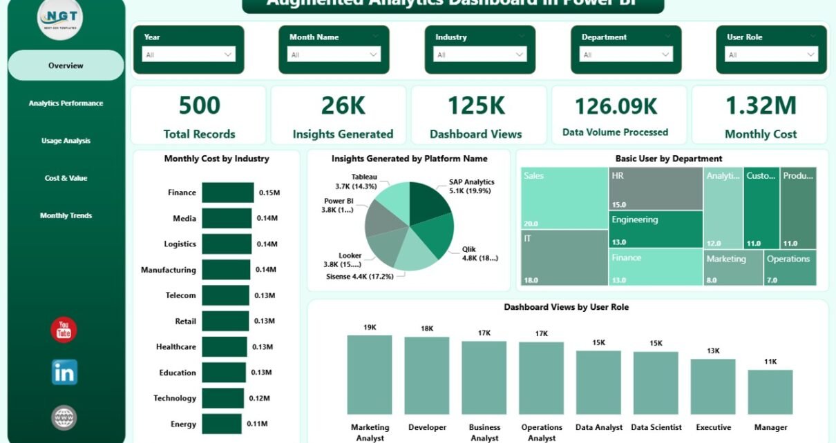
Overview Page – Quick Business Snapshot
This page provides a high-level summary of all key metrics.
KPI Cards:
- Total Records
- Insights Generated
- Dashboard Views
- Data Volume Processed
- Monthly Cost
Charts:
- Monthly Cost by Industry
- Insights Generated by Platform Name
- Basic Users by Department
- Dashboard Views by User Role
As a result, users can quickly understand overall performance at a glance.

Click to buy Augmented Analytics Dashboard in Power BI
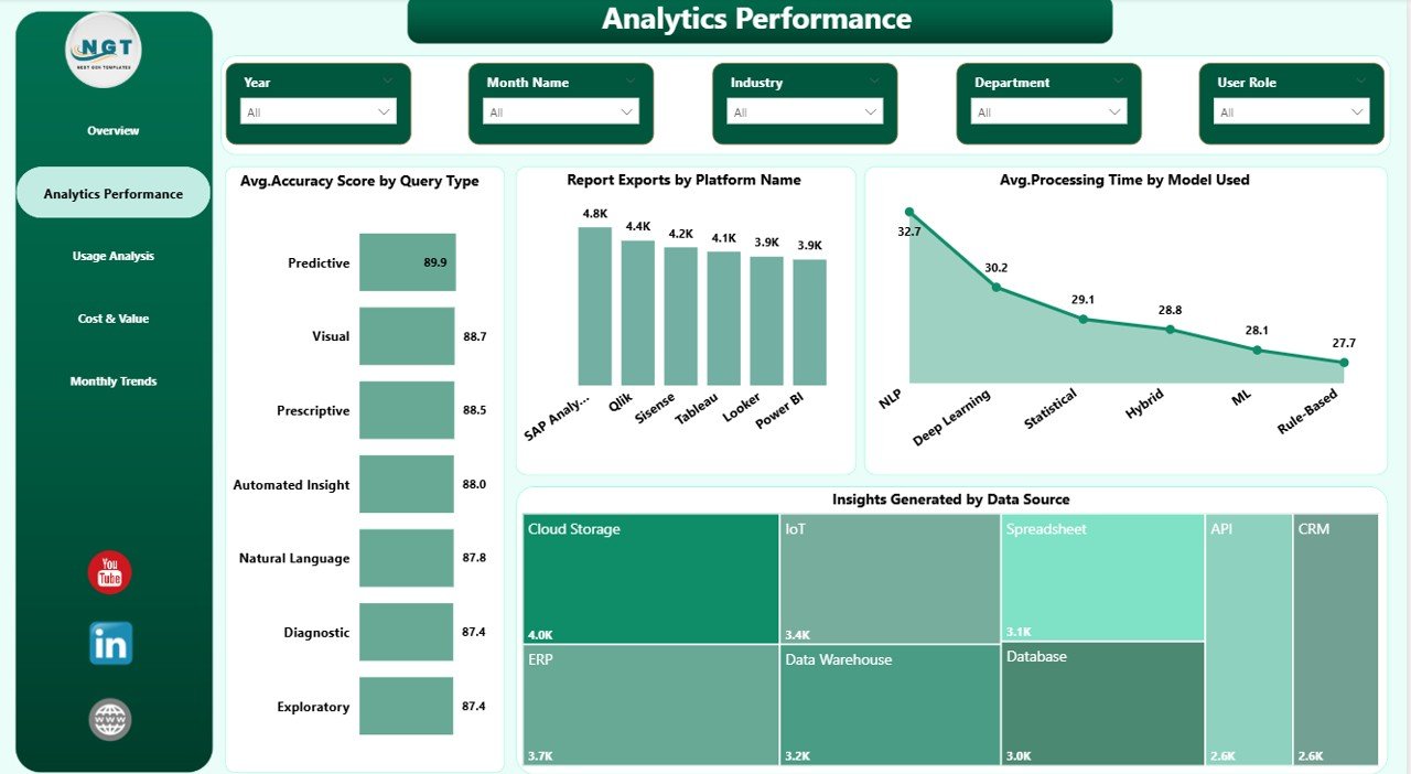
Analytics Performance – How Efficient is Your System?
This page focuses on performance and efficiency metrics.
Charts:
- Average Accuracy Score by Query Type
- Report Exports by Platform Name
- Average Processing Time by Model Used
- Insights Generated by Data Source
Therefore, organizations can evaluate how well their analytics systems perform.
Click to buy Augmented Analytics Dashboard in Power BI
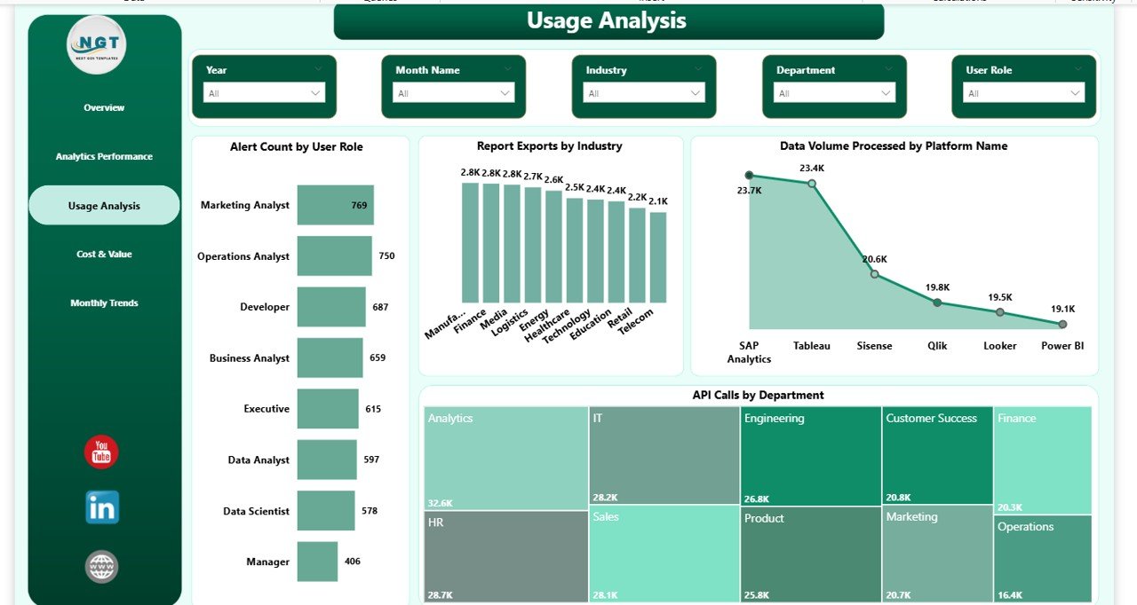
Usage Analysis – How Are Users Interacting?
This section highlights user engagement and system usage.
Charts:
- Alert Count by User Role
- Report Exports by Industry
- Data Volume Processed by Platform Name
- API Calls by Department
Consequently, businesses can understand user behavior and optimize resource usage.
Click to buy Augmented Analytics Dashboard in Power BI
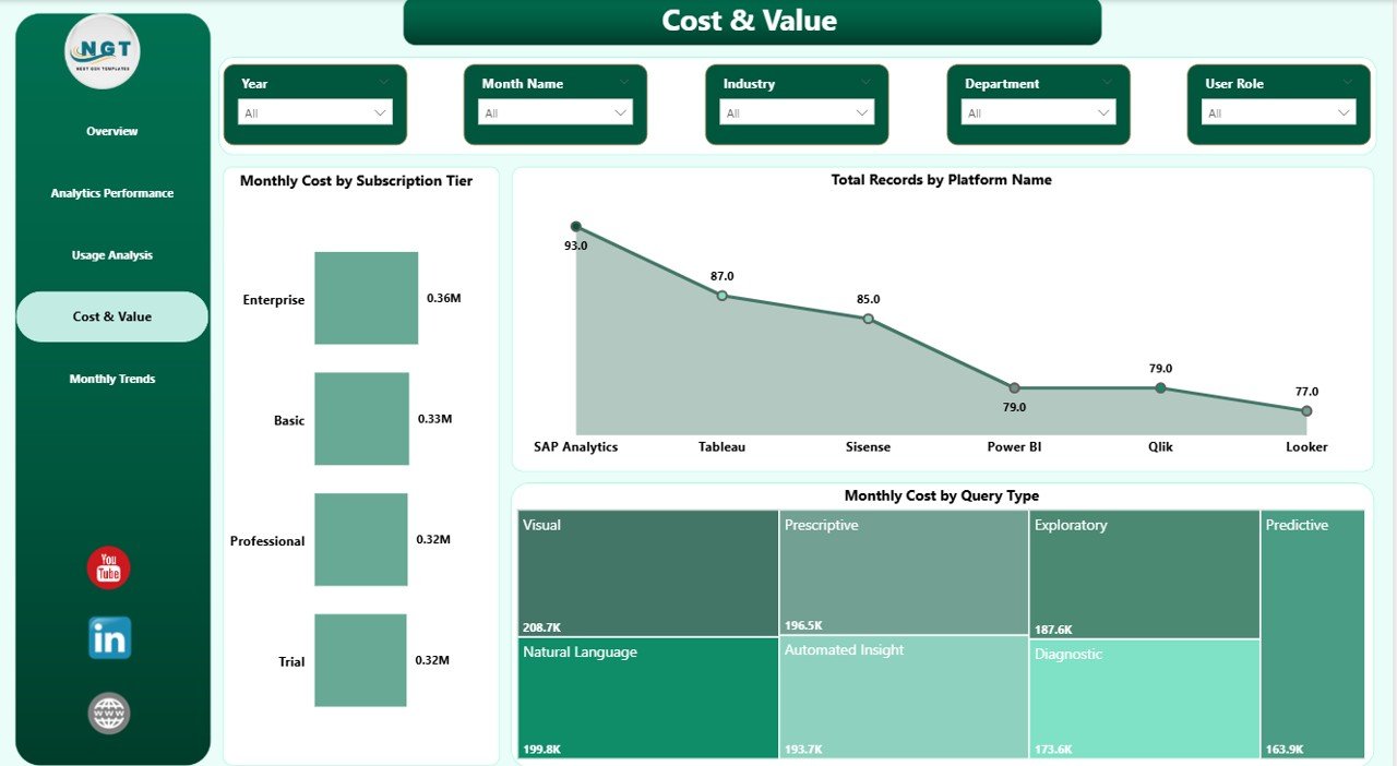
Cost & Value – Are You Getting ROI?
This page focuses on cost efficiency and value generation.
Charts:
- Monthly Cost by Subscription Tier
- Total Records by Platform
- Monthly Cost by Query Type
Hence, decision-makers can track spending and maximize return on investment.
Click to buy Augmented Analytics Dashboard in Power BI
Monthly Trend – How is Performance Changing Over Time?
This page helps track trends and patterns over time.
Charts:
- Monthly Cost by Month
- Total Records by Month
- Enterprise Users by Month
As a result, users can identify growth trends and seasonal patterns.

Click to buy Augmented Analytics Dashboard in Power BI
Advantages of Augmented Analytics Dashboard in Power BI
Using this dashboard provides several powerful benefits:
Faster Decision-Making
- Generates insights automatically
- Reduces manual effort
- Speeds up analysis
Improved Accuracy
- Uses AI-driven models
- Minimizes human errors
- Enhances prediction quality
Better Data Visibility
- Centralizes all data in one place
- Provides clear visual insights
- Improves transparency
Cost Optimization
- Tracks expenses effectively
- Identifies unnecessary costs
- Improves ROI
Enhanced User Experience
- Interactive dashboards
- Easy navigation
- Real-time updates
Best Practices for the Augmented Analytics Dashboard in Power BI
To get the most value from your dashboard, follow these best practices:
Keep Data Clean and Structured
- Use consistent formats
- Remove duplicates
- Validate data regularly
Focus on Key KPIs
- Track only important metrics
- Avoid clutter
- Highlight actionable insights
Use Interactive Filters (Slicers)
- Allow users to explore data
- Improve usability
- Enable dynamic analysis
Optimize Performance
- Reduce unnecessary visuals
- Use efficient data models
- Improve loading speed
Update Data Regularly
- Maintain real-time accuracy
- Schedule data refresh
- Ensure up-to-date insights
Who Can Benefit from This Dashboard?
This dashboard suits a wide range of professionals:
- Data Analysts
- Business Intelligence Teams
- IT Managers
- Data Scientists
- Executives and Decision-Makers
Moreover, industries like finance, healthcare, retail, and technology can benefit significantly.
How to Use the Augmented Analytics Dashboard?
Using this dashboard is simple and efficient:
- Import your dataset into Power BI
- Connect data sources
- Use slicers to filter data
- Analyze KPI cards and charts
- Identify trends and insights
As a result, you can make data-driven decisions quickly.
Future of Augmented Analytics in Power BI
Augmented analytics continues to evolve rapidly. In the future:
- AI models will become more accurate
- Automation will increase
- Real-time insights will improve
Therefore, businesses that adopt augmented analytics early will gain a strong competitive advantage.
Conclusion
The Augmented Analytics Dashboard in Power BI transforms how organizations analyze and use data. Instead of relying on manual reporting, businesses can now leverage AI-driven insights to improve performance, reduce costs, and make smarter decisions.
Moreover, with its interactive design and powerful features, this dashboard enables users to understand data quickly and act confidently.
If you want to unlock the full potential of your data, this dashboard is the perfect solution.
Frequently Asked Questions (FAQs)
1. What is augmented analytics in Power BI?
Augmented analytics uses AI and machine learning to automate data analysis and generate insights in Power BI.
2. Who should use this dashboard?
Data analysts, business managers, and decision-makers can use this dashboard to improve performance and insights.
3. Can beginners use this dashboard?
Yes, the dashboard offers an easy-to-use interface, so beginners can quickly understand and use it.
4. Does this dashboard support real-time data?
Yes, you can connect live data sources and get real-time insights.
5. How does it improve decision-making?
It provides automated insights, trend analysis, and predictive capabilities, which help users make faster and smarter decisions.
6. Is it customizable?
Yes, you can modify KPIs, charts, and filters based on your business needs.
Visit our YouTube channel to learn step-by-step video tutorials
Click to buy Augmented Analytics Dashboard in Power BI