Building Automation Dashboard in Excel is one of the most practical solutions for facility managers, building engineers, and operations teams who need to monitor building performance data in a structured and visual format. Modern buildings generate massive amounts of operational data from HVAC systems, lighting controls, security systems, and energy meters. Without a centralized monitoring system, it becomes nearly impossible to track performance, identify issues, and optimize building operations.
This comprehensive Building Automation Dashboard in Excel transforms raw building automation data into interactive visual insights. It includes 5 dedicated analysis pages covering energy consumption, alert management, maintenance costs, comfort scores, and occupancy analysis — all powered by Excel pivot tables and dynamic slicers.Building Automation Dashboard in Excel
Click here to Purchase Building Automation Dashboard in Excel
Key Features of Building Automation Dashboard in Excel
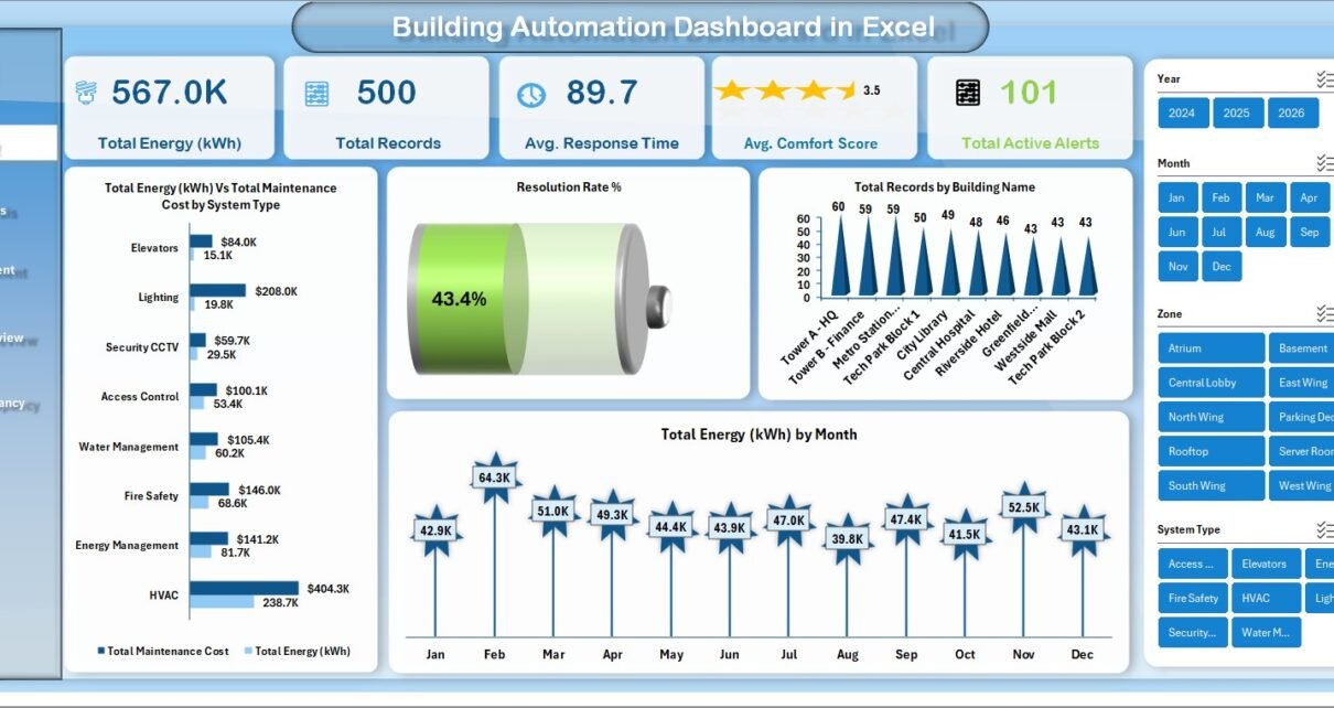
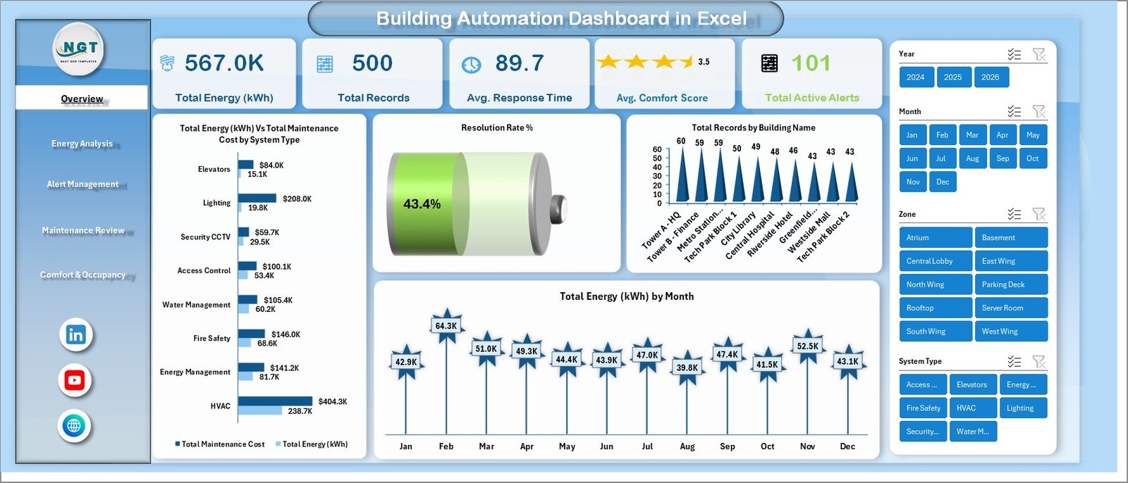
The Building Automation Dashboard in Excel is designed to provide comprehensive building performance monitoring through interactive charts, KPI cards, and dynamic slicers. This template includes 5 interactive dashboard pages, 7 structured worksheets, and tracks key building metrics including Total Energy (kWh), Total Records, Average Response Time, Average Comfort Score, and Total Active Alerts.Building Automation Dashboard in Excel
One of the standout features is the multi-page dashboard design. Each page focuses on a specific area of building automation: the Overview page provides a high-level summary with KPI cards and multiple charts, the Energy Analysis page breaks down energy consumption by system type, building, floor, and year, the Alert Management page tracks alerts by priority, type, and resolution status, the Maintenance Review page analyzes costs by system, month, and zone, and the Comfort & Occupancy page monitors comfort scores across buildings, zones, and system types.Building Automation Dashboard in Excel
The dashboard uses dynamic slicers and filters that let you instantly switch between buildings, systems, zones, months, and priority levels. Every chart and visualization updates automatically based on your filter selections, making analysis fast and interactive.
All charts and analysis are powered by pivot tables stored in a dedicated Support sheet. This means you simply need to update your data and click Refresh All to update the entire dashboard — no manual chart updates needed.
If you are looking for more building automation analytics, you can also explore the Building Automation KPI Dashboard in Power BI which provides KPI target tracking with MTD/YTD comparisons and trend analysis.
Dashboard Pages Explained
1. Overview Page
The Overview page serves as the main dashboard landing page. It displays high-level information through KPI cards at the top showing Total Energy (kWh), Total Records, Avg. Response Time, Avg. Comfort Score, and Total Active Alerts. Below the cards, several charts provide visual analysis including Total Energy (kWh) by Total Maintenance Cost, Resolution Rate %, Total Records by Building Name, and Total Energy (kWh) by Month. Multiple slicers allow you to filter the entire dashboard quickly.
Building Automation Dashboard in Excel2. Energy Analysis
The Energy Analysis page provides detailed breakdowns of energy consumption across different dimensions. It includes charts for Total Runtime Hours by System Type, Total Energy (kWh) by Year, Total Energy (kWh) by Total Maintenance Cost by Floor, and Total Energy (kWh) by Building Name. This helps energy managers identify which systems and buildings consume the most energy and where optimization is needed.
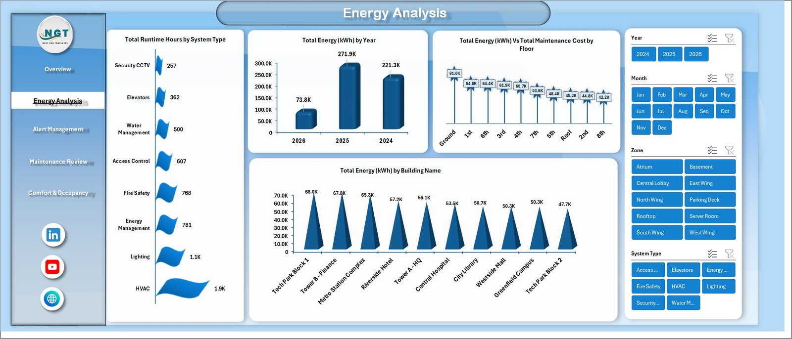 Energy Analysis
3. Alert Management
The Alert Management page tracks building alerts and response performance. It shows Total Records by Total Active Alerts by Priority, Total Records by Alert Type, Avg. Response Time (min) by Alert Category, and Total Records by Status. This page helps maintenance teams understand which alerts require immediate attention and how quickly issues are being resolved.
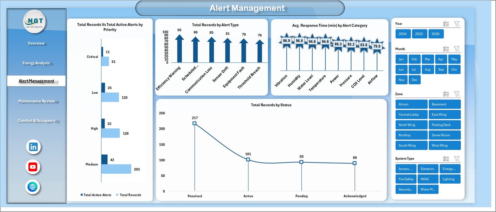 Alert Management
4. Maintenance Review
The Maintenance Review page focuses on cost analysis. It displays Total Maintenance Cost by System Type, Total Maintenance Cost by Month, and Total Maintenance Cost by Zone. Facility managers can use this page to identify which systems and zones are driving the highest maintenance expenses and plan budgets accordingly.
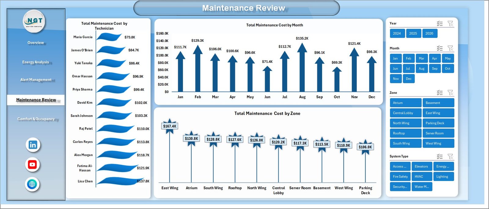 Maintenance Review
5. Comfort & Occupancy
The Comfort & Occupancy page monitors how building automation affects occupant satisfaction. It shows Avg. Comfort Score by Building Name, Avg. Comfort Score by Zone, and Avg. Comfort Score by System Type. This helps operations teams ensure comfortable environments while optimizing energy usage.
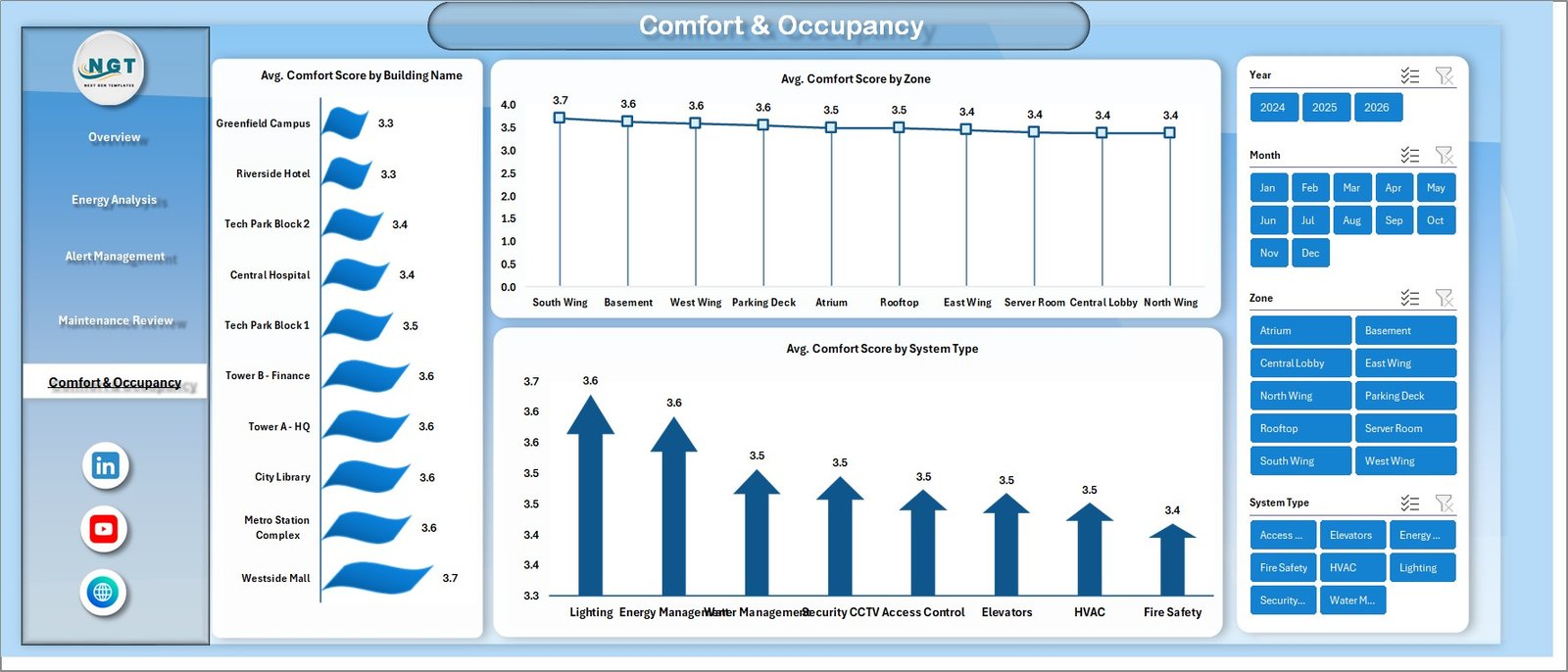 Comfort & Occupancy
6. Data Sheet
This is the main data sheet where you enter your building automation records. All dashboard pages pull data from this sheet. Simply add your records in the same structured format as the sample data provided.
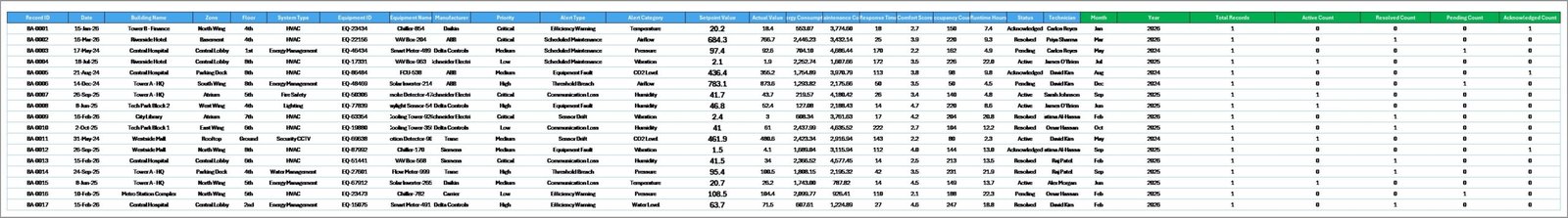 Data Sheet Tab
7. Support Sheet
The Support sheet contains all the pivot tables that power the entire dashboard. After updating data in the Data Sheet, go to the Data tab in the Excel Ribbon and click Refresh All. All pivot tables will refresh and all charts across all 5 dashboard pages will update automatically. You can keep this sheet hidden during normal use.
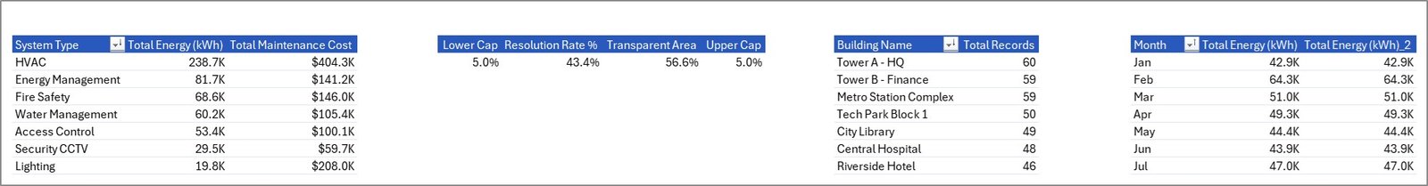 Support Sheet Tab
Advantages of the Building Automation Dashboard in Excel
- Centralized Monitoring — Track energy, alerts, maintenance, and comfort metrics from a single Excel file instead of scattered reports
- No Additional Software Required — Runs entirely in Microsoft Excel, making it accessible for teams without Power BI or other BI tools
- Automatic Updates — Pivot tables refresh all charts and visualizations with a single click
- Multi-Building Support — Compare performance across multiple buildings and zones using slicers
- Cost-Effective — Get professional-grade building analytics without expensive facility management software licenses
- Easy Data Entry — Structured Data Sheet format makes it simple to add and maintain building records
Opportunities for Improvement
- Adding automated data import from building management systems (BMS) via CSV or API connections would reduce manual data entry
- Including a weather data correlation page could help analyze energy consumption patterns relative to outdoor temperature
- A predictive maintenance section using historical alert data trends could help teams anticipate equipment failures
- Adding an executive summary page with email-ready reports would make it easier to share insights with stakeholders
Best Practices for Using This Dashboard
- Update Data Regularly — Enter building automation data weekly or monthly for the most accurate trend analysis
- Use Consistent Naming — Keep building names, system types, and zone names consistent across all entries for proper grouping in pivot tables
- Refresh After Every Update — Always click Data > Refresh All after adding new records to ensure all charts are current
- Hide the Support Sheet — Keep the Support sheet hidden to prevent accidental edits to pivot table configurations
- Use Slicers Strategically — Clear all slicer filters before sharing the dashboard to show the complete picture
- Compare With the Power BI Version — For KPI target tracking and advanced trend analysis, use this dashboard alongside the Building Automation KPI Dashboard in Power BI
Explore Relevant Templates
If you are looking for more building and infrastructure dashboards, explore these related templates on NextGenTemplates.com:
- Building Automation KPI Dashboard in Power BI — Track building KPIs with target comparisons and trend analysis
- Water Desalination KPI Dashboard in Excel — Monitor water plant performance and operational KPIs
- Recycling Infrastructure KPI Dashboard in Excel — Track recycling performance and sustainability metrics
You can also browse the full collection of Excel Dashboard Templates available on NextGenTemplates.com.
Frequently Asked Questions
What is the best Excel template for tracking building automation performance?
The Building Automation Dashboard in Excel is one of the best templates for tracking building automation performance. It includes 5 interactive dashboard pages covering energy consumption, alert management, maintenance costs, comfort scores, and occupancy insights. All charts update automatically using pivot tables when you refresh the data source.
How do I use a building automation dashboard in Excel?
Simply open the Excel file, enter your building automation data in the Data Sheet tab following the structured format provided, then go to the Data tab in the Excel Ribbon and click Refresh All. All pivot tables and charts across all 5 dashboard pages will update automatically. Use the slicers on each page to filter by building, system type, zone, or month.
Can I track multiple buildings in this dashboard?
Yes. The Building Automation Dashboard in Excel is designed to track and compare performance across multiple buildings. Add records for different buildings in the Data Sheet, and use the Building Name slicer on each dashboard page to filter and compare performance between buildings.
Do I need VBA or macros to use this building automation dashboard?
No. This dashboard does not use VBA or macros. It is entirely powered by Excel pivot tables, charts, and slicers. This makes it compatible with all modern versions of Microsoft Excel (2016 and later) without requiring macro-enabled settings.
What metrics does the Building Automation Dashboard in Excel track?
The dashboard tracks 5 primary metrics: Total Energy (kWh), Total Records, Average Response Time, Average Comfort Score, and Total Active Alerts. It analyzes these across multiple dimensions including building name, system type, zone, floor, month, priority level, and alert category.
How is the Excel version different from the Power BI version?
The Excel version provides pivot-based analysis with 5 dashboard pages focused on energy, alerts, maintenance, comfort, and occupancy. The Power BI version focuses on KPI target tracking with Month-to-Date and Year-to-Date comparisons, trend analysis, and performance indicators. Both templates complement each other for comprehensive building monitoring.
Conclusion
The Building Automation Dashboard in Excel is a practical, ready-to-use analytics template that helps facility managers and building operations teams monitor energy consumption, track alerts, analyze maintenance costs, and evaluate comfort scores across multiple buildings. With 5 interactive dashboard pages, dynamic slicers, and pivot-table-powered analytics, this template provides everything needed for comprehensive building performance monitoring without expensive software.
Click here to Purchase Building Automation Dashboard in Excel
For more Excel tutorials and dashboard walkthroughs, visit our YouTube channel:
👉 Youtube.com/@PK-AnExcelExpert