Running a convenience store looks simple from the outside. However, in reality, it involves managing thousands of transactions, multiple product categories, different shifts, varied payment modes, and regional performance differences—every single day.
Because of this complexity, many convenience store owners and operations managers struggle with scattered Excel files, delayed MIS reports, and limited visibility into real performance.
That is exactly where a Convenience Stores Dashboard in Power BI becomes a game-changer.
In this detailed guide, you will learn what a Convenience Stores Dashboard in Power BI is, why it matters, how it works, its page-wise structure, key insights you can generate, advantages, best practices, and frequently asked questions. By the end of this article, you will clearly understand how this dashboard helps convenience store businesses make faster, data-driven decisions with confidence.
Click to Purchases Convenience Stores Dashboard in Power BI
What Is a Convenience Stores Dashboard in Power BI?
A Convenience Stores Dashboard in Power BI is an interactive business intelligence solution that tracks sales, cost, profit, transactions, and operational performance across convenience store locations.
Instead of reviewing long spreadsheets or static reports, this dashboard presents all key metrics in a visual and easy-to-understand format.
Moreover, Power BI allows users to filter data dynamically using slicers. As a result, store managers, regional heads, and business owners can analyze performance by month, region, shift, product category, or payment mode within seconds.
Most importantly, this dashboard turns raw transaction data into meaningful insights that support daily, weekly, and monthly decision-making.
Why Do Convenience Stores Need a Power BI Dashboard?
Convenience stores operate on thin margins and high transaction volumes. Therefore, even small inefficiencies can impact profitability significantly.
However, many stores still rely on manual reporting methods. Consequently, they face issues such as delayed insights, hidden losses, and poor inventory planning.
A Convenience Stores Dashboard in Power BI solves these challenges by delivering real-time visibility into operations.
Key reasons why this dashboard is essential:
-
It centralizes sales, cost, and profit data
-
It highlights top-performing and underperforming regions
-
It compares shift-wise and category-wise performance
-
It identifies cost leakages quickly
-
It supports faster and smarter decisions
As a result, store owners gain better control over daily operations and long-term growth.
How Does a Convenience Stores Dashboard in Power BI Work?
This dashboard works by connecting transaction-level data—usually stored in Excel, CSV, or a database—to Power BI.
Once the data loads, Power BI models and aggregates it into meaningful KPIs such as sales amount, cost amount, gross profit, and transaction count.
After that, visuals like cards, bar charts, and trend charts display insights clearly.
Most importantly, slicers allow users to interact with the data. Therefore, users can filter reports by month, region, shift, or product category without changing the underlying data.
Page-Wise Structure of the Convenience Stores Dashboard in Power BI
This dashboard contains five powerful pages, each designed to answer specific business questions. Let us explore each page in detail.
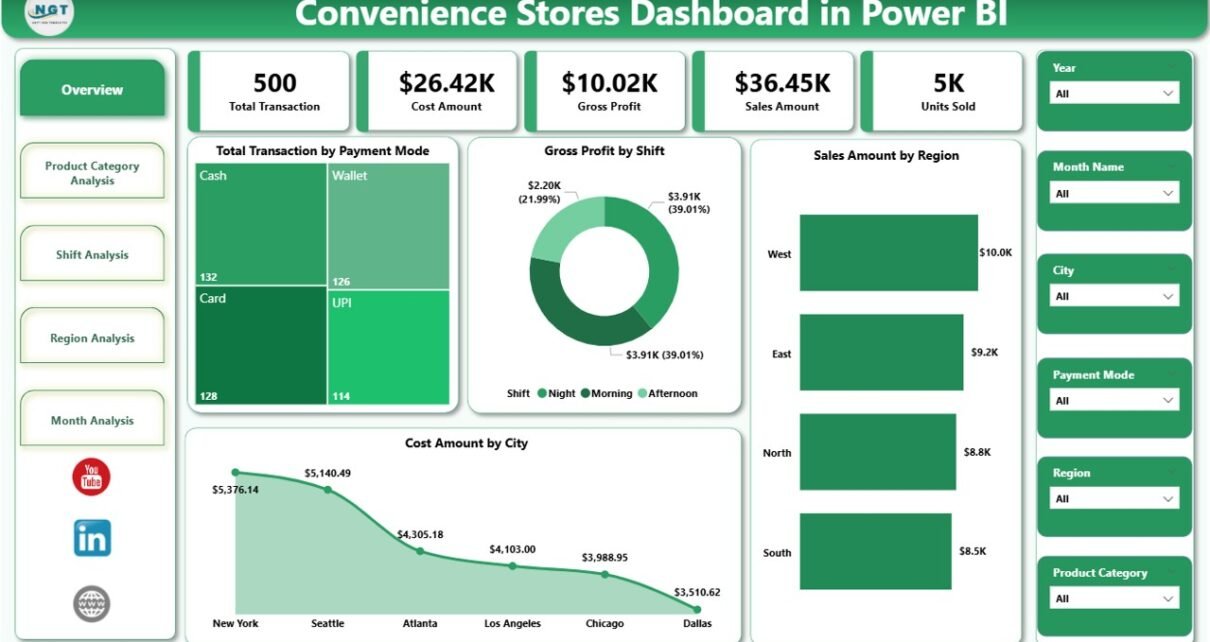
1. Overview Page: What Is Happening Across the Business?
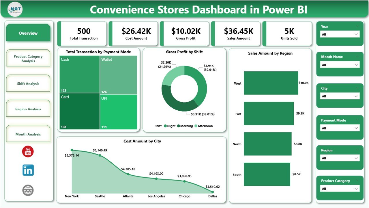
The Overview Page acts as the executive summary of the entire dashboard.
From the moment users open the dashboard, this page provides a high-level snapshot of overall performance.
Key Features of the Overview Page
This page includes dynamic slicers at the top. As a result, users can filter data by month, region, or other dimensions instantly.
Below the slicers, the dashboard displays five key cards and visuals:
-
Total Transactions by Payment Mode
-
Gross Profit by Shift
-
Sales Amount by Region
-
Cost Amount by City
-
Overall performance summary
Why the Overview Page Matters
This page answers critical questions such as:
-
Which payment modes customers prefer?
-
Which shifts generate the highest profit?
-
Which regions contribute the most sales?
-
Where are costs increasing?
Because of this clarity, decision-makers can quickly identify areas that need attention without diving into detailed reports.
2. Product Category Analysis: Which Products Drive Profit?
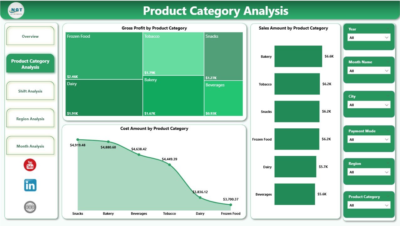
The Product Category Analysis Page focuses on understanding performance across different product categories.
Since convenience stores sell a wide range of items—from beverages and snacks to personal care and household products—category-level insights become essential.
Key Charts on This Page
This page includes three powerful visuals:
-
Gross Profit by Product Category
-
Sales Amount by Product Category
-
Cost Amount by Product Category
Insights You Can Gain from Product Category Analysis
This page helps answer important questions:
-
Which product categories generate the highest profit?
-
Which categories have high sales but low margins?
-
Where do costs eat into profitability?
As a result, store managers can adjust pricing, promotions, and shelf space more effectively.
Click to Purchases Convenience Stores Dashboard in Power BI
3. Shift Analysis: Which Shift Performs Best?
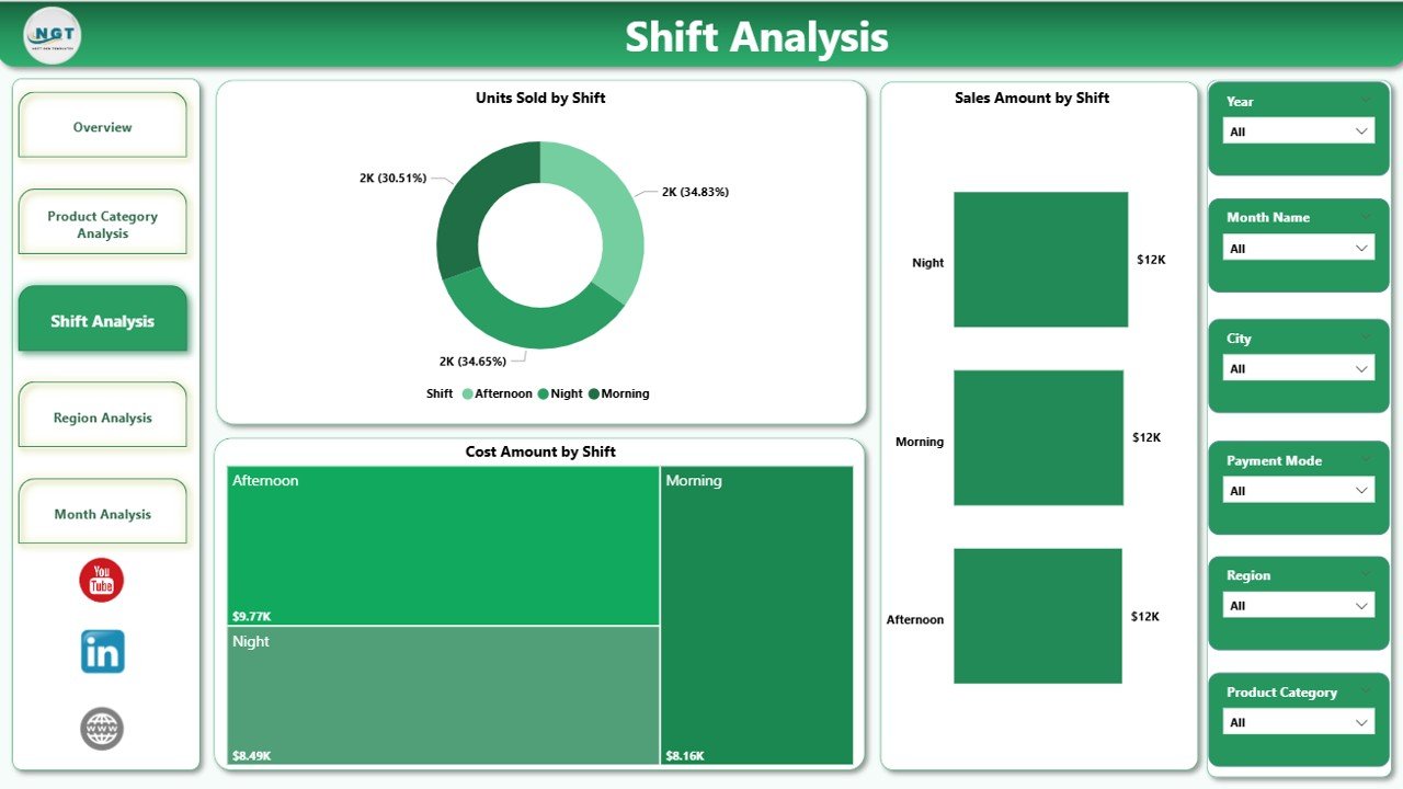
Convenience stores often operate in multiple shifts. Therefore, understanding shift-wise performance becomes critical.
The Shift Analysis Page breaks down sales, cost, and unit performance by shift.
Key Charts on the Shift Analysis Page
This page includes:
-
Units Sold by Shift
-
Sales Amount by Shift
-
Cost Amount by Shift
Why Shift Analysis Is Important
This page helps store owners and managers:
-
Identify the most profitable shifts
-
Optimize staffing levels
-
Reduce costs during low-performing shifts
-
Improve inventory planning based on demand patterns
Because of these insights, operational efficiency improves significantly.
4. Region Analysis: Which Locations Perform Better?
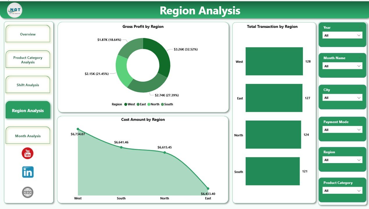
For businesses operating across multiple cities or regions, regional insights become essential.
The Region Analysis Page focuses on geographical performance.
Key Charts on the Region Analysis Page
This page displays:
-
Total Transactions by Region
-
Gross Profit by Region
-
Cost Amount by Region
Business Value of Region Analysis
This page helps decision-makers:
-
Compare performance across regions
-
Identify high-growth markets
-
Detect regions with high costs and low profit
-
Plan regional marketing strategies effectively
As a result, businesses can allocate resources more strategically.
5. Month Analysis: How Does Performance Change Over Time?
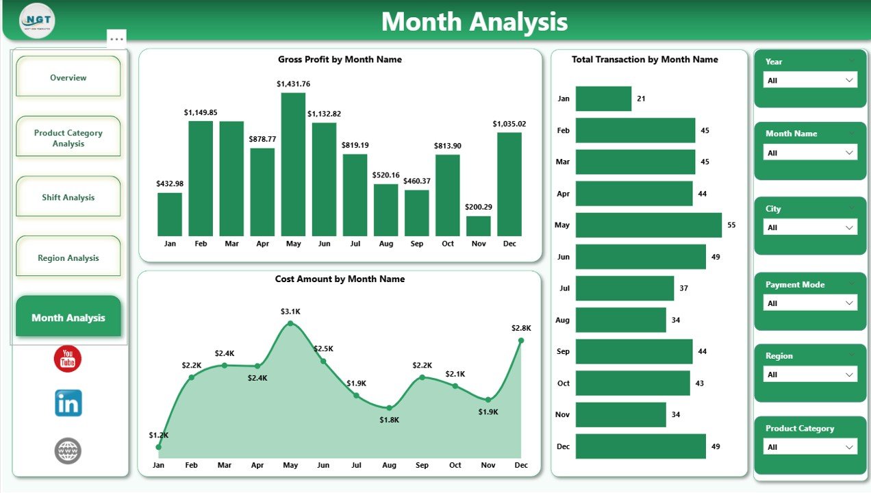
The Month Analysis Page focuses on trends over time.
Instead of viewing data as isolated numbers, this page shows how performance evolves month by month.
Key Charts on the Month Analysis Page
This page includes:
-
Total Transactions by Month
-
Gross Profit by Month
-
Cost Amount by Month
Why Month Analysis Matters
This page enables businesses to:
-
Track seasonal trends
-
Measure growth or decline over time
-
Identify months with higher costs
-
Forecast future performance more accurately
Consequently, planning and budgeting become more reliable.
Click to Purchases Convenience Stores Dashboard in Power BI
What KPIs Can You Track Using a Convenience Stores Dashboard in Power BI?
This dashboard allows tracking of multiple key performance indicators, including:
-
Total Transactions
-
Sales Amount
-
Cost Amount
-
Gross Profit
-
Units Sold
-
Payment Mode Performance
-
Shift-wise Performance
-
Product Category Performance
-
Regional Performance
-
Monthly Trends
Because all KPIs update dynamically, users always work with the latest data.
Advantages of a Convenience Stores Dashboard in Power BI
Using a Convenience Stores Dashboard in Power BI offers several business advantages.
1. Centralized Business Visibility
Instead of managing multiple reports, users view all critical metrics in one place.
2. Faster Decision-Making
Since insights update in real time, managers act quickly on issues and opportunities.
3. Improved Profitability
By identifying cost leakages and low-margin areas, businesses improve profitability.
4. Better Operational Control
Shift, region, and category analysis provide better control over daily operations.
5. User-Friendly and Interactive
Power BI dashboards remain easy to use, even for non-technical users.
Who Should Use a Convenience Stores Dashboard in Power BI?
This dashboard suits multiple roles, including:
-
Convenience Store Owners
-
Operations Managers
-
Regional Managers
-
Finance Teams
-
Business Analysts
-
Retail Consultants
Because of its flexibility, businesses of all sizes can benefit from it.
Best Practices for the Convenience Stores Dashboard in Power BI
To get maximum value from your dashboard, follow these best practices.
1. Use Clean and Structured Data
Always ensure transaction data remains accurate and consistent.
2. Update Data Regularly
Frequent data refresh ensures reliable insights.
3. Focus on Actionable KPIs
Track metrics that directly impact sales, cost, and profit.
4. Use Slicers Wisely
Avoid overcrowding dashboards with too many slicers.
5. Review Insights Periodically
Regular reviews help identify trends early and improve performance.
How Does This Dashboard Improve Business Performance?
This dashboard improves performance by:
-
Reducing manual reporting effort
-
Increasing data transparency
-
Supporting proactive decision-making
-
Enhancing accountability across teams
-
Driving consistent growth
As a result, convenience store businesses operate more efficiently and profitably.
Conclusion: Why Every Convenience Store Needs This Dashboard
A Convenience Stores Dashboard in Power BI transforms how retail businesses analyze and manage performance.
Instead of reacting to problems late, businesses gain real-time insights into sales, cost, profit, shifts, regions, and product categories.
Moreover, the structured five-page layout ensures clarity without complexity.
In today’s competitive retail environment, data-driven decision-making is not optional. Therefore, investing in a Power BI dashboard becomes a smart and strategic move for convenience store success.
Frequently Asked Questions (FAQs)
What data is required for a Convenience Stores Dashboard in Power BI?
You need transaction-level data such as date, product category, sales amount, cost amount, payment mode, shift, city, and region.
Can small convenience stores use this dashboard?
Yes, small stores benefit equally because Power BI scales easily and remains cost-effective.
Does this dashboard support multiple locations?
Yes, it supports multi-store and multi-region analysis effectively.
How often should the data be refreshed?
Daily or weekly refresh works best for operational insights.
Do users need Power BI expertise to use the dashboard?
No, end users interact with slicers and visuals without technical knowledge.
Can this dashboard integrate with Excel data?
Yes, Power BI integrates seamlessly with Excel files.
Is this dashboard customizable?
Yes, businesses can customize KPIs, visuals, and filters based on requirements.
Visit our YouTube channel to learn step-by-step video tutorials