Running a convenience store business requires fast decisions, accurate insights, and complete visibility into daily operations. However, when sales, margins, inventory, and operational data stay scattered across multiple reports, decision-making becomes slow and reactive. Because of this challenge, retailers now rely on advanced analytics dashboards to gain clarity.
That is exactly where the Convenience Stores KPI Dashboard in Power BI plays a critical role.
In this in-depth guide, you will learn what a Convenience Stores KPI Dashboard in Power BI is, how it works, why it matters, and how it helps store owners, regional managers, and retail analysts monitor performance with confidence. Moreover, this article explains dashboard pages, KPI tracking logic, Excel data structure, advantages, best practices, and real-world use cases. Finally, you will find detailed answers to the most frequently asked questions.
Click to buy Convenience Stores KPI Dashboard in Power BI
What Is a Convenience Stores KPI Dashboard in Power BI?
A Convenience Stores KPI Dashboard in Power BI is a ready-to-use, interactive analytics solution designed to track, monitor, and analyze key performance indicators for convenience store operations in real time.
Instead of checking multiple Excel files, static MIS reports, or manual summaries, this dashboard consolidates all performance metrics into a single visual control panel. As a result, retail decision-makers understand performance trends faster and respond to issues proactively.
Because the dashboard uses Power BI for visualization and Excel as the data source, it delivers the perfect balance of flexibility, control, and scalability.
Why Do Convenience Stores Need a KPI Dashboard?
Convenience stores operate in a high-volume, low-margin environment. Therefore, even small inefficiencies can reduce profitability. At the same time, daily operations generate large volumes of data related to sales, footfall, inventory, shrinkage, promotions, and operational costs.
Without a structured dashboard:
- Managers rely on delayed reports
- KPIs remain fragmented
- Trends stay hidden
- Targets become difficult to track
However, when you use a Convenience Stores KPI Dashboard in Power BI, you transform raw data into meaningful insights. Consequently, store managers take action faster, while leadership teams gain confidence in strategic decisions.
What Are the Key KPIs Tracked in a Convenience Stores KPI Dashboard?
This dashboard tracks both financial and operational KPIs, ensuring complete business visibility. While KPI names vary by organization, common categories include:
- Sales Performance KPIs
- Inventory and Stock KPIs
- Customer and Footfall KPIs
- Cost and Margin KPIs
- Operational Efficiency KPIs
Moreover, each KPI clearly shows Actual vs Target, Month-to-Date (MTD), and Year-to-Date (YTD) performance, along with historical comparison.
How Is the Convenience Stores KPI Dashboard Structured in Power BI?
The Convenience Stores KPI Dashboard in Power BI includes three well-designed pages, each created to serve a different analytical purpose. Together, these pages deliver a complete performance management framework.
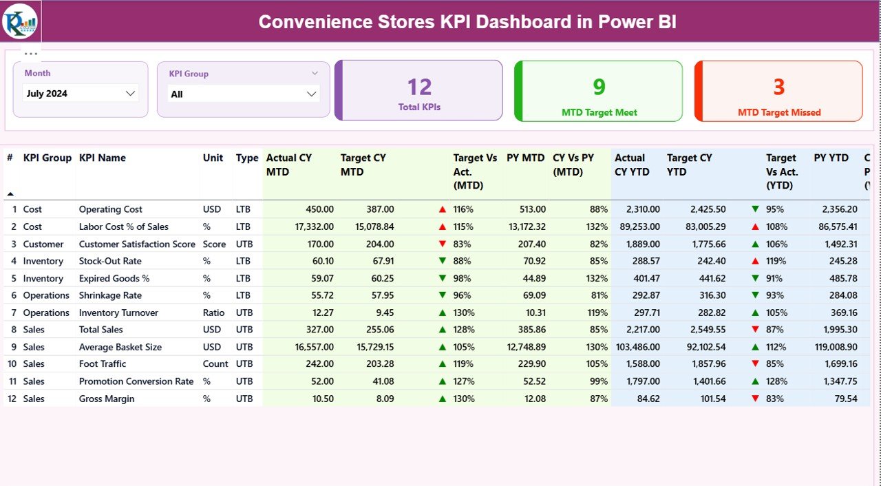
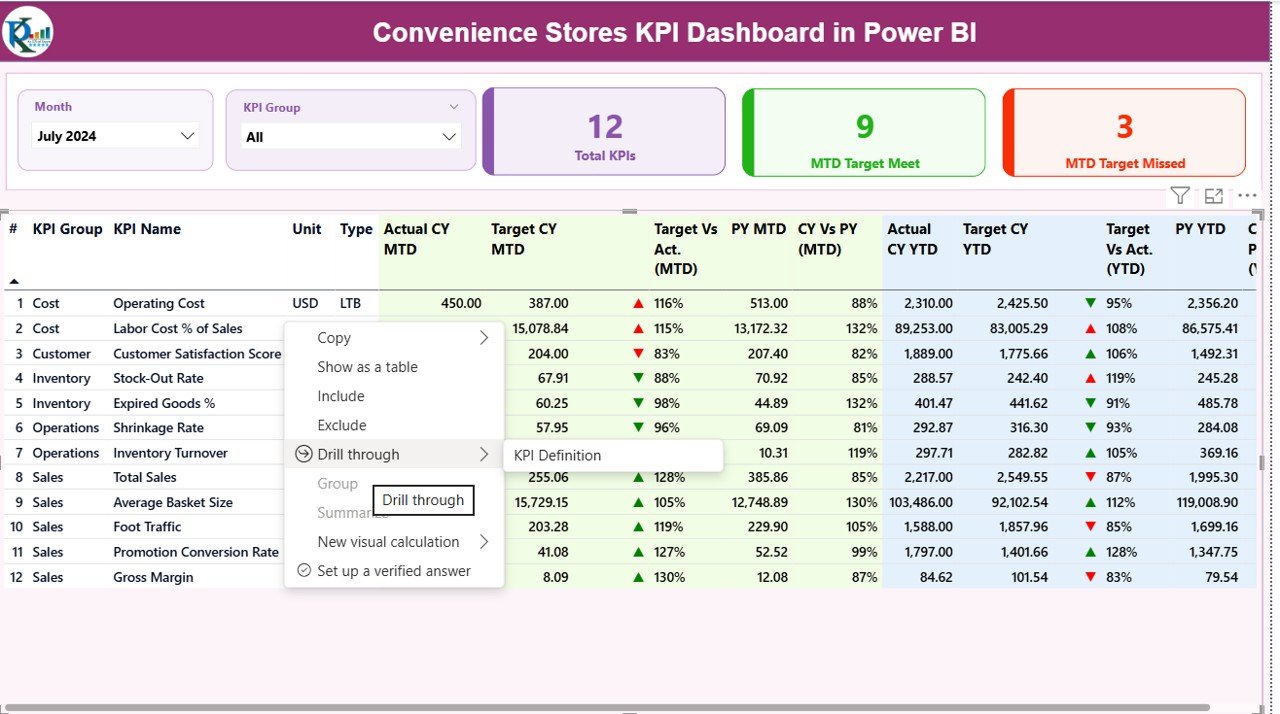
the Summary Page
The Summary Page acts as the main control center of the dashboard. As soon as the dashboard opens, users see the most critical performance insights.
Key Elements of the Summary Page
- Month Slicer
- Allows users to switch between months instantly
- Updates all visuals dynamically
- KPI Group Slicer
- Enables filtering KPIs by category
- Helps focus on specific operational areas
- Top KPI Cards
- Total KPIs Count
- MTD Target Met Count
- MTD Target Missed Count
Because these cards appear at the top, executives understand overall performance within seconds.
Click to buy Convenience Stores KPI Dashboard in Power BI
What Details Does the KPI Table Show on the Summary Page?
Below the cards, the dashboard displays a detailed KPI table with comprehensive performance metrics.
Each row represents one KPI, while columns include:
- KPI Number – Unique sequence number
- KPI Group – Category of KPI
- KPI Name – Name of the metric
- Unit – Measurement unit
- Type – LTB (Lower the Better) or UTB (Upper the Better)
Month-to-Date (MTD) Performance Columns
- Actual CY MTD
- Target CY MTD
- MTD Icon (▲ / ▼ with green or red indicator)
- Target vs Actual (MTD %)
- Previous Year MTD
- CY vs PY (MTD %)
Year-to-Date (YTD) Performance Columns
- Actual CY YTD
- Target CY YTD
- YTD Icon (▲ / ▼ with green or red indicator)
- Target vs Actual (YTD %)
- Previous Year YTD
- CY vs PY (YTD %)
Because of these details, users quickly identify performance gaps and trends without manual calculations.
How Does KPI Status Visualization Improve Decision-Making?
The dashboard uses red and green arrow icons to indicate performance status.
- Green ▲ shows target achievement
- Red ▼ highlights target shortfall
As a result, managers instantly recognize which areas need attention. Moreover, this visual approach eliminates confusion and speeds up decision-making.
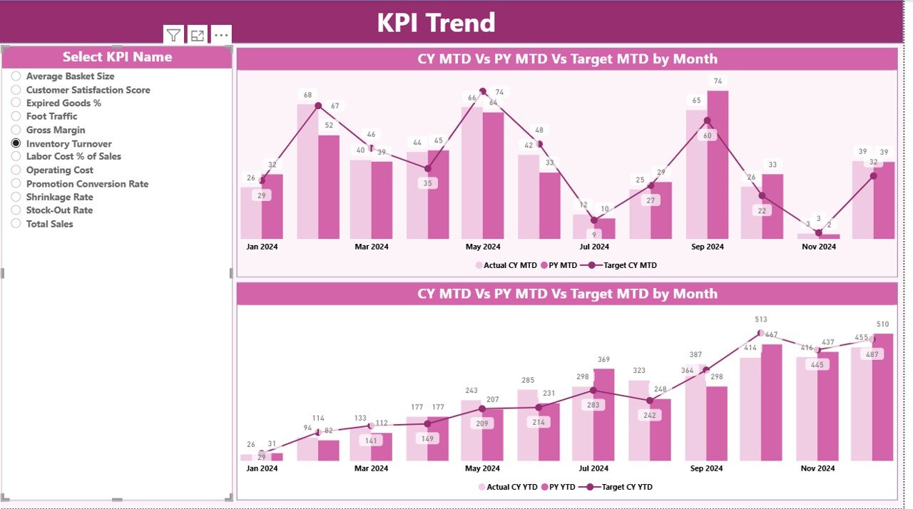
KPI Trend Page
The KPI Trend Page focuses on performance patterns over time. Instead of viewing only monthly snapshots, users can analyze historical movements.
Key Highlights of the KPI Trend Page
- KPI Name slicer on the left
- Two interactive combo charts:
- MTD Trend Chart
- YTD Trend Chart
- Each chart displays:
- Current Year Actual
- Previous Year Actual
- Target Values
- Because these elements appear together, users easily compare growth, decline, and seasonality.
Click to buy Convenience Stores KPI Dashboard in Power BI
How Do Combo Charts Add Business Value?
Combo charts combine columns and lines for clearer comparison. Therefore, users see performance movement relative to targets and past years in one view.
This feature helps retailers:
- Identify sales seasonality
- Track recovery after slow periods
- Monitor consistency across months
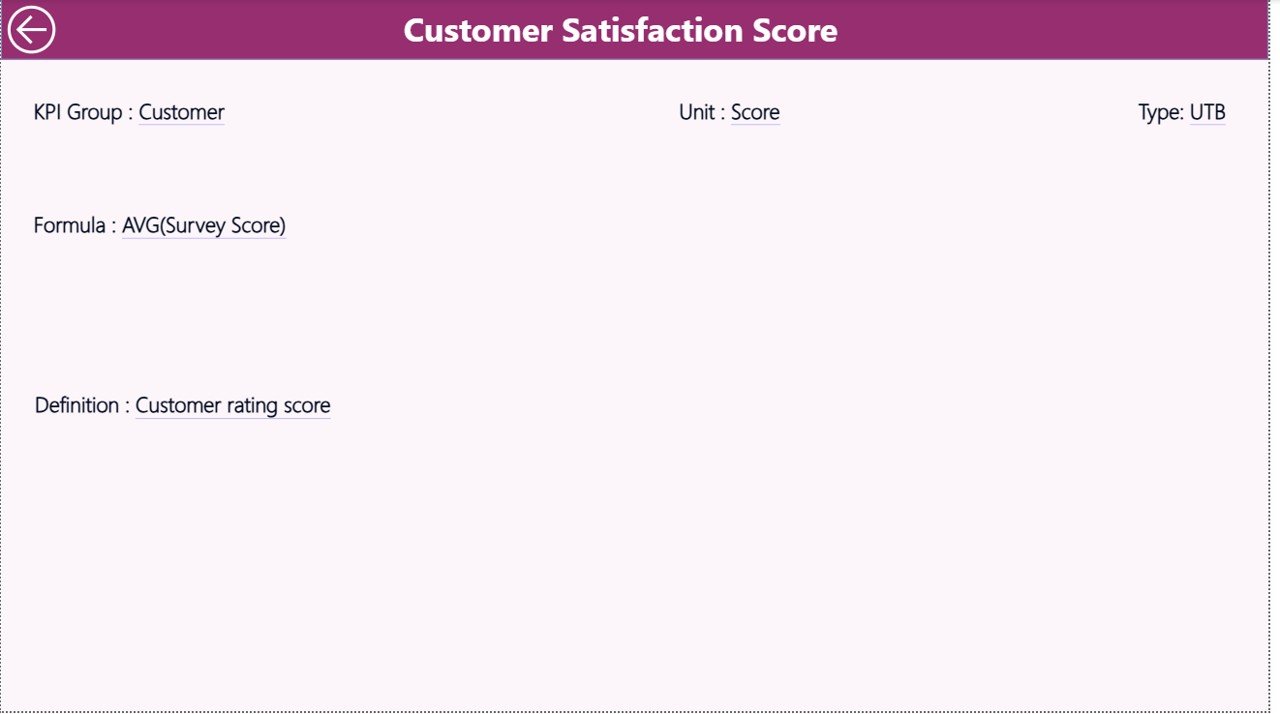
KPI Definition Page
The KPI Definition Page acts as a reference and documentation layer.
Key Features of the KPI Definition Page
- Drill-through page
- Hidden from main navigation
- Accessible from the Summary Page
This page displays:
- KPI Formula
- KPI Definition
- Business explanation
Because of this feature, users never misinterpret KPIs. Moreover, new team members learn metrics faster.
How Does Drill-Through Improve KPI Transparency?
When users drill through from the Summary Page, they access KPI logic instantly. Therefore, confusion reduces and reporting accuracy improves. Additionally, stakeholders trust the data more.
Click to buy Convenience Stores KPI Dashboard in Power BI
What Is the Excel Data Structure Behind the Dashboard?
The Convenience Stores KPI Dashboard in Power BI uses Excel as the data source, which keeps data management simple and flexible.
Excel Workbook Structure
The Excel file contains three structured worksheets.
the Input_Actual
This sheet captures actual performance data.
Columns include:
- KPI Name
- Month (first date of the month)
- MTD Actual Value
- YTD Actual Value
Users only update numbers. Power BI handles all calculations.
the Input_Target Sheet
This sheet stores target values.
Columns include:
- KPI Name
- Month (first date of the month)
- MTD Target Value
- YTD Target Value
This separation ensures clean target tracking.
Click to buy Convenience Stores KPI Dashboard in Power BI
What Is the KPI Definition Sheet Used For?
This sheet maintains metadata for each KPI.
Columns include:
- KPI Number
- KPI Group
- KPI Name
- Unit
- Formula
- Definition
- Type (LTB or UTB)
Because of this structure, users manage KPIs centrally without editing Power BI visuals.
Advantages of Convenience Stores KPI Dashboard in Power BI
Using a structured KPI dashboard offers both operational and strategic benefits.
- Centralized Performance Monitoring
All KPIs appear in one place. Therefore, teams avoid fragmented reports and conflicting numbers.
- Faster Decision-Making
Visual indicators, slicers, and trend charts provide instant clarity. As a result, managers react faster.
- Clear Target Tracking
MTD and YTD comparisons against targets highlight performance gaps early.
- Improved Accountability
Clear ownership and KPI tracking improve team responsibility and execution.
- Scalable and Customizable
Because the dashboard uses Power BI and Excel, businesses scale KPIs easily.
- Better Historical Analysis
CY vs PY comparison reveals growth trends and operational impact.
Best Practices for the Convenience Stores KPI Dashboard in Power BI
Following best practices ensures long-term dashboard effectiveness.
- Define KPIs Clearly Before Implementation
Always align KPIs with business objectives. Avoid tracking too many metrics.
- Maintain Consistent KPI Definitions
Ensure formulas and units stay consistent across all reporting periods.
- Update Data Regularly
Schedule weekly or monthly data updates to maintain accuracy.
- Use KPI Groups Effectively
Categorize KPIs logically to simplify analysis.
- Train Users on Dashboard Navigation
Teach slicer usage, drill-through functionality, and performance interpretation.
- Review Dashboard Performance Periodically
Improve visuals and KPIs based on evolving business needs.
Who Can Benefit from This Dashboard?
The Convenience Stores KPI Dashboard in Power BI benefits:
- Convenience Store Owners
- Regional and Area Managers
- Operations Heads
- Retail Analysts
- Finance and Planning Teams
Because of its flexibility, both single-store operators and multi-store chains use it effectively.
How Does This Dashboard Support Retail Growth?
This dashboard supports growth by:
- Identifying underperforming stores early
- Optimizing inventory movement
- Improving margin visibility
- Enhancing operational discipline
As a result, businesses improve profitability while reducing operational risks.
Conclusion
The Convenience Stores KPI Dashboard in Power BI transforms raw retail data into actionable insights. Instead of relying on static reports or manual analysis, businesses gain real-time visibility into performance.
With structured KPI tracking, MTD and YTD comparison, intuitive visuals, and Excel-based data input, this dashboard becomes an essential retail performance management tool. Moreover, its scalable architecture ensures long-term value as businesses grow.
If you want better control, faster decisions, and improved retail performance, this dashboard provides the clarity you need.
Frequently Asked Questions (FAQs)
- What is a Convenience Stores KPI Dashboard in Power BI?
It is an interactive Power BI dashboard that tracks key performance indicators for convenience store operations using Excel as a data source.
- Do I need Power BI expertise to use this dashboard?
No. Users only update Excel data. Power BI visuals update automatically.
- Can I add new KPIs to the dashboard?
Yes. You can add KPIs by updating the Excel KPI Definition sheet and data sheets.
- Does the dashboard support MTD and YTD analysis?
Yes. The dashboard shows MTD and YTD actuals, targets, and comparisons.
- Can I compare current year performance with previous years?
Yes. The dashboard includes CY vs PY comparison for both MTD and YTD.
- Is this dashboard suitable for multiple store locations?
Yes. It supports scalable KPI tracking across regions and stores.
- Does the dashboard include trend analysis?
Yes. The KPI Trend Page displays MTD and YTD trends using combo charts.
- Can I customize slicers and visuals?
Yes. Power BI allows full customization based on business needs.
Visit our YouTube channel to learn step-by-step video tutorials
Watch the step-by-step video tutorial:
Click to buy Convenience Stores KPI Dashboard in Power BI