Credit unions run on trust, member satisfaction, financial transparency, and strong operational efficiency. However, you cannot improve performance unless you track the right numbers at the right time. This is where a Credit Unions KPI Dashboard in Power BI becomes a powerful tool. It gives a clear picture of monthly trends, year-to-date (YTD) performance, target achievement, and previous-year comparisons—all in one interactive view.
In this detailed guide, you learn everything about this dashboard. You explore its structure, features, benefits, and best practices. You also understand how KPIs help your credit union grow faster. Whether you handle finance, operations, compliance, lending, or member services, this dashboard helps you make smarter decisions every day.
Let’s begin by understanding the purpose of a Credit Unions KPI Dashboard.
Click to Purchases Credit Unions KPI Dashboard in Power BI
What Is a Credit Unions KPI Dashboard in Power BI?
A Credit Unions KPI Dashboard in Power BI is an interactive reporting tool that tracks key performance indicators across departments such as loans, deposits, member services, risk, compliance, and financial operations. It converts raw numbers into meaningful insights through charts, slicers, scorecards, and real-time calculations.
Because Power BI is dynamic and user-friendly, this dashboard helps credit union teams monitor trends, set targets, track performance, and improve decision-making without scrolling through large spreadsheets.
The dashboard runs on structured Excel data, which includes
✔ monthly actuals,
✔ monthly targets, and
✔ KPI definitions.
When you refresh your data, all charts and KPIs update instantly.
Click to Purchases Credit Unions KPI Dashboard in Power BI
Why Do Credit Unions Need a KPI Dashboard?
Credit unions often track hundreds of metrics—loan disbursals, delinquency ratios, new member additions, deposit growth, call-center performance, product cross-sell ratios, and more. If teams track these manually, they face issues like:
-
Scattered data
-
Slow reporting
-
Missing trends
-
Errors in manual calculations
-
Delayed decision-making
A KPI Dashboard solves these issues by offering:
-
Real-time monitoring
-
Clear comparisons
-
Automated insights
-
Accurate performance tracking
Because the dashboard updates instantly, every department can stay aligned with organizational goals.
Click to Purchases Credit Unions KPI Dashboard in Power BI
Pages of the Credit Unions KPI Dashboard in Power BI
This dashboard includes three powerful pages:
-
Summary Page
-
KPI Trend Page
-
KPI Definition Page (Drill-Through Page)
Each page offers unique insights that help you monitor performance smoothly and take quick action.
Let’s explore each one.
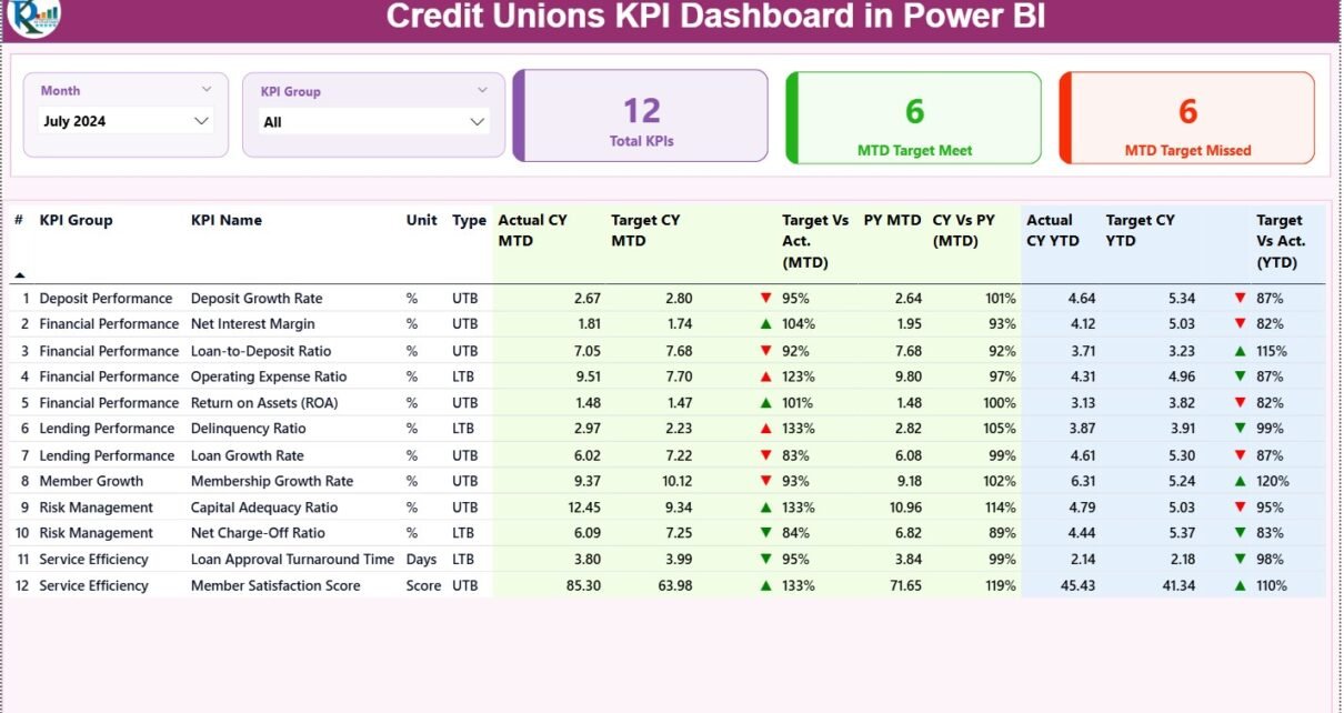
1. Summary Page – The Main Dashboard View
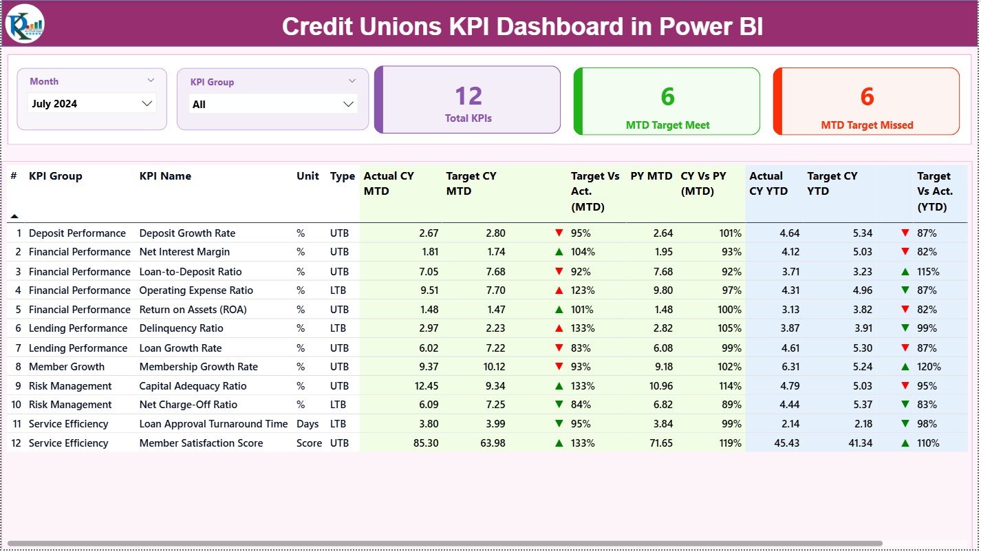
The Summary Page works as the central hub of analysis. You see all important KPIs, trends, and comparisons in one place.
Top Section – Filters and Highlight Cards
At the top, you get:
-
Month Slicer – Select the reporting month
-
KPI Group Slicer – Filter KPIs by operational category
Along with slicers, you see three performance cards:
-
Total KPIs Count
-
MTD Target Met Count
-
MTD Target Missed Count
These cards quickly show how your credit union performs for the selected month.
-
MTD and YTD
-
Target vs Actual
-
Current Year vs Previous Year
Because you see everything on a single screen, reporting becomes quick and simple.
Click to Purchases Credit Unions KPI Dashboard in Power BI
2. KPI Trend Page – Visualize MTD and YTD Trends
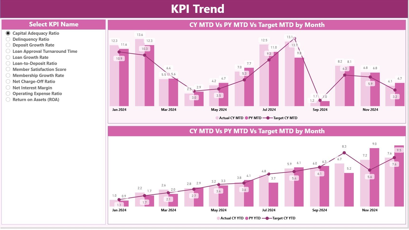
This page gives a visual representation of performance over time. You see:
-
One combo chart for Current Year MTD, Previous Year MTD, and MTD Target
-
One combo chart for Current Year YTD, Previous Year YTD, and YTD Target
These charts help you:
-
Identify performance trends
-
Compare monthly progress
-
Evaluate growth patterns
-
See how close you are to monthly and yearly targets
A KPI Name Slicer on the left lets you select any KPI and analyze its complete trend.
This page becomes extremely helpful for monthly review meetings and performance presentations.
Click to Purchases Credit Unions KPI Dashboard in Power BI
3. KPI Definition Page – Drill-through for Detailed Understanding
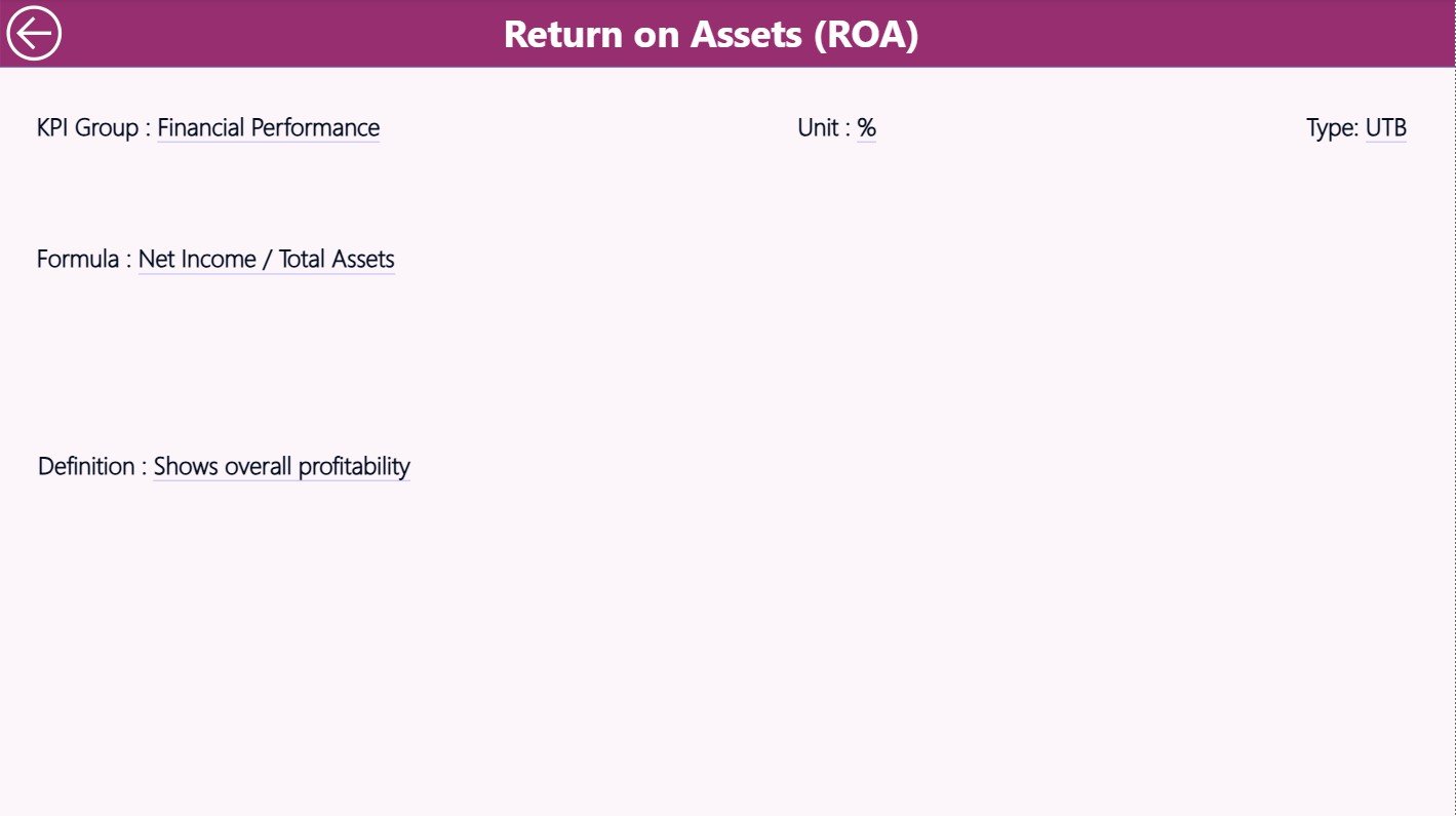
The KPI Definition Page contains:
-
KPI Number
-
KPI Group
-
KPI Name
-
Unit
-
Formula
-
Detailed Definition
-
Type (UTB or LTB)
You can drill through to this page from the Summary Page. It shows the logic behind each KPI, ensuring transparency and clarity.
Power BI hides this page by default, but you can access it anytime through right-click drill-through.
You can return to the main page using the Back Button on the top-left corner.
Excel Data Structure for the Dashboard
The dashboard runs on three Excel sheets:
1. Input_Actual Sheet
This sheet captures:
-
KPI Name
-
Month (first date of the month)
-
Actual MTD value
-
Actual YTD value
Because all data follows a structured layout, Power BI reads it without issues.
2. Input_Target Sheet
This sheet includes:
-
KPI Name
-
Month
-
Target MTD value
-
Target YTD value
This allows the dashboard to calculate performance percentages and show icons accurately.
3. KPI Definition Sheet
This sheet stores KPI metadata such as:
-
KPI Number
-
Group
-
Name
-
Unit
-
Type (UTB or LTB)
-
Formula
-
Description
All dashboard calculations and filters depend on this sheet.
What KPIs Can Credit Unions Track in This Dashboard?
Credit unions use many types of KPIs, such as:
Financial KPIs
-
Loan Disbursement
-
Deposit Growth
-
Net Interest Margin
-
Delinquency Ratio
-
Operating Cost Ratio
Member Service KPIs
-
Member Retention Rate
-
New Member Growth
-
Service Request Completion Time
-
Complaint Resolution Time
Operational KPIs
-
System Uptime
-
Transaction Accuracy
-
Branch Performance
-
Teller Productivity
Compliance KPIs
-
Audit Findings
-
Risk Assessment Scores
-
Regulatory Reporting Timeliness
You can track all these KPIs using the dashboard effortlessly.
Click to Purchases Credit Unions KPI Dashboard in Power BI
Advantages of a Credit Unions KPI Dashboard in Power BI
A Power BI dashboard offers many advantages for credit unions. Let’s explore the most important ones.
1. Real-Time Visibility
Teams see updated numbers instantly. They understand performance and take immediate action.
2. Faster Decision-Making
Leadership teams gain clarity. They identify strengths, weaknesses, opportunities, and threats quickly.
3. Better Transparency
Every KPI includes clear definitions and formulas. This removes confusion about how numbers are calculated.
4. Improved Reporting Speed
Reports that took hours now take minutes. Power BI auto-updates all charts and cards.
5. Better Collaboration
Employees across departments view the same dashboard. This reduces miscommunication and conflict.
6. Trend and Target Comparison
Teams track MTD, YTD, and previous-year performance side by side. This helps forecast and plan future actions.
7. Visual Appeal
Interactive charts, icons, and slicers make the dashboard easy to understand. Users do not need advanced analytics skills.
8. Error-Free Calculations
The dashboard uses formulas, not manual calculations. This reduces errors and increases confidence in data.
How Power BI Helps Credit Unions Improve Performance
Credit unions often want to:
-
Increase member satisfaction
-
Reduce operational delays
-
Improve loan servicing
-
Grow deposits
-
Strengthen compliance
-
Manage risks
-
Track cost-to-income ratio
-
Improve competitive performance
A KPI dashboard helps them achieve these goals by:
-
Showing bottlenecks
-
Highlighting improvement areas
-
Showing target gaps
-
Offering actionable insights
-
Identifying high-performing departments
-
Highlighting issues before they grow
Because the dashboard offers complete visibility, every team stays aligned with strategy.
Best Practices for the Credit Unions KPI Dashboard in Power BI
To get the best performance from your dashboard, follow these practices.
1. Update KPIs Regularly
Update monthly data in Excel without delay. This ensures the dashboard always reflects the latest status.
2. Keep KPI Definitions Clear
Every KPI must include:
-
Formula
-
Calculation logic
-
Unit
-
Interpretation
Clear definitions remove confusion.
3. Maintain Data Quality
Check for:
-
Missing values
-
Incorrect dates
-
Wrong units
-
Incomplete entries
Clean data leads to better insights.
4. Use Meaningful KPI Categories
Group KPIs into logical categories like:
-
Loans
-
Deposits
-
Member Services
-
Operations
-
Compliance
-
Finance
This improves readability.
5. Review Trends Monthly
Use the KPI Trend Page to:
-
Track improvement
-
Identify weak areas
-
Adjust targets
-
Plan resource allocation
6. Share Dashboards with Teams
Allow teams to access dashboards. This increases ownership and accountability.
7. Use Icons and Colors Effectively
▲ Green for good
▼ Red for concerns
Clear icons improve understanding instantly.
8. Evaluate Targets Annually
Review targets to ensure they align with strategic goals and market conditions.
How to Use This Dashboard During Monthly Review Meetings
You can use the dashboard for:
-
Loan department review
-
Operations review
-
Member services review
-
Risk and compliance review
-
Leadership decision-making
Follow this structure:
-
Filter Month
-
Select KPI Group
-
Review Total KPIs
-
Check MTD Target Met/Missed
-
Review KPI Table
-
Compare trends
-
Drill through for definition
-
Plan improvements
This approach improves transparency and accountability across teams.
Conclusion
A Credit Unions KPI Dashboard in Power BI transforms the way credit unions measure performance. It presents MTD and YTD numbers clearly, compares targets vs actuals, and highlights trends that matter. Because the dashboard connects with Excel data, updates become simple and fast. It helps every team—finance, operations, member service, compliance, and lending—make decisions confidently and improve results continuously.
When you use this dashboard as a part of your monthly review process, your credit union gains better control, better visibility, and better decision-making power.
Click to Purchases Credit Unions KPI Dashboard in Power BI
Frequently Asked Questions (FAQs)
1. What is a Credit Unions KPI Dashboard in Power BI?
It is an interactive reporting tool that tracks key performance indicators across credit union departments. It helps teams monitor performance, compare targets, analyze trends, and make better decisions.
2. How many pages does this dashboard include?
It includes three pages: Summary Page, KPI Trend Page, and KPI Definition Page.
3. Can I add new KPIs to the dashboard?
Yes, you can add more KPIs by updating the Excel sheets and refreshing Power BI.
4. What data source does the dashboard use?
It uses an Excel file with three sheets: Actuals, Targets, and KPI Definitions.
5. Do I need Power BI Pro to use this dashboard?
You can use it in Power BI Desktop for free. If you want to share it online, you may need Power BI Pro.
6. Can I customize the dashboard theme?
Yes, Power BI allows full theme customization.
7. Does the dashboard support drill-through?
Yes, you can drill through from the Summary Page to the KPI Definition Page.
8. How often should I update the data?
You should update the data at least once a month for accurate MTD and YTD analysis.
Click to Purchases Credit Unions KPI Dashboard in Power BI
Visit our YouTube channel to learn step-by-step video tutorials