In today’s experience-driven world, customer satisfaction defines business success. Every interaction — from first contact to post-purchase support — shapes how customers perceive your brand. Companies that measure and manage these touchpoints consistently outperform those that rely on guesswork.
The Customer Experience (CX) KPI Dashboard in Excel is a ready-to-use solution that helps organizations track and analyze their customer engagement performance in real time. This dashboard transforms raw feedback and service data into clear, visual insights that drive customer loyalty, retention, and satisfaction.
In this article, we’ll explore everything about the CX KPI Dashboard — its structure, key features, advantages, and best practices to help you improve customer experiences through data-driven decisions.
Click to Purchases Customer Experience (CX) KPI Dashboard in Excel
What Is a Customer Experience (CX) KPI Dashboard in Excel?
A Customer Experience (CX) KPI Dashboard in Excel is an interactive performance management tool that consolidates all customer-related key performance indicators (KPIs) in one place. It enables managers, marketing teams, and customer support leaders to monitor metrics like Net Promoter Score (NPS), Customer Satisfaction (CSAT), First Contact Resolution (FCR), and Average Handling Time (AHT) — all in a clean, visual format.
Unlike static reports, this Excel-based dashboard offers dynamic dropdowns, charts, and conditional formatting. You can easily switch between months, track MTD (Month-to-Date) and YTD (Year-to-Date) performance, and compare actual values with targets or previous year data.
By integrating data from different sheets, the dashboard provides a 360° view of how customers perceive your business — helping teams take proactive steps to enhance their experience.
Click to Purchases Customer Experience (CX) KPI Dashboard in Excel
Structure of the CX KPI Dashboard in Excel
The dashboard includes seven interactive worksheets, each designed for specific functions. Together, they create a complete ecosystem for tracking, analyzing, and improving customer experience metrics.
1. Home Sheet — Navigation Hub

The Home Sheet acts as the central navigation page. It contains six clickable buttons, each linked to one of the main sheets in the workbook.
Users can quickly jump to:
-
Dashboard
-
KPI Trend
-
Actual Numbers Input
-
Target Sheet
-
Previous Year Numbers
-
KPI Definition
This setup makes the Excel file easy to navigate, even for beginners. It works like a professional BI interface — no coding required.
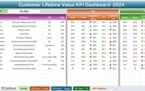
2. Dashboard Sheet — Visual Performance View

The Dashboard Sheet is the heart of this CX KPI Dashboard. It presents a comprehensive overview of all customer experience KPIs.
At the top (cell D3), a Month dropdown allows you to select the reporting period. The entire dashboard updates automatically based on the selected month.
Displayed Insights Include:
-
MTD Actual vs Target: Shows how the current month’s actual values perform against targets.
-
MTD vs PY (Previous Year): Compares current month’s results with the same month last year.
-
YTD Actual vs Target: Displays cumulative year-to-date performance versus set goals.
-
YTD vs PY: Evaluates current YTD figures against previous year’s YTD data.
Each KPI is accompanied by visual arrows (▲ or ▼) with color-coded formatting (green/red), making it easy to spot performance trends.
This sheet provides instant clarity — you can quickly identify which KPIs are performing well and which areas need attention.
Click to Purchases Customer Experience (CX) KPI Dashboard in Excel
3. KPI Trend Sheet — Historical Insight

The KPI Trend Sheet focuses on understanding trends over time. You can select any KPI from the dropdown in cell C3, and the dashboard automatically updates charts and related details.
Key Details Displayed:
-
KPI Group
-
Unit of Measurement
-
Type (Lower the Better / Upper the Better)
-
KPI Formula
-
KPI Definition
Below these details, you’ll find two trend charts:
-
MTD Chart: Compares actual, target, and previous year data for monthly performance.
-
YTD Chart: Visualizes cumulative trends across the year.
This layout helps you analyze seasonal patterns, spot emerging issues, and make informed adjustments to strategy.
4. Actual Numbers Input Sheet — Data Entry Section

The Actual Numbers Input Sheet is where you record real performance data for each KPI. It includes both MTD and YTD values for every month.
Key Columns Include:
-
KPI Name
-
Month (Date format)
-
Actual MTD
-
Actual YTD
You can modify the starting month from cell E1, which determines the fiscal period for reporting. This flexibility allows organizations operating on different financial calendars to customize reporting effortlessly.
5. Target Sheet — Benchmark Setup

In the Target Sheet, you enter the target numbers for each KPI for every reporting month. Both MTD and YTD target values are captured.
Setting clear targets ensures that every department knows what success looks like. It also allows the dashboard to compute performance ratios, such as:
-
Target vs Actual % (MTD)
-
Target vs Actual % (YTD)
These metrics help track whether your organization meets or exceeds service expectations.
6. Previous Year Numbers Sheet — Benchmark Comparison

This sheet contains data from the previous year. It follows the same structure as the Actual and Target sheets, enabling smooth comparisons for continuous improvement analysis.
Comparing past performance is crucial for understanding progress and adjusting future strategies.
For instance:
-
Did your NPS improve compared to last year?
-
Are customers resolving issues faster?
-
Has your CSAT score stabilized?
This worksheet ensures those answers are always just a click away.
7. KPI Definition Sheet — Central Reference

The KPI Definition Sheet acts as a data dictionary. It lists every KPI, its category, calculation formula, unit, and definition.
Columns Include:
-
KPI Name
-
KPI Group
-
Unit
-
Formula
-
Definition
This helps maintain consistency across departments. Everyone uses the same definitions, preventing data discrepancies and ensuring accurate interpretation.
Click to Purchases Customer Experience (CX) KPI Dashboard in Excel
Advantages of Customer Experience (CX) KPI Dashboard in Excel
1. Centralized Visibility
All KPIs are available in one file, making it easy to assess the entire customer journey without switching tools.
2. Real-Time Decision-Making
Dynamic Excel formulas and dropdown filters allow instant updates. You can make informed decisions based on current performance trends.
3. Simple Yet Powerful
No complex software installation or training is required. The dashboard is built entirely in Excel — accessible and easy to customize.
4. Consistent Reporting
Predefined KPI formulas ensure consistency across departments, improving reliability in reporting and analysis.
5. Historical Comparison
The inclusion of previous year data enables powerful trend analysis and goal alignment.
6. Actionable Insights
Conditional formatting with arrows and colors highlights whether each KPI meets, exceeds, or falls below target — making analysis intuitive.
7. Flexible Design
The dashboard can be tailored for industries like retail, banking, hospitality, or IT services. You can easily modify KPIs to suit specific business models.
Use Cases of CX KPI Dashboard
-
Customer Service Centers: Measure agent efficiency and resolution rates.
-
E-commerce Stores: Monitor post-purchase satisfaction and return handling.
-
SaaS Businesses: Track user retention, ticket resolution, and NPS.
-
Healthcare Providers: Evaluate patient feedback and appointment handling.
-
Hospitality Businesses: Assess guest satisfaction and service response times.
The dashboard’s versatility makes it suitable for both small teams and large enterprises.
How to Use the Dashboard Effectively
-
Input Data Monthly:
Update the Actual, Target, and Previous Year sheets regularly. -
Select Month in Dashboard:
Use the dropdown in cell D3 to switch months easily and view updated results. -
Monitor Trends:
Use the KPI Trend Sheet to identify which metrics improve and which decline. -
Drill into Definitions:
Refer to the KPI Definition Sheet whenever you need clarity on calculations. -
Review Progress:
Compare YTD performance against last year’s figures to measure growth. -
Take Action:
Use data insights to refine training, improve communication, and enhance service processes.
Best Practices for Using the CX KPI Dashboard
1. Define Clear KPI Ownership
Assign specific owners for each KPI (e.g., NPS to Marketing, AHT to Customer Support). This ensures accountability.
2. Keep Data Accurate
Double-check monthly entries before refreshing dashboards to avoid misleading results.
3. Automate Data Imports
Where possible, link Excel to CRM or survey tools like Salesforce or Google Forms for automated data refreshes.
4. Focus on Trends, Not Just Numbers
Analyzing patterns gives deeper insights than reviewing a single month’s data.
5. Encourage Team Collaboration
Share the dashboard across departments so everyone aligns on customer goals.
6. Protect Data Integrity
Apply password protection and restrict editing access to maintain reliable records.
7. Simplify Visuals
Use consistent colors, clear fonts, and minimal clutter to improve readability.
Click to Purchases Customer Experience (CX) KPI Dashboard in Excel
Why Excel Is Ideal for CX KPI Tracking
While Power BI and Tableau are advanced options, Excel remains the most widely used analytics tool due to its simplicity and accessibility.
Key Benefits of Using Excel:
-
No additional software costs.
-
Easy integration with survey and CRM data.
-
Familiar interface for most users.
-
Full flexibility in customizing formulas and visuals.
-
Quick export to PDF or print for stakeholder reviews.
For organizations starting their analytics journey, Excel offers the perfect balance between power and simplicity.
Conclusion
The Customer Experience (CX) KPI Dashboard in Excel empowers businesses to monitor satisfaction, loyalty, and service quality all in one place. With its structured design, interactive elements, and visual indicators, it turns everyday data into meaningful insights.
By tracking MTD and YTD results, comparing targets, and analyzing trends, you can strengthen customer relationships and boost long-term retention.
Whether you manage a call center, e-commerce store, or service organization, this Excel dashboard is your foundation for data-driven customer experience management.
Click to Purchases Customer Experience (CX) KPI Dashboard in Excel
Frequently Asked Questions (FAQs)
1. What is a CX KPI Dashboard?
A CX KPI Dashboard is a tool that tracks and visualizes customer experience metrics such as NPS, CSAT, and FCR to help improve service quality and satisfaction.
2. Why should I use Excel for CX analytics?
Excel offers flexibility, no licensing costs, and a familiar interface, making it ideal for small to medium teams tracking KPIs efficiently.
3. How often should I update the dashboard?
Update it monthly after all customer feedback and operational data are finalized for that period.
4. Can I customize KPIs for my business?
Yes. You can easily change KPI names, formulas, and targets in the KPI Definition Sheet to fit your company’s objectives.
5. What kind of insights can I get?
You can track performance trends, identify underperforming areas, and visualize year-over-year improvement.
6. Does the dashboard support automation?
Yes. You can link Excel to external databases or online forms to automate data entry and reduce manual effort.
7. Can multiple users access this dashboard?
Yes. Save it on a shared drive or cloud service like OneDrive or SharePoint to allow multiple stakeholders to view it.
Click to Purchases Customer Experience (CX) KPI Dashboard in Excel
Visit our YouTube channel to learn step-by-step video tutorials