A Customer Service and Support Cost Efficiency KPI Dashboard is a data visualization tool built in Excel that tracks and displays key performance indicators (KPIs) related to the cost-effectiveness of customer service operations. It helps businesses measure how efficiently resources are used in serving customers, while keeping service quality intact.
This dashboard focuses on cost per ticket, agent performance, resolution time, customer satisfaction, and other vital metrics that impact cost and customer experience. With Excel’s robust calculation and visualization capabilities, this dashboard becomes an accessible and powerful solution for service managers.
Click to Purchases Customer Service and Support Cost Efficiency KPI Dashboard in Excel
Key Features of the Dashboard Template
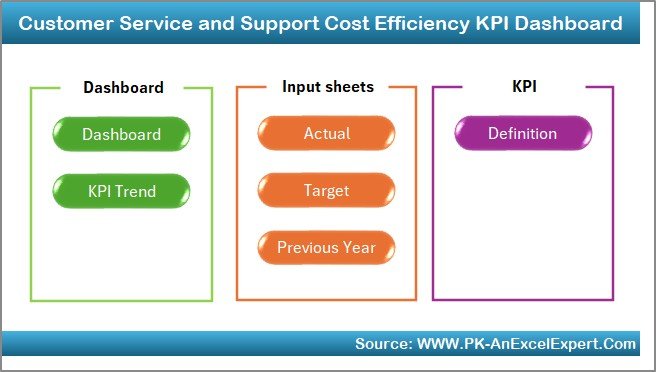
The ready-to-use Excel template consists of 7 strategically structured worksheet tabs, each serving a specific purpose. Let’s explore them one by one:
Home Sheet (Index Page)
The Home tab acts as a navigation panel. It contains six clickable buttons, each taking the user to the corresponding worksheet with a single click. This layout ensures smooth user experience and quick access to data sections.
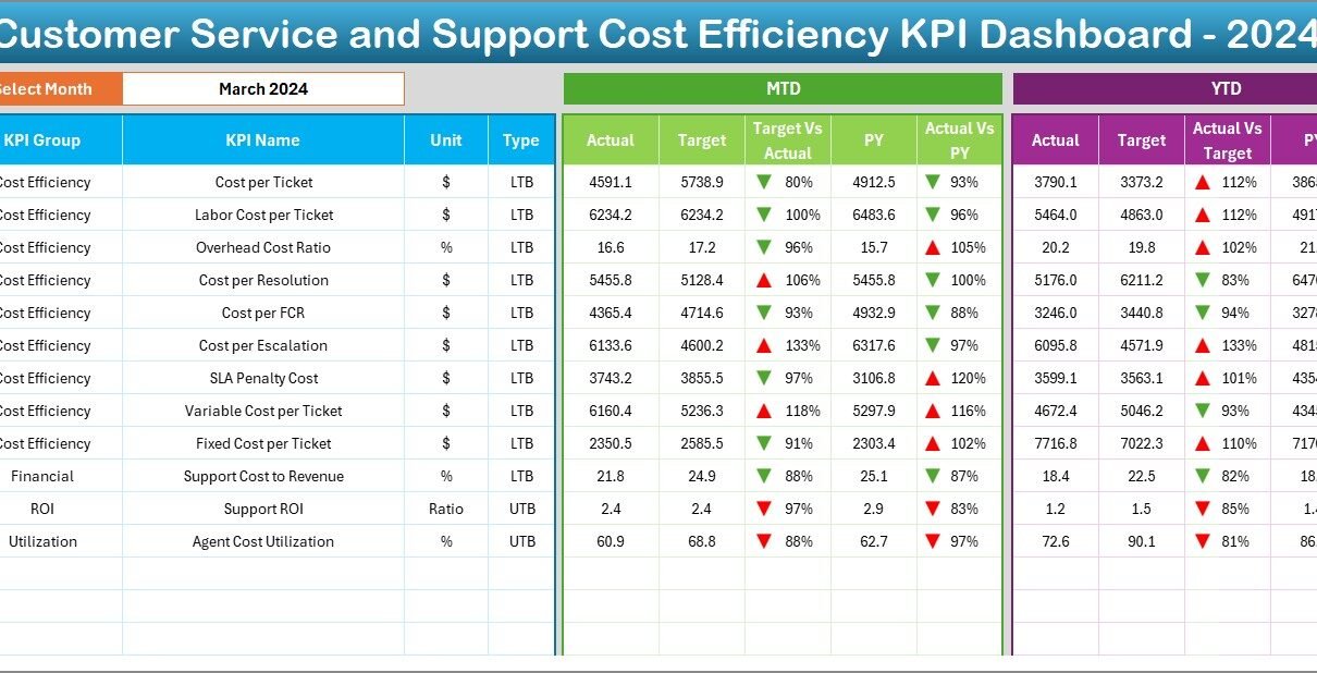
Dashboard Sheet
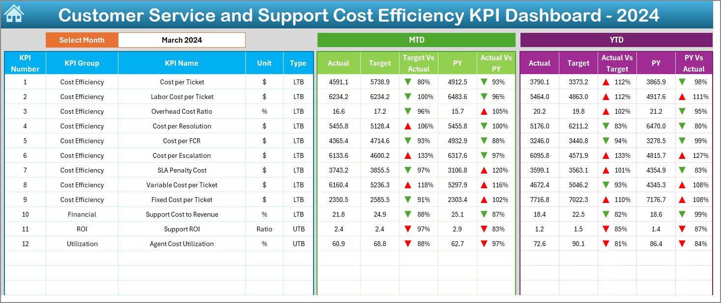
The Dashboard tab is the core of the template. Here’s what makes it stand out:
-
Month Selection: You can choose the month from a drop-down in cell D3. All dashboard metrics update automatically.
-
Visual Indicators: Conditional formatting shows up/down arrows to indicate performance against target and previous year (PY).
-
KPI Comparison: Displays MTD (Month-to-Date) and YTD (Year-to-Date) values for Actual, Target, and PY for each KPI.
-
Target vs Actual Analysis: Instantly see if a KPI is overperforming or underperforming.
This visual representation helps managers identify inefficiencies quickly and take corrective actions.
Click to Purchases Customer Service and Support Cost Efficiency KPI Dashboard in Excel
KPI Trend Sheet
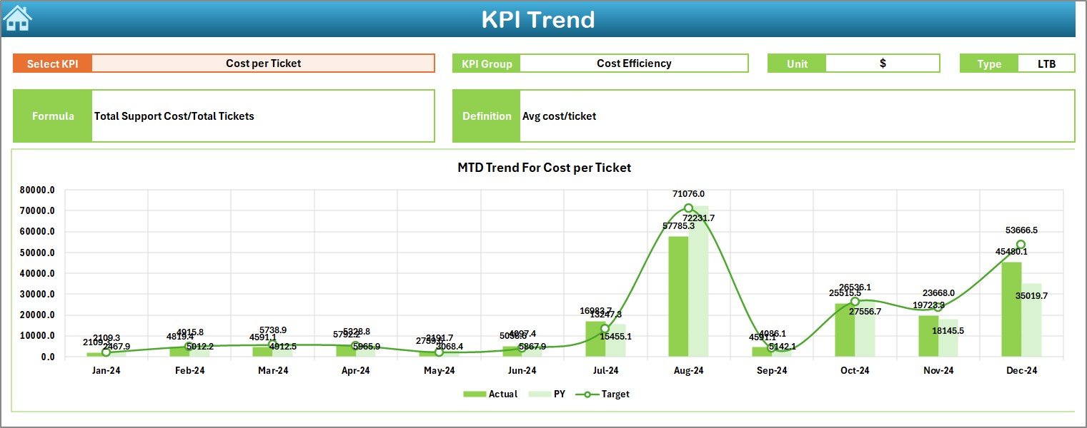
The KPI Trend sheet offers a dynamic view of each KPI over time:
-
Select a KPI from the drop-down in cell C3.
-
View the KPI Group, Unit, Type (LTB or UTB), Formula, and Definition.
-
Visualize monthly performance with MTD and YTD trend charts for Actual, Target, and PY.
This sheet is essential for tracking long-term progress and spotting performance trends.
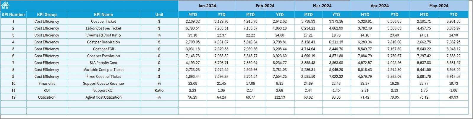
Actual Numbers Input Sheet
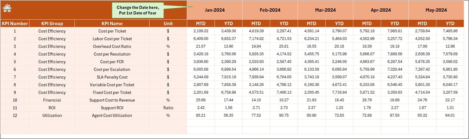
This is the engine room for raw performance data.
-
Enter monthly actual numbers for both MTD and YTD.
-
Change the starting month using cell E1, which updates the period tracking.
-
Input data regularly to keep the dashboard updated and functional.
Target Sheet
Define your performance goals in this section:
-
Add monthly targets for MTD and YTD.
-
Align goals with business expectations and benchmarks.
-
Use these targets as a reference point for dashboard evaluation.
Previous Year Numbers Sheet
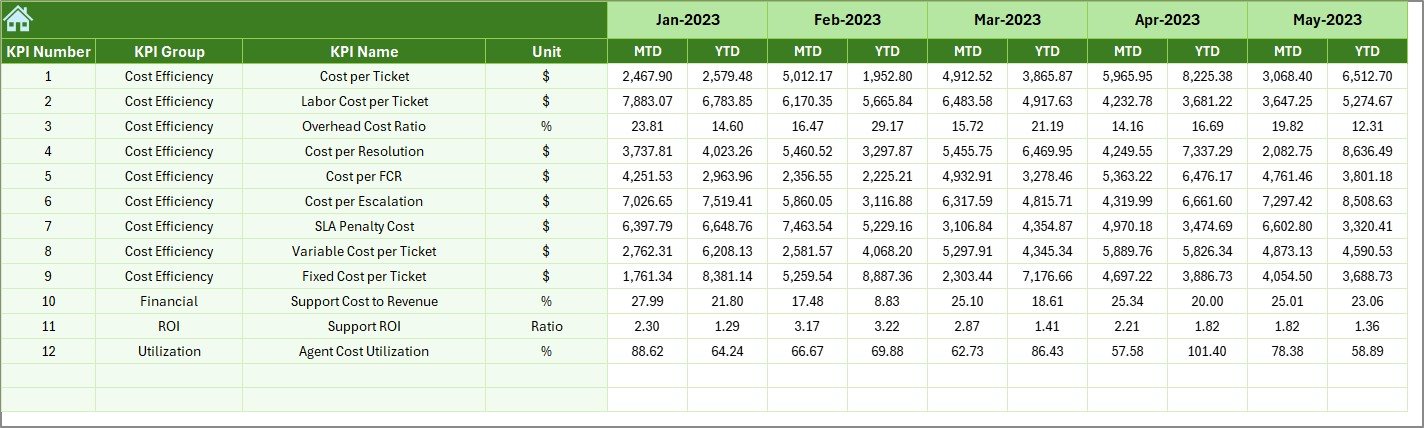
Here, enter last year’s KPI data:
-
Match the structure used for current year entries.
-
Enables year-on-year comparisons for meaningful insights.
-
Helps detect seasonal patterns or performance shifts.
Click to Purchases Customer Service and Support Cost Efficiency KPI Dashboard in Excel
KPI Definition Sheet
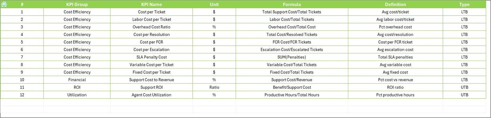
This sheet houses critical metadata:
-
Enter KPI Name, KPI Group, Unit, Formula, and Definition.
-
Classify each KPI as LTB (Lower the Better) or UTB (Upper the Better).
-
Maintain consistency across analysis and visualizations.
Why Use Excel for This Dashboard?
While many organizations use complex BI tools, Excel remains a favorite for a few good reasons:
-
Easy to Customize: You can adapt the dashboard layout or calculations without needing a developer.
-
Familiar Interface: Most business users already know Excel, making training and onboarding simpler.
-
No Additional Cost: Unlike BI software, Excel doesn’t require extra licensing fees.
-
Pivot-Friendly Design: The template uses PivotTables and PivotCharts to maintain compatibility and ease of use.
What KPIs Should You Track?
Tracking the right KPIs is crucial. Here are some common ones included in the template:
-
Cost per Support Ticket
-
Average Resolution Time
-
Customer Satisfaction Score (CSAT)
-
First Call Resolution Rate
-
Support Cost as % of Revenue
-
Tickets Handled per Agent
-
Escalation Rate
-
Repeat Contact Rate
-
Service Level Agreement (SLA) Compliance
-
Support Channel Cost Breakdown (Email, Phone, Chat)
These KPIs help evaluate cost control, operational performance, and customer experience—three pillars of support efficiency.
Advantages of a Cost Efficiency KPI Dashboard
Using a KPI dashboard delivers multiple benefits:
✅ 1. Enhanced Cost Visibility
You can easily see how much your customer service operations cost, down to individual KPIs and months.
✅ 2. Better Decision-Making
With side-by-side views of Actual vs Target and PY, you can quickly identify bottlenecks and make strategic decisions.
✅ 3. Performance Monitoring
Instantly evaluate agents, departments, or channels with high or low efficiency.
✅ 4. Improved Planning
Use historical data to forecast workload and budget needs for upcoming months or quarters.
✅ 5. Increased Accountability
Define ownership by KPI and link them with responsible managers or teams.
Best Practices for Using the KPI Dashboard
Click to Purchases Customer Service and Support Cost Efficiency KPI Dashboard in Excel
To get the most out of your Customer Service and Support Cost Efficiency KPI Dashboard, follow these best practices:
✅ 1. Update Data Monthly
Consistent data input ensures reliable trends and insights.
✅ 2. Set Realistic Targets
Use historical benchmarks and industry standards to set practical and achievable targets.
✅ 3. Use Visual Cues
Arrows, color coding, and conditional formatting help users interpret data at a glance.
✅ 4. Automate Where Possible
Use Excel formulas, drop-downs, and PivotCharts to reduce manual tasks.
✅ 5. Involve Your Team
Share dashboard access with key team members and encourage feedback or collaboration.
How to Customize the Dashboard for Your Business?
Here are some quick ideas to tailor the dashboard:
-
Add New KPIs: Expand the KPI Definition sheet and link data accordingly.
-
Create Department Views: Filter dashboard by department or team.
-
Include Customer Feedback: Integrate Net Promoter Score (NPS) or verbatim comments for qualitative insights.
-
Apply Role-Based Views: Use VBA or filters to control access for different users.
Excel’s flexibility makes these modifications easy, even for non-technical users.
Real-World Use Case
Let’s say you manage a support center handling email, phone, and chat tickets.
-
You want to know which channel is most cost-effective.
-
You also need to track agent performance monthly.
-
And you’re expected to report on cost trends to leadership every quarter.
With this dashboard:
-
You input your actual data for each KPI monthly.
-
Compare performance with your target and last year.
-
Use trend analysis to forecast Q3 performance.
-
Quickly identify inefficiencies in the phone support team.
You can make informed decisions like reallocating resources, adjusting SLA expectations, or offering more training—all from insights drawn from the dashboard.
Who Should Use This Dashboard?
This dashboard benefits multiple stakeholders:
-
Customer Service Managers – for day-to-day monitoring
-
Operations Heads – for cost control
-
Finance Teams – for budgeting and forecasting
-
Executives – for strategic decision-making
-
Support Agents – for self-assessment (optional)
It promotes a culture of transparency, accountability, and performance excellence.
Conclusion
A Customer Service and Support Cost Efficiency KPI Dashboard in Excel is more than just a reporting tool. It’s a performance management system that helps organizations balance service quality and operational efficiency.
With 7 purpose-built worksheet tabs, automated insights, and dynamic visualizations, this dashboard allows you to track cost-saving metrics, improve agent efficiency, and maintain a high level of customer satisfaction.
Best of all, Excel makes it simple to implement, manage, and evolve the dashboard to meet your unique business needs.
Frequently Asked Questions (FAQs)
❓What KPIs should I include in a customer service cost efficiency dashboard?
You should include KPIs such as:
-
Cost per Ticket
-
Average Resolution Time
-
Customer Satisfaction Score (CSAT)
-
First Call Resolution
-
Tickets per Agent
-
Support Cost as % of Revenue
These metrics give a balanced view of cost and service performance.
❓How often should I update the dashboard?
Update the dashboard once a month for MTD and YTD data. You can also input data weekly for more granular tracking, but monthly is standard for most businesses.
❓Is this dashboard suitable for small businesses?
Absolutely! This Excel-based dashboard is ideal for startups, small, and medium businesses due to its low cost, flexibility, and ease of use.
❓Can I use this dashboard for remote teams?
Yes. If your team collaborates on shared drives (like OneDrive or Google Drive), you can use this Excel file collaboratively. You may also customize the dashboard to track remote-specific metrics.
❓Can I integrate this with a ticketing system?
While Excel is not a direct integration platform, you can export reports from most ticketing systems (like Zendesk, Freshdesk, or ServiceNow) and paste the data into the “Actual Numbers Input” sheet.
❓How do I know if my customer support is cost-efficient?
Use this dashboard to compare your Actual vs Target cost-related KPIs. If you’re consistently underperforming on “Cost per Ticket” or “Support Cost as % of Revenue,” it’s a signal to optimize.
Visit our YouTube channel to learn step-by-step video tutorials
Click to Purchases Customer Service and Support Cost Efficiency KPI Dashboard in Excel