Dialysis Centers KPI Dashboard — Introduction
Dialysis Centers KPI Dashboard is a ready-to-use Excel template designed to help clinic managers and analysts monitor clinical and operational KPIs. This post explains the dashboard structure, how to use each sheet, advantages, improvements, and best practices so you can get started quickly.
Click to Purchases Dialysis Centers KPI Dashboard
Key Features of Dialysis Centers KPI Dashboard
- 7 pre-built worksheets covering home, dashboard, trend analysis, and data inputs.
- Month selector to view MTD and YTD numbers dynamically.
- MTD, YTD, Target, and Previous Year comparisons with conditional formatting (up/down arrows).
- KPI definitions, formulae, and whether a KPI is LTB (Lower The Better) or UTB (Upper The Better).
- Ready charts for Actual vs Target vs PY trends for quick visual analysis.
- User-friendly input sheets for Actuals, Targets, and Previous Year data.
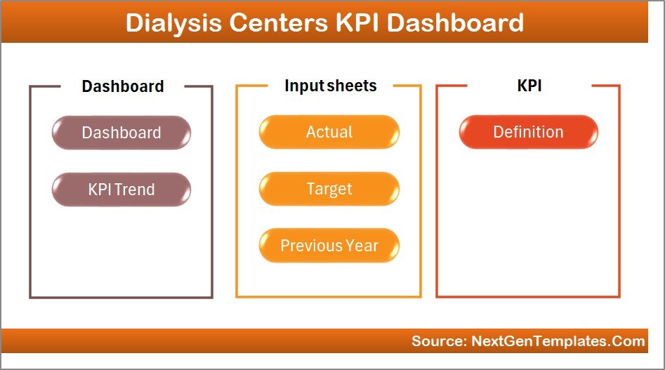
Dashboard Pages Explanation
The workbook includes seven sheets. Each is built to simplify data entry and present insights clearly.
-
1. Home sheet
This index page contains navigation buttons to jump to each sheet in the workbook for fast access.
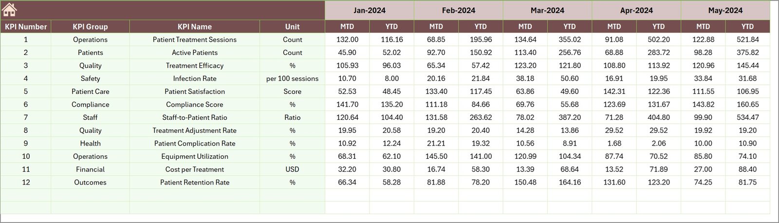
Home Page -
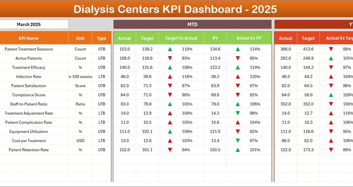
2. Dashboard sheet
This is the main reporting sheet. Use the month dropdown at cell D3 to change the reporting month—MTD and YTD values refresh accordingly.
- MTD Actual, Target, and Previous Year numbers with Target vs Actual and PY vs Actual comparisons using conditional up/down arrows.
- YTD Actual, Target, and Previous Year numbers with similar comparisons and conditional formatting.
- Quick visual cues and value cards to highlight performance gaps.
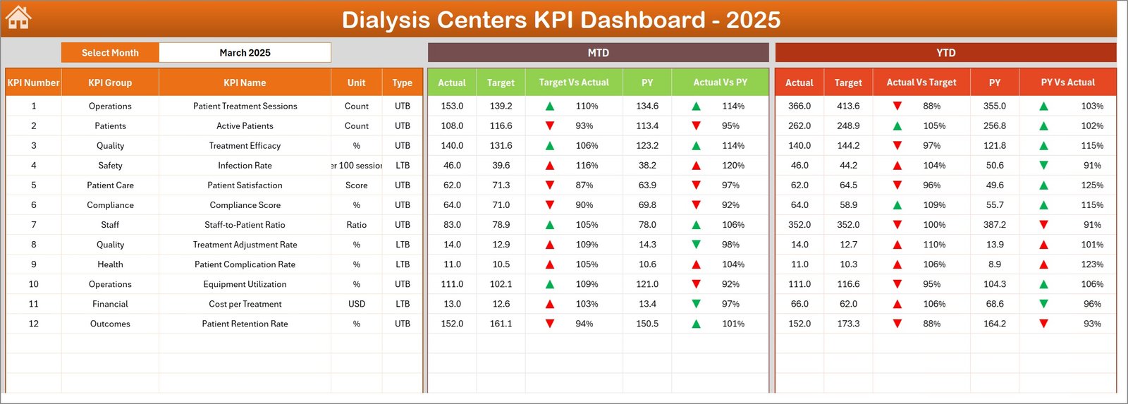
Dialysis Centers KPI Dashboard -
3. KPI Trend sheet
Select the KPI name from the dropdown in cell C3. The sheet displays KPI Group, Unit, KPI Type (LTB/UTB), formula, and definition. Trend charts show MTD and YTD Actual, Target and PY.
-
Click to Purchases Dialysis Centers KPI Dashboard
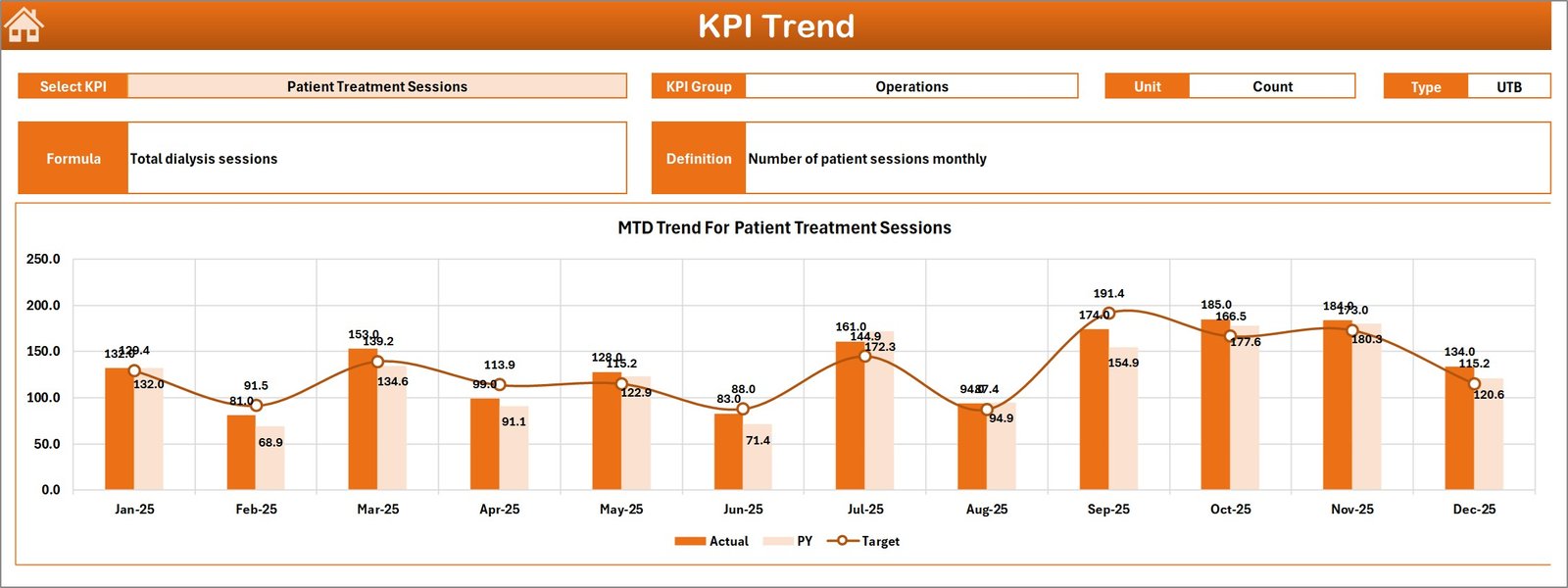
KPI Trend Sheet -
4. Actual Numbers Input sheet
Enter monthly Actual numbers here for both MTD and YTD. Change the first month of the year in cell E1 to align the months correctly for rolling calculations.
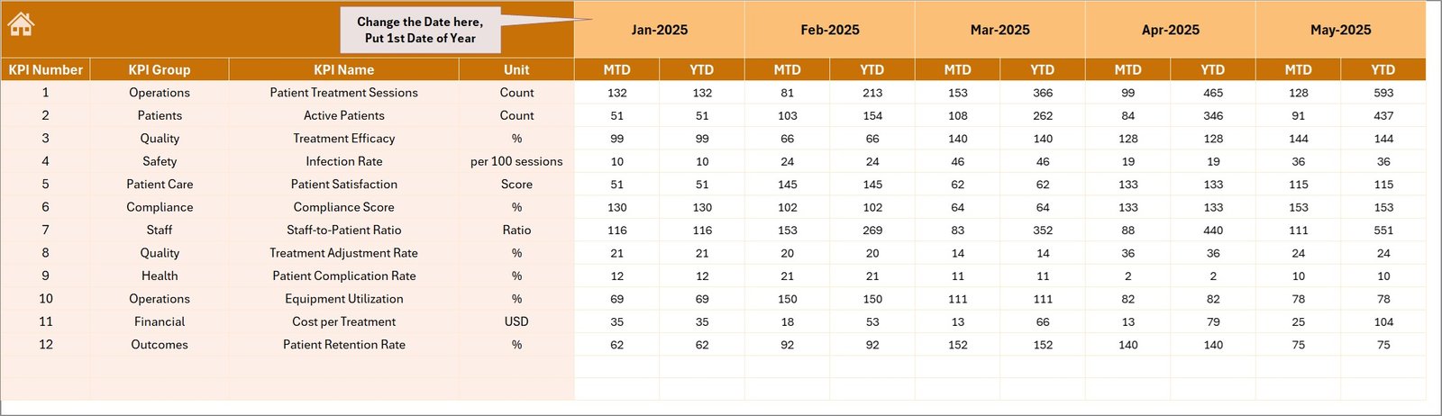
Actual Numbers Input sheet -
5. Target Number Input sheet
Enter monthly Target numbers for each KPI as both MTD and YTD targets. This drives the target comparisons on the dashboard and trends.
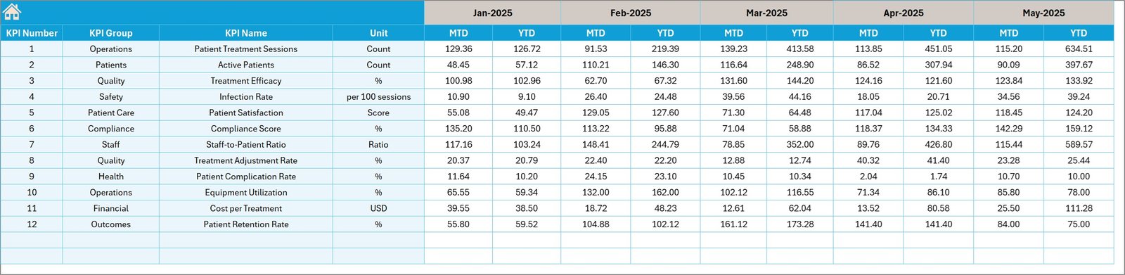
Target Number Input sheet -
6. Previous Year Number sheet
Populate the prior year numbers in the same layout as current year Actuals. The dashboard uses this to compute PY vs Actual deltas and trends.
Previous Year Number Input sheet -
7. KPI Definition sheet
Maintain a master list of KPIs including Name, Group, Unit, Formula, Definition and KPI Type (LTB or UTB). This powers labels, calculations and trend descriptions across the workbook.
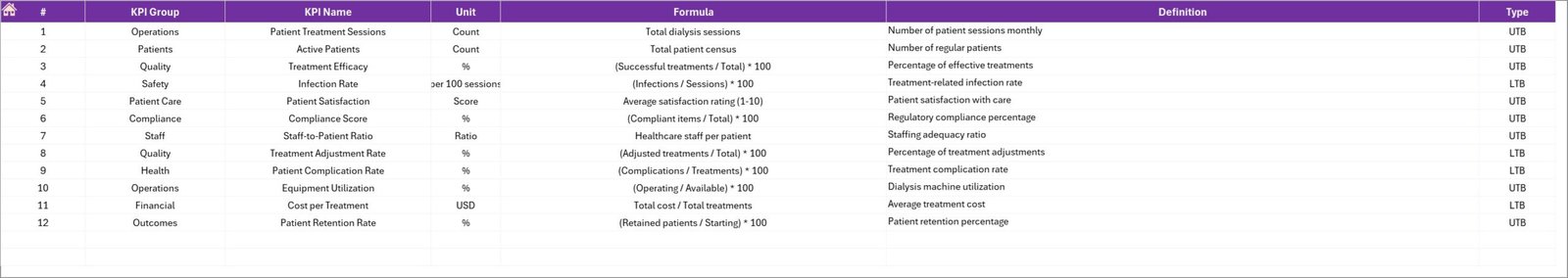
KPI Definition sheet
Advantages of Dialysis Centers KPI Dashboard
- Fast visibility into performance with monthly and year-to-date comparisons.
- Standardized KPI definitions reduce ambiguity between clinical and operational teams.
- Conditional formatting quickly highlights over- or under-performance.
- Minimal setup: populate three input sheets and use the dashboard without building reports from scratch.
- Flexible: works for single-center or multi-center rollups when adapted for aggregation.
Opportunities for Improvement
- Integrate with an automated data source (CSV import or direct database connection) to reduce manual entry.
- Extend to multi-location rollup with slicers for center-level filtering.
- Add KPI alerts via email or Teams when key thresholds are breached.
- Consider migrating to Power BI for more interactive visuals and scheduled refreshes.
Best Practices
- Define KPI owners and review cadence: assign someone to validate inputs monthly.
- Keep the KPI Definition sheet up to date to prevent calculation drift.
- Validate monthly data by spot-checking source systems against dashboard numbers.
- Use LTB/UTB flags to ensure trend directionality is interpreted correctly across stakeholders.
- Document any adjustments (e.g., data cutoffs, exclusions) in a notes column so users understand exceptions.
-
Click to Purchases Dialysis Centers KPI Dashboard
FAQs
Which KPIs are included?
The template is configurable; common dialysis KPIs include treatment count, machine utilization, infection rate, vascular access type mix, average treatment time, and patient no-shows. Add or remove KPIs in the KPI Definition sheet.
How do I change the reporting month?
Use the dropdown on the Dashboard sheet (cell D3). The MTD and YTD numbers update based on that selection.
Can I add more centers?
Yes. To roll up multiple centers, add columns for each center in the Actuals/Targets/PY sheets and build summation calculations or pivot tables to aggregate.
Conclusion
Dialysis Centers KPI Dashboard provides a practical, ready-made foundation to monitor and improve dialysis operations. With clear inputs, definitions, and visualizations, teams can make data-driven decisions faster. Start by populating the input sheets, validate with stakeholders, and use the dashboard for monthly performance reviews.
External resource: Learn more about analytics and reporting best practices on Microsoft Power BI: https://www.microsoft.com/en-us/microsoft-365/power-bi
Visit our YouTube channel to watch the demo: Youtube.com/@NextGenTemplates