Digital transformation is no longer optional. Organizations compete in a fast-moving world. Customers expect speed. Teams demand automation. Leaders need visibility.
However, many companies still track digital projects using scattered spreadsheets. As a result, executives struggle to monitor budgets, completion rates, customer experience impact, and cost variances.
So, how do you track digital transformation performance in one centralized system?
The answer is simple.
Click to Purchases Digital Transformation Dashboard in Power BI
You need a Digital Transformation Dashboard in Power BI.
This ready-to-use Power BI solution helps leaders monitor project progress, budget utilization, customer experience scores, and regional performance in real time. Moreover, it converts raw transformation data into interactive visuals. Instead of guessing project status, you can filter, drill down, and analyze insights instantly.
In this detailed guide, you will learn:
-
What a Digital Transformation Dashboard in Power BI is
-
Why organizations need it
-
A complete explanation of all 5 dashboard pages
-
Key KPIs you can track
-
Advantages of Digital Transformation Dashboard in Power BI
-
Best Practices for the Digital Transformation Dashboard
-
Frequently Asked Questions with Answers
Let us explore everything step by step.
What Is a Digital Transformation Dashboard in Power BI?
A Digital Transformation Dashboard in Power BI is an interactive analytics tool designed to monitor and measure digital initiatives across departments, regions, and project categories.
Instead of managing multiple Excel files, this dashboard centralizes:
-
Budget allocation tracking
-
Actual project costs
-
Completion percentage
-
Customer experience score
-
Cost variance
-
Performance by department, region, and project manager
Because Power BI updates visuals dynamically, decision-makers gain real-time insights. Moreover, slicers allow users to filter data by project status, region, department, or time period.
As a result, organizations improve visibility, accountability, and strategic alignment.
Why Do Organizations Need a Digital Transformation Dashboard?
Digital transformation involves multiple moving parts. Companies implement automation tools, cloud migration, AI integration, CRM upgrades, and cybersecurity enhancements. Therefore, leaders must monitor both financial and operational performance.
Without a dashboard:
-
Teams overspend budgets
-
Projects miss deadlines
-
Customer satisfaction declines
-
Regional performance varies
-
Leadership lacks clarity
However, with a Power BI dashboard:
-
Executives track progress instantly
-
Finance teams control budgets
-
Project managers monitor cost variance
-
Leadership improves decision-making
Therefore, this dashboard supports data-driven transformation.
Complete Explanation of All 5 Pages
This Digital Transformation Dashboard in Power BI includes 5 fully interactive pages. Each page focuses on a specific performance angle.
1️⃣ Overview Page – The Central Command Center
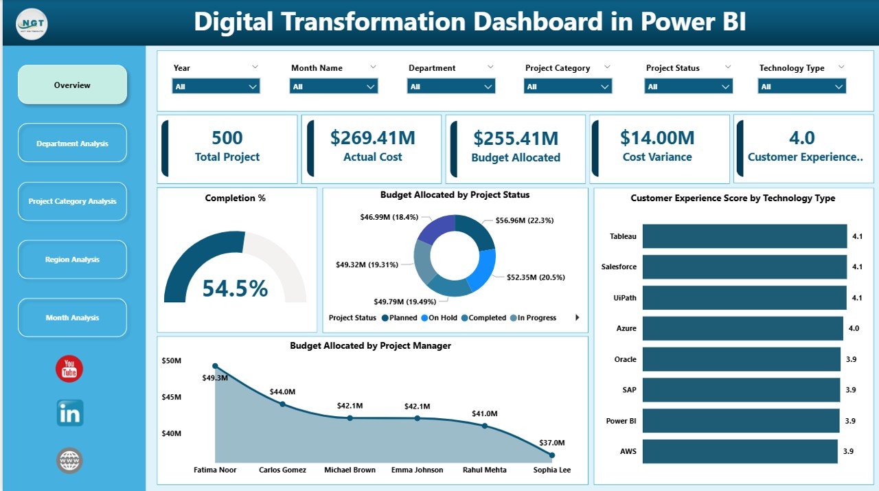
Key Elements on Overview Page:
✅ 5 KPI Cards
-
Completion %
-
Total Budget Allocated
-
Actual Cost
-
Cost Variance
-
Customer Experience Score
These KPI cards provide quick performance snapshots. Moreover, they update instantly when users apply slicers.
✅ Budget Allocated by Project Status
This visual shows how budgets distribute across:
-
Completed projects
-
In-progress projects
-
Delayed projects
-
On-hold projects
Therefore, leadership can identify risk areas quickly.
✅ Customer Experience Score by Technology Type
Click to Purchases Digital Transformation Dashboard in Power BI
Digital transformation impacts customers directly. This chart highlights customer satisfaction across:
-
CRM systems
-
Mobile applications
-
Automation tools
-
Cloud platforms
As a result, organizations align technology investment with customer satisfaction.
✅ Budget Allocated by Project Manager
This visualization improves accountability. It shows which project managers handle larger budgets and whether they manage funds effectively.
✅ Slicers (Interactive Filters)
Users can filter data by:
-
Department
-
Region
-
Project Category
-
Month
-
Project Status
Therefore, the Overview Page delivers complete strategic visibility.
2️⃣ Department Analysis – How Do Departments Perform?
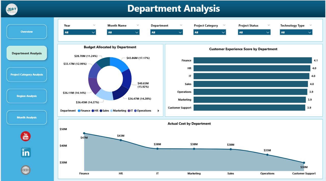
This page answers an important question:
Which department drives digital success?
Charts Included:
✔ Budget Allocated by Department
This chart shows funding distribution among:
-
IT
-
HR
-
Finance
-
Operations
-
Marketing
Leaders can instantly identify which department receives maximum funding.
✔ Customer Experience Score by Department
This metric reveals how digital initiatives impact customer satisfaction per department.
For example:
-
IT upgrades may increase app performance.
-
Marketing automation may improve customer engagement.
Therefore, organizations connect technology investment with customer value.
✔ Actual Cost by Department
This visual compares planned budgets with actual spending.
If one department overspends, leadership can investigate immediately.
3️⃣ Project Category Analysis – Which Digital Initiative Performs Best?
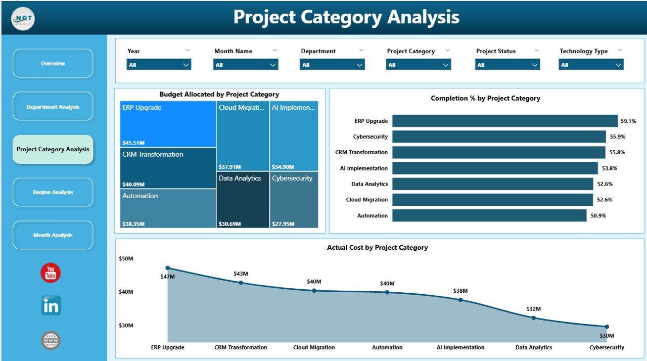
-
Cloud Migration
-
AI Implementation
-
ERP Upgrades
-
Automation Projects
-
Cybersecurity Enhancements
This page evaluates category-wise performance.
✔ Budget Allocated by Project Category
This chart highlights funding allocation across transformation initiatives.
✔ Completion % by Project Category
Some categories progress faster than others. This metric identifies efficiency levels.
✔ Actual Cost by Project Category
Leaders compare cost against performance.
For example:
-
AI projects may require high investment.
-
Automation initiatives may deliver faster ROI.
Therefore, management can prioritize high-impact initiatives.
4️⃣ Region Analysis – How Do Regions Compare?
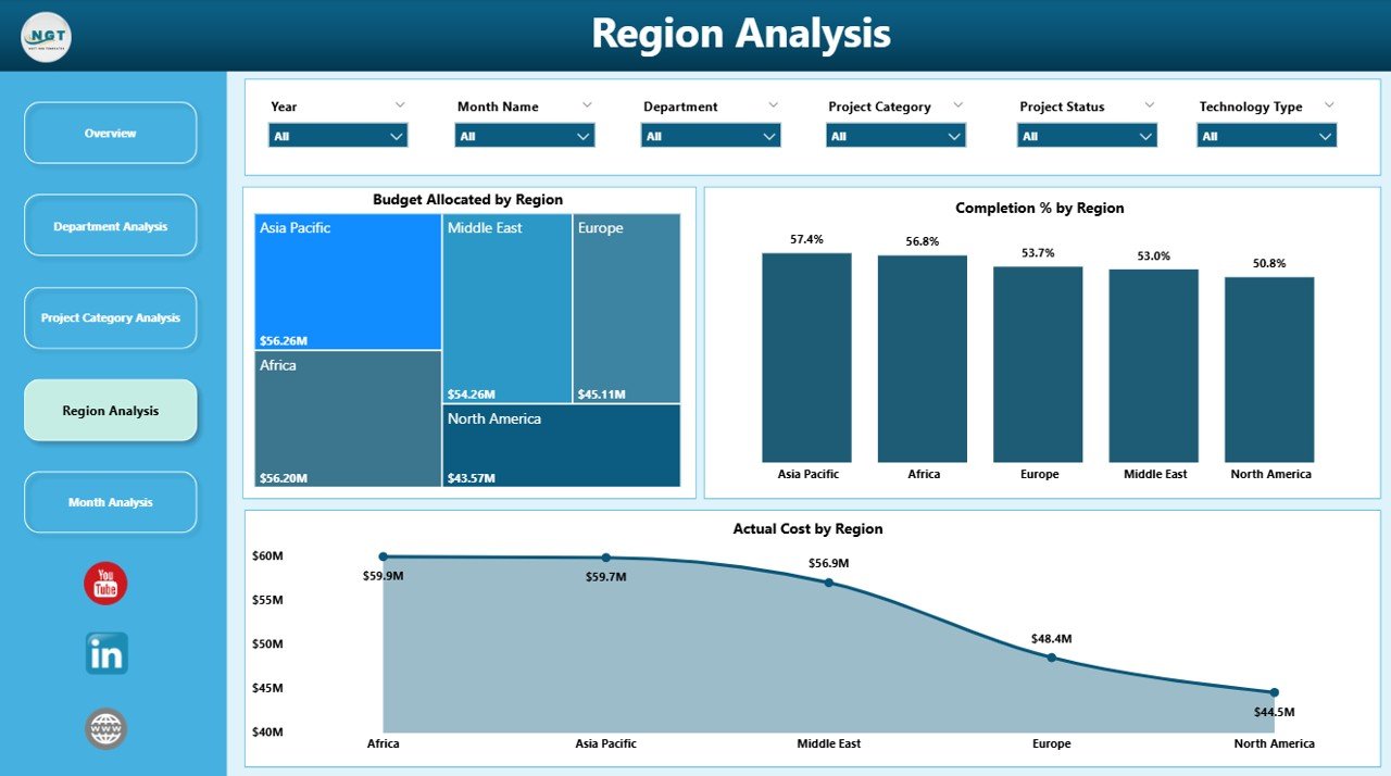
This page answers:
Which region leads digital transformation?
Included Visuals:
-
Budget Allocated by Region
-
Completion % by Region
-
Actual Cost by Region
Therefore, leadership identifies:
-
Regions that execute projects faster
-
Regions that overspend budgets
-
Regions that require additional support
Consequently, management improves global digital alignment.
Click to Purchases Digital Transformation Dashboard in Power BI
5️⃣ Month Analysis – How Does Performance Change Over Time?
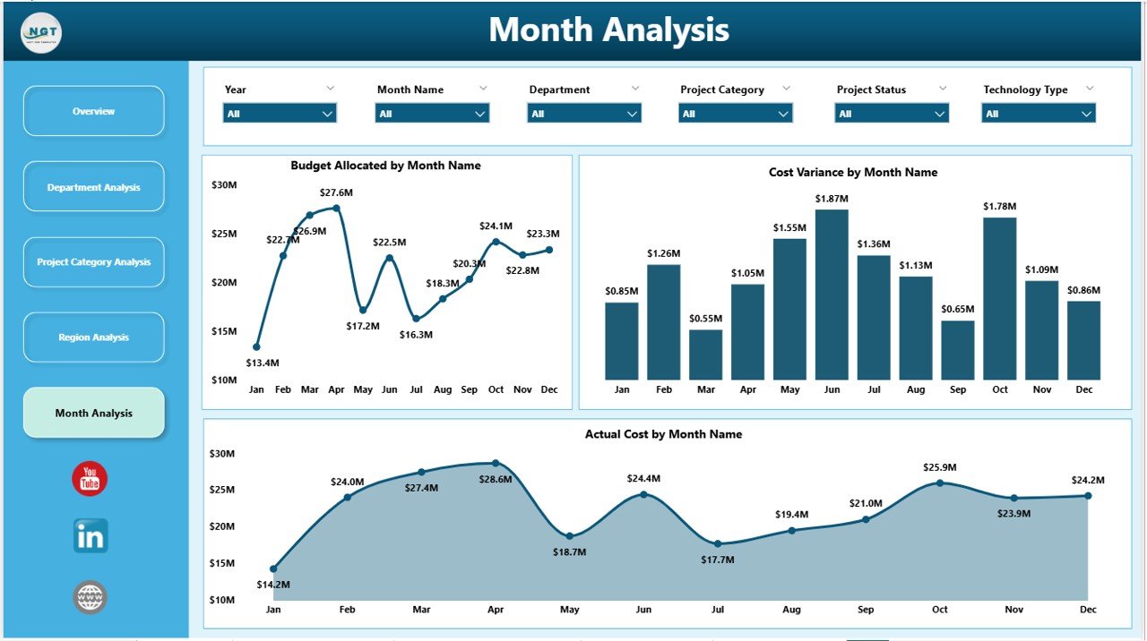
Key Monthly Visuals:
-
Budget Allocated by Month
-
Actual Cost by Month
-
Cost Variance by Month
This page helps leadership:
-
Detect overspending trends
-
Track budget utilization patterns
-
Forecast future expenses
-
Improve financial planning
As a result, organizations maintain financial discipline.
Key KPIs You Can Track in This Dashboard
This Power BI solution allows you to monitor important digital transformation KPIs:
-
Completion Percentage (%)
-
Budget Allocated
-
Actual Cost
-
Cost Variance
-
Customer Experience Score
-
Budget by Project Manager
-
Budget by Department
-
Completion by Region
-
Cost by Project Category
-
Monthly Budget Trends
Because these KPIs connect financial and operational metrics, leadership gains holistic visibility.
Advantages of Digital Transformation Dashboard in Power BI
Organizations gain multiple benefits when they implement this dashboard.
🚀 1. Real-Time Visibility
Power BI updates visuals dynamically. Therefore, leaders make faster decisions.
💰 2. Budget Control
Finance teams monitor allocation and actual spending easily.
📊 3. Improved Accountability
Project managers see budget ownership clearly.
🌍 4. Regional Performance Comparison
Global organizations compare transformation progress across regions.
📈 5. Strategic Alignment
Leaders align digital investment with customer satisfaction.
🔍 6. Early Risk Detection
Cost variance charts highlight overspending quickly.
Best Practices for the Digital Transformation Dashboard
To maximize value, follow these best practices:
✔ Define Clear KPIs
Select measurable KPIs such as completion %, cost variance, and CX score.
✔ Update Data Regularly
Ensure departments upload monthly data consistently.
✔ Use Slicers Strategically
Encourage leaders to filter data by department, region, and category.
✔ Monitor Cost Variance Closely
Investigate negative variances immediately.
✔ Align Projects with Strategy
Prioritize categories that improve customer experience and ROI.
✔ Conduct Monthly Reviews
Schedule structured dashboard review meetings.
How Does This Dashboard Improve Decision-Making?
This dashboard improves leadership decisions because:
-
It connects budget and performance data
-
It provides drill-down capability
-
It highlights risk areas instantly
-
It supports forecasting
-
It simplifies reporting
Moreover, executives can present clear visuals during board meetings. Therefore, communication improves significantly.
Who Can Benefit from This Dashboard?
Click to Purchases Digital Transformation Dashboard in Power BI
-
CIOs
-
CTOs
-
Digital Transformation Leaders
-
Project Managers
-
Finance Managers
-
Regional Directors
-
Strategy Teams
If your organization runs multiple digital projects, this dashboard adds immediate value.
How to Implement the Digital Transformation Dashboard in Power BI?
Follow these simple steps:
-
Collect project-level data
-
Structure data into tables
-
Import data into Power BI
-
Create relationships
-
Build KPI measures
-
Design interactive visuals
-
Publish dashboard to Power BI Service
-
Schedule automatic refresh
Because implementation remains straightforward, teams can deploy quickly.
Conclusion
Digital transformation drives business growth. However, transformation without measurement creates confusion.
The Digital Transformation Dashboard in Power BI solves that challenge. It centralizes performance data. It improves visibility. It controls budgets. It strengthens accountability.
Moreover, it empowers leadership to make strategic decisions with confidence.
If your organization wants structured digital oversight, this dashboard becomes a powerful solution.
Frequently Asked Questions with Answers
1. What is a Digital Transformation Dashboard in Power BI?
It is an interactive Power BI solution that tracks budget, completion rate, cost variance, and customer experience across digital initiatives.
2. Who should use this dashboard?
CIOs, project managers, finance teams, and transformation leaders can use it.
3. Can I customize this dashboard?
Yes. You can add additional KPIs, filters, or visualizations based on business needs.
4. How often should I update the dashboard?
You should update it monthly or weekly depending on project size.
5. Does this dashboard support regional analysis?
Yes. It includes a dedicated Region Analysis page for performance comparison.
6. Can this dashboard improve budget control?
Yes. Cost variance and actual cost visuals highlight overspending early.
7. Why should I use Power BI instead of Excel?
Power BI provides interactive visuals, drill-down capability, and real-time refresh features.
Visit our YouTube channel to learn step-by-step video tutorials