Energy Consumption Analysis Dashboard in Excel is a powerful, ready-to-use interactive analytics template designed for energy managers, facility operators, sustainability officers, and operations teams who need a centralized solution to monitor energy consumption, costs, carbon emissions, and operational efficiency. This Excel Dashboard Template includes 5 interactive dashboard pages, 5 KPI cards, and over 15 dynamic charts — all powered by pivot tables and slicers for instant data exploration.
Managing energy data across multiple facilities, departments, and equipment types can become overwhelming when data sits in scattered spreadsheets and utility reports. This dashboard solves that problem by bringing all critical energy metrics into one structured, visual interface. Whether you manage a single facility or a multi-site operation, this template helps you make smarter, faster, and data-driven decisions about energy consumption and sustainability.Energy Consumption Analysis Dashboard in Excel
Click to buy Energy Consumption Analysis Dashboard in Excel
Key Features of Energy Consumption Analysis Dashboard in Excel
The Energy Consumption Analysis Dashboard in Excel provides a comprehensive set of features that make it one of the most complete energy analytics solutions available in spreadsheet format. Here are the standout capabilities that set this template apart:
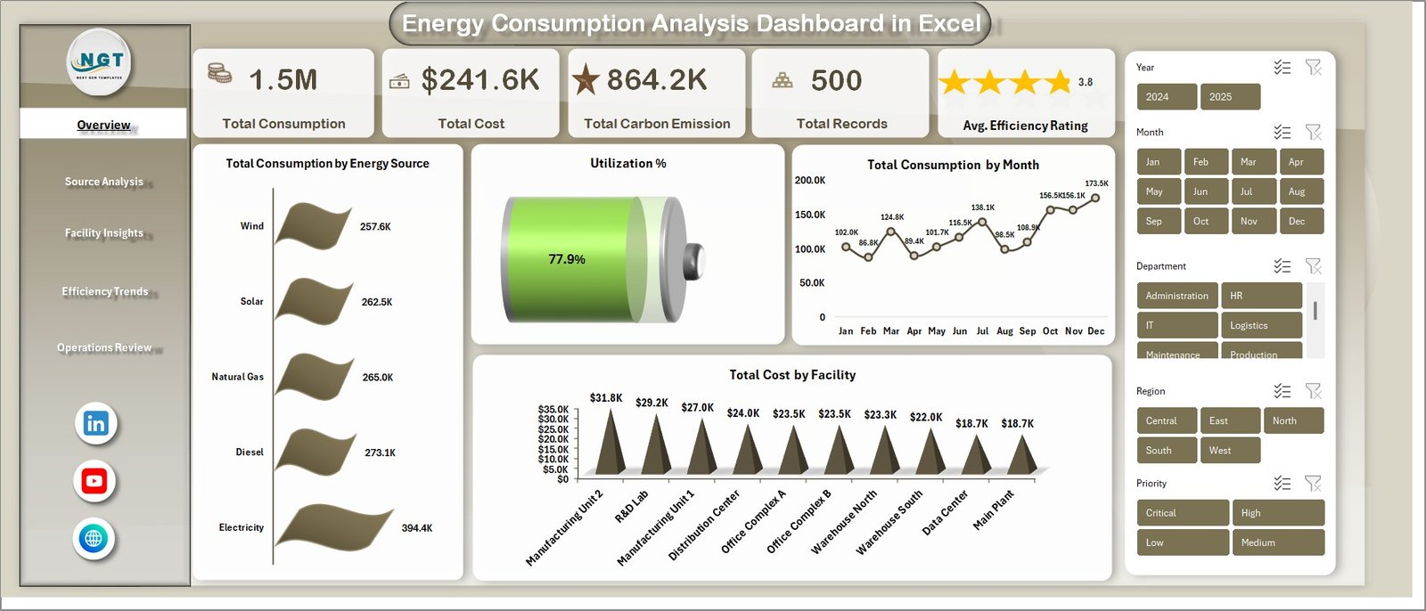
The dashboard includes 5 interactive dashboard pages — Overview, Source Analysis, Facility Insights, Efficiency Trends, and Operations Review — each designed for a specific analytical perspective. It tracks 5 key performance indicators on the Overview page: Total Consumption, Total Cost, Total Carbon Emission, Total Records, and Avg. Efficiency Rating. Dynamic slicers allow you to filter the entire dashboard by energy source, region, department, facility, equipment type, status, and more with a single click.
Carbon emission tracking is built into multiple pages, helping sustainability teams monitor environmental impact by energy source, zone, and facility. The efficiency trend analysis page provides month-by-month and year-over-year comparisons, making it easy to identify patterns and anomalies. All charts and KPIs are powered by pivot tables stored in the Support sheet, so the entire dashboard auto-refreshes when you click Refresh All after updating your data. To learn more about pivot table techniques, visit Microsoft’s PivotTable documentation.
Dashboard Pages Explained
1 — Overview Page
The Overview page is your main command center for energy monitoring. At the top, 5 dynamic KPI cards display Total Consumption, Total Cost, Total Carbon Emission, Total Records, and Avg. Efficiency Rating. Below the cards, interactive charts provide detailed analysis: Total Consumption by Energy Source reveals the distribution of usage across different fuel types, Utilization % provides a quick efficiency snapshot, Total Consumption by Month tracks energy usage patterns over time, and Total Cost by Facility compares spending across your different locations. Multiple slicers let you instantly filter the entire dashboard for focused analysis.
Energy Consumption Analysis Dashboard in Excel
Click to buy Energy Consumption Analysis Dashboard in Excel
2 — Source Analysis
The Source Analysis page dives deep into energy source performance. It features 4 targeted charts: Total Carbon Emission by Energy Source tracks environmental impact per fuel type, Total Consumption by Equipment Type identifies which equipment categories consume the most energy, Total Consumption by Region shows geographic distribution of energy usage, and Total Cost Vs Total Carbon Emission by Zone reveals cost-to-emission relationships across operational zones. This page is essential for understanding which energy sources drive the most cost and environmental impact.
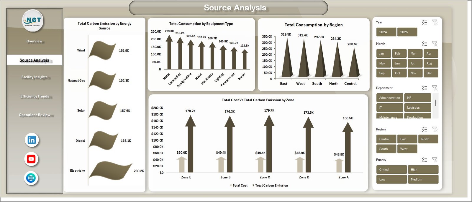
Source Analysis
3 — Facility Insights
The Facility Insights page provides operational performance analysis at the facility and department level. It includes 4 charts: Total Consumption Vs Total Carbon Emission by Facility compares energy usage against environmental impact for each location, Total Cost by Department reveals departmental spending patterns, Total Records by Maintenance Status monitors equipment health across the organization, and Total Consumption by Priority highlights consumption distribution across different priority levels.
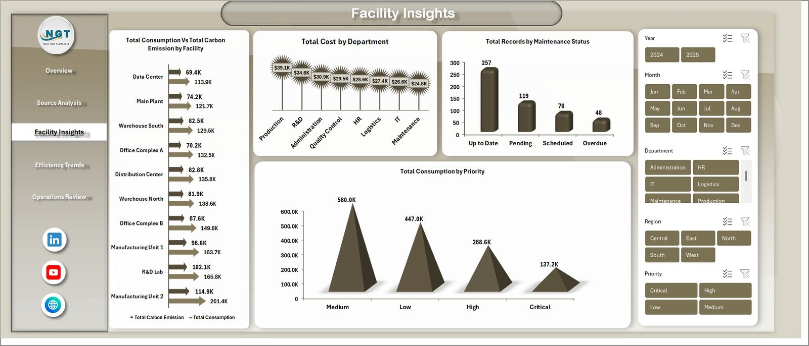
Facility Insights
4 — Efficiency Trends
The Efficiency Trends page tracks performance over time with 4 insightful charts: Avg. Efficiency Rating by Month monitors how efficiency fluctuates throughout the year, Total Consumption Vs Total Cost by Year benchmarks annual performance and cost-effectiveness, Avg. Operating Hours by Equipment Type compares runtime across different equipment categories, and Avg. Efficiency Rating by Facility ranks your facilities by their efficiency performance. This page is invaluable for identifying seasonal patterns and year-over-year improvement opportunities.
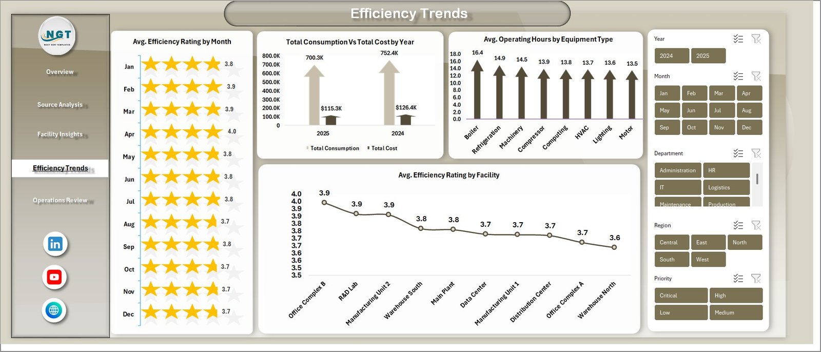
Efficiency Trends
5 — Operations Review
The Operations Review page gives you a clear view of operational status and resource allocation. It features 3 charts: Total Records by Status breaks down the distribution of operational statuses, Avg. Operating Hours by Region compares average runtime across geographic areas, and Total Consumption Vs by Department analyzes departmental consumption patterns to identify areas for optimization.
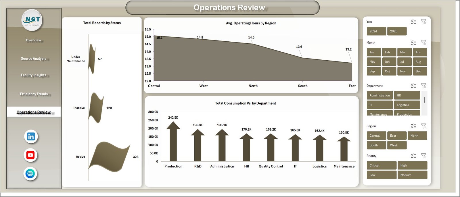
Operations Review
6 — Data Sheet
The Data Sheet is where you enter your energy consumption records in the structured format provided. All dashboard pages pull their data from this sheet. Simply replace the sample data with your own records and the entire dashboard will update after a Refresh All.Energy Consumption Analysis Dashboard in Excel
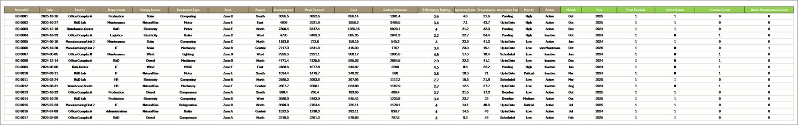
Data Sheet Tab
7 — Support Sheet
The Support Sheet contains all the pivot tables that power the entire dashboard dynamically. After updating your data in the Data Sheet, go to the Data tab in the Excel Ribbon and click Refresh All. All pivots will be refreshed and all charts across every page will update automatically. You can keep this sheet hidden for a cleaner user experience.Energy Consumption Analysis Dashboard in Excel
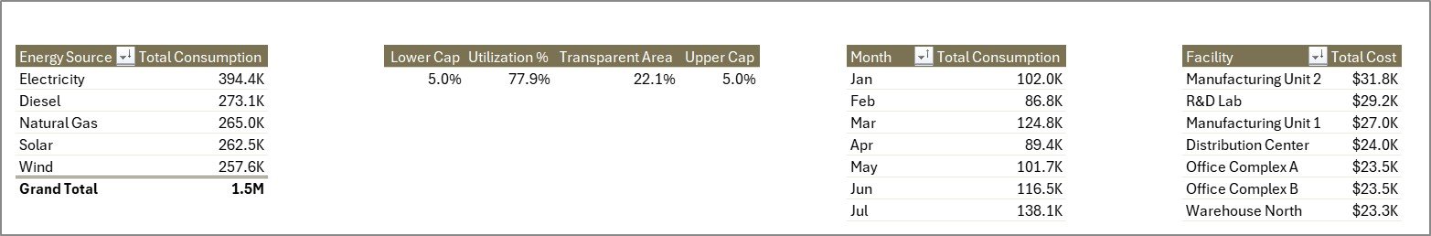
Support Sheet Tab
Advantages of Energy Consumption Analysis Dashboard in Excel
This dashboard offers several advantages that make it a must-have tool for any organization managing energy consumption data. First, it provides a single-view summary of all critical energy KPIs, eliminating the need to check multiple files or reports. Second, the pivot-driven architecture means you never need to manually rebuild charts — one click on Refresh All updates everything. Third, the interactive slicers allow non-technical users to explore data on their own without any Excel expertise. Fourth, the carbon emission tracking built into multiple pages makes it an excellent tool for organizations pursuing sustainability certifications or environmental compliance reporting. Finally, since it runs in standard Microsoft Excel with no VBA or macros, it works on virtually every computer and is easy to share with team members and stakeholders.Energy Consumption Analysis Dashboard in Excel
Opportunities for Improvement
While this dashboard is comprehensive, there are areas where users could extend its functionality further. Adding conditional formatting to the KPI cards would make it easier to spot values outside acceptable ranges at a glance. Incorporating budget targets alongside actual consumption data would enable variance analysis. Users managing very large datasets might benefit from connecting the dashboard to Power Query for automated data import from external sources like CSV files or databases. Additionally, integrating weather data could help correlate energy consumption patterns with seasonal temperature changes for more precise forecasting.
Best Practices for Using This DashEnergy Consumption Analysis Dashboard in Excelboard
To get the most value from the Energy Consumption Analysis Dashboard in Excel, follow these best practices. Keep your data consistent by entering records in the exact format provided in the Data Sheet — consistency in column names, date formats, and category labels ensures accurate pivot table grouping. Schedule regular data updates, ideally monthly, and always click Refresh All after adding new records. Use the slicers strategically during presentations to drill down into specific facilities, regions, or time periods. Consider creating separate copies of the dashboard for different reporting audiences — for example, a facility-level view for operations teams and a company-wide summary for executive leadership. Finally, hide the Support Sheet to keep the interface clean for end users while preserving the pivot table engine behind the scenes.Energy Consumption Analysis Dashboard in Excel
Explore Relevant Templates
If you found this dashboard useful, here are some related templates from NextGenTemplates.com that you might also enjoy:Energy Consumption Analysis Dashboard in Excel
- Energy Consumption Analysis Dashboard in HTML — Browser-based interactive version with 5 pages, dynamic filters, and CSV export.
- Building Automation Dashboard in Excel — Track building energy, alerts, maintenance costs, comfort scores, and occupancy insights.
- Browse all Excel Dashboard Templates for more interactive analytics solutions across industries.
Frequently Asked Questions
What is the best Excel dashboard template for energy consumption analysis?
The Energy Consumption Analysis Dashboard in Excel by NextGenTemplates is a top-rated template with 5 interactive pages, 5 KPI cards, 15+ charts, and dynamic slicers — all powered by pivot tables that auto-update when you refresh your data. It covers consumption, costs, carbon emissions, efficiency trends, and operational status in one comprehensive template.Energy Consumption Analysis Dashboard in Excel
How do I update the data in this energy dashboard?
Open the Data Sheet tab, replace the sample records with your own energy consumption data in the same column format, then go to the Data tab in the Excel Ribbon and click Refresh All. Every chart, KPI card, and pivot table across all 5 dashboard pages will update automatically.Energy Consumption Analysis Dashboard in Excel
Can I track carbon emissions with this Excel dashboard?
Yes. The dashboard includes dedicated charts for Total Carbon Emission by Energy Source, Total Cost Vs Total Carbon Emission by Zone, and Total Consumption Vs Total Carbon Emission by Facility. These charts help sustainability teams monitor environmental impact and prepare compliance reports.Energy Consumption Analysis Dashboard in Excel
Do I need VBA or macros to use this dashboard?
No. The Energy Consumption Analysis Dashboard in Excel uses standard pivot tables, slicers, and charts — no VBA or macros required. It works with Microsoft Excel 2016 and later versions, including Excel for Microsoft 365.Energy Consumption Analysis Dashboard in Excel
Who can benefit from this energy consumption dashboard?
Energy managers, facility operators, sustainability officers, data analysts, operations directors, property management companies, and students studying energy analytics can all benefit from this dashboard. It is designed for anyone who needs structured, visual energy consumption reporting.
Conclusion
The Energy Consumption Analysis Dashboard in Excel is a comprehensive, ready-to-use analytics solution that brings clarity to your organization’s energy consumption data. With 5 interactive pages, 5 KPI cards, 15+ charts, dynamic slicers, and pivot-table-powered auto-refresh — it transforms raw energy data into actionable insights for smarter decision-making. Whether you are tracking costs, monitoring carbon emissions, or benchmarking facility efficiency, this template has you covered.Energy Consumption Analysis Dashboard in Excel
Click here to Purchase Energy Consumption Analysis Dashboard in Excel
Visit our YouTube channel to learn step-by-step video tutorials
Click to buy Energy Consumption Analysis Dashboard in Excel