Executive coaching has become an essential investment for organizations that want to develop strong leaders, improve management effectiveness, and drive long-term business growth. However, measuring the impact of executive coaching programs can be challenging. Companies often struggle to track leadership development progress, coaching outcomes, performance improvements, and return on investment.
Therefore, organizations increasingly rely on data-driven performance dashboards to monitor coaching performance effectively. One of the most powerful tools for this purpose is the Executive Coaching KPI Dashboard in Power BI.
The Executive Coaching KPI Dashboard in Power BI is a ready-to-use business intelligence solution designed to track and analyze coaching performance indicators. This dashboard converts raw coaching data into interactive visual insights, KPI indicators, trend charts, and performance comparisons, which allows leadership teams to monitor coaching outcomes in real time.
Because Power BI provides powerful visualization and analytical capabilities, organizations can easily track KPI performance, compare targets vs actual results, and evaluate progress against previous year performance.
In this comprehensive guide, you will learn everything about the Executive Coaching KPI Dashboard in Power BI, including its features, structure, benefits, best practices, and frequently asked questions.
Click to Purchases Executive Coaching KPI Dashboard in Power BI
What is an Executive Coaching KPI Dashboard in Power BI?
An Executive Coaching KPI Dashboard in Power BI is a data visualization tool designed to monitor and analyze key performance indicators related to executive coaching programs.
Executive coaching programs focus on improving leadership skills, communication abilities, decision-making capabilities, and overall executive performance. However, without proper measurement, organizations cannot determine whether coaching initiatives deliver meaningful results.
Therefore, the dashboard helps organizations track metrics such as:
-
Coaching program effectiveness
-
Leadership development progress
-
Coaching engagement performance
-
Target achievement rates
-
Month-to-date and year-to-date progress
-
Performance comparison with previous year
Instead of manually reviewing spreadsheets and reports, managers can instantly analyze coaching KPIs through interactive dashboards and charts.
As a result, leadership teams gain deeper insights and make faster, more informed decisions.
Why Do Organizations Need an Executive Coaching KPI Dashboard?
Executive coaching involves multiple stakeholders, performance metrics, and evaluation parameters. Therefore, tracking all this information manually becomes extremely difficult.
Moreover, organizations often face several challenges when they do not use a structured KPI monitoring system.
Common Challenges Without a KPI Dashboard
-
Difficulty tracking coaching program outcomes
-
Lack of visibility into leadership development progress
-
Inconsistent KPI measurement across departments
-
Limited insights into target achievement rates
-
Difficulty comparing current performance with historical performance
However, the Executive Coaching KPI Dashboard in Power BI solves these challenges by providing real-time analytics and performance tracking.
Consequently, organizations can monitor coaching effectiveness and improve leadership development strategies.
Key Features of Executive Coaching KPI Dashboard in Power BI
The dashboard includes three powerful analytical pages designed to provide comprehensive KPI insights.
These pages allow users to analyze performance trends, track KPI achievements, and review KPI definitions easily.
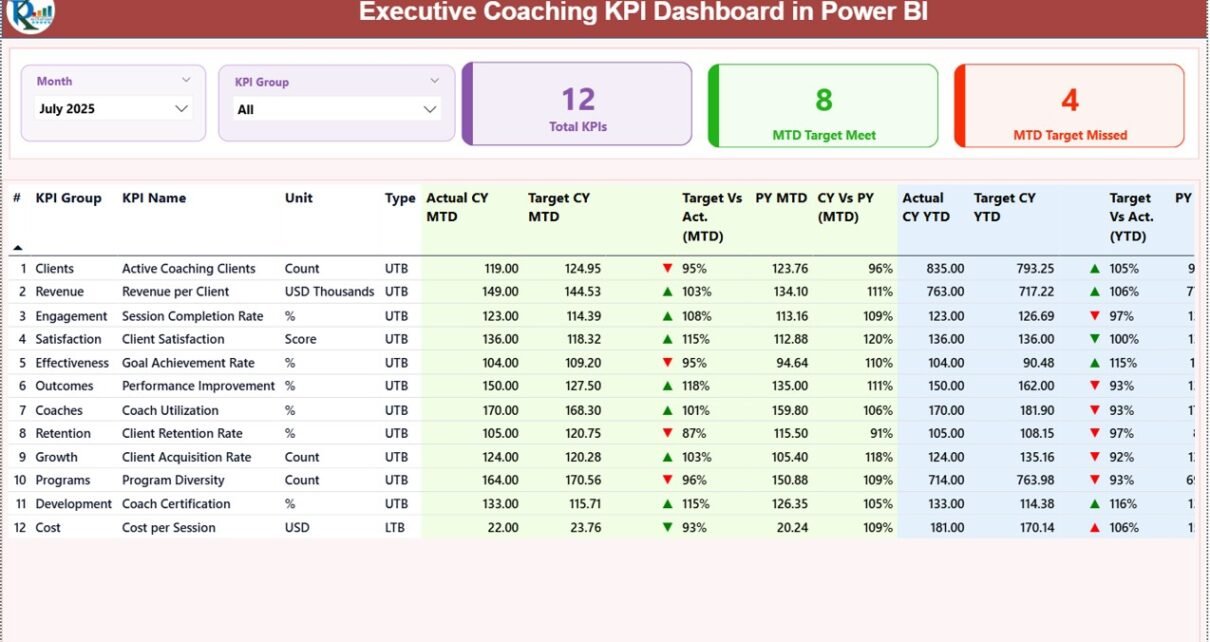
1. Summary Page – The Main Performance Overview
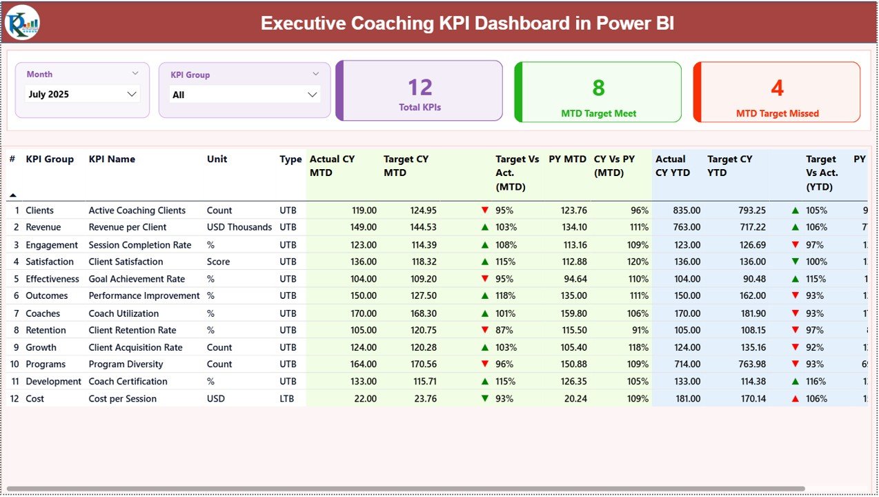
The Summary Page acts as the central monitoring page of the dashboard. It provides a complete overview of KPI performance using slicers, KPI cards, and a detailed KPI table.
Slicers Available
Users can filter the dashboard using:
-
Month Slicer
-
KPI Group Slicer
Because of these slicers, users can quickly analyze performance for a specific time period or KPI category.
KPI Cards
The dashboard displays three important KPI cards:
-
Total KPIs Count
-
MTD Target Meet Count
-
MTD Target Missed Count
These KPI cards provide an instant summary of overall performance.
Detailed KPI Performance Table
Below the KPI cards, the dashboard displays a detailed performance table containing the following information.
KPI Number
This column shows the sequence number assigned to each KPI.
KPI Group
This represents the category or group of the KPI.
KPI Name
This column displays the name of the KPI being monitored.
Unit
The measurement unit used for the KPI.
Type
The type indicates the KPI measurement logic:
-
LTB – Lower the Better
-
UTB – Upper the Better
Performance Metrics Displayed
The dashboard displays several important performance metrics.
Actual CY MTD
This shows the current year Month-to-Date actual value of the KPI.
Target CY MTD
This shows the target value for the current year Month-to-Date.
MTD Icon
The dashboard displays green ▲ and red ▼ icons to indicate KPI performance status against the target.
Target vs Actual (MTD)
This metric shows the percentage comparison using the formula:
Actual MTD ÷ Target MTD
PY MTD
This represents the previous year MTD value for the same period.
CY vs PY (MTD)
This metric compares the current year MTD performance with previous year MTD performance.
Formula used:
Current Year MTD ÷ Previous Year MTD
Year-To-Date KPI Metrics
The dashboard also provides year-to-date comparisons.
Actual CY YTD
Current year actual YTD value.
Target CY YTD
Target value for the current year YTD.
YTD Icon
Performance indicators using green ▲ and red ▼ icons.
Target vs Actual (YTD)
Calculated using:
Actual YTD ÷ Target YTD
PY YTD
Previous year YTD value.
CY vs PY (YTD)
Comparison between current year YTD and previous year YTD performance.
Because of these metrics, managers can easily evaluate short-term and long-term KPI performance.
Click to Purchases Executive Coaching KPI Dashboard in Power BI
KPI Trend Page – How Does KPI Performance Change Over Time?
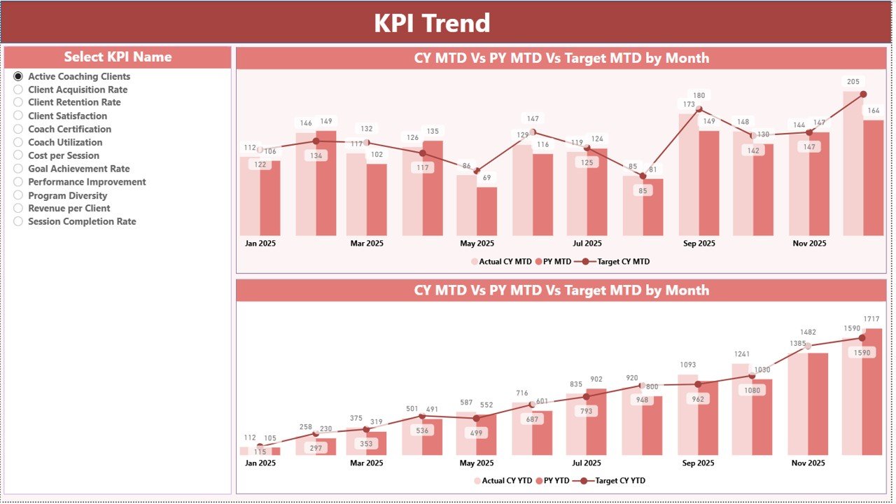
The KPI Trend Page provides a deeper analytical view of KPI performance over time.
This page displays two combo charts that analyze KPI performance for:
-
Month-to-Date (MTD)
-
Year-to-Date (YTD)
What Do These Charts Show?
The combo charts display:
-
Current Year Actual values
-
Previous Year Actual values
-
Target values
Therefore, users can easily identify performance trends and deviations.
KPI Selection Slicer
The page also includes a KPI Name slicer located on the left side of the dashboard.
Because of this slicer, users can select any KPI and instantly analyze its performance trend.
Consequently, managers gain deeper insights into:
-
KPI progress over time
-
Target achievement patterns
-
Performance fluctuations
KPI Definition Page – Understanding KPI Logic
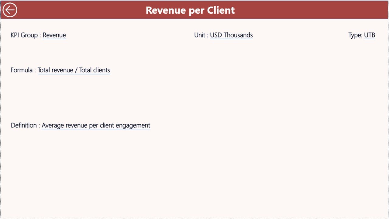
The KPI Definition Page serves as a detailed reference section for KPI information.
This page contains detailed information such as:
-
KPI formula
-
KPI definition
-
KPI measurement unit
-
KPI category
However, this page remains hidden by default and works as a drill-through page.
Users can access it by drilling through from the summary page.
Navigation Feature
To return to the main page, users can simply click the Back Button located in the top-left corner.
This feature ensures smooth dashboard navigation.
Excel Data Source Used in the Dashboard
The dashboard uses Excel as the primary data source.
Users must fill three worksheets in the Excel file.
1. Input_Actual Sheet
This sheet captures the actual KPI performance data.
Users need to enter:
-
KPI Name
-
Month (use the first date of the month)
-
MTD numbers
-
YTD numbers
2. Input_Target Sheet
This sheet contains the target KPI values.
Users need to fill:
-
KPI Name
-
Month
-
Target MTD numbers
-
Target YTD numbers
3. KPI Definition Sheet
This sheet contains detailed KPI information.
Users need to enter:
-
KPI Number
-
KPI Group
-
KPI Name
-
Unit
-
Formula
-
Definition
-
KPI Type (LTB or UTB)
Because the dashboard connects directly to Excel data, users can easily update KPI values and refresh the dashboard.
Click to Purchases Executive Coaching KPI Dashboard in Power BI
Advantages of Executive Coaching KPI Dashboard in Power BI
Organizations benefit significantly from implementing this dashboard.
1. Clear Performance Visibility
Managers can instantly view coaching performance metrics without reviewing multiple reports.
2. Real-Time KPI Monitoring
Power BI allows organizations to update KPI data and refresh dashboards quickly.
3. Improved Leadership Development Tracking
The dashboard helps organizations monitor leadership improvement and coaching outcomes.
4. Data-Driven Decision Making
Executives can make informed decisions based on accurate KPI insights.
5. Easy Performance Comparisons
Users can compare:
-
Target vs Actual performance
-
Current vs Previous Year performance
-
Month-to-Date vs Year-to-Date metrics
6. Centralized KPI Management
All KPI information remains organized in one structured dashboard.
Opportunities for Improvement in Executive Coaching KPI Dashboards
Even though the dashboard provides strong insights, organizations can further improve it.
Add Advanced KPIs
Companies can track additional metrics such as:
-
Leadership competency scores
-
Coaching session effectiveness
-
Behavioral improvement indicators
Integrate HR Systems
Integration with HR platforms can automate data collection.
Add Predictive Analytics
Predictive models can forecast coaching outcomes and leadership performance trends.
Use Real-Time Data Integration
Connecting the dashboard to cloud data sources can enable real-time monitoring.
Best Practices for the Executive Coaching KPI Dashboard
Organizations should follow best practices to maximize dashboard effectiveness.
1. Define Clear KPIs
Always define measurable and actionable KPIs.
2. Use Consistent Data Entry
Ensure accurate data entry in Excel sheets.
3. Review KPIs Regularly
Managers should review KPI performance monthly.
4. Use Simple KPI Definitions
Clearly define KPI formulas and measurement logic.
5. Align KPIs With Business Goals
Leadership KPIs should align with strategic objectives.
6. Train Dashboard Users
Ensure that managers and analysts understand how to interpret dashboard metrics.
How Does Power BI Improve Executive Coaching Analytics?
Power BI significantly improves coaching performance monitoring.
Interactive Data Visualization
Power BI converts raw data into charts, KPI cards, and trend analysis.
Easy Data Integration
Power BI integrates easily with Excel, databases, and cloud platforms.
Powerful Analytics
Users can analyze:
-
KPI performance trends
-
Target achievement levels
-
Historical comparisons
Dynamic Filtering
Slicers allow users to filter dashboard views quickly.
Conclusion
The Executive Coaching KPI Dashboard in Power BI provides a powerful solution for tracking leadership development and coaching performance. Instead of relying on scattered reports and spreadsheets, organizations can monitor coaching effectiveness through interactive dashboards, KPI indicators, and performance charts.
Moreover, the dashboard helps managers track target achievement, performance trends, and year-to-year comparisons in one centralized system.
Because organizations increasingly rely on data-driven decision making, implementing a structured KPI monitoring system becomes essential.
Therefore, businesses that adopt the Executive Coaching KPI Dashboard in Power BI gain better visibility into leadership development progress and improve their executive coaching strategies.
Click to Purchases Executive Coaching KPI Dashboard in Power BI
Frequently Asked Questions (FAQs)
What is an Executive Coaching KPI Dashboard?
An Executive Coaching KPI Dashboard is a performance monitoring tool that tracks leadership development metrics, coaching effectiveness, and KPI performance using data visualization tools such as Power BI.
Why should organizations use Power BI for KPI dashboards?
Power BI offers powerful visualization, real-time analytics, easy data integration, and interactive dashboard capabilities.
What type of data is used in this dashboard?
The dashboard uses Excel data including:
-
Actual KPI values
-
Target KPI values
-
KPI definitions
What are MTD and YTD metrics?
MTD stands for Month-to-Date, which shows performance for the current month.
YTD stands for Year-to-Date, which shows cumulative performance from the beginning of the year.
What does LTB and UTB mean in KPIs?
-
LTB (Lower the Better) means lower values indicate better performance.
-
UTB (Upper the Better) means higher values indicate better performance.
Can this dashboard be customized?
Yes. Organizations can easily customize the dashboard by adding new KPIs, modifying visuals, or connecting new data sources.
Click to Purchases Executive Coaching KPI Dashboard in Power BI
Visit our YouTube channel to learn step-by-step video tutorials