Managing a modern farm requires more than experience and intuition. Today, data plays a critical role in improving efficiency, reducing costs, and boosting sustainability. Farmers, agribusiness managers, and stakeholders need tools that provide real-time insights into farm operations. That is exactly where a Farm Management KPI Dashboard in Power BI becomes valuable.
This dashboard brings together key data on farm performance, targets, and trends. It empowers decision-makers to monitor everything from crop yield and livestock performance to resource usage and financial outcomes. In this article, we will explore the features, benefits, and best practices for implementing a Farm Management KPI Dashboard in Power BI.
Click to Purchases Farm Management KPI Dashboard in Power BI
What Is a Farm Management KPI Dashboard?
A Farm Management KPI Dashboard is a business intelligence solution built in Power BI that tracks Key Performance Indicators (KPIs) specific to farm operations. It connects to data sources such as Excel, ERP systems, or IoT devices and presents information in easy-to-read charts, cards, and tables.
Instead of relying on manual reports, the dashboard provides an automated, visual, and interactive way to monitor farm performance. You can quickly see if you are meeting targets, identify problem areas, and take corrective action before losses occur.
Key Features of the Farm Management KPI Dashboard in Power BI
The Farm Management Dashboard we are discussing includes three main pages and links directly to an Excel-based data input structure. Let’s break it down:
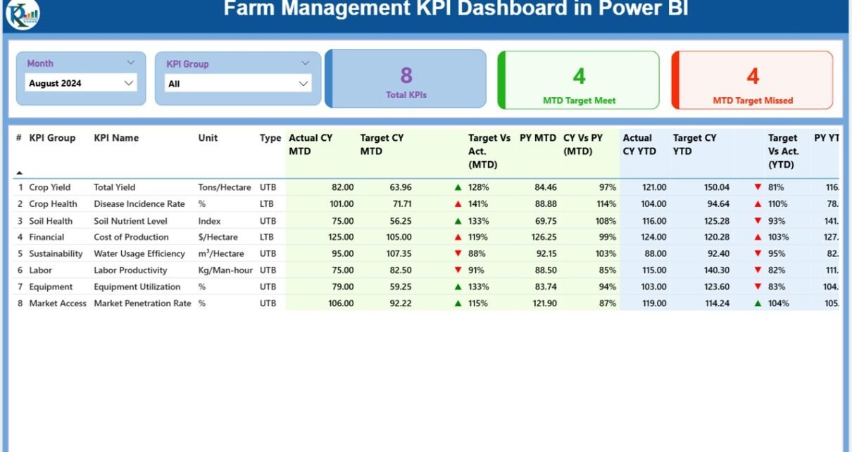
Summary Page
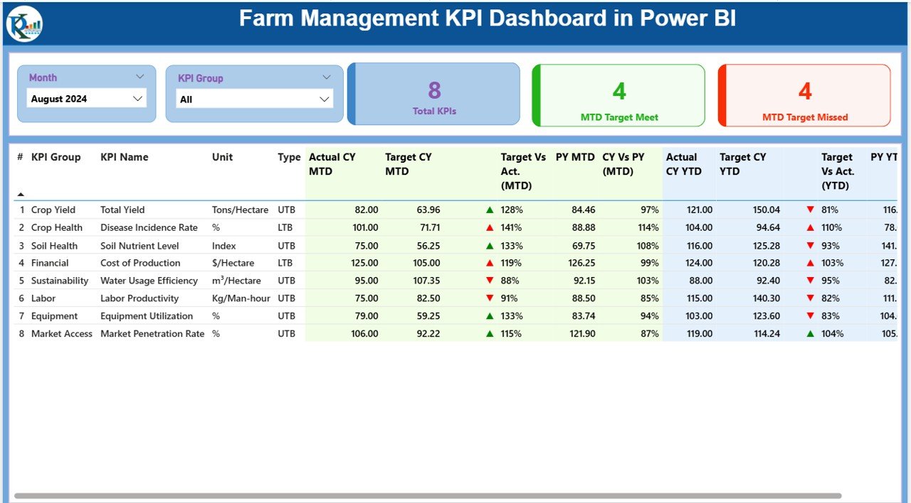
The Summary Page is the central view of farm performance. It contains:
-
Month and KPI Group slicer at the top for quick filtering.
-
Cards for total KPI count, MTD target met, and MTD target missed.
Detailed KPI table showing:
- KPI Number
- KPI Group (Crop, Livestock, Finance, Sustainability, etc.)
- KPI Name
- Unit of measurement
- Type (LTB = Lower the Better, UTB = Upper the Better)
- Actual Current Year (CY) MTD values
- Target CY MTD values
- MTD icons with green ▲ or red ▼ for quick comparison
- Target vs Actual % (MTD)
- Previous Year (PY) MTD values
- CY vs PY (MTD %)
- Actual CY YTD values
- Target CY YTD values
- YTD icons with indicators
- Target vs Actual % (YTD)
- PY YTD values
- CY vs PY (YTD %)
This page provides a snapshot of farm performance at both monthly and yearly levels.
KPI Trend Page
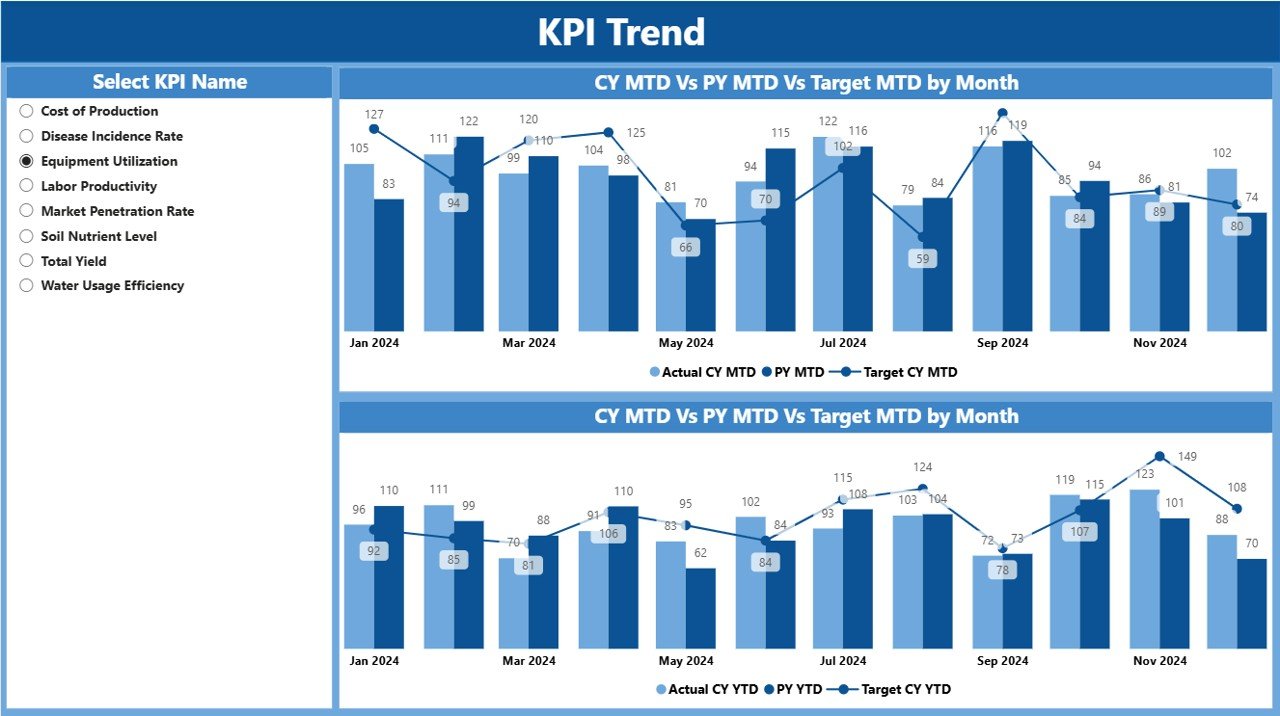
This page focuses on trends over time.
-
Displays combo charts comparing Actual vs Target for both MTD and YTD.
-
Shows data for Current Year, Previous Year, and Targets.
-
Includes a slicer to filter by KPI name.
This is very useful for analyzing patterns, such as:
-
Is crop yield improving compared to last year?
-
Are costs per acre trending downward?
-
Are sustainability targets being met?
Click to Purchases Farm Management KPI Dashboard in Power BI
KPI Definition Page
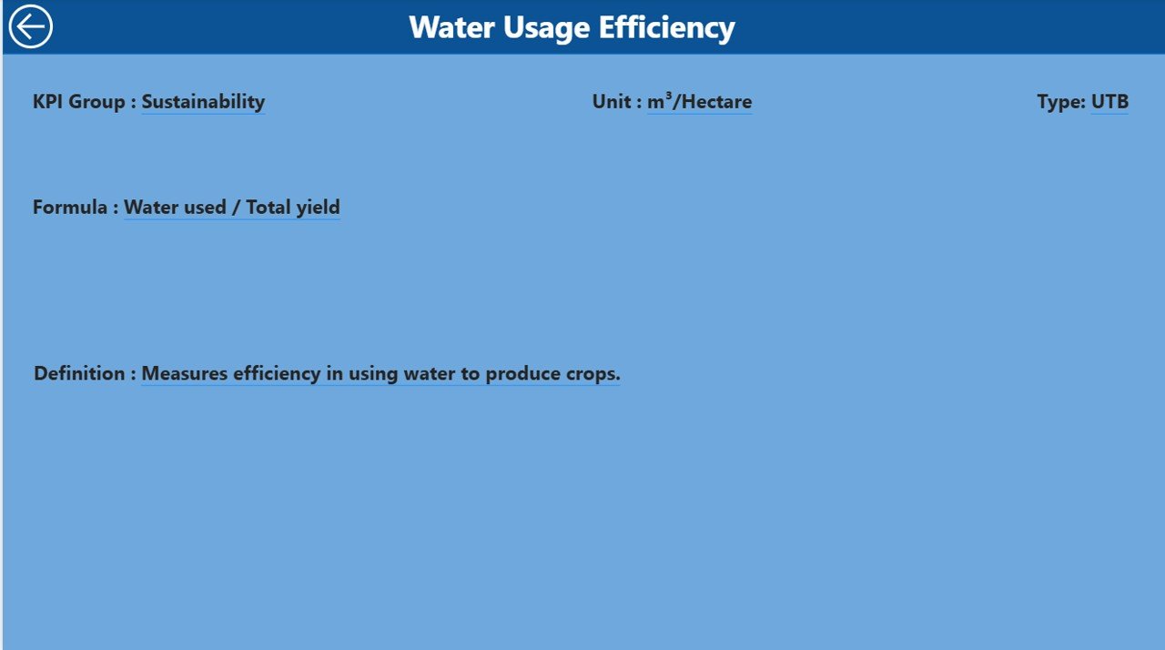
The KPI Definition Page is a drill-through view designed for deeper analysis.
-
Provides detailed information about formulas and definitions of KPIs.
-
Helps farm managers understand exactly how metrics are calculated.
-
Ensures alignment between stakeholders on what each KPI means.
It also includes a back button to easily return to the main page.
Excel Data Source for the Dashboard
The dashboard connects to a structured Excel file with three worksheet tabs:
Input_Actual
- Capture Actual numbers for each KPI by month.
- Includes MTD and YTD data.
Input_Target
- Capture Target numbers for each KPI by month.
- Also includes MTD and YTD targets.
KPI Definition
- Stores KPI metadata such as Number, Group, Name, Unit, Formula, Definition, and Type (LTB or UTB).
This structure makes it easy to update and refresh the Power BI dashboard with new farm data.
Why Do Farmers Need a KPI Dashboard?
Modern farming involves many variables: weather, labor, inputs, machinery, water, and finances. A single missed KPI can reduce yields or increase costs. A dashboard offers:
-
Real-time monitoring of key indicators.
-
Early detection of issues (e.g., rising fertilizer costs).
-
Data-driven decisions instead of guesswork.
-
Improved accountability across teams and departments.
-
Time savings since reports are auto-generated.
Advantages of Farm Management KPI Dashboard in Power BI
Using this dashboard brings many benefits:
✅ Centralized View: Combines all farm KPIs into one place.
✅ Interactive Analysis: Slice and dice by month, group, or individual KPI.
✅ Performance Tracking: Track MTD vs YTD results and compare with previous years.
✅ Visual Indicators: Quick icons highlight areas of concern.
✅ Forecasting Power: Historical trend analysis helps in predicting future outcomes.
✅ Scalability: Works for small farms as well as large agribusinesses.
✅ Ease of Use: Excel-based input makes it farmer-friendly.
Best Practices for Using the Farm Management Dashboard
To get the most out of your dashboard, follow these best practices:
-
Define Clear KPIs: Choose metrics that align with farm goals (yield, cost efficiency, sustainability).
-
Update Data Regularly: Keep the Excel input sheets up to date for accurate reporting.
-
Segment Data: Use KPI groups such as Crops, Livestock, Finance, and Resources.
-
Use Drill-Through Wisely: Check the definition page to ensure consistent interpretation.
-
Leverage Trends: Analyze YTD and PY comparisons to spot improvement areas.
-
Share Reports: Use Power BI’s sharing features to collaborate with team members.
-
Automate Data Sources: Over time, link IoT sensors, ERP, or farm management software to reduce manual updates.
Opportunities for Improvement
Even with a strong setup, dashboards can evolve. Here are areas to improve:
-
🌱 Integration with IoT devices (soil moisture, climate sensors).
-
💧 Water usage KPIs for sustainable farming.
-
🐄 Animal health metrics for livestock management.
-
📊 Predictive analytics using AI in Power BI.
-
💰 Financial forecasting models to manage cash flow.
Conclusion
A Farm Management KPI Dashboard in Power BI helps farmers and agribusinesses achieve greater efficiency, sustainability, and profitability. With real-time monitoring, clear visuals, and trend analysis, farm managers can make informed decisions quickly.
By following best practices and updating data consistently, you can transform farm operations into a more data-driven and productive system. As farming becomes more complex, tools like this dashboard are no longer optional—they are essential.
Frequently Asked Questions (FAQs)
1. What is a Farm Management KPI Dashboard?
It is a Power BI tool that tracks key farm performance metrics like yield, costs, resource use, and sustainability in real time.
2. Can small farms use this dashboard?
Yes. The Excel-based input structure makes it simple for small farms to adopt, while larger farms can integrate more advanced data sources.
3. How often should I update the dashboard?
Ideally, update it monthly with MTD and YTD data. Larger farms may benefit from weekly updates.
4. What KPIs are most common in farm management?
Common KPIs include crop yield per acre, livestock growth rate, water use efficiency, fertilizer costs, and net farm income.
5. Does the dashboard work offline?
Yes, as long as you have Power BI Desktop and the Excel input file. For online sharing, Power BI Service is recommended.
6. Can I customize the KPIs?
Absolutely. The KPI Definition sheet allows you to add, edit, or remove KPIs based on farm needs.
7. How does this dashboard help with sustainability?
By tracking water, fertilizer, and energy usage, the dashboard helps farms reduce waste and adopt sustainable practices.
Visit our YouTube channel to learn step-by-step video tutorials