Financial management plays a critical role in every organization, regardless of size or industry. Companies constantly track revenue, expenses, budgets, and profits to ensure sustainable growth. However, many businesses still rely on scattered spreadsheets and manual calculations. As a result, decision-makers struggle to understand financial performance quickly.So, how can organizations monitor financial data efficiently while gaining clear insights?The answer lies in a Finance Dashboard in Excel.In this comprehensive guide, you will learn everything about creating and using a Finance Dashboard in Excel, including its structure, features, benefits, analysis capabilities, best practices, and frequently asked questions. Whether you are a finance professional, business owner, or analyst, this article will help you transform raw financial data into actionable insights.
Click to buy Finance Dashboard in Excel
What Is a Finance Dashboard in Excel?
A Finance Dashboard in Excel is an interactive reporting tool that converts financial data into visual insights using charts, KPIs, and dynamic analysis pages.
Instead of reviewing multiple financial reports separately, users can monitor all key financial indicators from a single dashboard. Therefore, organizations make faster and more accurate financial decisions.
This ready-to-use dashboard allows users to analyze:
- Revenue performance
- Expense tracking
- Budget monitoring
- Profitability analysis
- Variance evaluation
- Department performance
- Regional financial results
- Customer segment profitability
- Monthly financial trends
Because Excel offers flexibility and automation, businesses can customize dashboards easily according to their reporting needs.
Why Do Businesses Need a Finance Dashboard?
Many organizations collect financial data daily. However, data alone does not create value. Companies must convert numbers into insights.
Without a dashboard:
- Finance teams spend hours preparing reports.
- Managers struggle to compare budget vs actual performance.
- Decision-making becomes slow.
- Financial risks remain unnoticed.
On the other hand, a Finance Dashboard simplifies analysis and improves visibility.
Key Reasons Businesses Use Finance Dashboards
- Centralized financial monitoring
- Faster reporting cycles
- Better budget control
- Improved profitability tracking
- Real-time performance visibility
- Data-driven strategic planning
Consequently, companies gain clarity and confidence while making financial decisions.
Key Features of the Finance Dashboard in Excel
This ready-to-use Finance Dashboard includes multiple analytical sheet tabs designed to provide deep financial insights.
The dashboard structure focuses on five major analytical areas:
- Overview Sheet
- Department Analysis
- Region Analysis
- Customer Type Analysis
- Monthly Trends
Let’s explore each section in detail.
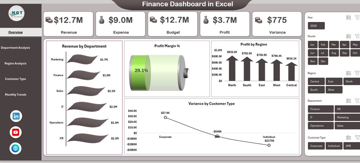
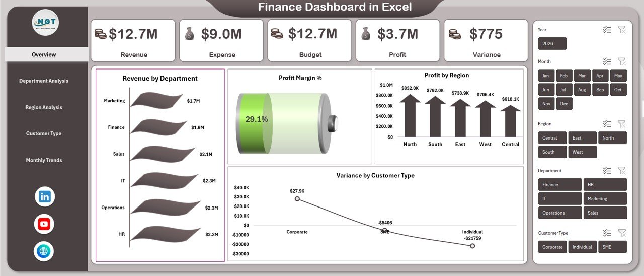
Overview Sheet Tab – The Financial Control Center
The Overview Sheet works as the main dashboard page. It provides a high-level summary of overall financial performance.
Here, users quickly understand whether the business operates profitably or requires corrective action.
KPIs Displayed on Overview Page
- Revenue
- Expense
- Budget
- Profit
- Variance
- Profit Margin %
These KPIs provide an instant snapshot of financial health.
Charts Available in Overview
- Revenue by Department
Helps identify top-performing departments. - Profit Margin %
Shows overall profitability efficiency. - Profit by Region
Highlights geographical performance differences. - Variance by Customer Type
Displays budget deviations across customer segments.
Because all key metrics appear on one page, executives quickly assess performance without opening multiple reports.
Click to buy Finance Dashboard in Excel
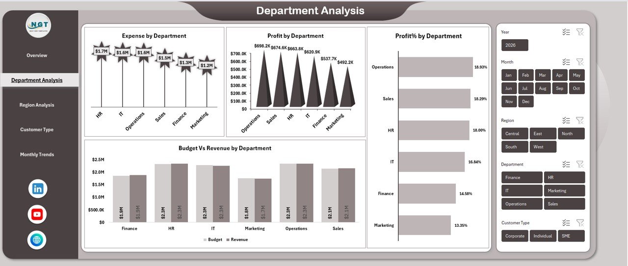
Department Analysis Sheet – How Do Departments Perform Financially?
Departments contribute differently to business results. Therefore, analyzing departmental performance becomes essential.
The Department Analysis sheet focuses on cost efficiency and profitability.
Key Visualizations
- Expense by Department
- Profit by Department
- Budget vs Revenue by Department
- Profit % by Department
Insights You Can Gain
- Which department generates maximum profit?
- Which department overspends budget?
- Where cost optimization is required?
- Which department delivers the highest margins?
As a result, management allocates resources more effectively.
Click to buy Finance Dashboard in Excel
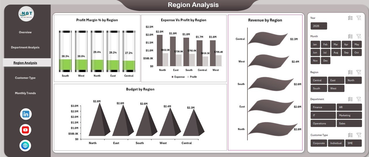
Region Analysis Sheet – Which Regions Drive Profitability?
Organizations operating across multiple regions must compare financial performance geographically.
The Region Analysis sheet answers critical questions about regional efficiency.
Charts Included
- Profit Margin % by Region
- Expense vs Profit by Region
- Budget by Region
- Revenue by Region
Business Benefits
- Identify high-growth markets
- Detect underperforming regions
- Optimize regional investment
- Improve expansion strategies
Therefore, leaders make smarter geographic decisions.
Click to buy Finance Dashboard in Excel
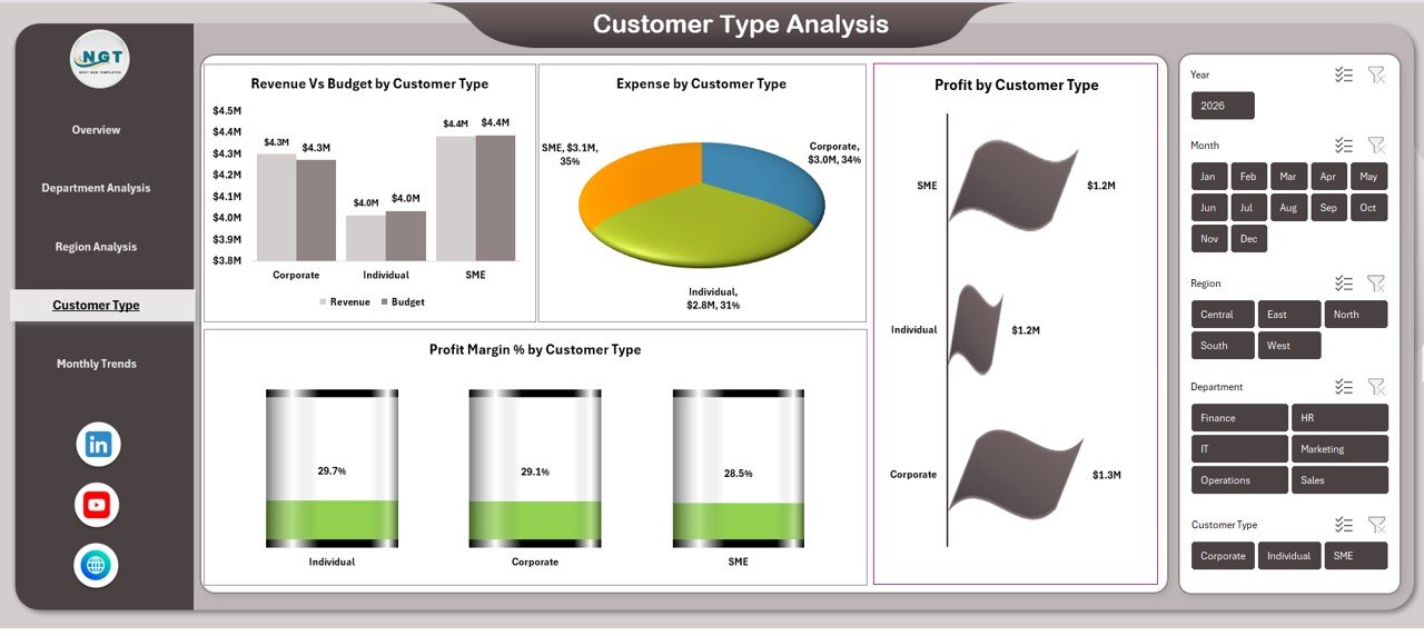
Customer Type Analysis – Which Customers Are Most Profitable?
Not all customers contribute equally to profits. Some generate revenue but also increase operational costs.
The Customer Type Analysis sheet helps businesses understand customer profitability.
Visual Reports
- Revenue vs Budget by Customer Type
- Expense by Customer Type
- Profit Margin % by Customer Type
- Profit by Customer Type
Key Questions Answered
- Which customer segments deliver the best margins?
- Which segments exceed budget expectations?
- Where should marketing focus increase?
- Which customers require cost optimization?
Consequently, companies refine pricing and customer strategies.
Click to buy Finance Dashboard in Excel
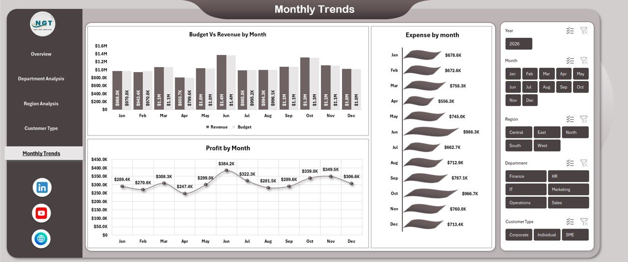
Monthly Trends Sheet – How Does Financial Performance Change Over Time?
Trend analysis helps organizations predict future performance.
The Monthly Trends sheet provides time-based financial insights.
Charts Included
- Budget vs Revenue by Month
- Profit by Month
- Expense by Month
Why Monthly Analysis Matters
- Detect seasonal patterns
- Track growth trends
- Monitor expense fluctuations
- Improve forecasting accuracy
Because trends reveal patterns early, businesses respond proactively instead of reactively.
Click to buy Finance Dashboard in Excel
How Does a Finance Dashboard Improve Decision-Making?
A Finance Dashboard transforms raw data into clear visuals. As a result, decision-makers quickly understand performance without complex calculations.
Decision-Making Improvements
- Faster financial reviews
- Accurate budget planning
- Early problem detection
- Better cost control
- Improved forecasting
Moreover, leadership teams align strategies using shared financial insights.
Advantages of Finance Dashboard in Excel
Using a Finance Dashboard provides several operational and strategic benefits.
Centralized Financial Visibility
All financial metrics appear in one location, reducing reporting confusion.
Easy Data Analysis
Charts simplify complex numbers instantly.
Faster Reporting
Users update data once and dashboards refresh automatically.
Budget Control
Variance tracking highlights overspending quickly.
Better Profitability Monitoring
Businesses track margins across departments and customers.
Cost Efficiency
Excel eliminates the need for expensive software.
Customization Flexibility
Organizations modify dashboards according to industry needs.
Therefore, Excel dashboards remain one of the most practical financial tools.
What Metrics Should Every Finance Dashboard Track?
A strong finance dashboard focuses on meaningful KPIs.
Essential Financial KPIs
- Total Revenue
- Total Expenses
- Net Profit
- Budget Variance
- Profit Margin %
- Department Profitability
- Regional Performance
- Customer Segment Revenue
- Monthly Financial Trends
Tracking these KPIs ensures complete financial visibility.
How to Create a Finance Dashboard in Excel?
Although ready-to-use templates simplify work, understanding the creation process helps customization.
Step 1: Prepare Data
Create structured tables including:
- Date
- Department
- Region
- Customer Type
- Revenue
- Expense
- Budget
Step 2: Clean Data
Ensure:
- No blank rows
- Correct formats
- Consistent categories
Step 3: Create Pivot Tables
Pivot tables summarize financial data efficiently.
Step 4: Build Pivot Charts
Use charts such as:
- Column charts
- Bar charts
- Line charts
- Pie charts
Step 5: Add Slicers
Slicers allow interactive filtering.
Step 6: Design Dashboard Layout
Arrange KPIs, charts, and navigation logically.
Best Practices for the Finance Dashboard in Excel
Following best practices ensures accuracy and usability.
Keep Layout Simple
Avoid overcrowded visuals.
Use Consistent Colors
Apply standard colors for revenue, expense, and profit.
Automate Calculations
Use formulas and pivot tables instead of manual updates.
Highlight Variances
Use conditional formatting for quick attention.
Update Data Regularly
Fresh data ensures reliable decisions.
Focus on Key KPIs
Avoid unnecessary metrics.
Maintain Data Validation
Prevent incorrect entries.
When teams follow these practices, dashboards remain effective and reliable.
Common Mistakes to Avoid While Creating Finance Dashboards
Even experienced users make mistakes. However, avoiding these issues improves dashboard quality.
- Using too many charts
- Mixing inconsistent data sources
- Ignoring data cleaning
- Overcomplicated formulas
- Poor chart labeling
- Lack of filtering options
Therefore, simplicity and clarity should remain the priority.
Who Can Benefit from a Finance Dashboard in Excel?
This dashboard serves multiple roles across organizations.
Finance Teams
Monitor profitability and budget performance.
Business Owners
Track company financial health instantly.
Accountants
Simplify reporting and analysis.
Managers
Evaluate departmental efficiency.
Analysts
Identify trends and forecasting opportunities.
Hence, the dashboard supports organization-wide decision-making.
Future Scope of Finance Dashboards in Excel
Financial analytics continues evolving. Excel dashboards now integrate with:
- Power Query automation
- Power Pivot models
- Cloud data sources
- Advanced forecasting techniques
As businesses adopt data-driven strategies, dashboards will become even more essential.
Conclusion
A Finance Dashboard in Excel provides a powerful yet simple solution for monitoring financial performance. Instead of analyzing multiple reports manually, organizations gain a centralized platform that presents revenue, expenses, budgets, and profits clearly.
Because the dashboard includes Overview, Department Analysis, Region Analysis, Customer Type Analysis, and Monthly Trends pages, users obtain complete financial visibility.
Moreover, interactive charts and structured KPIs enable faster decisions, stronger cost control, and improved profitability planning.
Ultimately, businesses that adopt finance dashboards move from reactive reporting to proactive financial management.
Frequently Asked Questions (FAQs)
What is a Finance Dashboard in Excel used for?
A Finance Dashboard helps organizations monitor revenue, expenses, profit, budget performance, and financial trends using visual reports.
Is Excel suitable for financial dashboards?
Yes. Excel provides pivot tables, charts, formulas, and automation features that make it ideal for financial analysis.
Can small businesses use a Finance Dashboard?
Absolutely. Small businesses benefit greatly because Excel dashboards offer low-cost financial monitoring.
How often should I update the dashboard?
You should update data monthly or weekly depending on reporting needs.
Do I need advanced Excel skills?
No. Basic Excel knowledge works well when using ready-to-use templates.
What charts work best for finance dashboards?
Column charts, line charts, bar charts, and pie charts work best with pivot tables.
Can I customize the dashboard?
Yes. You can modify KPIs, charts, and layouts according to business requirements.
Why is variance analysis important?
Variance analysis helps compare budget and actual performance, allowing faster corrective actions.
Visit our YouTube channel to learn step-by-step video tutorials
Watch the step-by-step video tutorial:
Click to buy Finance Dashboard in Excel