Financial risk plays a critical role in every organization, regardless of size or industry. Companies face risks related to liquidity, credit, compliance, cost overruns, volatility, and performance gaps on a daily basis. However, tracking these risks manually often creates confusion, delays, and poor decisions. Because of this, organizations now prefer automated and visual tools that deliver clarity instantly.
A Financial Risk KPI Dashboard in Power BI helps businesses monitor, measure, and manage financial risks in a structured and transparent way. It converts complex numbers into easy-to-understand visuals while keeping leadership teams focused on what truly matters.
In this detailed guide, you will learn what a Financial Risk KPI Dashboard in Power BI is, how it works, what pages it includes, how Excel supports the data model, and why it is essential for modern financial risk management. In addition, you will also explore advantages, best practices, and frequently asked questions so you can use this dashboard effectively.
Click to Purchases Financial Risk KPI Dashboard in Power BI
What Is a Financial Risk KPI Dashboard in Power BI?
A Financial Risk KPI Dashboard in Power BI is a ready-to-use analytical solution that tracks financial risk-related Key Performance Indicators (KPIs) in one centralized view. This dashboard pulls structured data from Excel and transforms it into meaningful charts, tables, and trend analyses.
Instead of reviewing scattered spreadsheets or static reports, users can monitor real-time financial risk performance through interactive slicers, trend visuals, and performance indicators.
Moreover, this dashboard allows finance teams, risk managers, and leadership to:
-
Track actual versus target performance quickly
-
Compare current results with previous year values
-
Identify underperforming risk metrics instantly
-
Take corrective actions before risks increase further
Because Power BI updates visuals dynamically, decision-makers stay informed without waiting for manual reports.
Why Do Organizations Need a Financial Risk KPI Dashboard?
Financial risks change rapidly. Therefore, organizations need fast and reliable insights to stay in control. Traditional methods often fail because they rely heavily on manual effort, delayed reporting, and inconsistent calculations.
A Financial Risk KPI Dashboard in Power BI solves these challenges by providing:
-
A single source of truth for financial risk KPIs
-
Real-time monitoring of performance across periods
-
Automated calculations for accuracy and consistency
-
Visual alerts that highlight risk deviations
As a result, organizations gain confidence in their financial decisions and avoid unpleasant surprises.
How Does the Financial Risk KPI Dashboard in Power BI Work?
The dashboard works on a clean and practical data flow. First, users maintain structured financial risk data in Excel. Then, Power BI reads this data and applies predefined calculations, logic, and visuals automatically.
Because Excel acts as the data source, finance teams can update numbers without technical skills. Once updated, Power BI refreshes the dashboard instantly.
This approach ensures:
-
Easy maintenance
-
Minimal dependency on IT teams
-
Faster reporting cycles
-
Accurate and consistent results
What Are the Key Features of the Financial Risk KPI Dashboard in Power BI?
This dashboard includes three powerful pages, each designed to support a specific risk analysis objective.
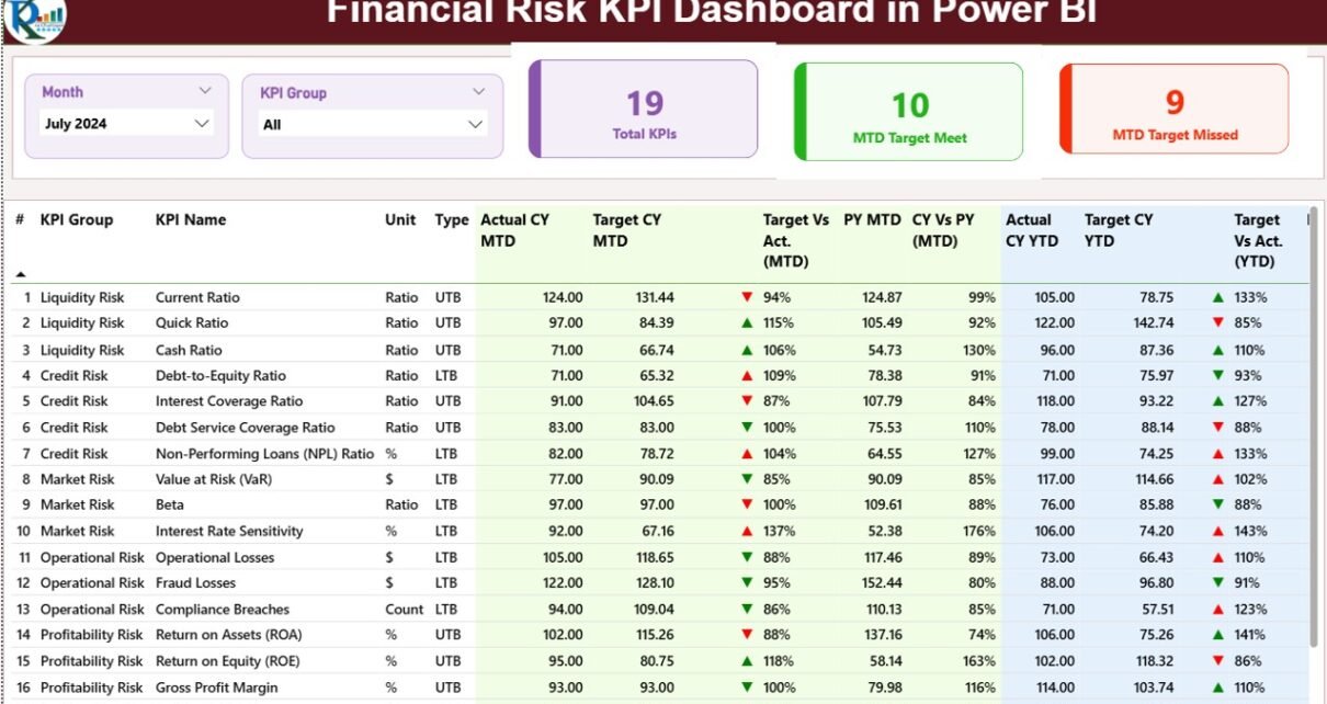
Page 1: What Does the Summary Page Show?
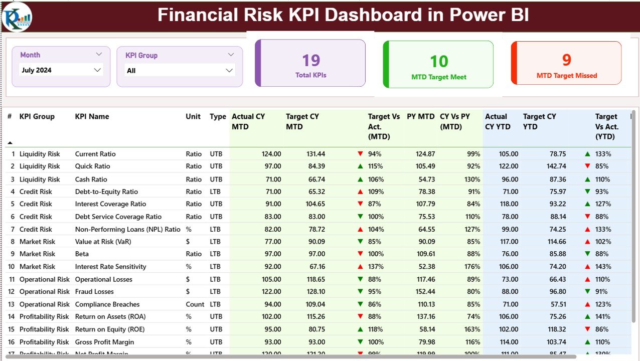
The Summary Page acts as the main landing page of the dashboard. It provides an executive-level overview while still offering detailed insights.
Interactive Filters on the Top
At the top of the summary page, users see two slicers:
-
Month Slicer – Allows selection of a specific reporting month
-
KPI Group Slicer – Filters KPIs based on risk categories
These slicers update all visuals instantly, which ensures faster analysis.
KPI Overview Cards
Below the slicers, the dashboard displays three key indicator cards:
-
Total KPIs Count – Shows the total number of monitored financial risk KPIs
-
MTD Target Met Count – Displays how many KPIs achieved targets for the current month
-
MTD Target Missed Count – Highlights KPIs that failed to meet monthly targets
These cards provide instant clarity about overall financial risk performance.
Click to Purchases Financial Risk KPI Dashboard in Power BI
Detailed KPI Performance Table
The core strength of the summary page lies in its detailed table. This table presents all KPIs with comprehensive metrics that support deep analysis.
The table includes the following columns:
-
KPI Number
This column shows the sequence number of each KPI. -
KPI Group
This column categorizes KPIs into risk types such as liquidity risk, credit risk, compliance risk, or operational risk. -
KPI Name
This column displays the name of the financial risk KPI. -
Unit
This column shows the unit of measurement, such as percentage, currency, ratio, or count. -
Type (LTB or UTB)
This column defines whether a KPI performs better when lower (LTB – Lower the Better) or higher (UTB – Upper the Better).
Monthly Performance Metrics (MTD)
-
Actual CY MTD – Displays current year actual month-to-date values
-
Target CY MTD – Shows target values for the current month
-
MTD Status Icon – Uses green ▲ and red ▼ icons to indicate performance
-
Target vs Actual (MTD) – Calculates Actual ÷ Target to show percentage achievement
-
PY MTD – Displays the same period’s MTD value from the previous year
-
CY vs PY (MTD) – Compares current and previous year performance
These metrics help users understand short-term financial risk fluctuations.
Year-to-Date Performance Metrics (YTD)
-
Actual CY YTD – Displays cumulative actual values for the current year
-
Target CY YTD – Shows cumulative target values
-
YTD Status Icon – Highlights performance using arrows and colors
-
Target vs Actual (YTD) – Calculates actual performance against targets
-
PY YTD – Shows previous year cumulative values
-
CY vs PY (YTD) – Compares year-to-date performance
Thus, users gain a long-term perspective on financial risk performance.
Page 2: How Does the KPI Trend Page Help Analysis?
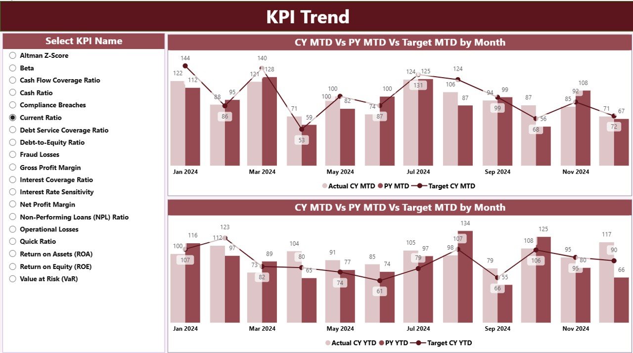
The KPI Trend Page focuses on performance patterns over time.
Interactive KPI Selector
On the left side, users can select a specific KPI. Once selected, all visuals update automatically.
Click to Purchases Financial Risk KPI Dashboard in Power BI
Combo Charts for Trend Analysis
This page includes two combo charts:
-
MTD Trend Chart
Shows Actual CY, Actual PY, and Target values for month-to-date. -
YTD Trend Chart
Displays year-to-date trends for Actual CY, Actual PY, and Targets.
Because combo charts combine bars and lines, users can easily compare actuals, targets, and historical performance in one view.
As a result, this page helps identify:
-
Improving or declining risk trends
-
Seasonal performance patterns
-
Long-term risk exposure
Page 3: What Is the KPI Definition Page?
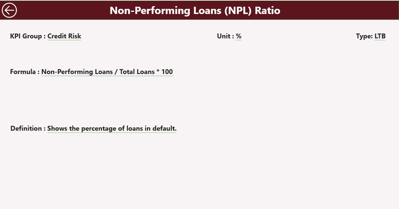
The KPI Definition Page serves as a drill-through and reference page. It remains hidden by default to keep the dashboard clean.
Drill-Through Functionality
Users can right-click any KPI on the summary page and drill through to this page.
What Information Does This Page Show?
This page explains each KPI in detail, including:
-
KPI Formula
-
KPI Definition
-
Measurement Logic
-
KPI Type (LTB or UTB)
Because of this, users never misunderstand performance numbers.
Easy Navigation
A back button appears on the top left corner. One click takes users back to the summary page instantly.
How Does Excel Support the Financial Risk KPI Dashboard?
Excel works as the foundation for this dashboard. It keeps the data organized, accurate, and easy to maintain.
Excel Data Structure
The Excel file includes three worksheets:
1) Input_Actual Sheet
This sheet stores all actual financial risk values.
Users must fill:
-
KPI Name
-
Month (first date of the month)
-
MTD values
-
YTD values
This design ensures consistency across reporting periods.
2) Input_Target Sheet
This sheet stores target values.
Users fill:
-
KPI Name
-
Month (first date of the month)
-
Target MTD values
-
Target YTD values
Because targets often change, this sheet simplifies updates.
3) KPI Definition Sheet
This sheet stores master KPI information:
-
KPI Number
-
KPI Group
-
KPI Name
-
Unit
-
Formula
-
Definition
-
Type (LTB or UTB)
Thanks to this structure, governance and clarity remain strong.
Advantages of Financial Risk KPI Dashboard in Power BI
Using a Financial Risk KPI Dashboard in Power BI delivers multiple benefits.
✅ Centralized Financial Risk Monitoring
All KPIs stay available in one place, which eliminates confusion.
✅ Faster Decision-Making
Visual alerts and trend charts enable quicker responses to risk deviations.
✅ Improved Accuracy
Automated calculations reduce manual errors significantly.
✅ Time Savings
Teams stop preparing repetitive reports and focus on analysis.
✅ Executive-Friendly Design
Clear visuals and KPIs help leadership understand risks instantly.
Best Practices for the Financial Risk KPI Dashboard in Power BI
Click to Purchases Financial Risk KPI Dashboard in Power BI
Following best practices ensures long-term success.
✅ Define Clear KPI Ownership
Assign responsibility for each KPI to avoid data gaps.
✅ Update Excel Data Regularly
Consistent updates keep insights reliable.
✅ Use Proper KPI Types
Clearly define LTB and UTB KPIs from the start.
✅ Review Targets Periodically
Adjust targets based on business realities.
✅ Train Users
Ensure teams understand slicers, drill-through, and trend visuals.
Conclusion: Why the Financial Risk KPI Dashboard in Power BI Matters
Financial risks never stay static. They evolve continuously and require constant monitoring. A Financial Risk KPI Dashboard in Power BI empowers organizations to stay proactive instead of reactive.
By combining Excel-based data with interactive Power BI visuals, this dashboard delivers clarity, speed, and confidence. It helps finance teams detect risks early, compare performance across time, and support better decisions at every level.
In today’s data-driven world, using such a dashboard is no longer optional—it is essential.
Frequently Asked Questions (FAQs)
❓ What is a Financial Risk KPI Dashboard in Power BI used for?
It helps organizations track, monitor, and manage financial risk KPIs using interactive visuals and trends.
❓ Can I update the dashboard without Power BI expertise?
Yes. You only need to update Excel data. Power BI refreshes visuals automatically.
❓ Does this dashboard support both MTD and YTD analysis?
Yes. It includes detailed month-to-date and year-to-date metrics.
❓ Can I add more KPIs in the future?
Absolutely. You can add new KPIs by updating the Excel sheets.
❓ Is this dashboard suitable for all industries?
Yes. You can customize KPIs based on industry-specific financial risks.
Visit our YouTube channel to learn step-by-step video tutorials
Click to Purchases Financial Risk KPI Dashboard in Power BI