The food supply chain is a complex system, involving multiple stages from production to delivery. In today’s data-driven world, managing this process effectively requires clear insights into key performance indicators (KPIs). A Food Supply Chain KPI Dashboard in Power BI serves as an essential tool to track, measure, and improve the performance of various aspects of the food supply chain. In this article, we will dive deep into the features, advantages, best practices, and key elements of using this Power BI dashboard.
Click to Purchases Food Supply Chain KPI Dashboard in Power BI
What is a Food Supply Chain KPI Dashboard in Power BI?
A Food Supply Chain KPI Dashboard in Power BI is a powerful tool designed to provide real-time insights into the performance of key metrics across various stages of the food supply chain. From sourcing ingredients to delivery, businesses can track KPIs like stock levels, delivery times, production efficiency, and much more.
This dashboard uses Power BI, a leading data visualization tool, to present data in an easily digestible format. By integrating data from Excel files, users can track performance and make data-driven decisions that enhance the efficiency of their food supply operations.
Key Features of the Food Supply Chain KPI Dashboard
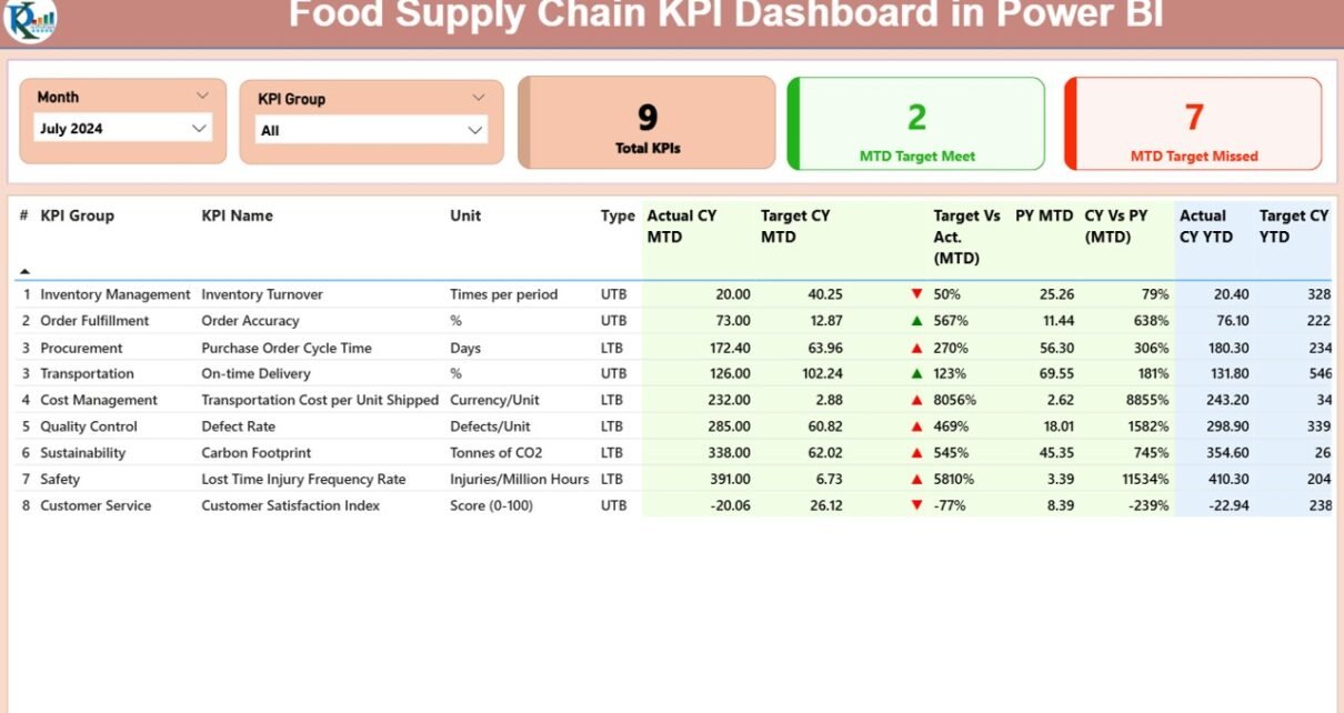
Summary Page – Overview at a Glance

The Summary Page is the heart of the dashboard. Here, you get an overall snapshot of all KPIs across different categories. Key features include:
-
Slicers: The Month and KPI Group slicers allow users to filter data by specific months and KPI categories.
-
Key Performance Indicators (KPIs): Three cards show the total number of KPIs, the number of targets met (MTD), and the number of targets missed (MTD).
Detailed KPI Table: This table provides in-depth information about each KPI, including:
Click to Purchases Food Supply Chain KPI Dashboard in Power BI
- KPI Number: Sequence number of the KPI.
- KPI Group: The category or group of the KPI.
- KPI Name: The specific KPI being measured.
- Unit: The unit of measurement (e.g., kilograms, units).
- Type: Indicates if the KPI is Lower the Better (LTB) or Upper the Better (UTB).
- Actual CY MTD: The actual value for the Current Year Month-To-Date (MTD).
- Target CY MTD: The target value for the Current Year MTD.
- MTD Icon: Green or red arrows indicating if the KPI is meeting or missing the target.
- Target Vs Actual (MTD): The percentage comparison between the actual and target MTD values.
- PY MTD: The previous year’s MTD number for comparison.
- CY Vs PY (MTD): The percentage difference between the current year’s MTD and the previous year’s MTD.
- Actual CY YTD: The actual year-to-date (YTD) numbers for the current year.
- Target CY YTD: The target YTD values.
- YTD Icon: Green or red arrows indicating the YTD performance.
- Target Vs Actual (YTD): A percentage showing the comparison between actual and target YTD values.
- PY YTD: The previous year’s YTD number for comparison.
- CY Vs PY (YTD): The percentage comparison between the current year’s YTD and the previous year’s YTD.
KPI Trend Page – Visual Representation of Trends

On the KPI Trend Page, two combo charts provide a visual representation of the performance of KPIs over time. You can see:
-
Current Year vs. Previous Year: Trends for both MTD and YTD.
-
Target vs. Actual: Comparing current performance against targets for both MTD and YTD.
A slicer on the left allows users to select specific KPIs and view their trends in detail.
KPI Definition Page – Detailed Insights

The KPI Definition Page offers drill-through capabilities that provide deeper insights into individual KPIs. You can see:
-
KPI Formula: The underlying calculation for the KPI.
-
KPI Definition: A clear description of what the KPI represents.
The page is hidden by default, but users can drill through from the summary page for detailed analysis.
Excel Data Integration
The Food Supply Chain KPI Dashboard in Power BI uses Excel files as the data source. The integration ensures that the dashboard remains dynamic and reflects real-time updates. There are three primary Excel worksheets to fill out:
-
Input_Actual Sheet Tab: This sheet contains the actual performance data for each KPI, broken down by month.
-
Input_Target Sheet Tab: Here, you fill in the target values for each KPI, also segmented by month.
-
KPI Definition Sheet Tab: This sheet contains the KPI numbers, groups, names, units, formulas, definitions, and types (LTB or UTB).
By maintaining these Excel files, users can easily update the dashboard with new data, making it an incredibly flexible and scalable solution.
Advantages of the Food Supply Chain KPI Dashboard in Power BI
A Food Supply Chain KPI Dashboard in Power BI brings several benefits that enhance the overall performance and decision-making process in the food industry:
-
Real-Time Monitoring: Track KPIs in real-time, enabling prompt action when targets are not met.
-
Data-Driven Decision Making: With clear visualizations and data analysis, decisions are based on solid facts rather than assumptions.
-
Improved Efficiency: Quickly identify areas of underperformance and optimize supply chain processes.
-
Customizable: Users can adjust the dashboard’s slicers to monitor specific KPIs, periods, or groups.
-
Historical Comparison: The ability to compare current data with previous years helps in spotting long-term trends and anomalies.
Best Practices for Using the Food Supply Chain KPI Dashboard
To maximize the effectiveness of the Food Supply Chain KPI Dashboard in Power BI, follow these best practices:
-
Regular Data Updates: Ensure that the Excel sheets are updated regularly to keep the dashboard relevant.
-
Use Slicers for Specific Insights: Leverage the slicers to drill down into specific KPIs, months, or groups to gain deeper insights.
-
Set Realistic Targets: Ensure that targets are based on historical data and current trends to make them achievable.
-
Focus on Key KPIs: Avoid information overload by focusing on the KPIs that matter most to your operations.
-
Implement Continuous Improvement: Use the insights from the dashboard to continuously improve supply chain processes and KPI performance.
Conclusion
A Food Supply Chain KPI Dashboard in Power BI is an invaluable tool for businesses in the food industry looking to optimize their operations. By providing real-time insights, visual trends, and detailed comparisons, it allows businesses to make informed decisions and improve efficiency. Regularly updating the dashboard and adhering to best practices will ensure its continued success in driving supply chain performance.
Frequently Asked Questions (FAQs)
1. What is a KPI in the context of the food supply chain?
A KPI (Key Performance Indicator) is a measurable value that demonstrates how effectively a company is achieving its business objectives. In the food supply chain, KPIs can measure everything from inventory levels to delivery times.
2. How often should the data be updated in the dashboard?
It’s best to update the data on a monthly or weekly basis, depending on the frequency of supply chain activities and the type of data being tracked.
3. Can I customize the KPIs on the dashboard?
Yes, the dashboard can be customized to display the KPIs that are most relevant to your business operations. Simply adjust the Excel input files accordingly.
4. How can I compare current performance with historical data?
The dashboard allows users to compare current performance with the same period in the previous year, both for MTD (Month-to-Date) and YTD (Year-to-Date).
5. Is the Food Supply Chain KPI Dashboard suitable for small businesses?
Absolutely! The dashboard can be adapted to suit businesses of all sizes. Even small businesses can use it to streamline their supply chain processes and make data-driven decisions.
Visit our YouTube channel to learn step-by-step video tutorials