The footwear and accessories industry moves fast. Trends change quickly, customer demands shift every month, and sales performance varies across stores, regions, and categories. Because of this dynamic environment, retail leaders need a smart way to monitor KPIs, track targets, and compare performance at any time.
A Footwear & Accessories KPI Dashboard in Power BI solves this challenge in the most practical way. It gathers essential business data, transforms it into visual insights, and helps decision-makers understand performance instantly. Whether your goal focuses on boosting sales, reducing returns, improving customer experience, or analyzing store efficiency, this dashboard gives you a complete picture.
In this article, you will learn everything about this dashboard, how each page works, how data flows from Excel into Power BI, and why this solution becomes essential for footwear and accessories retailers. You will also find advantages, best practices, and a detailed FAQ section to guide you further.
Click to Purchases Footwear & Accessories KPI Dashboard in Power BI
What Is a Footwear & Accessories KPI Dashboard in Power BI?
A Footwear & Accessories KPI Dashboard in Power BI is a ready-to-use business intelligence solution that helps retail teams track KPIs in one place. It visualizes:
-
Monthly performance
-
Category and product group results
-
Target vs Actual comparisons
-
Current year vs previous year progress
-
MTD (Month to Date) and YTD (Year to Date) analysis
-
KPI-level trends
-
Performance icons and indicators
Because the dashboard runs inside Power BI, you get interactive visuals, slicers, drill-through features, and automated calculations that update as soon as you refresh the data.
Retail teams simply update the Excel source file, and the dashboard refreshes with the latest KPIs.
Click to Purchases Footwear & Accessories KPI Dashboard in Power BI
Why Do Retailers Need a Footwear & Accessories KPI Dashboard?
Retailers in this sector deal with:
-
Many SKUs
-
Seasonal trends
-
Fast-moving competition
-
High return rates
-
Category-level variation
-
Performance pressure
Tracking all KPIs manually becomes slow and confusing. However, with a BI dashboard:
-
You track results in seconds
-
You compare MTD vs YTD instantly
-
You monitor targets more accurately
-
You understand customer behavior easily
-
You find issues before they impact revenue
This dashboard turns raw data into a visual story that anyone can understand.
Click to Purchases Footwear & Accessories KPI Dashboard in Power BI
Key Features of the Footwear & Accessories KPI Dashboard in Power BI
This dashboard contains three professionally designed pages, each built for a different purpose.
Let’s explore them one by one.
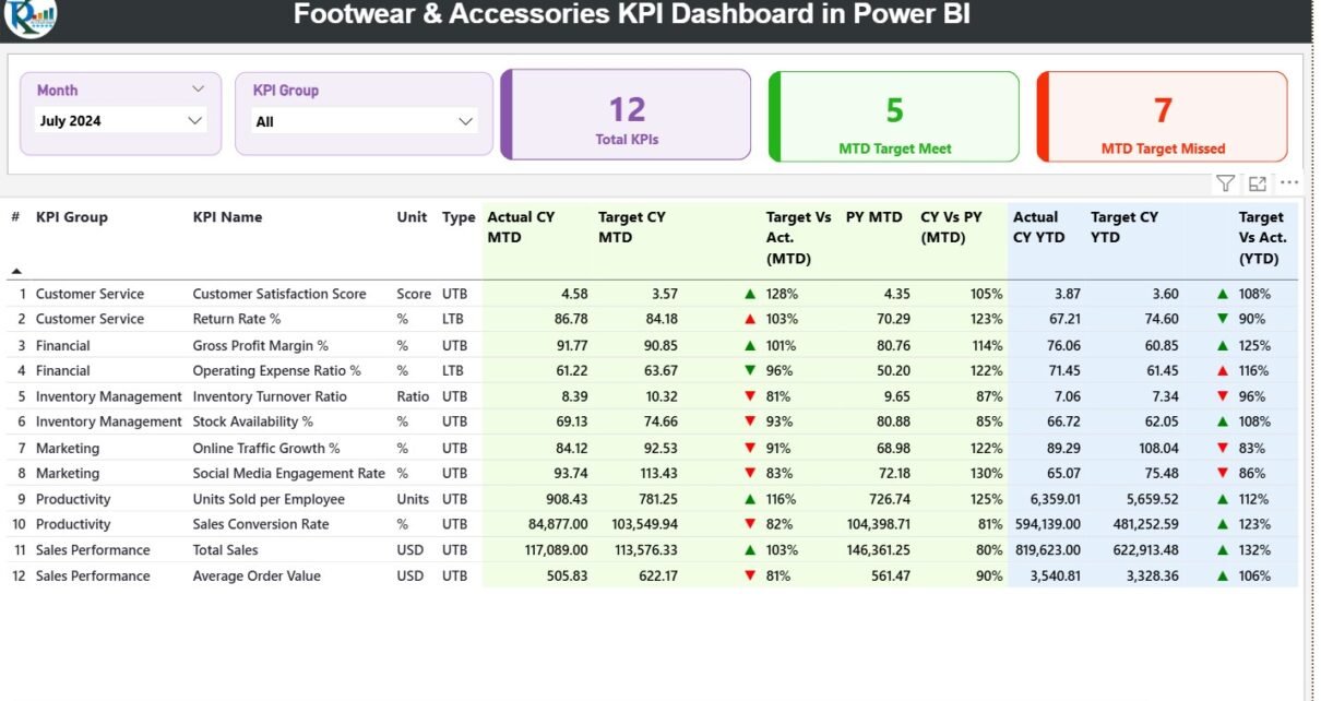
1. Summary Page (Main Dashboard Page)
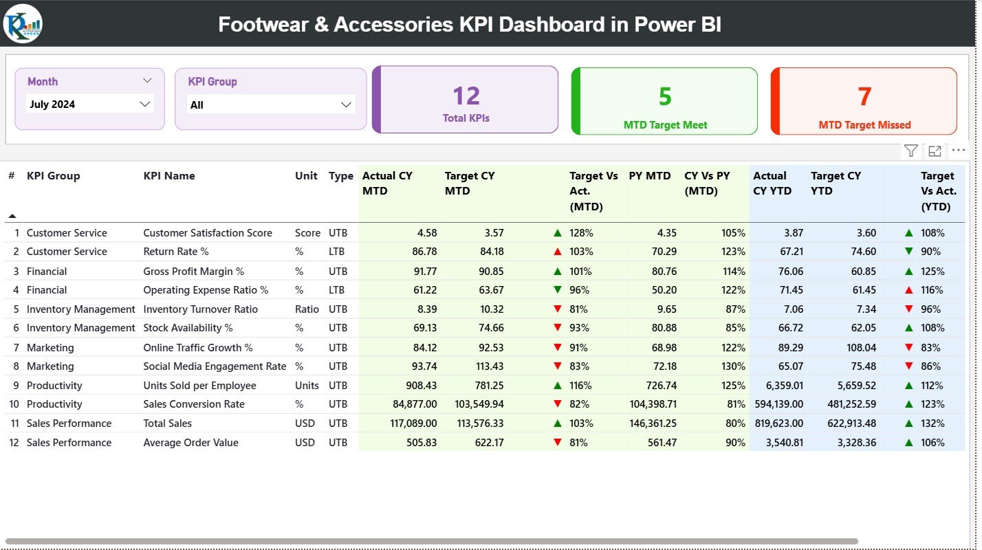
The Summary Page acts as the central command center of the entire dashboard. It shows the complete list of KPIs along with a smart performance comparison.
Top-Level Filters
At the top, you will find two slicers:
-
Month Slicer
-
KPI Group Slicer
These slicers help you filter the dashboard instantly. You can view performance for a specific group such as:
-
Sales KPIs
-
Customer KPIs
-
Store KPIs
-
Operations KPIs
KPI Cards
Below the slicers, the page displays three performance cards:
-
Total KPIs Count
-
MTD Target Met
-
MTD Target Missed
These cards give an immediate overview of how the business performs for the selected period.
Detailed KPI Table
The heart of the page is the detailed KPI table. It provides every important number in one place:
-
KPI Number – Sequential KPI identifier
-
KPI Group – Category or functional group
-
KPI Name – The KPI title
-
Unit – Measurement unit like %, USD, Count
-
Type – LTB (Lower the Better) or UTB (Upper the Better)
-
Actual CY MTD – Month to date actual value
-
Target CY MTD – Month to date target value
-
MTD Icon – ▲ or ▼ with green/red indicators
-
Target vs Actual (MTD) – MTD achievement percentage
-
PY MTD – Previous year MTD value
-
CY vs PY (MTD) – Current year vs previous year percentage
-
Actual CY YTD – Year to date actual value
-
Target CY YTD – Year to date target value
-
YTD Icon – ▲ or ▼ indicator for YTD status
-
Target vs Actual (YTD) – YTD achievement percentage
-
PY YTD – Previous year YTD value
-
CY vs PY (YTD) – Current vs previous year YTD comparison
Because the page shows everything in a structured format, retail leaders can identify:
-
Underperforming KPIs
-
High-performing areas
-
Targets not met
-
Year-on-year growth patterns
-
Trend changes
-
Performance gaps
This page acts as the core performance tracker for the entire organization.
Click to Purchases Footwear & Accessories KPI Dashboard in Power BI
2. KPI Trend Page
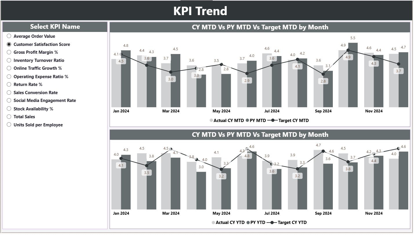
The KPI Trend Page offers a deeper view of performance over time. It helps you understand how each KPI moves month after month.
KPI Selector (Slicer)
On the left side, there is a slicer where you can select any KPI. Once you choose a KPI, both combo charts update automatically.
Two Combo Charts
The page displays two trend charts:
-
MTD Trend Chart – Shows Actual MTD, Target MTD, PY MTD
-
YTD Trend Chart – Shows Actual YTD, Target YTD, PY YTD
These charts compare:
-
Current performance
-
Target expectation
-
Previous year trend
Because the visuals highlight the gap between actual and target, leaders identify early if a KPI is improving or declining.
This trend page is especially useful for:
-
Sales forecasting
-
Seasonal product planning
-
Performance improvement
-
Demand forecasting
-
Target setting
3. KPI Definition Page
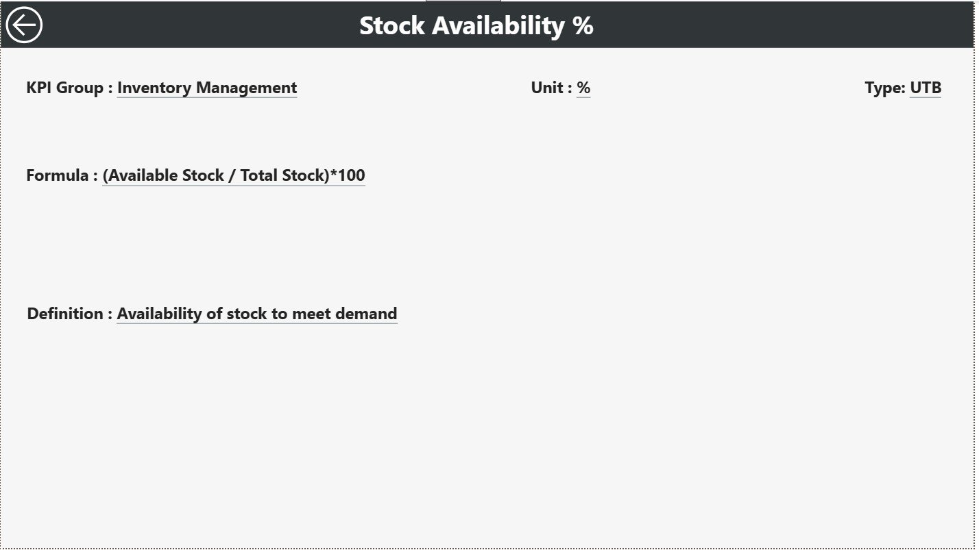
The KPI Definition Page is a hidden drill-through page. You cannot see this page directly, but you can open it by right-clicking any KPI on the summary page and selecting Drill Through.
This page shows:
-
KPI Number
-
KPI Group
-
KPI Name
-
Unit
-
Formula
-
Definition
-
Type (LTB or UTB)
This feature helps users understand:
-
How each KPI is calculated
-
What the KPI means
-
What performance type applies
-
How to interpret the result
Retail teams often use this page for reporting, training, and KPI documentation.
To return to the main page, you click the Back button at the top left corner.
Excel Data Source Structure
This dashboard connects to one Excel file, which includes three structured worksheets.
Let’s understand each one:
1. Input_Actual Sheet
This sheet contains the actual KPI numbers.
Columns include:
-
KPI Name
-
Month (First date of the month)
-
Actual MTD
-
Actual YTD
Retail teams enter monthly performance numbers here.
2. Input_Target Sheet
This sheet contains planned or target numbers for KPIs.
Columns include:
-
KPI Name
-
Month
-
Target MTD
-
Target YTD
Once you update values here, the dashboard automatically shows:
-
Target vs Actual
-
Percentage achieved
-
Performance icons
3. KPI Definition Sheet
This sheet contains all necessary KPI details such as:
-
KPI Number
-
KPI Group
-
KPI Name
-
Unit
-
Formula
-
Definition
-
Type (LTB or UTB)
Power BI uses this sheet to show additional details during drill-through analysis.
Click to Purchases Footwear & Accessories KPI Dashboard in Power BI
Advantages of Footwear & Accessories KPI Dashboard in Power BI
A good BI dashboard improves decision-making and boosts overall efficiency. Here are the top benefits:
1. Instant Performance Monitoring
Retailers view real-time KPI results without waiting for reports.
2. Target vs Actual Comparison
Users track MTD and YTD performance with smart visual indicators.
3. Easy Trend Analysis
The dashboard highlights month-wise growth and seasonal patterns.
4. Powerful Drill-Through Capability
Users see KPI formulas and definitions with one click.
5. Automation and Zero Manual Reporting
Once the Excel source updates, Power BI refreshes everything.
6. Clear and Visual Insights
Charts, KPIs, slicers, and icons make insights easy to understand.
7. Better Store, Product, and Category Decisions
Retailers identify profitable areas and resolve performance issues faster.
Best Practices for Using the Footwear & Accessories Power BI Dashboard
To get the best results from this dashboard, follow these proven practices:
1. Update the Excel Source File Monthly
Always enter the first date of the month to maintain consistency.
2. Use the Correct KPI Names
Ensure that the KPI names match exactly between Actual, Target, and KPI Definition sheets.
3. Apply Consistent Units
Always use the same measurement unit for the same KPI.
4. Check Year-over-Year Data Carefully
Enter accurate previous-year data to compare trends correctly.
5. Refresh Power BI After Every Update
Click Refresh to load the newest values from Excel.
6. Drill Through Frequently
Use the hidden KPI Definition page to understand each KPI deeply.
7. Review MTD and YTD Icons
These icons help you detect performance gaps quickly.
How Does the Dashboard Support Better Decision-Making?
Because this dashboard offers real-time visual insights, retail leaders can:
-
Improve stock planning
-
Identify slow-moving categories
-
Increase profitability
-
Boost customer experience
-
Manage store-level performance
-
Strengthen retail strategy
This Power BI solution transforms raw data into performance intelligence.
Conclusion
A Footwear & Accessories KPI Dashboard in Power BI gives retailers a clear view of business performance. It organizes KPIs, compares targets, tracks trends, and highlights gaps instantly. Whether your goal is to improve profitability, reduce returns, or increase efficiency, this dashboard becomes your most powerful decision-making tool.
With automated updates, interactive visuals, and detailed drill-through pages, every retail team gains clarity, speed, and confidence in their reporting process.
Click to Purchases Footwear & Accessories KPI Dashboard in Power BI
Frequently Asked Questions (FAQs)
1. What is a Footwear & Accessories KPI Dashboard in Power BI?
It is a ready-to-use dashboard that tracks all KPIs related to sales, category performance, operations, and customer experience for footwear and accessories retail.
2. How does the dashboard update?
You update the Excel source file, and Power BI refreshes the dashboard automatically.
3. What KPIs can I track?
You can track Sales KPIs, Customer KPIs, Store KPIs, Inventory KPIs, and Operational KPIs.
4. Can I add more KPIs?
Yes, you can add new KPIs by updating the definition sheet and adjusting data in Actual and Target sheets.
5. Can beginners use this dashboard easily?
Yes, the dashboard is simple, visual, and easy to navigate.
6. Does the dashboard show year-over-year performance?
Yes, it compares Current Year and Previous Year for both MTD and YTD.
7. Can I modify the visuals?
You can customize charts, KPI cards, and slicers inside Power BI.
Click to Purchases Footwear & Accessories KPI Dashboard in Power BI
Visit our YouTube channel to learn step-by-step video tutorials