Government organizations manage hundreds of projects, departments, budgets, and public services every year. However, decision-makers often struggle because data remains scattered across spreadsheets, reports, and manual systems. As a result, leaders cannot quickly evaluate performance, track spending, or measure citizen satisfaction.
Therefore, public sector institutions increasingly adopt data visualization and analytics tools to improve transparency and efficiency. One of the most powerful solutions available today is the Government Administration Dashboard in Power BI.In this comprehensive guide, you will learn everything about the Government Administration Dashboard in Power BI, including its structure, features, benefits, implementation approach, best practices, and frequently asked questions. Moreover, you will understand how governments can transform raw administrative data into actionable insights that support better governance.
Click to buy Government Administration Dashboard in Power BI
What Is a Government Administration Dashboard in Power BI?
A Government Administration Dashboard in Power BI is an interactive analytics system designed to monitor government projects, departmental performance, budgets, beneficiaries, and citizen satisfaction using visual reports.
Instead of reviewing multiple static reports, administrators can analyze real-time performance indicators from a centralized dashboard. Consequently, leaders make faster and more informed decisions.
This dashboard combines:
- Project performance tracking
- Budget vs. actual spending monitoring
- Departmental analysis
- Regional performance insights
- Citizen satisfaction evaluation
- Monthly trend analysis
Because Power BI connects data dynamically, users can filter information instantly using slicers and interactive visuals.
Why Do Government Organizations Need an Administration Dashboard?
Government departments manage complex operations. However, traditional reporting methods slow down decision-making. Therefore, dashboards play a critical role in modern governance.
Common Challenges Without Dashboards
- Data stored in multiple files
- Delayed reporting cycles
- Limited transparency
- Difficulty tracking budget utilization
- Poor performance monitoring
- Lack of citizen feedback visibility
How Power BI Solves These Problems
Power BI dashboards simplify administration because they:
- Centralize all government data
- Provide real-time analytics
- Improve accountability
- Enable faster policy decisions
- Enhance operational transparency
As a result, administrators focus more on outcomes instead of manual reporting.
Key Features of the Government Administration Dashboard in Power BI
This dashboard contains five interactive analytical pages inside the Power BI Desktop application. Each page focuses on a specific administrative perspective.
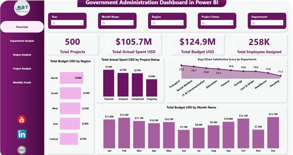
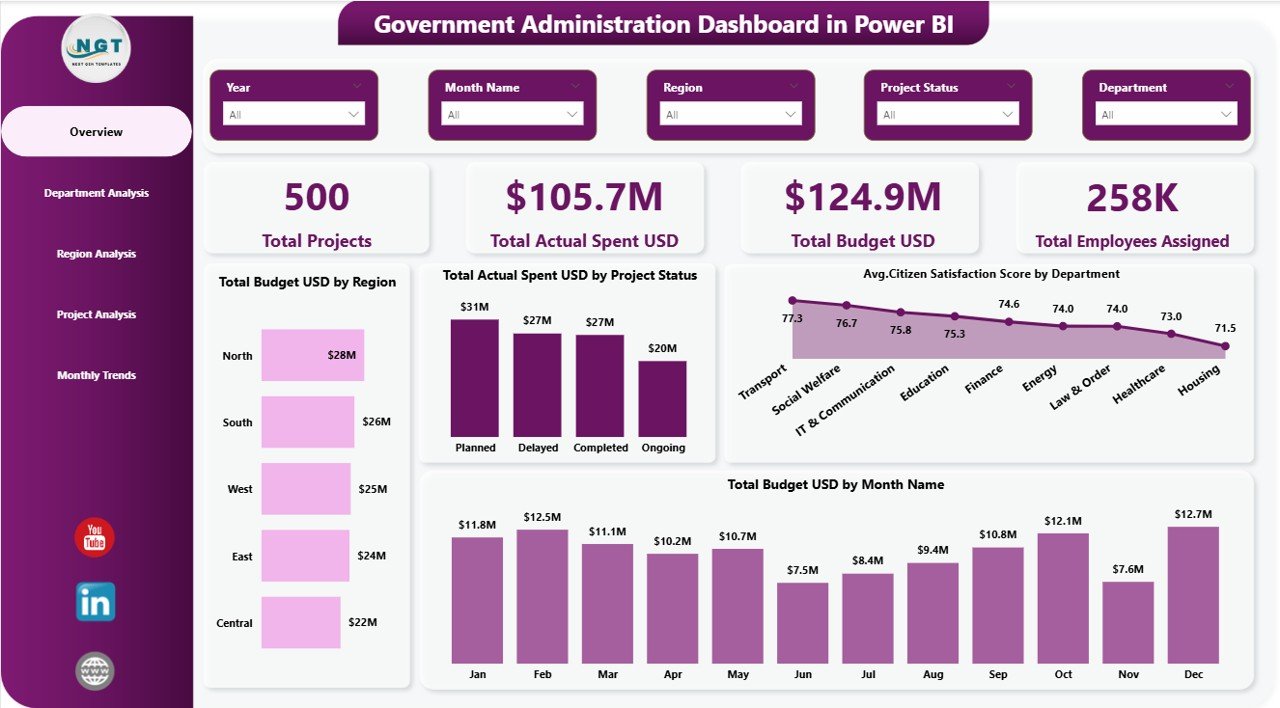
Overview Page – How Does the Main Dashboard Work?
The Overview Page acts as the central command center of the dashboard. Here, decision-makers quickly understand overall performance.
KPI Cards Available
- Total Projects
- Total Actual Spent (USD)
- Total Budget (USD)
- Total Employees Assigned
These cards immediately display organizational scale and resource usage.
Charts Included
- Total Budget USD by Region
- Total Actual Spent USD by Project Status
- Average Citizen Satisfaction Score by Department
- Total Budget USD by Month Name
Why This Page Matters
This page helps leaders answer questions such as:
- Are projects staying within budget?
- Which regions receive the highest funding?
- How satisfied are citizens with services?
- How does spending change monthly?
Therefore, executives gain a high-level performance overview within seconds.
Click to buy Government Administration Dashboard in Power BI
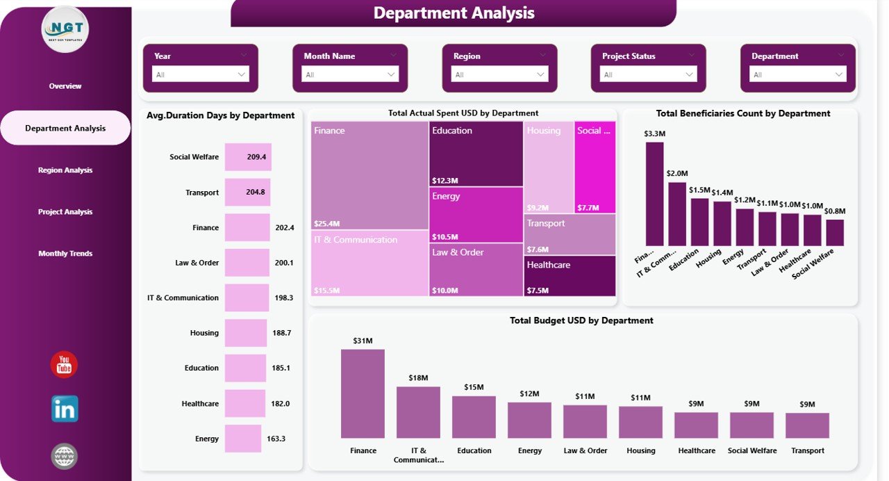
Department Analysis – How Do Departments Perform?
The Department Analysis Page evaluates departmental efficiency and resource allocation.
Charts Available
- Average Duration (Days) by Department
- Total Actual Spent USD by Department
- Total Beneficiaries Count by Department
- Total Budget USD by Department
Insights You Can Generate
- Identify high-performing departments
- Compare spending efficiency
- Measure service delivery speed
- Analyze beneficiary reach
Consequently, administrators allocate resources more effectively.
Click to buy Government Administration Dashboard in Power BI
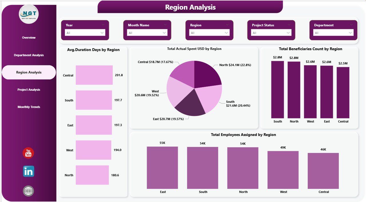
Region Analysis – Which Regions Perform Better?
Government services often vary across regions. Therefore, regional analysis becomes essential.
Charts Included
- Average Duration Days by Region
- Total Actual Spent USD by Region
- Total Beneficiaries Count by Region
- Total Employees Assigned by Region
Key Benefits
- Detect regional performance gaps
- Monitor workforce distribution
- Evaluate regional budget utilization
- Improve balanced development planning
Because regional insights remain visual, policymakers quickly identify improvement areas.
Click to buy Government Administration Dashboard in Power BI
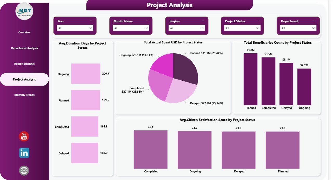
Project Analysis – How Efficient Are Government Projects?
Projects represent the execution layer of government programs. Hence, monitoring project performance ensures accountability.
Charts Available
- Average Duration Days by Project Status
- Total Spent USD by Project Status
- Total Beneficiaries Count by Project Status
- Average Citizen Satisfaction Score by Project Status
Questions This Page Answers
- Which projects experience delays?
- How much budget completed projects consume?
- Which project types benefit the most citizens?
- Do completed projects improve satisfaction?
As a result, project managers adjust strategies proactively.
Click to buy Government Administration Dashboard in Power BI
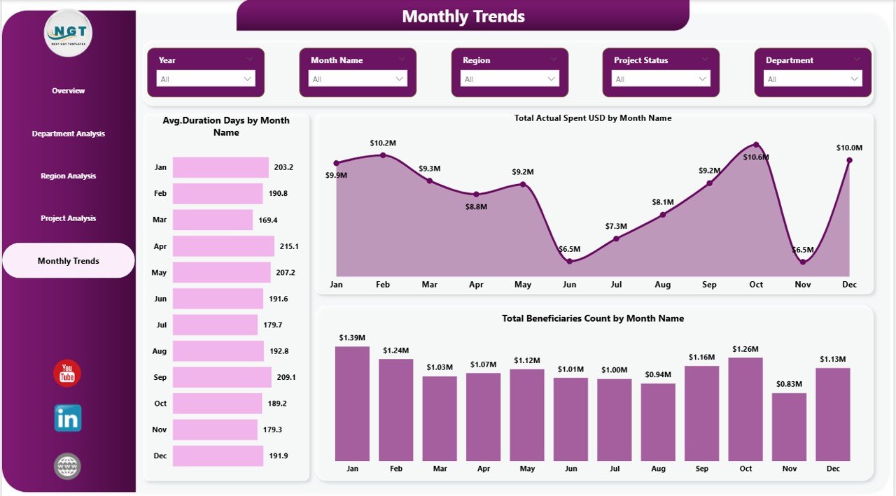
Monthly Trends – How Does Performance Change Over Time?
The Monthly Trends Page focuses on time-based analysis.
Charts Included
- Average Duration Days by Month
- Total Actual Spent USD by Month Name
- Total Beneficiaries Count by Month Name
Why Monthly Analysis Is Important
- Detect seasonal patterns
- Monitor budget flow
- Track implementation progress
- Forecast future performance
Therefore, leaders move from reactive decisions to predictive planning.
Click to buy Government Administration Dashboard in Power BI
What Data Does This Dashboard Typically Track?
A Government Administration Dashboard usually includes structured datasets such as:
- Project Name
- Department
- Region
- Budget Amount
- Actual Spending
- Project Status
- Start and End Dates
- Employee Assignments
- Beneficiary Counts
- Citizen Satisfaction Scores
Because Power BI integrates multiple sources, organizations maintain one single source of truth.
Advantages of Government Administration Dashboard in Power BI
Improved Decision-Making
Leaders analyze performance instantly instead of waiting for reports.
Enhanced Transparency
Stakeholders clearly see budget usage and outcomes.
Better Resource Allocation
Departments receive funding based on performance insights.
Real-Time Monitoring
Administrators track projects continuously.
Increased Accountability
Performance metrics reduce inefficiencies.
Citizen-Centric Governance
Satisfaction scores highlight service quality.
Time Savings
Automation eliminates manual reporting tasks.
How Does Power BI Improve Government Administration?
Power BI provides several advanced capabilities that traditional tools cannot deliver.
Interactive Filtering
Users apply slicers to view data by:
- Department
- Region
- Project Status
- Time Period
Dynamic Visualizations
Charts update automatically when data changes.
Data Integration
Power BI connects with:
- Excel files
- Databases
- Government systems
- Cloud platforms
Secure Access
Role-based access ensures data confidentiality.
Steps to Implement a Government Administration Dashboard
Organizations can follow these steps to implement the dashboard successfully.
Step 1: Define Objectives
Identify key performance indicators such as budgets, beneficiaries, and satisfaction.
Step 2: Collect Data Sources
Gather departmental and project-level data.
Step 3: Clean and Structure Data
Ensure consistent formats and remove duplicates.
Step 4: Build Data Model
Create relationships between tables.
Step 5: Design Visual Pages
Develop overview and analytical pages.
Step 6: Publish Dashboard
Share reports securely using Power BI Service.
Step 7: Monitor and Improve
Continuously update metrics and visuals.
Best Practices for the Government Administration Dashboard in Power BI
To achieve maximum value, organizations should follow these best practices:
Define Clear KPIs
Choose measurable and actionable metrics.
Keep Visuals Simple
Avoid overcrowded dashboards.
Use Consistent Colors
Maintain uniform visual identity.
Enable Drill-Down Analysis
Allow users to explore deeper insights.
Update Data Regularly
Ensure dashboards reflect current performance.
Train Users
Educate teams on interpreting insights.
Focus on Outcomes
Track results, not just activities.
How Does This Dashboard Support Data-Driven Governance?
Data-driven governance improves public administration because decisions rely on facts rather than assumptions.
The dashboard helps governments:
- Measure policy impact
- Optimize public spending
- Improve service delivery
- Monitor development programs
- Strengthen accountability
Consequently, governments build trust with citizens.
Real-World Use Cases of Government Administration Dashboards
Public Infrastructure Monitoring
Track road, transport, and construction projects.
Social Welfare Programs
Measure beneficiary reach and fund allocation.
Healthcare Administration
Monitor hospital programs and patient satisfaction.
Education Initiatives
Evaluate training and development programs.
Smart City Projects
Analyze urban development progress.
Future of Government Analytics with Power BI
Governments increasingly adopt analytics-driven systems. Therefore, dashboards will evolve further.
Future trends include:
- AI-driven predictions
- Automated performance alerts
- Real-time IoT integration
- Predictive budgeting models
- Citizen feedback analytics
As technology advances, data visualization will become essential for governance.
Conclusion
The Government Administration Dashboard in Power BI transforms how public sector organizations manage performance, budgets, and citizen services. Instead of relying on manual reporting, administrators gain instant visibility into projects, departments, regions, and monthly trends.
Moreover, interactive analytics improve transparency, accountability, and efficiency across government operations. Because leaders access insights quickly, they make smarter policy decisions and improve service delivery.
Ultimately, this dashboard empowers governments to shift from reactive administration to proactive governance driven by data.
Frequently Asked Questions (FAQs)
What is a Government Administration Dashboard in Power BI?
It is an interactive reporting tool that tracks government projects, budgets, departments, beneficiaries, and performance metrics using visual analytics.
Who can use this dashboard?
Government officials, administrators, project managers, analysts, and policy planners can use it.
Does Power BI require advanced technical skills?
No. Users can interact with dashboards easily using filters and visuals without coding knowledge.
Can the dashboard handle large datasets?
Yes. Power BI efficiently processes large volumes of administrative data.
How often should data be updated?
Organizations should update data daily, weekly, or monthly depending on operational needs.
Can dashboards improve transparency?
Yes. Visual reporting clearly shows budget utilization and performance outcomes.
Is Power BI secure for government data?
Yes. Power BI offers role-based security and controlled access features.
Can this dashboard integrate with Excel?
Yes. Power BI connects seamlessly with Excel and many other data sources.
Visit our YouTube channel to learn step-by-step video tutorials
Watch the step-by-step video tutorial:
Click to buy Government Administration Dashboard in Power BI