Hospital Patient Flow Dashboard in Power BI is a comprehensive, interactive analytics template designed for hospital administrators, healthcare analysts, and clinical operations teams who need to monitor patient movement, treatment costs, satisfaction scores, and quality metrics across departments. This ready-to-use Power BI dashboard includes 5 interactive pages with dynamic slicers for instant filtering — helping you make smarter, faster decisions about patient care and hospital operations.
Whether you run a single hospital unit or manage multi-department operations, this dashboard delivers instant visibility into admission patterns, discharge rates, ward utilization, readmission trends, and physician-level satisfaction analysis. If you prefer Excel-based analytics, also check out the Hospital Patient Flow Dashboard in Excel or the browser-based Hospital Patient Flow Dashboard in HTML.
Key Features of Hospital Patient Flow Dashboard in Power BI
This Hospital Patient Flow Dashboard in Power BI is built to deliver actionable healthcare analytics without requiring advanced Power BI skills. The dashboard tracks 5 key performance indicators — Total Treatment Cost, Total Patients, Average Length of Stay, Average Wait Time, and Average Satisfaction Score — displayed as dynamic KPI cards on the Overview page. Below the cards, interactive charts provide visual breakdowns of treatment costs by department, discharge rates, admission type distributions, and monthly cost trends.
The template includes 5 dedicated analytical pages — Overview, Department Analysis, Patient Demographics, Capacity Flow, and Quality Metrics — each equipped with slicers that let you filter by department, admission type, ward, bed type, and date range. All visuals update automatically when you connect your own data and hit Refresh. Explore our full collection of Power BI Dashboard Templates for other industries.
Hospital Patient Flow Dashboard in Power BI
Dashboard Pages Explained
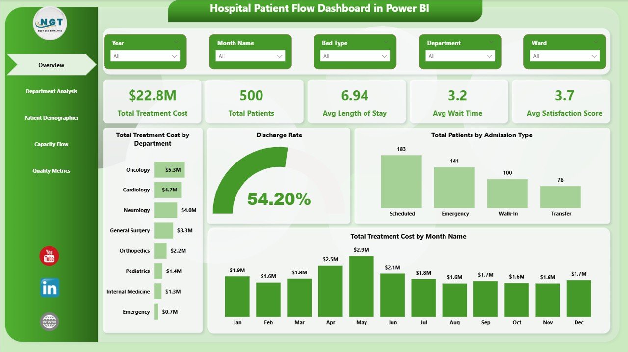
1. Overview Page
The Overview page serves as the command center of your hospital analytics. At the top, five high-level KPI cards display Total Treatment Cost, Total Patients, Avg Length of Stay, Avg Wait Time, and Avg Satisfaction Score. Below the cards, interactive charts visualize Total Treatment Cost by Department, helping you identify which departments consume the most resources. The Discharge Rate chart shows the proportion of patients discharged versus still admitted. Total Patients by Admission Type breaks down emergency, elective, and urgent admissions, while Total Treatment Cost by Month Name reveals seasonal cost patterns. Multiple slicers let you filter the entire dashboard instantly.
Hospital Patient Flow Dashboard in Power BI
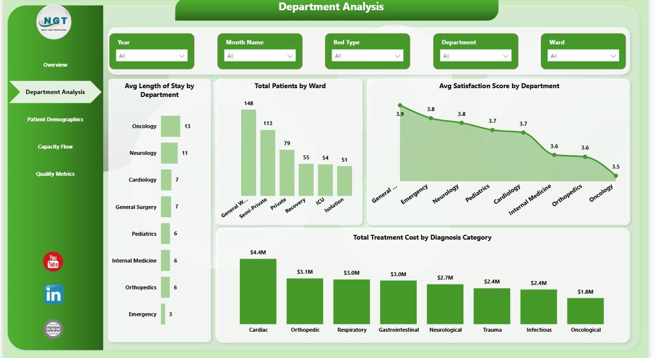
2. Department Analysis
The Department Analysis page provides a deep dive into departmental performance. Avg Length of Stay by Department helps identify departments where patients stay longer, indicating potential bottlenecks or complex cases. Total Patients by Ward shows patient distribution across hospital wards for capacity planning. Avg Satisfaction Score by Department highlights which departments excel in patient experience and which need improvement. Total Treatment Cost by Diagnosis Category reveals which medical conditions drive the highest costs across your hospital.
Department Analysis
3. Patient Demographics
The Patient Demographics page helps you understand your patient population and financial patterns. Total Treatment Cost by Insurance Type shows how costs are distributed across different insurance providers, helping with payer mix optimization. Total Treatment Cost by Discharge Status reveals spending patterns for patients who were discharged normally versus those transferred or still admitted. Total Treatment Cost by Admission Type compares the financial impact of emergency, elective, and urgent admissions.
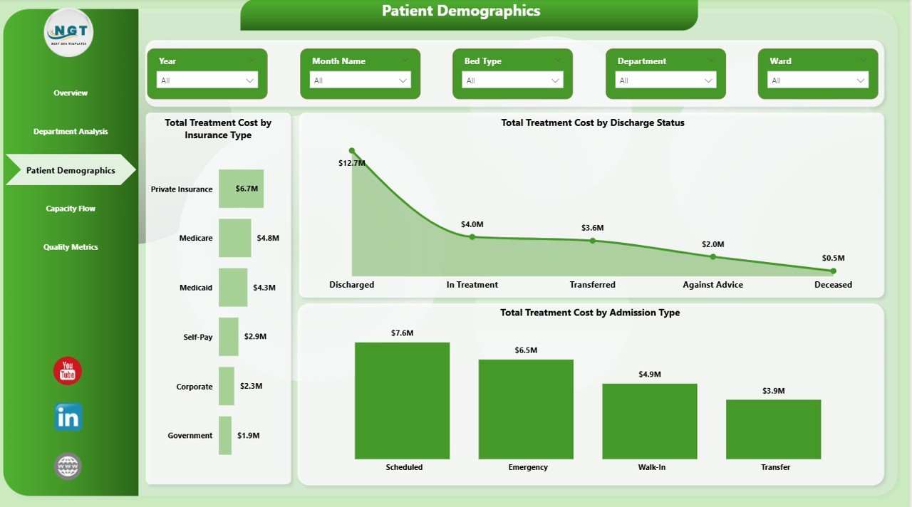
Patient Demographics
4. Capacity Flow
The Capacity Flow page is critical for bed management and resource planning. Total Treatment Cost by Bed Type breaks down spending across ICU, general, private, and semi-private beds. Total Treatment Cost by Ward shows which wards generate the highest costs. Total Patients and Total Discharged by Month Name visualizes monthly admission versus discharge trends, helping you identify seasonal peaks and plan staffing accordingly.
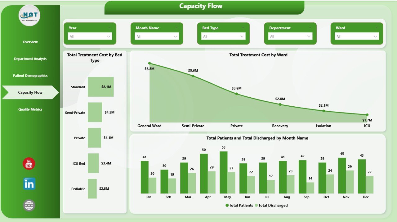
Capacity Flow
5. Quality Metrics
The Quality Metrics page focuses on clinical outcomes and patient experience. Total Readmissions by Department identifies which departments have the highest readmission rates, enabling targeted quality improvement initiatives. Avg Length of Stay by Diagnosis Category shows which medical conditions result in the longest hospital stays. Avg Satisfaction Score by Attending Physician provides physician-level performance insights that are critical for performance reviews and patient experience optimization. Browse all our Healthcare Templates for more analytics solutions.
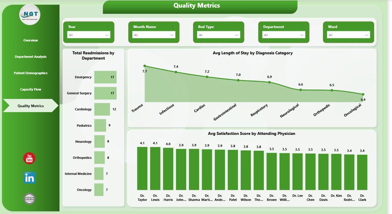
Quality Metrics
Advantages of Hospital Patient Flow Dashboard in Power BI
This dashboard eliminates the need for manual reporting by consolidating all patient flow data into a single interactive Power BI report. Hospital leaders can monitor KPIs in real-time, identify departmental bottlenecks, and make data-driven decisions about resource allocation, staffing, and patient care improvements. The 5-page structure ensures that different stakeholders — from C-suite executives to department heads — can access the specific insights they need without information overload.
The template is fully customizable and connects seamlessly to Excel, CSV, SQL, and cloud data sources through Power BI’s built-in data connectors. No DAX formulas or complex measures need to be created — everything is pre-built and ready to use out of the box.
Opportunities for Improvement
While this dashboard covers the essential aspects of hospital patient flow analytics, organizations with more complex needs could extend it by adding pages for financial forecasting, staff productivity tracking, or emergency department-specific metrics. Integrating real-time data feeds from hospital information systems would enable live monitoring rather than periodic refresh-based analysis. Adding drill-through pages for individual patient records could provide even deeper analytical depth.
Best Practices
To get the most value from this dashboard, maintain consistent data formatting when updating your source files. Use the slicers strategically — start with the Overview page for high-level trends, then drill into specific departments or time periods using the dedicated analysis pages. Schedule regular data refreshes in Power BI to ensure your KPIs always reflect the latest patient data. Share the dashboard with relevant stakeholders through Power BI Service for collaborative analysis and board-level reporting.
Explore Relevant Templates
📌 Hospital Patient Flow Dashboard in Excel — The Excel version with pivot tables and automated formulas for hospital analytics.
📌 Hospital Patient Flow Dashboard in HTML — Browser-based interactive dashboard for patient flow monitoring with no software needed.
📌 Blood Banks Dashboard in Power BI — Monitor blood bank operations, inventory, and donor analytics with Power BI.
📌 Cardiology Institutes Dashboard in Power BI — Track cardiology performance, patient volumes, and financial metrics.
📌 Dental Practice Dashboard in Excel — Comprehensive dental clinic analytics with treatment and insurance analysis.
Frequently Asked Questions
What KPIs does the Hospital Patient Flow Dashboard in Power BI track?
The Hospital Patient Flow Dashboard in Power BI tracks 5 key performance indicators: Total Treatment Cost, Total Patients, Average Length of Stay, Average Wait Time, and Average Satisfaction Score. It also provides detailed analysis across 5 interactive pages covering department performance, patient demographics, capacity flow, and quality metrics including readmission tracking by department.
Do I need advanced Power BI skills to use this dashboard?
No. Simply open the .pbix file in Power BI Desktop (free from Microsoft), connect your data source, and hit Refresh. All charts, KPI cards, and slicers update automatically. No DAX formulas or custom measures need to be written — the template is fully pre-built.
Can I filter the dashboard by specific department or admission type?
Yes. The dashboard includes multiple slicers on each page that let you filter all charts and KPIs by department, admission type, ward, bed type, date range, and other dimensions instantly for focused analysis.
What is the best Power BI template for hospital patient flow analysis?
The Hospital Patient Flow Dashboard in Power BI from NextGenTemplates is one of the best options available. It includes 5 dedicated pages covering Overview, Department Analysis, Patient Demographics, Capacity Flow, and Quality Metrics with slicers and dynamic visuals that update automatically with your data.
Is this template available in other formats like Excel or HTML?
Yes. NextGenTemplates also offers the Hospital Patient Flow Dashboard in Excel with pivot tables and the Hospital Patient Flow Dashboard in HTML that runs in any web browser.
How do I replace sample data with my own hospital data?
Open the .pbix file in Power BI Desktop, navigate to the data model, and connect your own data source using Power BI’s data import wizard. Map your columns to the existing data structure and click Refresh — all visuals update automatically with your hospital data.
Conclusion
The Hospital Patient Flow Dashboard in Power BI is a must-have analytics tool for any hospital or healthcare organization looking to optimize patient flow, reduce costs, and improve satisfaction scores. With 5 interactive pages, 5 KPI cards, and dynamic slicers, it delivers enterprise-grade analytics in a ready-to-use template. Click here to Purchase Hospital Patient Flow Dashboard in Power BI and transform your hospital data into actionable insights today.
For more healthcare and Power BI templates, visit NextGenTemplates.com. For video tutorials on how to use this dashboard and more, subscribe to our YouTube channel at Youtube.com/@PK-AnExcelExpert.
Also read: Hospital Patient Flow Dashboard in Excel | Microsoft Power BI Documentation