Intercity bus services play a major role in modern transportation. Because thousands of passengers travel every day, transport companies deal with several operations—route planning, ticket bookings, revenue tracking, fuel usage, scheduling, and customer feedback. Managing all these activities manually becomes difficult and time-consuming. However, when you use a powerful reporting tool like the Intercity Bus Services Dashboard in Excel, you gain complete visibility into your transport operations.
This dashboard helps you track performance, analyze trends, monitor costs, measure profitability, and improve customer satisfaction. It is a ready-to-use Excel template with smart navigation, clean visuals, and dynamic charts. Therefore, transport managers and business owners can make quick and accurate decisions.
In this article, you will learn everything about this dashboard—its structure, features, benefits, best practices, and the insights it delivers.
Click to Purchases Intercity Bus Services Dashboard in Excel
What Is an Intercity Bus Services Dashboard in Excel?
An Intercity Bus Services Dashboard in Excel is a structured reporting tool that provides real-time insights into operational, financial, and customer performance of intercity bus services. It uses Excel formulas, pivot tables, and charts to display information in a simple and easy-to-read format.
This dashboard helps transport teams monitor:
-
Route-wise profitability
-
Ticket demand
-
Fuel cost
-
Trip cancellations
-
Booking channel performance
-
Revenue and costs
-
Monthly customer ratings
-
Operational performance trends
Because the dashboard is built entirely in Excel, it is:
-
Easy to update
-
Simple to maintain
-
Fully customizable
-
Ideal for transport companies of any size
Why Transport Companies Need KPI Dashboards
Intercity bus operations involve several moving parts. Without proper analytics, companies may face issues like high operating costs, poor route planning, low customer satisfaction, and missed revenue opportunities.
A KPI dashboard solves these problems because it:
-
Helps identify profitable routes
-
Highlights high-cost operations
-
Tracks customer ratings
-
Shows booking channel performance
-
Reveals cost vs. revenue mismatch
-
Improves decision-making
-
Reduces manual reporting
Transport teams can use these insights to improve services, reduce expenses, and enhance passenger experience.
Click to Purchases Intercity Bus Services Dashboard in Excel
Key Features of the Intercity Bus Services Dashboard in Excel
This dashboard includes five analytical pages, along with support sheets and data sheets. Each page displays a unique set of KPIs and charts.
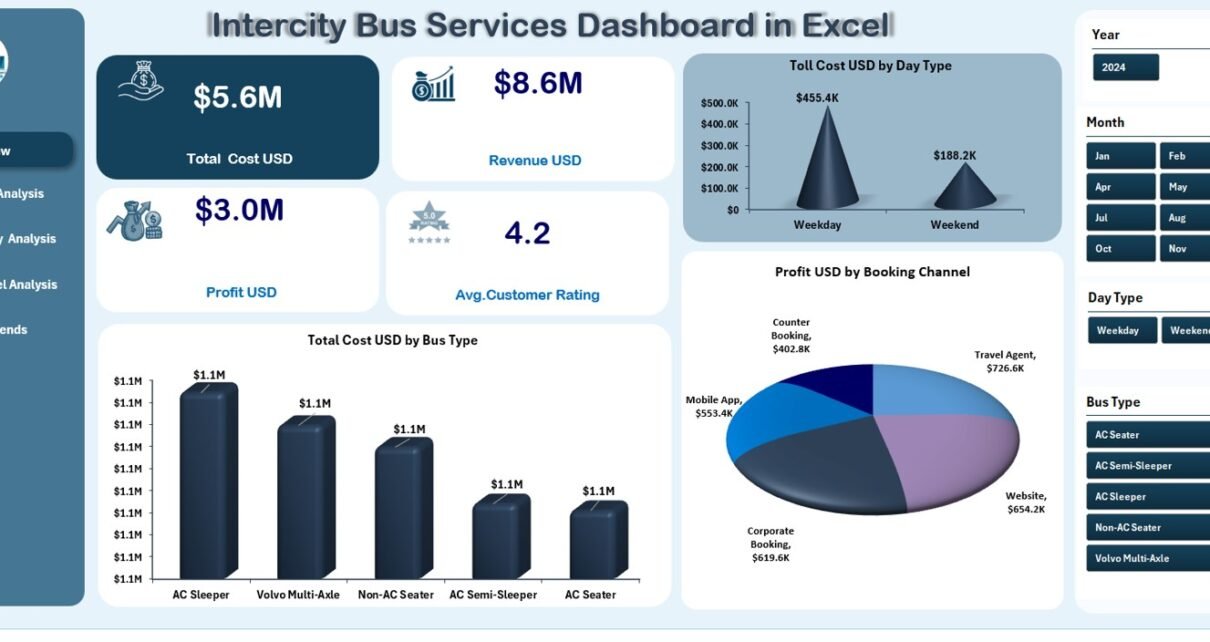
1. Overview Page – Main Dashboard for Key Metrics
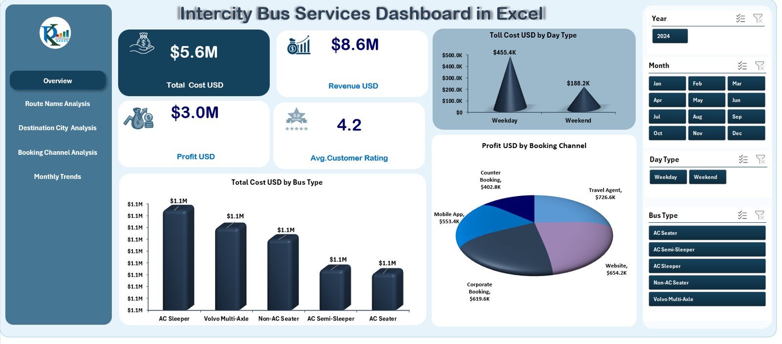
The Overview Page is the heart of the dashboard. On the left side, you have a Page Navigator that lets you switch between different analysis pages. On the right side, you will find slicers for filtering the dashboard by month, bus type, booking channel, or any field available in the dataset.
✔ KPI Cards
The Overview Page includes four important KPI cards, usually showing:
-
Total Revenue
-
Total Cost
-
Profit
-
Profit Margin %
These cards help you understand overall business performance in seconds.
✔ Visual Charts
The page also includes three powerful visuals:
-
Toll Cost (USD) by Day Type
Shows how toll expenses differ between weekdays, weekends, and holidays. -
Total Cost (USD) by Bus Type
Helps identify which bus type costs more to operate. -
Profit (USD) by Booking Channel
Reveals which booking channels bring higher profit—website, travel agent, app, or counter bookings.
Because these visuals update instantly with slicers, transport managers can evaluate performance quickly.
Click to Purchases Intercity Bus Services Dashboard in Excel
2. Route Name Analysis – Route-Wise Performance Insights
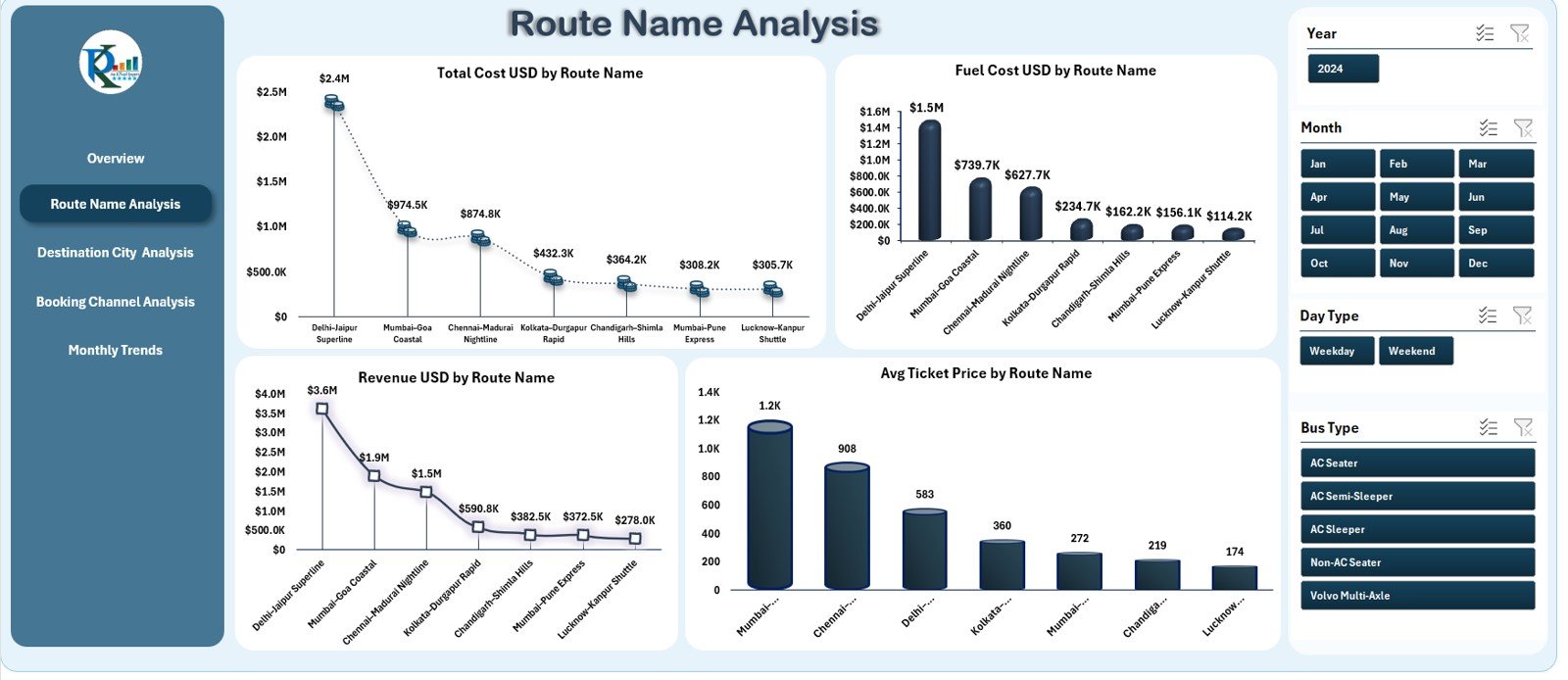
This page helps you understand which routes perform well and which ones need improvements.
It includes four detailed charts:
✔ Total Cost (USD) by Route Name
Helps identify costly routes so teams can adjust schedules or optimize operations.
✔ Fuel Cost (USD) by Route Name
Fuel usage varies across routes because of distance, traffic, and road conditions. This chart highlights high-consumption routes.
✔ Revenue (USD) by Route Name
Shows which routes generate the most money.
✔ Average Ticket Price by Route Name
Helps understand ticket pricing trends and passenger demand.
Route Name Analysis is important for route profitability planning and scheduling optimization.
3. Destination City Analysis – City-Wise Performance Breakdown
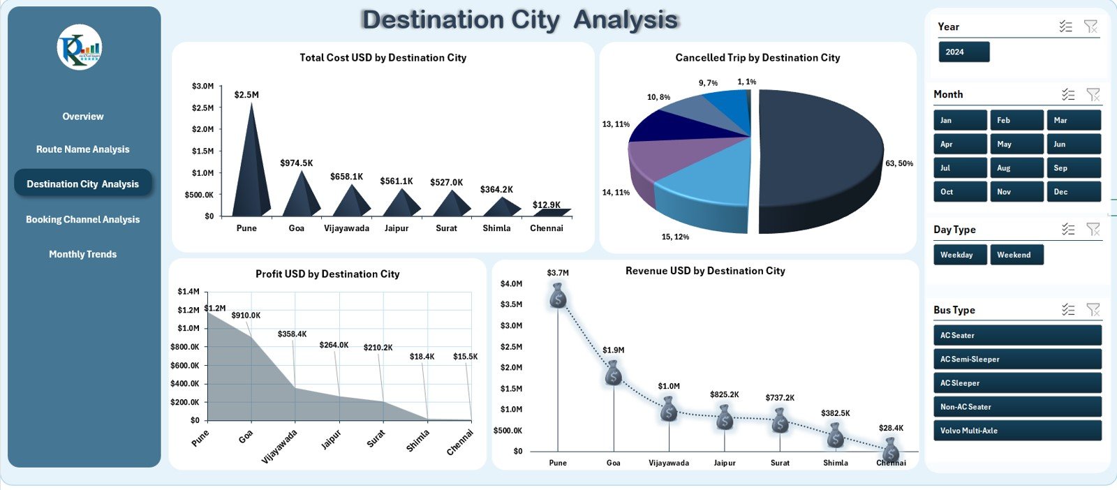
This page focuses on performance based on destination cities. Transport companies often operate across multiple cities, and the demand varies for each one.
The dashboard shows four useful charts:
✔ Total Cost (USD) by Destination City
Displays operational costs linked to specific cities.
✔ Cancelled Trip Count by Destination
Shows cancellation frequency across different destinations.
✔ Profit (USD) by Destination City
Helps identify profitable and loss-making destinations.
✔ Revenue (USD) by Destination City
Highlights cities with maximum passenger demand.
These visuals help managers decide where to increase services, reduce trips, or adjust pricing.
Click to Purchases Intercity Bus Services Dashboard in Excel
4. Booking Channel Analysis – Channel-Wise Performance
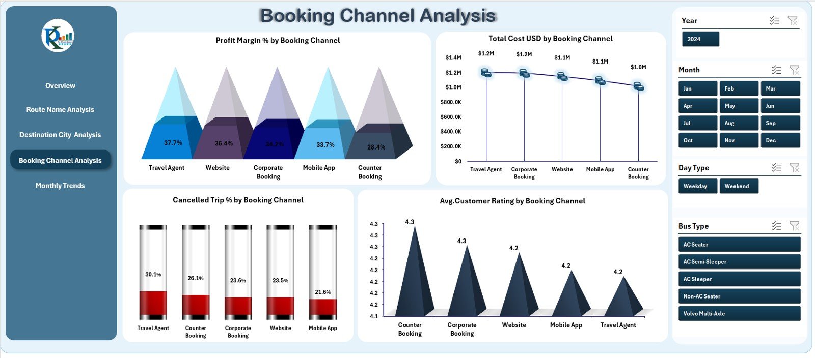
Booking channels have a direct impact on revenue and customer reach. This page analyzes performance across channels such as:
-
Mobile App
-
Website
-
Travel Agent
-
Ticket Counter
-
Partner Platforms
It includes four important charts:
✔ Profit Margin % by Booking Channel
Helps identify the most profitable channels.
✔ Total Cost (USD) by Booking Channel
Shows the cost of acquiring bookings from each channel.
✔ Cancelled Trip % by Booking Channel
Reveals cancellation behavior across booking methods.
✔ Average Customer Rating by Booking Channel
Shows customer satisfaction based on booking experience.
This page helps companies focus on high-performing channels and improve weaker ones.
Click to Purchases Intercity Bus Services Dashboard in Excel
5. Monthly Trends – Month-Wise Performance Tracking
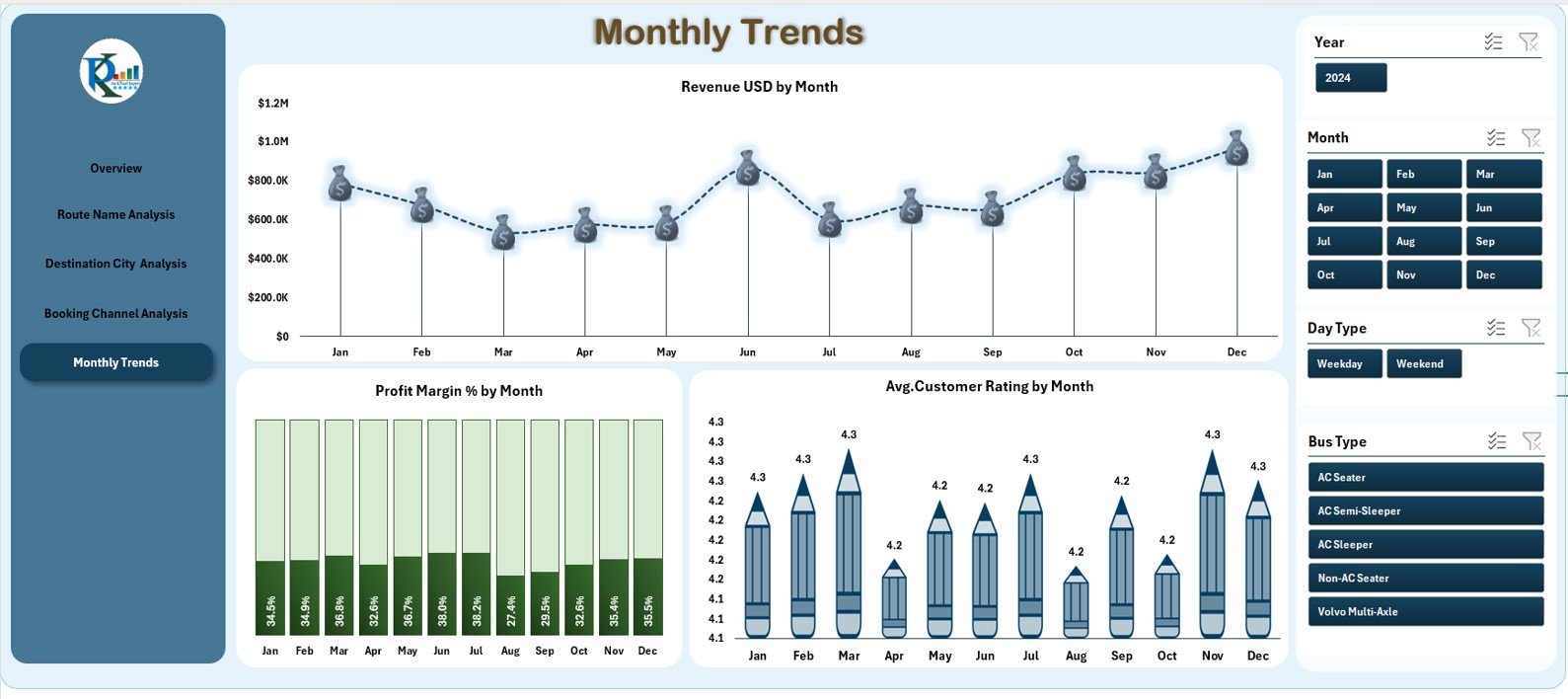
This page provides a deeper understanding of how performance changes each month.
It includes three trend charts:
✔ Revenue (USD) by Month
Shows seasonal demand or peak travel months.
✔ Profit Margin % by Month
Tracks profitability over time.
✔ Average Customer Rating by Month
Displays customer satisfaction trends throughout the year.
Monthly trend insights help companies make better marketing and pricing decisions.
Support Sheet & Data Sheet
In addition to the analytical pages, the dashboard includes:
✔ Support Sheet
Used to store drop-down lists, data validation fields, or mapping tables.
✔ Data Sheet
Stores raw data related to:
-
Trips
-
Bookings
-
Revenue
-
Fuel cost
-
Toll cost
-
Customer ratings
-
Cancellations
-
Route information
All dashboard visuals refresh based on the information in this sheet.
Types of KPIs You Can Track in This Dashboard
This dashboard covers several KPI categories, including:
Operational KPIs
-
Number of trips
-
Fuel consumption
-
Toll cost
-
Cancellations
-
Delay time
Financial KPIs
-
Total revenue
-
Total cost
-
Profit
-
Profit margin %
Customer KPIs
-
Average customer rating
-
Complaints count
-
Booking channel satisfaction
Route KPIs
-
Route-wise profitability
-
Route-wise revenue
-
Route-wise cost
Trend KPIs
-
Revenue by month
-
Profit by month
-
Rating by month
These KPIs help transport teams optimize their services and improve profitability.
Click to Purchases Intercity Bus Services Dashboard in Excel
Advantages of Using the Intercity Bus Services Dashboard in Excel
1. Easy to Use
Anyone with basic Excel knowledge can operate the dashboard.
2. Quick Navigation
The Page Navigator on the left side allows smooth movement across pages.
3. Clear Visual Insights
Charts and KPI cards make performance easy to understand.
4. Helps Reduce Costs
Cost-related visuals help identify inefficient routes and high-cost areas.
5. Improves Profitability
Profit charts and booking channel analysis help optimize revenue.
6. Enhances Customer Experience
Customer rating visuals reveal areas that need service improvement.
7. Fully Customizable
You can add new KPIs, rename sheets, or expand charts as needed.
Best Practices for Using the Dashboard
1. Keep Data Updated
Monthly updates ensure accurate trend analysis.
2. Use Slicers Frequently
Slicers help analyze performance from different angles.
3. Compare Costs With Revenue
Route-wise and city-wise comparisons help balance cost and profit.
4. Use Monthly Trends for Planning
Trend charts help identify seasonal travel behavior.
5. Track Fuel and Toll Costs
These two costs directly impact profitability.
6. Review Booking Channel Insights
Focus on channels with high profit and low cancellations.
7. Maintain Clean Data
Avoid errors by ensuring the Data Sheet is structured.
Real-World Use Cases of This Dashboard
✔ Optimizing Loss-Making Routes
If a route shows high cost and low revenue, the company can reduce frequency or revise pricing.
✔ Improving Customer Experience
Low ratings for a specific channel help identify service or communication gaps.
✔ Fuel Cost Benchmarking
Comparing fuel cost by route helps plan efficient driving or route updates.
✔ Strengthening Digital Channels
Higher profit from app or website channels promotes investment in digital marketing.
✔ Demand Forecasting
Monthly trends show peak travel periods, helping companies plan buses accordingly.
Conclusion
The Intercity Bus Services Dashboard in Excel is a complete performance monitoring solution for transport companies. Because it combines route insights, booking performance, customer ratings, and monthly trends in one place, it becomes an essential tool for decision-making.
Whether you manage a small fleet or a large intercity network, this dashboard helps improve operations, reduce costs, and increase customer satisfaction.
Click to Purchases Intercity Bus Services Dashboard in Excel
Frequently Asked Questions (FAQs)
1. What does this dashboard track?
It tracks revenue, cost, fuel usage, customer ratings, route performance, booking channels, and monthly trends.
2. Is Excel enough for transport analytics?
Yes, this dashboard provides powerful insights using standard Excel tools.
3. Can I customize the KPIs?
Yes, you can modify KPIs, add charts, or update formulas easily.
4. Is this suitable for small transport companies?
Absolutely. Any bus service provider can use it.
5. How often should I update data?
You should update data every month for accurate results.
6. Does the dashboard track customer ratings?
Yes, it includes customer rating KPIs and charts.
7. Can I use the dashboard for financial planning?
Yes, cost and revenue visuals help with profitability analysis.
Visit our YouTube channel to learn step-by-step video tutorials
Click to Purchases Intercity Bus Services Dashboard in Excel