In today’s connected world, IoT service providers handle massive data streams, device networks, uptime metrics, response times, and customer performance indicators. However, many IoT businesses still rely on scattered spreadsheets and manual reports. As a result, leaders struggle to monitor performance clearly and make timely decisions.
So, how can you track device uptime, service quality, incident response, SLA compliance, and revenue performance in one place?
You need an IoT Services KPI Dashboard in Excel.
This ready-to-use dashboard helps you monitor key IoT service metrics using a structured and dynamic Excel framework. Moreover, it allows you to compare Month-to-Date (MTD) and Year-to-Date (YTD) performance instantly. Therefore, you can identify issues early, improve service reliability, and increase customer satisfaction.
In this complete guide, you will learn:
-
What an IoT Services KPI Dashboard in Excel is
-
Why IoT service providers need it
-
Detailed explanation of all 7 worksheets
-
Advantages of using this dashboard
-
Best practices for implementation
-
Frequently Asked Questions with Answers
Let us explore everything step by step.
Click to Purchases IoT Services KPI Dashboard in Excel
What Is an IoT Services KPI Dashboard in Excel?
An IoT Services KPI Dashboard in Excel is a structured performance monitoring tool designed specifically for IoT service companies. It tracks key metrics such as:
-
Device uptime percentage
-
SLA compliance rate
-
Incident resolution time
-
Active device count
-
Data transmission accuracy
-
Customer response time
-
Service revenue performance
Instead of reviewing raw operational logs, you can monitor structured KPIs in a single interactive dashboard. Furthermore, you can compare Actual vs Target vs Previous Year values in seconds.
Because the template runs in Excel, you can customize it easily. At the same time, you can maintain complete control over your data.
Why Do IoT Service Providers Need a KPI Dashboard?
IoT services operate in real time. Devices connect continuously. Networks transmit data 24/7. Customers expect instant support.
However, without structured monitoring:
-
Downtime increases unnoticed
-
SLA breaches damage reputation
-
Incident backlogs grow
-
Service costs rise
-
Customer churn increases
Therefore, you must track performance proactively.
An IoT Services KPI Dashboard helps you:
-
Monitor operational stability
-
Track financial performance
-
Compare performance trends
-
Identify weak areas early
-
Improve decision-making speed
As a result, you build a reliable and scalable IoT service operation.
Click to Purchases IoT Services KPI Dashboard in Excel
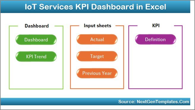
How Is the IoT Services KPI Dashboard Structured?
This dashboard includes 7 structured worksheets, each designed for clarity and usability. Let us examine each sheet in detail.
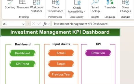
1️⃣ What Is the Role of the Home Sheet?
The Home Sheet acts as the index page.
Here, you get:
-
6 navigation buttons
-
Quick access to all sheets
-
Clean and organized interface
Because of these buttons, you can move between sheets instantly. Therefore, you save time and improve workflow efficiency.
Click to Purchases IoT Services KPI Dashboard in Excel
2️⃣ What Makes the Dashboard Sheet the Core of the System?
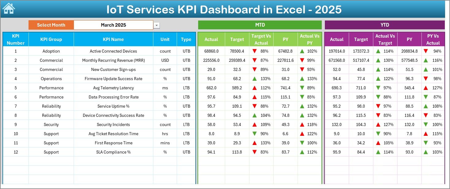
The Dashboard Sheet serves as the main performance page.
Key Features:
-
Month selection from cell D3
-
Dynamic MTD performance view
-
Dynamic YTD performance view
-
Target vs Actual comparison
-
Previous Year vs Actual comparison
-
Conditional formatting with up/down arrows
When you select a month from the drop-down in D3, the entire dashboard updates automatically. As a result, you can analyze any month instantly.
What Does It Display?
For each KPI, you can view:
MTD Section:
-
Actual
-
Target
-
Previous Year
-
Target vs Actual variance
-
PY vs Actual variance
YTD Section:
-
Actual
-
Target
-
Previous Year
-
Target vs Actual variance
-
PY vs Actual variance
Because the dashboard uses conditional formatting arrows, you can identify improvement or decline immediately.
Therefore, leadership teams can take faster action.
Click to Purchases IoT Services KPI Dashboard in Excel
3️⃣ How Does the KPI Trend Sheet Help in Analysis?
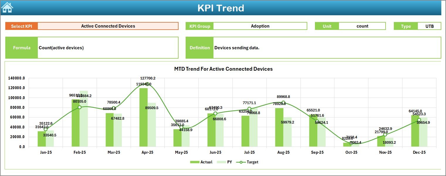
The KPI Trend Sheet focuses on deep performance analysis.
What Can You Do Here?
-
Select KPI name from drop-down (Cell C3)
-
View KPI Group
-
View Unit of KPI
-
Identify KPI Type (Lower the Better / Upper the Better)
-
Review Formula
-
Understand KPI Definition
Moreover, the sheet displays:
-
MTD trend chart (Actual vs Target vs PY)
-
YTD trend chart (Actual vs Target vs PY)
Because of trend visualization, you can detect patterns over time. For example:
-
Rising downtime trend
-
Improving SLA compliance
-
Declining device activation rate
Therefore, you can make strategic improvements.
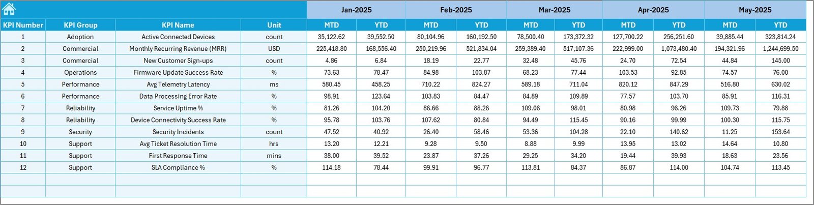
4️⃣ What Is the Purpose of the Actual Numbers Input Sheet?
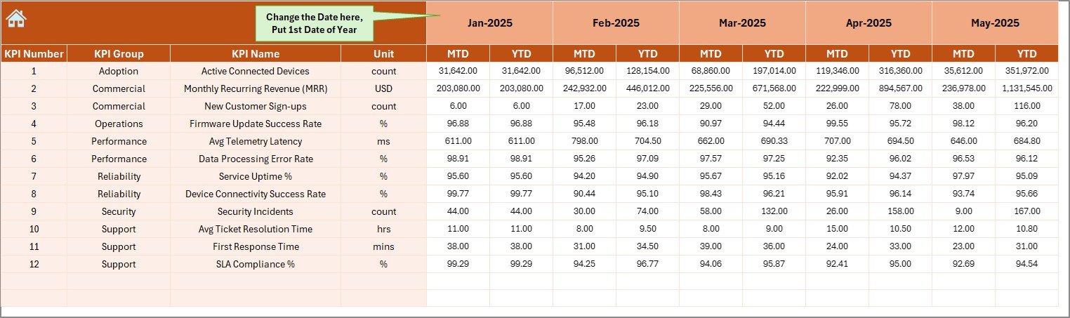
The Actual Numbers Input Sheet allows you to enter real operational data.
How Does It Work?
-
Enter first month of the year in cell E1
-
Select month dynamically
-
Enter MTD values
-
Enter YTD values
Because the dashboard connects directly to this sheet, your inputs reflect instantly on all reports.
Therefore, you maintain real-time accuracy.
Click to Purchases IoT Services KPI Dashboard in Excel
5️⃣ Why Is the Target Sheet Important?
The Target Sheet defines expected performance.
Here, you enter:
-
Monthly Target (MTD)
-
Cumulative Target (YTD)
Targets help you measure performance gaps. Therefore, you can:
-
Monitor SLA compliance
-
Track revenue goals
-
Maintain uptime standards
-
Reduce response time
Without targets, you cannot measure success clearly.
6️⃣ What Does the Previous Year Numbers Sheet Do?
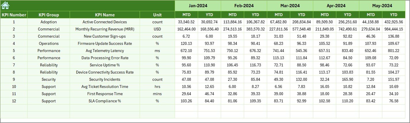
The Previous Year Numbers Sheet stores historical data.
You enter:
-
Previous Year MTD values
-
Previous Year YTD values
Because of this comparison, you can analyze growth and decline trends.
For example:
-
Did uptime improve this year?
-
Did response time reduce?
-
Did service revenue grow?
Year-over-Year comparison strengthens strategic planning.
Click to Purchases IoT Services KPI Dashboard in Excel
7️⃣ Why Is the KPI Definition Sheet Critical?
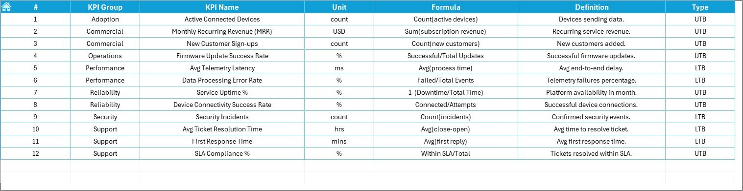
The KPI Definition Sheet maintains clarity.
Here, you define:
-
KPI Name
-
KPI Group
-
Unit
-
Formula
-
KPI Definition
Because of this structured documentation:
-
Everyone understands each KPI
-
Teams avoid confusion
-
Reports stay consistent
-
Audit readiness improves
Therefore, governance becomes stronger.
What Are the Key KPIs You Can Track in an IoT Services Dashboard?
Although you can customize KPIs, common IoT service metrics include:
Operational KPIs
-
Device Uptime %
-
Network Availability
-
Mean Time to Repair (MTTR)
-
Incident Resolution Time
-
SLA Compliance Rate
Financial KPIs
-
Service Revenue
-
Cost per Device
-
Maintenance Cost
-
Customer Acquisition Cost
Customer KPIs
-
Customer Satisfaction Score
-
Response Time
-
Support Ticket Closure Rate
Because you can classify KPIs as:
-
Upper the Better (UTB)
-
Lower the Better (LTB)
You can evaluate performance logically.
Click to Purchases IoT Services KPI Dashboard in Excel
Advantages of IoT Services KPI Dashboard in Excel
Now let us explore the major advantages.
1. Centralized Performance Monitoring
You can monitor all KPIs in one dashboard. Therefore, you avoid scattered reports.
2. Real-Time Monthly Analysis
Because you can change month from D3, you can analyze performance instantly.
3. Clear Target Comparison
You can track:
-
Actual vs Target
-
Actual vs Previous Year
As a result, you identify performance gaps quickly.
4. Trend Visualization
Charts display MTD and YTD performance trends clearly. Therefore, you can spot long-term issues.
5. Easy Customization
Since Excel allows flexibility, you can:
-
Add new KPIs
-
Modify formulas
-
Adjust targets
-
Change design elements
6. Improved Decision-Making
When leadership sees performance visually, decision-making improves significantly.
How Can This Dashboard Improve IoT Service Operations?
This dashboard improves operations in several ways.
Better SLA Management
You can monitor SLA compliance daily. Therefore, you reduce penalty risks.
Faster Incident Resolution
Because you track MTTR trends, you improve support efficiency.
Improved Customer Retention
When uptime improves, customers stay satisfied.
Stronger Financial Control
You can compare cost vs revenue monthly. Therefore, you protect margins.
Best Practices for the IoT Services KPI Dashboard in Excel
To maximize results, follow these best practices.
1. Define Clear KPIs
Choose KPIs aligned with business goals. Avoid tracking unnecessary metrics.
2. Update Data Regularly
Enter actual numbers monthly without delay. Otherwise, reports lose value.
3. Validate Data Accuracy
Cross-check actual numbers before entry. Accurate input ensures reliable output.
4. Review Trends Monthly
Do not rely only on one month. Instead, review YTD trends regularly.
5. Align Targets with Strategy
Set realistic yet challenging targets.
6. Train Your Team
Ensure managers understand KPI definitions and dashboard navigation.
Click to Purchases IoT Services KPI Dashboard in Excel
How to Implement IoT Services KPI Dashboard Successfully?
Follow these steps:
-
Define KPIs
-
Enter KPI definitions
-
Input previous year data
-
Enter targets
-
Update actual monthly data
-
Review dashboard
-
Conduct monthly performance meetings
Because of structured workflow, implementation becomes smooth.
Conclusion: Why Should You Use an IoT Services KPI Dashboard in Excel?
IoT services require precision, speed, and reliability. However, without structured monitoring, performance gaps grow silently.
The IoT Services KPI Dashboard in Excel offers:
-
Centralized KPI monitoring
-
MTD and YTD comparison
-
Target vs Actual analysis
-
Previous Year benchmarking
-
Clear trend visualization
Therefore, you gain full visibility into operations, finances, and service quality.
If you want to scale your IoT services confidently, this dashboard gives you the clarity and control you need.
Click to Purchases IoT Services KPI Dashboard in Excel
Frequently Asked Questions with Answers
1. What is an IoT Services KPI Dashboard in Excel?
It is a structured Excel tool that tracks key IoT service performance indicators such as uptime, SLA compliance, revenue, and incident resolution.
2. Can I customize the KPIs?
Yes. You can add, edit, or remove KPIs based on your business needs.
3. Does the dashboard support MTD and YTD tracking?
Yes. It shows both Month-to-Date and Year-to-Date performance dynamically.
4. How do I change the reporting month?
You can select the month from the drop-down in cell D3 on the Dashboard sheet.
5. Can I compare performance with the previous year?
Yes. The dashboard includes a Previous Year sheet for Year-over-Year comparison.
6. Is this dashboard suitable for large IoT companies?
Yes. Both small and large IoT service providers can use it effectively.
7. Do I need advanced Excel knowledge?
No. Basic Excel knowledge allows you to use this dashboard easily.
Click to Purchases IoT Services KPI Dashboard in Excel
Visit our YouTube channel to learn step-by-step video tutorials