Managing leases without real-time visibility often leads to cost overruns, missed renewals, compliance risks, and poor decision-making. However, when organizations track lease performance using structured KPIs, they gain clarity, control, and confidence. That is exactly why a Lease Management KPI Dashboard in Power BI becomes a critical analytics tool for finance teams, real estate managers, and business leaders.
This in-depth guide explains what a Lease Management KPI Dashboard in Power BI is, how it works, why it matters, and how each dashboard page supports better lease decisions. Moreover, you will discover its advantages, best practices, use cases, and frequently asked questions. By the end, you will clearly understand how this dashboard transforms lease data into actionable insights.
Click to buy Lease Management KPI Dashboard in Power BI
What Is a Lease Management KPI Dashboard in Power BI?
A Lease Management KPI Dashboard in Power BI is an interactive performance monitoring solution designed to track, analyze, and visualize key lease-related metrics. Instead of relying on scattered Excel files or manual reports, this dashboard consolidates all lease KPIs into one centralized view.
Because it uses Microsoft Power BI, the dashboard delivers dynamic filtering, visual storytelling, and real-time insights. As a result, organizations can monitor Month-to-Date (MTD), Year-to-Date (YTD), target vs actual, and year-on-year lease performance with ease.
Most importantly, the dashboard uses Excel as a data source. Therefore, it remains flexible, user-friendly, and easy to maintain without complex system integrations.
Why Do Organizations Need a Lease Management KPI Dashboard?
Lease portfolios grow complex as businesses expand. Therefore, manual tracking quickly becomes risky. A Lease Management KPI Dashboard in Power BI solves this problem by delivering structured insights.
Key reasons organizations use this dashboard include:
- Improved visibility into lease costs and performance
- Faster identification of target misses and risks
- Better compliance and audit readiness
- Stronger forecasting and budgeting accuracy
- Reduced dependency on manual reporting
Because the dashboard updates automatically when data changes, teams always work with the latest numbers. Consequently, decision-making becomes proactive instead of reactive.
How Does the Lease Management KPI Dashboard in Power BI Work?
The dashboard follows a clean and logical design. It uses an Excel file as the backend and Power BI as the visualization layer. As a result, users can update data easily while enjoying powerful analytics.
High-level workflow:
- Enter actual and target data in Excel
- Load Excel data into Power BI
- Select month and KPI group using slicers
- Analyze MTD, YTD, and year-on-year performance
- Drill through KPIs for definitions and formulas
Because of this structure, both technical and non-technical users can use the dashboard confidently.
Dashboard Architecture: Pages Explained Clearly
The Lease Management KPI Dashboard in Power BI contains three structured pages, each serving a specific purpose.
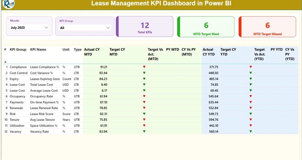
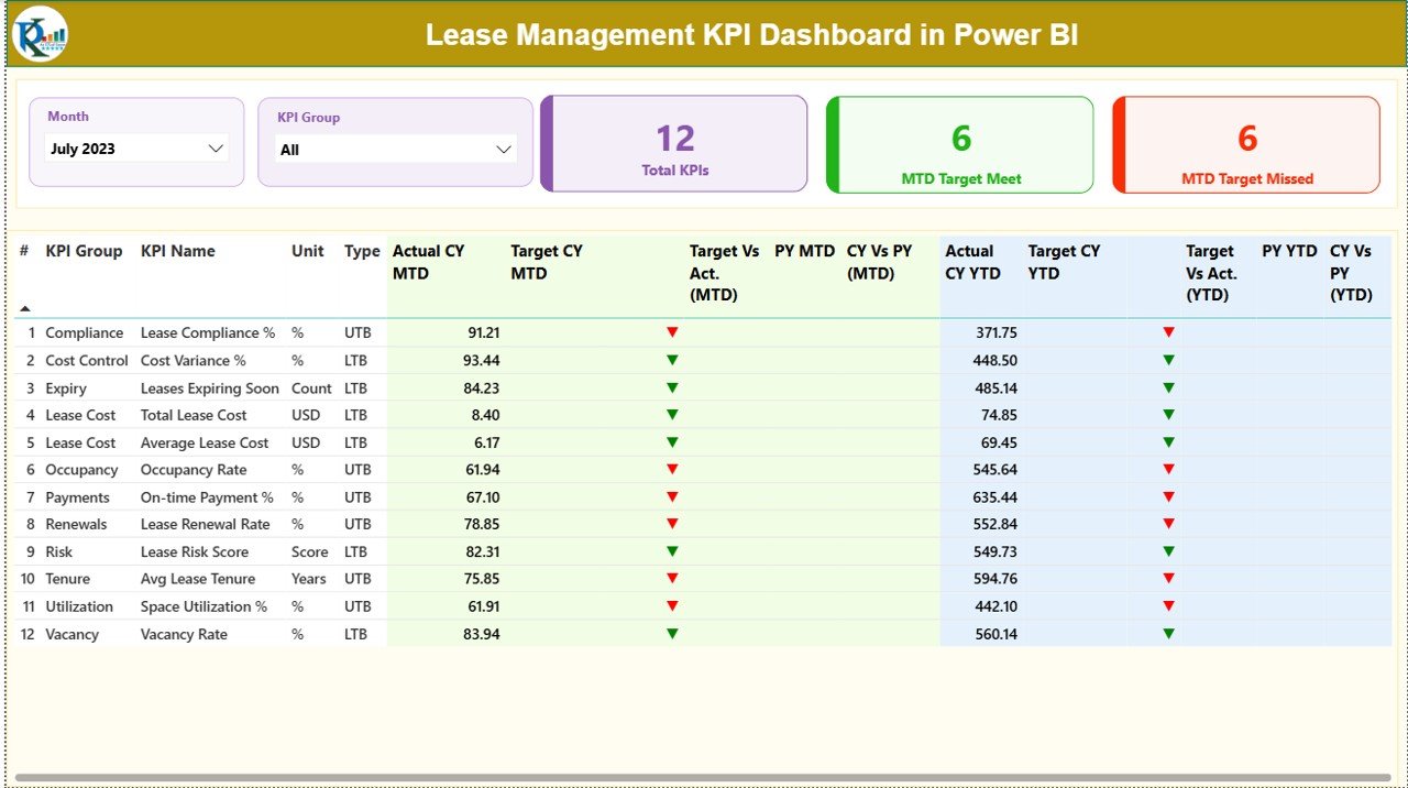
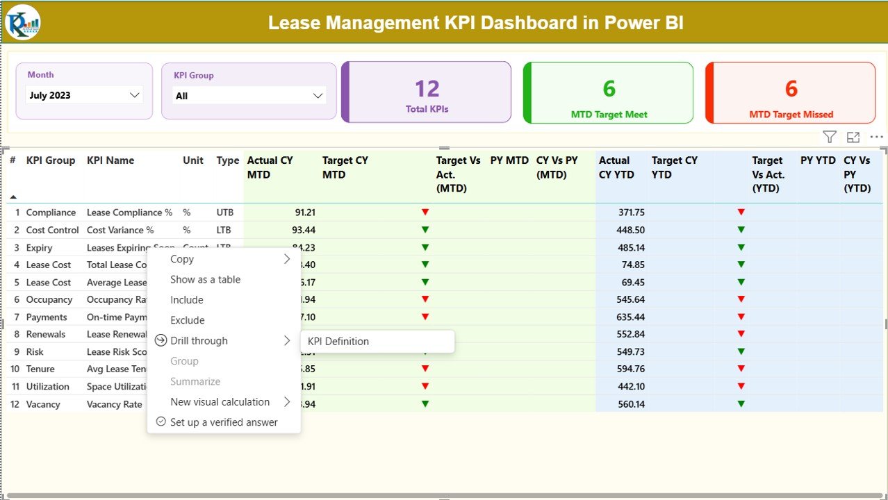
Summary Page: Where Lease Performance Comes Alive
The Summary Page acts as the main control center of the dashboard. It provides a high-level view of all lease KPIs in one place.
Top Section: Filters and KPI Cards
At the top of the page, you will find:
- Month slicer to select the reporting period
- KPI Group slicer to filter KPI categories
Alongside the slicers, three KPI cards display:
- Total KPIs Count
- MTD Target Meet Count
- MTD Target Missed Count
Because these cards update dynamically, users instantly understand overall performance status.
Click to buy Lease Management KPI Dashboard in Power BI
Detailed KPI Table: Complete Performance Breakdown
Below the cards, a detailed table displays all lease KPIs with rich performance indicators.
Columns included in the table:
- KPI Number – Unique sequence number for each KPI
- KPI Group – Category or group of the KPI
- KPI Name – Name of the lease KPI
- Unit – Unit of measurement
- Type – KPI type (LTB – Lower the Better, UTB – Upper the Better)
MTD Performance Metrics:
- Actual CY MTD – Current Year actual MTD value
- Target CY MTD – Current Year target MTD value
- MTD Icon – ▲ green or ▼ red icon showing target status
- Target vs Actual (MTD) – Actual ÷ Target percentage
- PY MTD – Previous Year MTD value
- CY vs PY (MTD) – Current vs Previous Year MTD comparison
YTD Performance Metrics:
- Actual CY YTD – Current Year actual YTD value
- Target CY YTD – Current Year target YTD value
- YTD Icon – ▲ green or ▼ red icon showing YTD status
- Target vs Actual (YTD) – Actual ÷ Target percentage
- PY YTD – Previous Year YTD value
- CY vs PY (YTD) – Current vs Previous Year YTD comparison
Because of this layout, users can evaluate performance at a glance while still accessing deep insights.
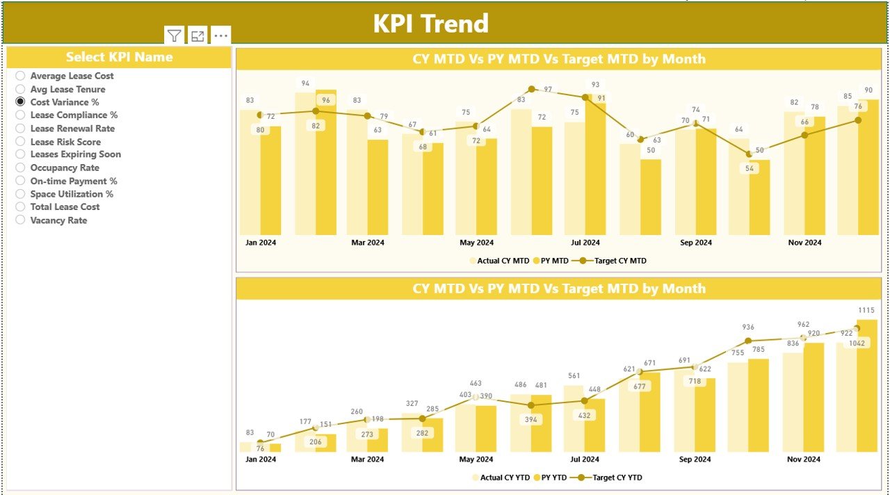
KPI Trend Page: How Are Lease KPIs Performing Over Time?
The KPI Trend Page focuses on historical analysis and trend identification. This page helps users understand whether performance improves, declines, or remains stable.
What does this page show?
Two combo charts:
MTD trend chart
YTD trend chart
Actual values for:
Current Year
Previous Year
Target values
On the left side, a KPI Name slicer allows users to select a specific KPI. As soon as they select a KPI, both charts update automatically.
Because of this design, users can:
- Compare targets vs actuals visually
- Identify seasonal patterns
- Spot early warning signs
- Support forecasting discussions
Click to buy Lease Management KPI Dashboard in Power BI
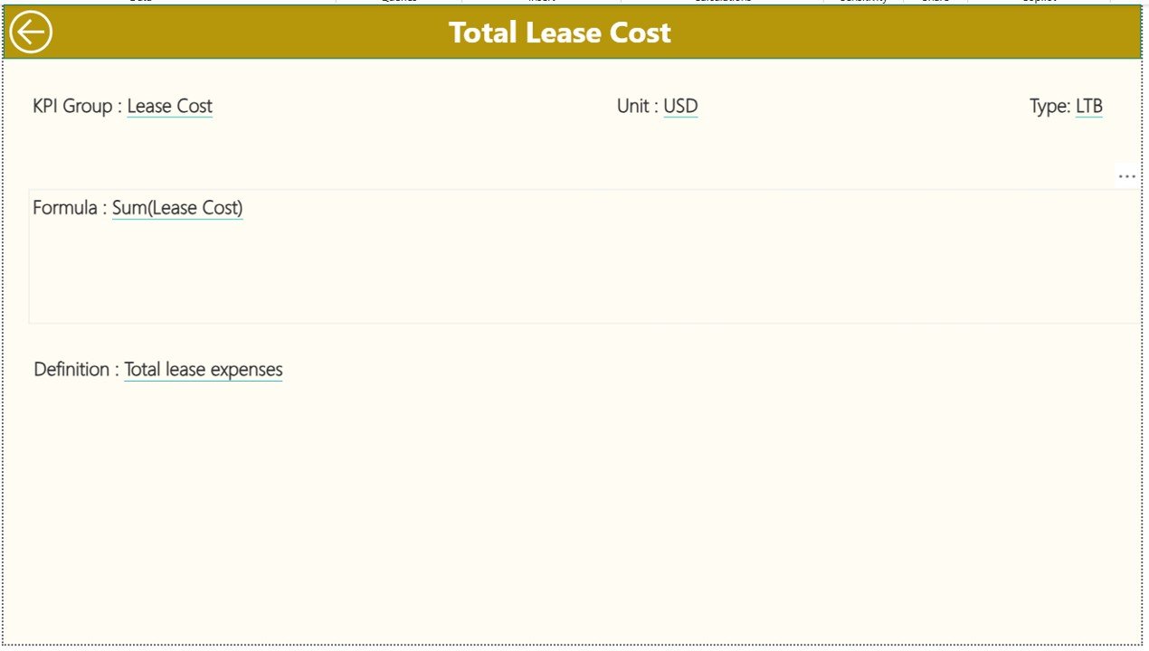
KPI Definition Page: What Does Each KPI Mean?
The KPI Definition Page serves as a drill-through page. Although it remains hidden by default, users can access it from the Summary Page.
This page displays:
- KPI Number
- KPI Group
- KPI Name
- Unit
- Formula
- Definition
- KPI Type (LTB or UTB)
Because of this page, users never guess KPI meanings. Instead, everyone works with the same definitions, formulas, and logic.
A Back button at the top-left corner allows users to return to the Summary Page instantly.
Click to buy Lease Management KPI Dashboard in Power BI
Excel Data Source Structure Explained Simply
The dashboard uses an Excel file as its data source. This approach keeps data management simple and flexible.
Excel Worksheets Used:
Input_Actual Sheet
In this sheet, users enter:
- KPI Name
- Month (use the first date of the month)
- MTD Actual value
- YTD Actual value
Input_Target Sheet
In this sheet, users enter:
- KPI Name
- Month (use the first date of the month)
- MTD Target value
- YTD Target value
Click to buy Lease Management KPI Dashboard in Power BI
KPI Definition Sheet
In this sheet, users define:
- KPI Number
- KPI Group
- KPI Name
- Unit
- Formula
- Definition
- Type (LTB or UTB)
Because the Excel structure remains simple, updates take only a few minutes each month.
Advantages of Lease Management KPI Dashboard in Power BI
Using a Lease Management KPI Dashboard in Power BI delivers measurable business benefits.
Key advantages include:
- Centralized lease visibility across all KPIs
- Faster performance evaluation with automated visuals
- Reduced manual reporting effort
- Clear target vs actual comparison
- Improved year-on-year analysis
- Consistent KPI definitions and logic
- Executive-ready reporting format
Moreover, because Power BI supports interactivity, users explore data instead of reading static reports.
Who Can Benefit from This Dashboard?
This dashboard supports multiple roles across an organization.
Primary users include:
- Finance and accounting teams
- Corporate real estate managers
- Lease administrators
- Compliance and audit teams
- Business leaders and executives
- FP&A professionals
Because the dashboard works with Excel, even small teams can adopt it without heavy IT involvement.
Best Practices for the Lease Management KPI Dashboard in Power BI
To get maximum value, organizations should follow proven best practices.
Best practices to follow:
- Maintain consistent KPI definitions across teams
- Update Excel data monthly without delays
- Validate target values before loading data
- Use clear KPI groups for better filtering
- Review trend charts regularly, not just summary tables
- Train users on drill-through functionality
- Archive historical Excel data for audits
When teams follow these practices, dashboard accuracy and trust improve significantly.
Common Lease KPIs Tracked in This Dashboard
Although organizations customize KPIs, common lease metrics include:
- Lease cost variance
- Occupancy rate
- Lease renewal rate
- Lease expiration risk
- Compliance score
- Cost per square foot
- Budget vs actual lease spend
Because the dashboard remains flexible, teams can add or remove KPIs as business needs change.
How Does This Dashboard Improve Decision-Making?
The dashboard transforms raw numbers into insights. Instead of reacting late, managers identify issues early.
Decision-making improvements include:
- Early identification of cost overruns
- Better negotiation timing for renewals
- Improved budgeting accuracy
- Reduced compliance risks
- Stronger performance accountability
As a result, lease management becomes strategic instead of administrative.
Conclusion: Why Lease Management KPI Dashboard in Power BI Is a Must-Have
A Lease Management KPI Dashboard in Power BI delivers clarity, control, and confidence. It replaces manual tracking with structured analytics and visual intelligence. Because it combines Excel simplicity with Power BI power, it fits organizations of all sizes.
When teams track MTD, YTD, target vs actual, and year-on-year performance in one dashboard, they reduce risks and improve outcomes. Therefore, this dashboard becomes an essential decision-support tool for modern lease management.
Frequently Asked Questions (FAQs)
- What is the main purpose of a Lease Management KPI Dashboard in Power BI?
The main purpose is to track, analyze, and visualize lease performance using KPIs. It helps organizations monitor targets, trends, and risks in one centralized dashboard.
- Can beginners use this dashboard easily?
Yes. Because the data source uses Excel and the visuals remain intuitive, beginners can use the dashboard with minimal training.
- Does this dashboard support year-on-year comparison?
Yes. The dashboard includes PY MTD and PY YTD metrics along with CY vs PY percentage comparisons.
- Can organizations customize KPIs?
Absolutely. Users can add, remove, or modify KPIs by updating the Excel KPI Definition sheet.
- Why use Power BI instead of Excel alone?
Power BI offers interactive visuals, slicers, drill-through features, and better performance for large datasets, which Excel alone cannot match.
- How often should data be updated?
Most organizations update lease KPI data monthly. However, teams can update it more frequently if required.
- Is this dashboard suitable for large lease portfolios?
Yes. Power BI handles large datasets efficiently, making this dashboard suitable for both small and large lease portfolios.
Visit our YouTube channel to learn step-by-step video tutorials
Watch the step-by-step video tutorial:
Click to buy Lease Management KPI Dashboard in Power BI