Luxury brands operate in a world where precision, exclusivity, and performance matter deeply. While aesthetics define luxury, data defines success. However, many luxury businesses still rely on scattered spreadsheets, manual reports, and delayed insights. As a result, leadership teams struggle to understand revenue drivers, discount impact, regional performance, and brand profitability.
That is exactly where a Luxury Goods Dashboard in Excel becomes a powerful business tool.
In this detailed guide, you will learn what a Luxury Goods Dashboard in Excel is, why it matters, how it works, its structure, advantages, best practices, and real-world use cases. Moreover, you will understand how this ready-to-use Excel dashboard helps luxury brands make faster, smarter, and more profitable decisions.
Click to Purchases Luxury Goods Dashboard in Excel
What Is a Luxury Goods Dashboard in Excel?
A Luxury Goods Dashboard in Excel is a structured and interactive analytics tool designed to track, analyze, and visualize key sales and revenue metrics for luxury brands.
Instead of reviewing raw data tables, this dashboard transforms numbers into clear charts, KPI cards, and trends. Consequently, decision-makers gain instant visibility into performance across brands, product categories, sales channels, regions, customers, and time periods.
Because the dashboard runs entirely in Excel, it remains flexible, familiar, and easy to update. At the same time, it delivers executive-level insights without complex software or heavy IT dependency.
Why Do Luxury Brands Need a Dashboard in Excel?
Luxury businesses face unique challenges. While margins remain high, expectations stay even higher. Therefore, brands must balance pricing power, discount control, regional demand, and brand positioning.
Without a centralized dashboard:
-
Revenue insights remain scattered
-
Discount leakage goes unnoticed
-
Regional performance stays unclear
-
Brand-level profitability becomes hard to track
However, when you use a Luxury Goods Dashboard in Excel, everything changes.
This dashboard helps luxury brands:
-
Monitor net and gross revenue clearly
-
Control discount percentages effectively
-
Track unit sales and pricing trends
-
Compare brands, categories, and channels
-
Analyze monthly and seasonal performance
As a result, leadership teams move from guesswork to data-driven strategy.
How Does the Luxury Goods Dashboard in Excel Work?
The Luxury Goods Dashboard in Excel works on a simple yet powerful structure.
First, users update the Data Sheet with transactional sales data.
Next, Excel processes the data using formulas, Pivot Tables, and structured models.
Finally, the dashboard pages visualize insights using interactive charts, KPI cards, and slicers.
Because the dashboard uses right-side slicers, users can filter data dynamically by region, brand, product category, sales channel, customer type, or month. Therefore, the entire dashboard responds instantly to selections.
What Are the Core Components of the Luxury Goods Dashboard in Excel?
This ready-to-use Luxury Goods Dashboard in Excel includes multiple well-organized sheets. Each sheet serves a clear analytical purpose.
Let’s explore each component in detail.
What Is the Page Navigator and Why Is It Important?
The Page Navigator, located on the left side, allows users to move seamlessly across different analytical pages.
Instead of scrolling or searching through tabs, users can jump instantly to any analysis page. As a result, navigation becomes faster, smoother, and more professional—especially during leadership reviews or client presentations.
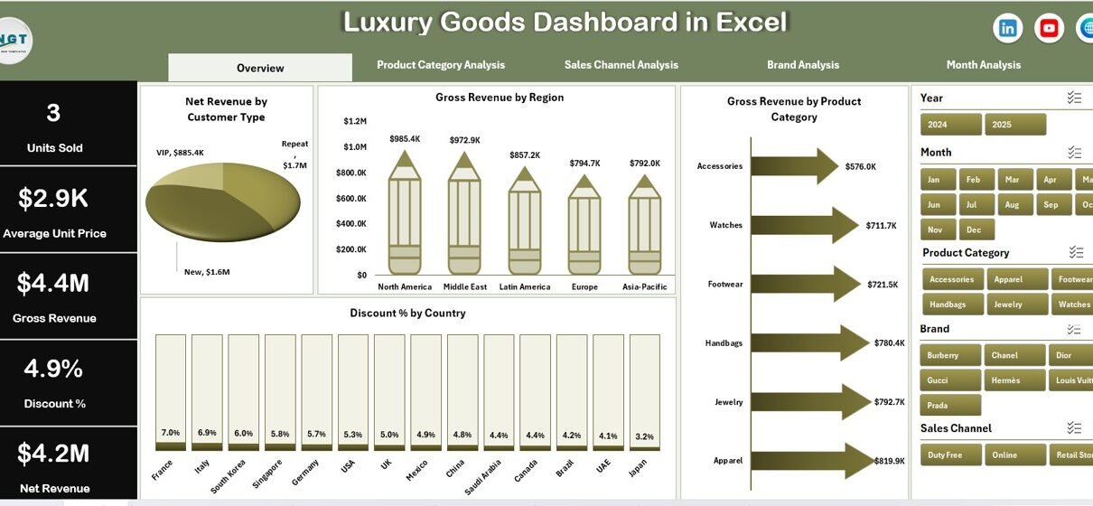
Overview Page: How Do You Get a High-Level Business Snapshot?
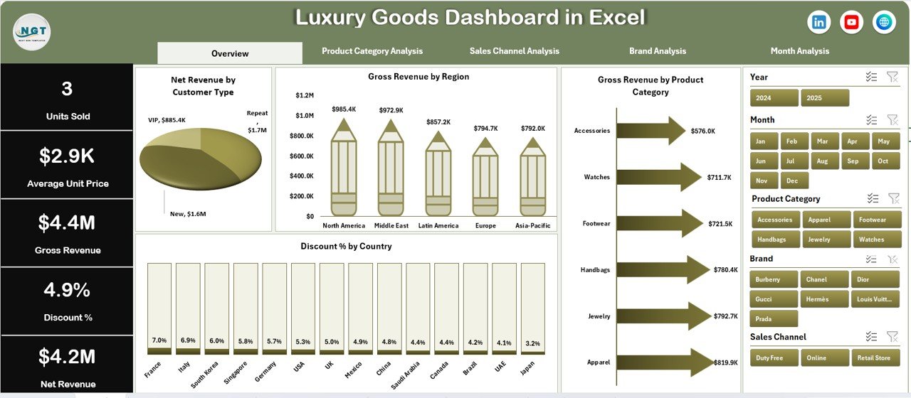
The Overview Page acts as the command center of the Luxury Goods Dashboard in Excel.
Key Features of the Overview Page
-
Right-side slicer for dynamic filtering
-
Four KPI cards for quick performance review
-
Four strategic charts for executive insights
KPI Cards on the Overview Page
The dashboard displays four cards that highlight critical performance metrics. These cards give leaders an instant understanding of overall business health.
Charts Available on the Overview Page
The Overview Page includes the following visualizations:
-
Net Revenue by Customer Type
Understand which customer segments drive real profitability. -
Gross Revenue by Region
Identify high-performing regions and growth opportunities. -
Gross Revenue by Product Category
Analyze category-level contribution to overall revenue. -
Discount % by Country
Monitor discount behavior and protect brand value.
Together, these visuals provide a strong foundation for strategic discussions.
Product Category Analysis: How Do You Compare Categories Effectively?
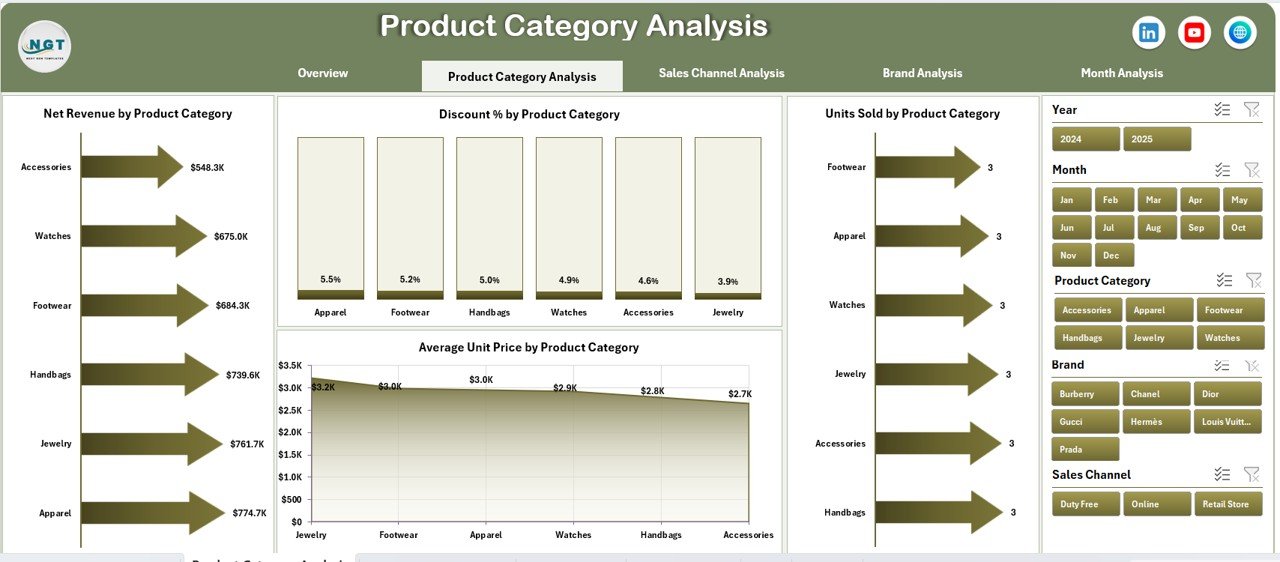
The Product Category Analysis Page focuses on understanding performance across different luxury product categories.
Key Features of This Page
-
Right-side slicer for quick filtering
-
Four category-specific performance charts
-
Click to Purchases Luxury Goods Dashboard in Excel
Charts Included in Product Category Analysis
-
Net Revenue by Product Category
Identify top-earning and underperforming categories. -
Discount % by Product Category
Evaluate how discounting varies across categories. -
Units Sold by Product Category
Track volume trends and customer demand. -
Average Unit Price by Product Category
Monitor pricing strategy and premium positioning.
This analysis helps luxury brands balance volume, pricing, and margin across product lines.
Sales Channel Analysis: Which Channels Drive the Most Value?
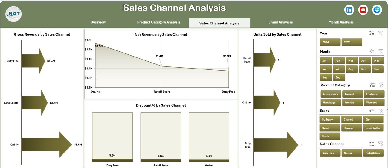
The Sales Channel Analysis Page reveals how different sales channels contribute to revenue and profitability.
Why Sales Channel Analysis Matters
Luxury brands often sell through multiple channels such as boutiques, online stores, distributors, and partners. Therefore, understanding channel performance becomes critical.
Charts Available on This Page
-
Net Revenue by Sales Channel
Measure true revenue contribution after discounts. -
Discount % by Sales Channel
Identify channels that apply excessive discounts. -
Units Sold by Sales Channel
Track demand distribution across channels. -
Gross Revenue by Sales Channel
Compare overall sales volume by channel.
This page helps brands optimize channel strategy while protecting exclusivity.
Brand Analysis: How Do You Measure Brand-Level Performance?
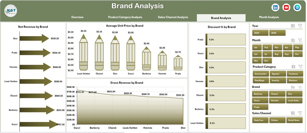
The Brand Analysis Page focuses on performance comparison across luxury brands within the portfolio.
Key Charts on the Brand Analysis Page
-
Net Revenue by Brand
Understand which brands deliver the highest profitability. -
Discount % by Brand
Control discount exposure at brand level. -
Average Unit Price by Brand
Monitor pricing strength and brand positioning. -
Gross Revenue by Brand
Track overall sales contribution per brand.
With this analysis, leadership teams can make informed decisions about brand investments, pricing strategy, and portfolio optimization.
Click to Purchases Luxury Goods Dashboard in Excel
Month Analysis: How Do You Track Trends Over Time?

The Month Analysis Page focuses on time-based performance trends.
Why Month Analysis Is Critical
Luxury demand often changes due to seasons, promotions, and global events. Therefore, monthly trend tracking becomes essential.
Charts Available on Month Analysis Page
-
Discount % by Month
Identify discount spikes and promotional patterns. -
Units Sold by Month
Track seasonal demand fluctuations. -
Net Revenue by Month
Measure actual profitability over time. -
Gross Revenue by Month
Monitor total sales trends.
This page supports forecasting, planning, and seasonal strategy.
What Role Do Data Sheet and Support Sheet Play?
Data Sheet
The Data Sheet stores raw transactional data such as:
-
Date or Month
-
Brand
-
Product Category
-
Sales Channel
-
Region and Country
-
Units Sold
-
Gross Revenue
-
Discount %
-
Net Revenue
Users only need to update this sheet regularly. After that, all dashboard visuals update automatically.
Support Sheet
The Support Sheet manages calculations, mappings, and helper logic. As a result, the dashboard remains clean, structured, and scalable.
Advantages of Luxury Goods Dashboard in Excel
Using a Luxury Goods Dashboard in Excel delivers multiple strategic advantages.
Key Advantages
-
Centralized performance tracking in one file
-
Clear visibility into revenue, discounts, and pricing
-
Faster decision-making with interactive visuals
-
Easy customization without technical skills
-
Cost-effective alternative to BI tools
-
Excel-native and familiar for users
-
Professional layout suitable for executives
Because of these advantages, Excel dashboards remain a preferred choice for luxury businesses worldwide.
How Does This Dashboard Support Business Decision-Making?
Click to Purchases Luxury Goods Dashboard in Excel
This dashboard helps leadership teams:
-
Identify profitable brands and categories
-
Control discount leakage proactively
-
Optimize pricing and sales channels
-
Monitor regional performance accurately
-
Track seasonal trends effectively
As a result, businesses move from reactive reporting to proactive strategy.
Best Practices for the Luxury Goods Dashboard in Excel
To get maximum value from this dashboard, follow these best practices.
Best Practice 1: Maintain Clean Data
Always validate data before updating the Data Sheet. Clean data ensures accurate insights.
Best Practice 2: Use Consistent Dimensions
Maintain consistent naming for brands, regions, and categories to avoid reporting errors.
Best Practice 3: Review Discount Trends Regularly
Monitor discount percentage charts weekly or monthly to protect brand value.
Best Practice 4: Analyze Net Revenue Over Gross Revenue
Focus more on net revenue since it reflects real profitability.
Best Practice 5: Leverage Month Analysis for Forecasting
Use historical trends to plan inventory, campaigns, and launches.
Who Should Use a Luxury Goods Dashboard in Excel?
This dashboard works perfectly for:
-
Luxury brand owners
-
Retail strategy teams
-
Sales and marketing leaders
-
Financial controllers
-
Business analysts
-
Consultants serving luxury clients
Because Excel remains widely used, adoption stays quick and easy.
How Is This Dashboard Different from Standard Sales Reports?
Unlike static reports, this dashboard:
-
Updates dynamically using slicers
-
Visualizes insights clearly
-
Enables instant comparisons
-
Supports storytelling with data
-
Reduces reporting time drastically
Therefore, it transforms raw data into actionable intelligence.
Conclusion: Why the Luxury Goods Dashboard in Excel Is a Must-Have Tool
In today’s competitive luxury market, intuition alone does not guarantee success. Data clarity, speed, and accuracy define winning brands.
A Luxury Goods Dashboard in Excel empowers decision-makers with real-time insights across brands, categories, channels, regions, and months. It simplifies analysis, strengthens control over discounts, and improves profitability.
Most importantly, it delivers executive-ready insights using a familiar Excel environment. As a result, luxury businesses gain confidence, control, and competitive advantage.
Frequently Asked Questions About Luxury Goods Dashboard in Excel
What is a Luxury Goods Dashboard in Excel used for?
A Luxury Goods Dashboard in Excel tracks sales, revenue, discounts, and performance across brands, categories, channels, regions, and time.
Can non-technical users use this dashboard?
Yes. The dashboard uses Excel slicers and charts, so business users can operate it easily without technical skills.
How often should data be updated?
You should update the Data Sheet daily, weekly, or monthly depending on business needs.
Can this dashboard handle large datasets?
Yes. With optimized Pivot Tables and structured data, it can handle thousands of records smoothly.
Is this dashboard customizable?
Absolutely. Users can modify charts, KPIs, slicers, and layouts based on business requirements.
Does the dashboard support decision-making?
Yes. It provides actionable insights that help leaders improve pricing, channel strategy, and profitability.
Visit our YouTube channel to learn step-by-step video tutorials
Click to Purchases Luxury Goods Dashboard in Excel