Managing a shopping mall today requires much more than leasing spaces and collecting rent. Mall managers must constantly track footfall, revenue performance, operational efficiency, tenant success, and customer experience. However, when data stays scattered across Excel files, emails, and manual reports, decision-making becomes slow and unreliable.
That is exactly where a Mall Management KPI Dashboard in Power BI becomes a game-changing solution.
This article explains what a Mall Management KPI Dashboard in Power BI is, why it matters, how it works, its page-wise structure, data setup, advantages, best practices, and frequently asked questions. Moreover, the language stays clear and practical so that mall managers, facility teams, leasing teams, and analysts can easily implement it.
Click to Purchases Mall Management KPI Dashboard in Power BI
What Is a Mall Management KPI Dashboard in Power BI?
A Mall Management KPI Dashboard in Power BI is a centralized, interactive reporting tool that helps mall operators track key performance indicators (KPIs) in real time. Instead of reviewing static Excel reports or manual summaries, managers can instantly analyze performance using visual dashboards.
This dashboard uses Power BI Desktop for visualization while Excel acts as the data source. As a result, users get both flexibility and power. They can update data easily in Excel and instantly see updated insights in Power BI.
Most importantly, this dashboard focuses on MTD (Month-to-Date) and YTD (Year-to-Date) performance, which allows management teams to track short-term execution and long-term trends at the same time.
Why Do Mall Managers Need a KPI Dashboard?
Mall operations involve multiple moving parts. Therefore, managers must monitor performance continuously. Without a dashboard, teams rely on manual reports, which creates delays and errors.
A Mall Management KPI Dashboard in Power BI helps because:
-
It shows actual vs target performance instantly
-
It highlights underperforming KPIs clearly
-
It compares current year vs previous year
-
It improves data-driven decision-making
-
It saves time and manual effort
As a result, mall managers can focus on improving results instead of compiling reports.
How Does the Mall Management KPI Dashboard in Power BI Work?
This dashboard follows a simple yet powerful structure.
-
Data entry happens in Excel
-
Visualization happens in Power BI
-
KPIs update automatically when Excel data changes
Because of this design, even non-technical users can maintain the dashboard without complexity.
Click to Purchases Mall Management KPI Dashboard in Power BI
What Are the Key Pages in the Mall Management KPI Dashboard in Power BI?
This dashboard contains three professionally designed pages inside the Power BI Desktop file.
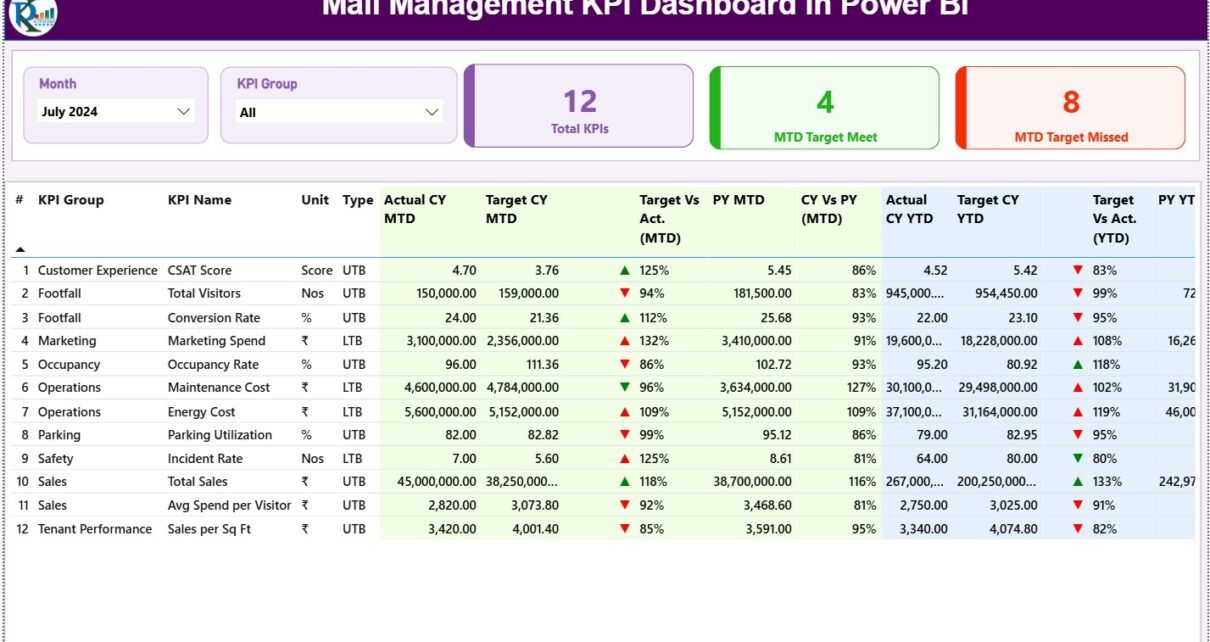
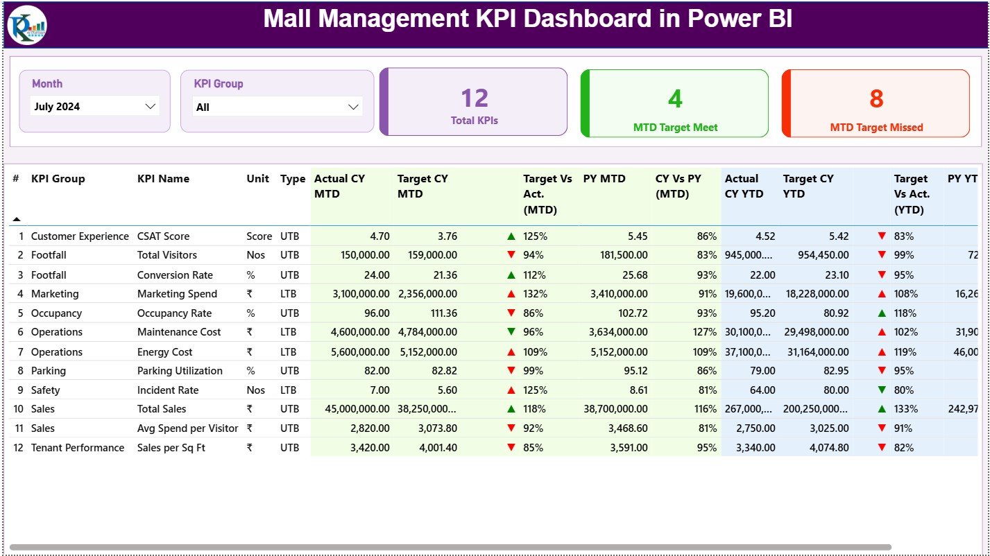
What Is Shown on the Summary Page?
The Summary Page acts as the main control center of the dashboard.
Key Filters on the Summary Page
At the top of the page, users can find:
-
Month Slicer – Select a specific month for analysis
-
KPI Group Slicer – Filter KPIs by category or department
These slicers allow instant focus on specific time periods or KPI groups.
KPI Cards on the Summary Page
Right below the slicers, the dashboard displays three high-impact KPI cards:
-
Total KPIs Count
-
MTD Target Met Count
-
MTD Target Missed Count
These cards provide a quick performance snapshot. Therefore, managers instantly know how many KPIs perform well and how many need attention.
Detailed KPI Table on the Summary Page
Below the KPI cards, the dashboard displays a detailed KPI performance table.
This table includes the following columns:
KPI Number
Shows the unique sequence number of each KPI.
KPI Group
Represents the department or category such as Operations, Leasing, Finance, or Customer Experience.
KPI Name
Displays the name of the KPI being tracked.
Unit
Defines the unit of measurement such as %, INR, Count, or Sq. Ft.
Type (LTB or UTB)
-
LTB (Lower the Better) for metrics like complaints or downtime
-
UTB (Upper the Better) for metrics like revenue or occupancy
MTD Performance Metrics
The dashboard clearly shows Month-to-Date performance using:
-
Actual CY MTD
-
Target CY MTD
-
MTD Status Icon (▲ / ▼)
-
Target vs Actual (MTD %)
-
Previous Year MTD
-
CY vs PY (MTD %)
Because of icons and color indicators, users immediately understand performance without reading numbers deeply.
YTD Performance Metrics
Similarly, the dashboard displays Year-to-Date performance using:
-
Actual CY YTD
-
Target CY YTD
-
YTD Status Icon (▲ / ▼)
-
Target vs Actual (YTD %)
-
Previous Year YTD
-
CY vs PY (YTD %)
As a result, users can analyze both short-term progress and long-term trends together.
Click to Purchases Mall Management KPI Dashboard in Power BI
What Is the KPI Trend Page and Why Is It Important?
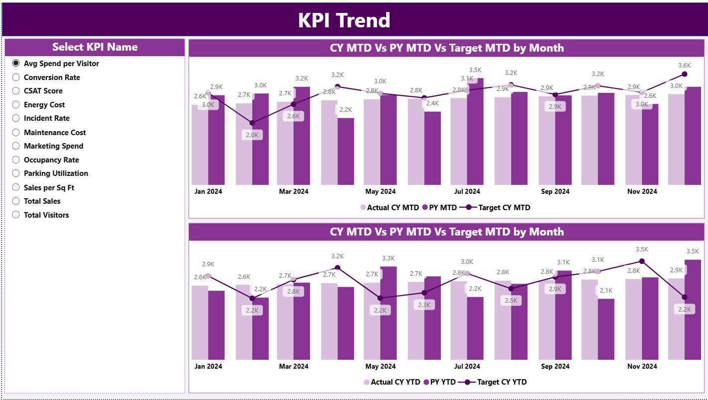
The KPI Trend Page focuses on performance trends over time.
Key Features of the KPI Trend Page
-
Two combo charts display:
-
Actual CY
-
Actual PY
-
Target values
-
-
Separate charts for MTD trends and YTD trends
-
A KPI Name slicer on the left side
Because of this setup, users can easily track how a specific KPI behaves month after month.
Moreover, trend analysis helps mall managers identify seasonal patterns, growth opportunities, and performance risks early.
What Is the KPI Definition Page?
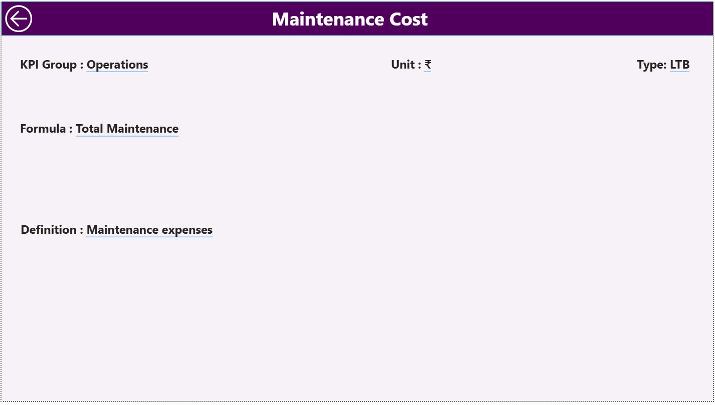
The KPI Definition Page serves as a drill-through page and remains hidden by default.
What Information Does the KPI Definition Page Show?
When users drill through from the Summary Page, they can view:
-
KPI Formula
-
KPI Definition
-
KPI Type
-
Measurement Unit
This page improves transparency and ensures that all stakeholders interpret KPIs correctly.
A Back button on the top-left corner allows users to return easily to the Summary Page.
How Is Excel Used as the Data Source?
The dashboard uses Excel as its backend, which keeps data management simple and flexible.
The Excel file contains three structured worksheets.
What Is the Input_Actual Sheet Used For?
The Input_Actual sheet stores actual performance data.
Users must enter:
-
KPI Name
-
Month (first date of the month)
-
MTD Actual Value
-
YTD Actual Value
Once users update this sheet, Power BI refreshes the visuals instantly.
What Is the Input_Target Sheet Used For?
The Input_Target sheet stores target values.
Users must enter:
-
KPI Name
-
Month (first date of the month)
-
MTD Target Value
-
YTD Target Value
This structure ensures accurate comparison between actual and target values.
What Is the KPI Definition Sheet Used For?
The KPI Definition sheet stores master KPI information, including:
-
KPI Number
-
KPI Group
-
KPI Name
-
Unit
-
Formula
-
Definition
-
KPI Type (LTB or UTB)
Because of this setup, the dashboard stays scalable and well-documented.
Advantages of Mall Management KPI Dashboard in Power BI
A Mall Management KPI Dashboard in Power BI delivers several strong advantages.
Centralized Performance Monitoring
All KPIs remain available in one place. Therefore, managers no longer chase multiple reports.
Faster Decision-Making
Real-time visuals allow quick identification of issues and opportunities.
Clear Target Tracking
MTD and YTD comparisons make performance gaps visible immediately.
Historical Performance Comparison
CY vs PY analysis helps understand growth patterns and seasonal effects.
User-Friendly Design
Even non-technical users can operate the dashboard easily.
Scalability
Users can add new KPIs without redesigning the entire dashboard.
Click to Purchases Mall Management KPI Dashboard in Power BI
Best Practices for the Mall Management KPI Dashboard in Power BI
To get maximum value, follow these best practices.
Define KPIs Clearly
Always maintain clear KPI definitions to avoid confusion.
Update Data Regularly
Update Excel input sheets on a fixed schedule to ensure accuracy.
Use Consistent Units
Maintain consistent measurement units across KPIs.
Review Trends Monthly
Analyze trend charts regularly to identify early warning signs.
Train Key Users
Train mall managers and analysts to interpret KPIs correctly.
Who Should Use This Dashboard?
This dashboard suits multiple stakeholders:
-
Mall Managers
-
Leasing Teams
-
Facility Management Teams
-
Finance Teams
-
Operations Heads
-
Business Analysts
Because of its flexibility, both small and large malls can benefit equally.
How Does This Dashboard Improve Mall Performance?
This dashboard transforms raw data into actionable insights. As a result:
-
Managers spot underperforming KPIs faster
-
Teams align better with targets
-
Leadership gains confidence in reports
-
Operational efficiency improves
Over time, data-driven decisions lead to better tenant satisfaction and higher revenue.
Conclusion: Why Choose a Mall Management KPI Dashboard in Power BI?
A Mall Management KPI Dashboard in Power BI acts as a powerful decision-support tool for modern mall operations. It combines the simplicity of Excel with the analytical strength of Power BI. Moreover, it offers clear insights into MTD and YTD performance, target achievement, and historical comparisons.
If mall managers want visibility, control, and confidence in their decisions, this dashboard becomes an essential solution.
Frequently Asked Questions (FAQs)
What is the purpose of a Mall Management KPI Dashboard in Power BI?
The dashboard helps mall managers track, analyze, and improve performance using visual KPIs.
Can I update data without Power BI expertise?
Yes. Users only need to update Excel input sheets.
Does the dashboard support multiple KPI groups?
Yes. Users can categorize KPIs into groups and filter them easily.
Can I add new KPIs later?
Yes. The dashboard supports easy KPI expansion.
Is this dashboard suitable for large malls?
Yes. It scales well for both small and large mall operations.
Does it support historical comparison?
Yes. The dashboard compares current year performance with previous year data.
Click to Purchases Mall Management KPI Dashboard in Power BI
Visit our YouTube channel to learn step-by-step video tutorials