The maritime and port industry is one of the most complex and globally connected sectors. Every day, hundreds of ships, containers, and logistics operations move across ports and terminals worldwide. Managing these processes efficiently requires accurate data, real-time monitoring, and clear performance insights. This is where a Marine and Ports KPI Dashboard in Power BI becomes a game-changer.
This dashboard provides a comprehensive analytical view of key performance indicators (KPIs) that measure the health, efficiency, and productivity of marine operations. Whether you are monitoring vessel turnaround time, berth utilization, container handling performance, or fuel efficiency, this dashboard turns data into actionable intelligence.
Built in Microsoft Power BI, the dashboard connects directly to Excel-based data sources, visualizing real-time updates with interactive charts, filters, and trend analyses.
Click to Purchases Marine and Ports KPI Dashboard in Power BI
What Is a Marine and Ports KPI Dashboard in Power BI?
A Marine and Ports KPI Dashboard is an advanced data visualization solution that allows port authorities, shipping operators, and logistics managers to track operational and financial metrics in one unified platform.
This dashboard integrates data from multiple sources — such as Excel files, databases, and IoT sensors — to measure monthly performance (MTD) and year-to-date performance (YTD) across various KPIs.
For example, the dashboard might include KPIs like:
-
Ship turnaround time
-
Cargo handling efficiency
-
Equipment downtime
-
Berth occupancy rate
-
Maintenance cost
-
On-time departures
-
Safety compliance percentage
By visualizing these metrics interactively, decision-makers can identify inefficiencies, compare performance trends, and ensure targets are achieved.
Click to Purchases Marine and Ports KPI Dashboard in Power BI
Key Features of the Marine and Ports KPI Dashboard
This Power BI dashboard contains three main pages, each designed for specific analytical needs.
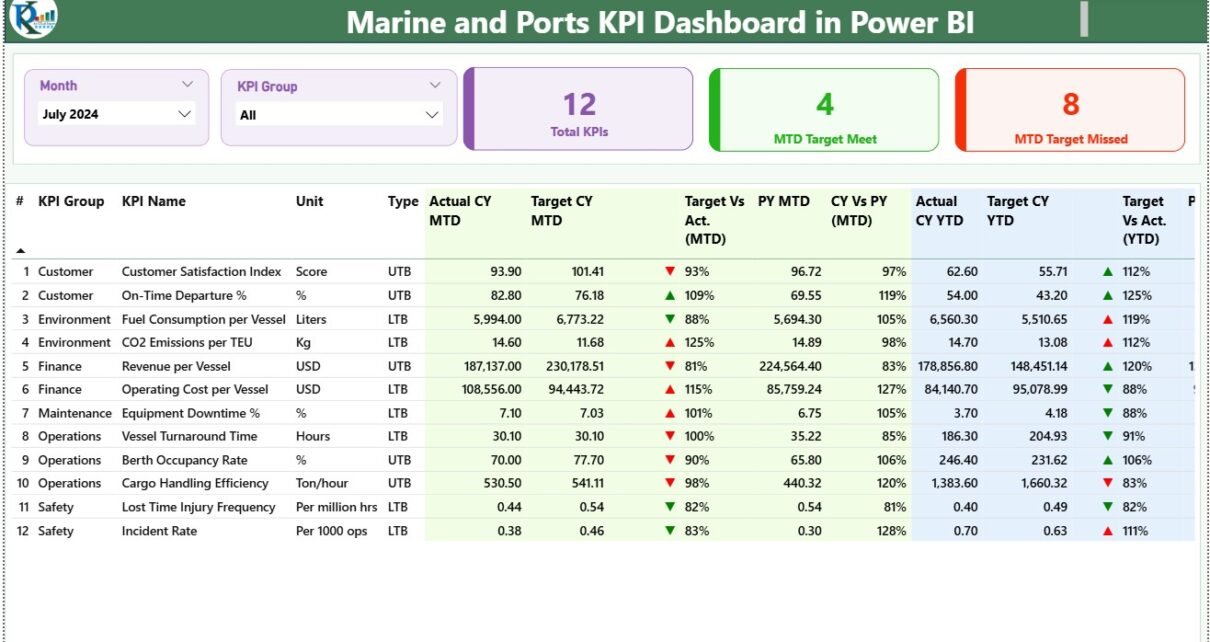
1. Summary Page
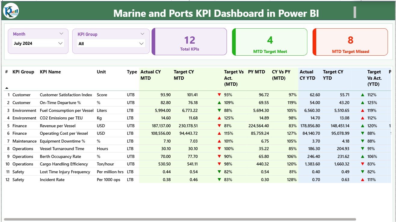
The Summary Page serves as the main analytical workspace. At the top, you’ll find slicers that allow filtering data by Month and KPI Group — ensuring quick access to the required time period or performance category.
Below that, the page displays three key metric cards:
-
Total KPIs Count
-
MTD Target Met Count
-
MTD Target Missed Count
Each card provides a snapshot of performance, helping users immediately understand how well the marine operations are performing for the current month.
A detailed KPI Performance Table below these cards includes:
-
KPI Number – The unique sequence identifier for each KPI.
-
KPI Group – The functional area (e.g., Operations, Safety, Maintenance).
-
KPI Name – The specific metric being tracked.
-
Unit – The unit of measurement (e.g., %, Hours, Tons, USD).
-
Type – Indicator of KPI behavior: UTB (Upper the Better) or LTB (Lower the Better).
-
Actual CY MTD / Target CY MTD – Actual and target monthly values for the current year.
-
MTD Icon – Green ▲ or red ▼ icon showing whether the KPI is on target or lagging.
-
Target vs. Actual (MTD) – Percentage comparison of performance vs. goal.
-
PY MTD – Previous year’s monthly value for comparison.
-
CY vs. PY (MTD) – Growth or decline compared to the same period last year.
-
YTD Values (Actual, Target, PY) – Year-to-date progress tracking.
-
YTD Icons and Ratios – Quick visuals of performance consistency.
This page acts as the command center of the dashboard, offering a bird’s-eye view of every critical indicator.
2. KPI Trend Page
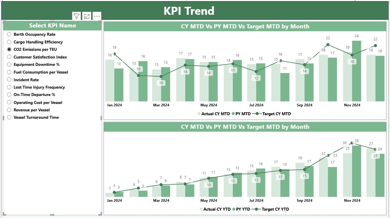
The KPI Trend Page enables deep-dive analysis of performance over time. Users can select a specific KPI from the slicer and visualize its trend in two combo charts:
-
MTD Trend Chart: Tracks monthly fluctuations in actual, target, and previous-year data.
-
YTD Trend Chart: Shows cumulative performance for the year.
This dynamic visualization helps identify seasonal variations, recurring issues, and performance improvements across different months.
3. KPI Definition Page
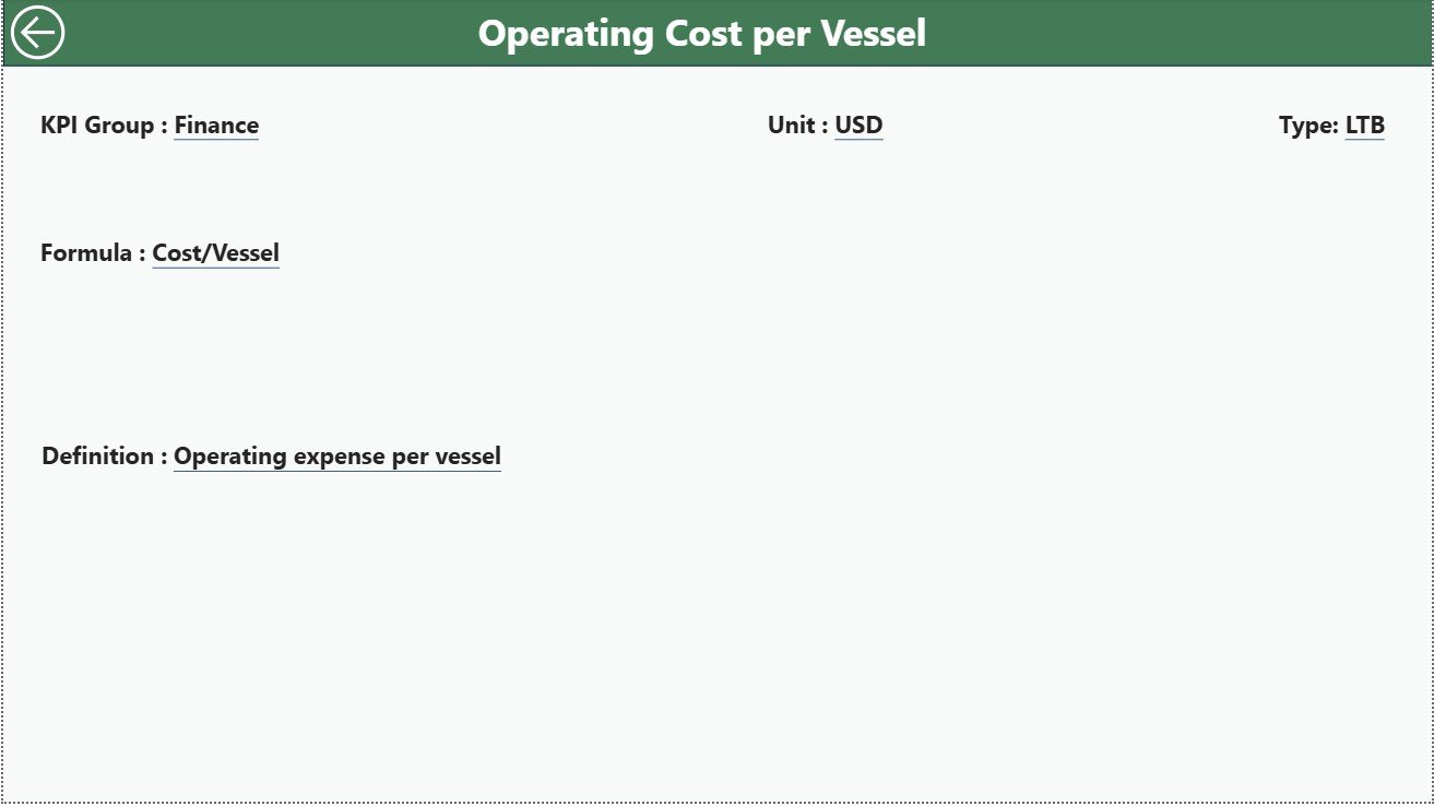
The KPI Definition Page acts as a reference guide, containing all formulae, definitions, and metadata for each KPI. Users can drill through from the Summary Page to view this hidden page and explore:
-
KPI Formula
-
KPI Description
-
KPI Type (UTB/LTB)
-
Unit of Measure
It also includes a Back Button on the top-left corner for easy navigation to the main Summary Page.
Excel Data Integration
The dashboard uses an Excel workbook as its core data source, containing three structured worksheets:
1️⃣ Input_Actual Sheet:
-
Captures actual values for each KPI, including KPI Name, Month (first day of the month), MTD values, and YTD totals.
2️⃣ Input_Target Sheet:
-
Contains target values for the same KPIs and periods.
3️⃣ KPI Definition Sheet:
-
Lists KPI Number, Group, Name, Unit, Formula, Definition, and Type.
This approach ensures the Power BI dashboard automatically refreshes as soon as new data is entered into the Excel sheets — making it a low-maintenance, real-time analytical tool.
Click to Purchases Marine and Ports KPI Dashboard in Power BI
Advantages of Marine and Ports KPI Dashboard in Power BI
Implementing this dashboard provides numerous business benefits for port authorities and shipping operators:
⚓ 1. Real-Time Performance Tracking
Monitor operational, safety, and financial KPIs instantly without manual report generation.
📈 2. Data-Driven Decision-Making
Use interactive visuals to identify which areas are performing well and which need attention.
🚢 3. Enhanced Operational Efficiency
Track vessel turnaround time, cargo handling, and maintenance schedules to minimize delays.
🧭 4. Improved Resource Allocation
By understanding resource utilization, management can optimize staffing, fuel usage, and dock availability.
💡 5. Historical Trend Analysis
Compare performance between years and months to evaluate improvement or decline patterns.
📊 6. Transparent Reporting
Facilitate stakeholder reporting with clean visuals, KPIs, and data-driven insights.
🔒 7. Customization and Scalability
Power BI allows adding new KPIs, integrating IoT or ERP systems, and scaling for multiple ports or terminals.
Opportunities for Improvement
Even though the dashboard provides a solid structure, continuous improvement enhances its value.
Here are a few ideas:
-
Add predictive analytics for ship delays and maintenance forecasting.
-
Include weather impact metrics to analyze how storms or tides affect port performance.
-
Integrate with live vessel tracking data (AIS systems) for real-time insights.
-
Expand KPI groups to include sustainability and carbon emission tracking.
-
Automate data refreshes using Power BI Gateway for live reporting.
By implementing these enhancements, marine organizations can transform the dashboard from a reporting tool into a predictive intelligence system.
Click to Purchases Marine and Ports KPI Dashboard in Power BI
Best Practices for the Marine and Ports KPI Dashboard
To get the most out of this solution, follow these best practices:
1️⃣ Define Clear KPI Ownership:
Each KPI should have a responsible department or individual for accountability.
2️⃣ Maintain Consistent Data Entry:
Ensure that Excel data is entered correctly — consistent date formats, units, and naming conventions.
3️⃣ Update Data Monthly:
Regular updates maintain accuracy and prevent outdated insights.
4️⃣ Use Conditional Formatting Wisely:
Keep visual cues (like red/green arrows) simple and consistent to enhance readability.
5️⃣ Leverage Power BI Slicers and Filters:
Encourage users to explore data by month, region, or department for custom analysis.
6️⃣ Validate Calculations Regularly:
Cross-check formulas (MTD vs YTD) to avoid discrepancies.
7️⃣ Encourage Collaborative Review:
Share Power BI reports with teams for collective insight and action planning.
Step-by-Step: How to Use the Dashboard
-
Open the Power BI File.
Launch the dashboard in Power BI Desktop or Service. -
Select the Desired Month and KPI Group.
Use slicers to view specific data periods or functional categories. -
Analyze Key Cards on Summary Page.
Quickly check how many KPIs met or missed targets. -
Review the KPI Table.
Identify underperforming areas using color-coded icons. -
Drill Through to KPI Definition Page.
Understand KPI calculation logic and unit meaning. -
Switch to KPI Trend Page.
Explore MTD and YTD performance trends visually. -
Export or Share Report.
Publish the report to Power BI Service for stakeholder access.
This intuitive workflow ensures both technical and non-technical users can gain insights easily.
How the Dashboard Supports Decision-Making
A port’s operational success depends on timely, accurate decisions — and that requires reliable data. This dashboard empowers leaders to:
-
Detect early warning signs like rising downtime or declining efficiency.
-
Plan resource deployment strategically across terminals.
-
Measure progress against annual or contractual targets.
-
Improve transparency with stakeholders and regulators.
-
Support strategic initiatives like digital transformation or sustainability tracking.
The result is a data-driven management culture that continuously improves performance and safety.
Conclusion
The Marine and Ports KPI Dashboard in Power BI is more than a visualization tool — it’s a strategic decision-support system. By combining Excel-based data with dynamic analytics, it transforms how marine organizations track operations, analyze efficiency, and plan improvements.
From port authorities to shipping managers, this dashboard provides real-time insights, trend comparisons, and performance transparency, enabling smarter, faster, and more effective management decisions.
Click to Purchases Marine and Ports KPI Dashboard in Power BI
Frequently Asked Questions (FAQs)
1. What is the purpose of the Marine and Ports KPI Dashboard?
It helps marine and port organizations track operational, financial, and safety KPIs in real time to improve performance and accountability.
2. Can I connect live data instead of Excel?
Yes. Power BI allows connection with live databases, ERP systems, and APIs. You can automate data refreshes using Power BI Gateway.
3. What are examples of Marine KPIs included?
Some examples include vessel turnaround time, cargo handling rate, fuel cost per vessel, maintenance downtime, and berth occupancy rate.
4. How frequently should I update the dashboard?
You should update or refresh data monthly, but automated data connections can enable daily or hourly updates.
5. Is this dashboard suitable for multiple ports?
Absolutely. The model can be scaled to handle data from multiple ports, terminals, or shipping lines with added filters and drill-downs.
6. Can non-technical users operate it?
Yes. The dashboard’s slicers, icons, and visual cues make it simple for anyone to use without Power BI expertise.
7. Can this dashboard support sustainability tracking?
Yes. By adding KPIs such as fuel efficiency, emissions, and energy usage, the dashboard can track environmental impact as well.
8. What is the biggest advantage of using Power BI for marine analytics?
Power BI combines powerful data visualization with easy Excel integration, making it perfect for interactive, real-time, and sharable dashboards.
Click to Purchases Marine and Ports KPI Dashboard in Power BI
Visit our YouTube channel to learn step-by-step video tutorials