Museums and cultural centres play a vital role in preserving heritage, promoting education, and enriching communities. However, managing a museum requires more than exhibitions and ticketing. Teams must track visitor numbers, membership growth, event performance, revenue streams, operational efficiency, collection management, and overall cultural impact. Because so many moving parts exist, leaders need a clear, data-driven way to monitor performance. That is exactly why a Museums and Cultural Centres KPI Dashboard in Excel becomes a powerful solution.
This article explains everything you need to know about this dashboard—its structure, worksheets, features, benefits, best practices, and frequently asked questions. You will also understand how Excel becomes a robust tool for visual management even without advanced software.
Let’s explore this dashboard step by step.
Click to Purchases Museums and Cultural Centres KPI Dashboard in Excel
What Is a Museums and Cultural Centres KPI Dashboard in Excel?
A Museums and Cultural Centres KPI Dashboard in Excel is a ready-to-use reporting system that tracks all key performance indicators related to museum operations. It simplifies performance monitoring by bringing multiple KPIs into one interactive dashboard.
This includes:
-
Visitor statistics
-
Membership KPIs
-
Exhibit engagement
-
Event attendance
-
Revenue and donations
-
Collection management
-
Educational program performance
-
Community outreach
-
Operational efficiency
Since the dashboard uses Excel formulas, conditional formatting, dropdowns, and charts, it allows museum professionals to get insights quickly without technical training.
Why Do Museums Need a KPI Dashboard?
Museums must make decisions based on facts—not assumptions. They must understand:
-
How many people visit each month
-
Which exhibitions perform better
-
Whether events meet attendance goals
-
How memberships grow or decline
-
Which programs attract more community participation
-
Whether revenue matches targets
-
How operational performance changes each year
A KPI dashboard provides visibility, accuracy, and confidence. Museum leaders can compare month-to-month and year-to-year performance across departments. Therefore, decisions become faster and more effective.
Click to Purchases Museums and Cultural Centres KPI Dashboard in Excel
Structure of the Museums and Cultural Centres KPI Dashboard in Excel
This dashboard includes 7 important worksheets:
-
Home
-
Dashboard
-
KPI Trend
-
Actual Numbers Input
-
Target Sheet
-
Previous Year Numbers
-
KPI Definition
Let’s explore each sheet in detail.
1. Home Sheet – Your Navigation Hub

The Home Sheet is the index page of the dashboard. It contains six buttons that help users navigate easily to specific worksheets. This organized structure improves usability and makes the Excel file look professional.
The navigation buttons allow quick access to:
-
Dashboard
-
KPI Trends
-
Actual Input
-
Target Input
-
Previous Year Data
-
KPI Definition
When users can move through sheets with a single click, efficiency increases and errors reduce.
Click to Purchases Museums and Cultural Centres KPI Dashboard in Excel
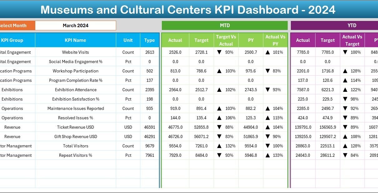
2. Dashboard Sheet – The Main Performance View
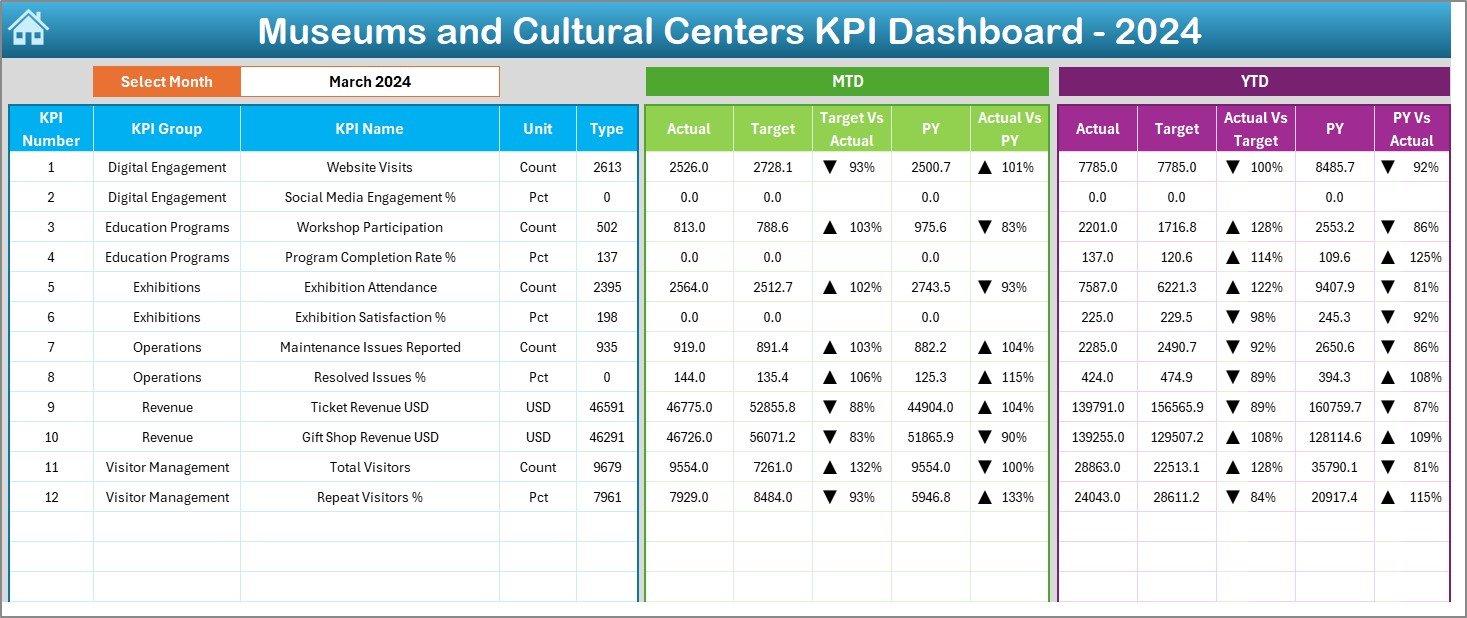
The Dashboard Sheet is the central reporting page. It displays all KPIs along with comparisons and performance indicators.
Month Selection (Cell D3)
Users can select a month from the dropdown in cell D3. Once a month is selected, all KPIs update immediately. This dynamic setup makes the dashboard flexible and interactive.
MTD Analysis (Month-to-Date)
For the selected month, the dashboard shows:
-
MTD Actual
-
MTD Target
-
MTD Previous Year
-
Target vs Actual %
-
Previous Year vs Actual %
To make the analysis clearer, the dashboard uses conditional formatting with up/down arrows:
-
▲ Green Arrow → KPI performing well
-
▼ Red Arrow → KPI performing below target
YTD Analysis (Year-to-Date)
The dashboard also shows:
-
YTD Actual
-
YTD Target
-
YTD Previous Year
-
Target vs Actual %
-
Previous Year vs Actual %
This dual-view system (MTD + YTD) helps museum leaders analyze short-term and long-term performance.
3. KPI Trend Sheet – Detailed Trend Analysis

The KPI Trend Sheet is extremely powerful for understanding performance patterns over time.
Dropdown Filter (Cell C3)
Users can choose any KPI from the dropdown menu in cell C3.
Once a KPI is selected, the sheet automatically displays:
-
KPI Group
-
Unit of Measurement
-
KPI Type (LTB = Lower the Better, UTB = Upper the Better)
-
KPI Formula
-
KPI Definition
This ensures transparency and clarity across the organization.
MTD and YTD Trend Charts
The sheet displays two essential trend charts:
-
MTD Trend Chart – compares Actual, Target, and Previous Year
-
YTD Trend Chart – compares Actual, Target, and Previous Year
These charts reveal:
-
Whether visitors increased
-
Whether event attendance grew
-
How membership retention changed
-
Whether revenue improved
-
Whether educational programs show consistent participation
Because trends matter more than static values, this sheet helps users gain deeper insights.
Click to Purchases Museums and Cultural Centres KPI Dashboard in Excel
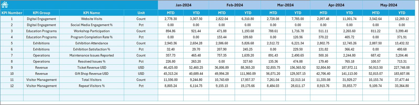
4. Actual Numbers Input Sheet

This worksheet is the foundation of the dashboard. Users enter all actual values for each KPI.
Key Inputs Include:
-
Month (first month entered in cell E1)
-
MTD Actual
-
YTD Actual
Since museums handle multiple KPIs—ticket sales, visitor count, event participation, membership renewals, donations, program registrations—this sheet ensures all values remain organized.
5. Target Sheet – Expected Performance Values
The Target Sheet stores the expected KPI values for each month. This includes:
-
Monthly Target (MTD)
-
Yearly Target (YTD)
By comparing actual and target data, museums understand whether they are meeting performance goals.
Examples of target KPIs include:
-
Visitor target per month
-
Membership growth targets
-
Donation target per quarter
-
Average event attendance goals
-
Exhibition rating goals
6. Previous Year Number Sheet
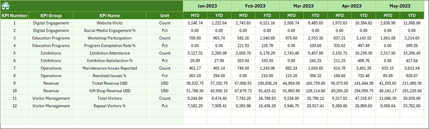
This worksheet stores previous year’s actual values. Comparing current and previous year performance helps museum leaders:
-
Identify growth
-
Spot performance decline
-
Analyze seasonal variations
-
Improve forecasting
Since museums often track yearly trends, this sheet becomes an important reference point.
Click to Purchases Museums and Cultural Centres KPI Dashboard in Excel
7. KPI Definition Sheet – Clear Performance Logic
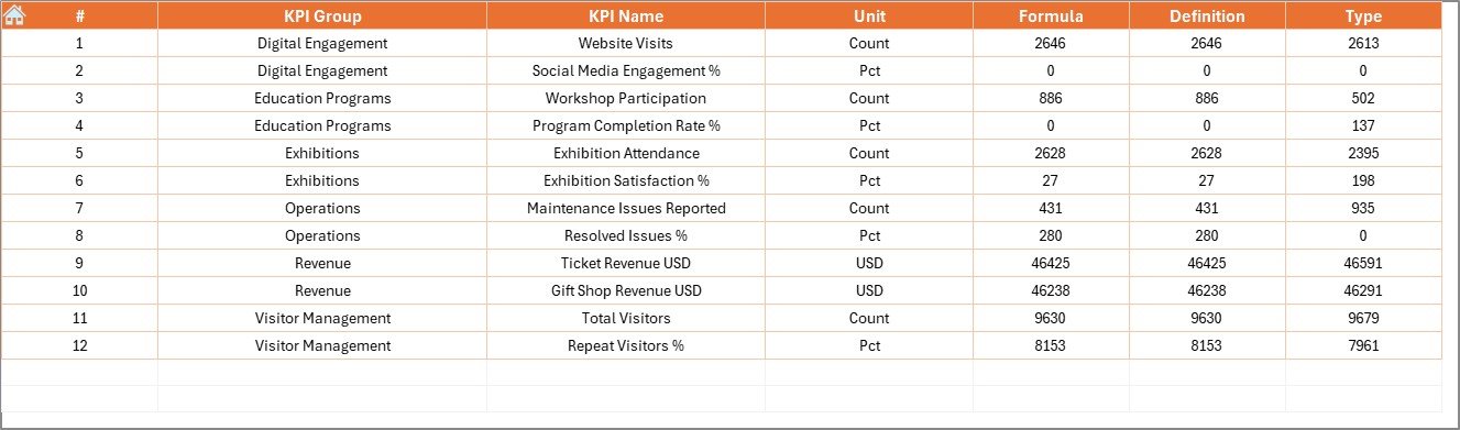
This sheet explains:
-
KPI Name
-
KPI Group
-
Unit
-
Formula
-
KPI Definition
Because museums involve multiple departments—operations, events, education, finance, visitor services—consistent definitions help everyone follow the same understanding.
Examples:
-
Visitor Satisfaction Rate
-
Exhibition Attendance
-
Event Conversion Rate
-
Gift Shop Revenue per Visitor
-
Membership Renewal Rate
-
Collection Maintenance Compliance
Clear definitions reduce confusion and improve reporting quality.
Advantages of Museums and Cultural Centres KPI Dashboard in Excel
A KPI dashboard helps museums become more efficient, more data-driven, and more visitor-focused. Here are the key advantages:
1. All KPIs in One Place
Museums track many activities. This dashboard centralizes everything, making performance monitoring simple and efficient.
2. Improves Strategic Decision-Making
With MTD, YTD, and Previous Year comparisons, leaders make informed decisions quickly.
3. Reduces Manual Reporting Time
Since the dashboard auto-updates based on data entry, teams save significant time every month.
4. Highlights Performance Gaps
Thanks to conditional formatting arrows, museum staff can easily identify:
-
Declining KPIs
-
Missed targets
-
Areas that need improvement
5. Supports Monthly and Annual Reviews
Museum directors can use the dashboard for presentations, board meetings, and grant reporting.
6. Improves Visitor Experience
When museums track visitor trends and service quality KPIs, they create better experiences for their audiences.
7. Encourages Data-Driven Culture
Teams trust decisions more when data is clear, updated, and accessible.
Click to Purchases Museums and Cultural Centres KPI Dashboard in Excel
Best Practices for the Museums and Cultural Centres KPI Dashboard in Excel
To get the best results from the dashboard, follow these practices:
1. Keep KPI Definitions Standardized
Do not change KPI names frequently. Consistency improves reporting clarity.
2. Enter Monthly Values on Time
Update actual, target, and previous year values before reviewing performance.
3. Use the First Date of Each Month
This ensures correct functioning of all charts and formulas.
4. Use Appropriate KPI Types (LTB/UTB)
Example:
-
LTB → Complaint Rate, Maintenance Delays
-
UTB → Visitors, Memberships, Donations
5. Review Targets Every Quarter
Museum programs change throughout the year. Adjust targets accordingly.
6. Leverage Trend Charts
Patterns reveal more than individual numbers.
7. Protect Critical Sheets
Lock formulas in KPI Definition, Target, and Previous Year sheets.
8. Encourage Department Collaboration
Every department must update their relevant KPIs consistently.
How Does This Dashboard Help Museums Improve Performance?
This dashboard improves museum operations by enhancing visibility across:
Visitor Services
-
Visitor count
-
Repeat visitor percentage
-
Visitor satisfaction
Events & Exhibitions
-
Event registration
-
Exhibit engagement levels
-
Education session attendance
Membership Programs
-
New memberships
-
Membership renewal rate
-
Donation contributions
Financial Metrics
-
Ticket revenue
-
Shop sales
-
Fundraising contributions
Operational Metrics
-
Staff productivity
-
Collection maintenance
-
Safety compliance
When museums see real-time performance, they plan better and deliver more value to the community.
Conclusion
The Museums and Cultural Centres KPI Dashboard in Excel is a powerful, easy-to-use tool that helps organizations monitor performance across departments. With interactive dropdowns, conditional formatting, trend charts, and clear definitions, it becomes ideal for monthly analysis and strategic planning.
As museums focus on improving engagement, enhancing visitor experience, and promoting cultural growth, a KPI dashboard becomes essential. With seven well-structured worksheets and simple data entry requirements, this dashboard delivers clarity and speed.
Whether you manage a small gallery or a large cultural institution, this dashboard helps you make informed decisions every day.
Click to Purchases Museums and Cultural Centres KPI Dashboard in Excel
Frequently Asked Questions (FAQs)
1. What is a Museums and Cultural Centres KPI Dashboard in Excel?
It is a ready-to-use Excel tool that tracks museum KPIs using charts, tables, and formulas.
2. Who can use this dashboard?
Museum directors, operations managers, education teams, event coordinators, finance teams, and community program leaders.
3. Do I need advanced Excel skills to use it?
No. You only enter numbers in input sheets. The dashboard updates automatically.
4. Can I add more KPIs?
Yes. You can add more KPIs by updating the KPI Definition, Target, and Actual sheets.
5. Does the dashboard support both MTD and YTD analysis?
Yes. It shows Month-to-Date and Year-to-Date values with comparison charts.
6. Can I customize dashboard colors?
Yes. You can update Excel formatting, shapes, and charts to match your branding.
7. Can this dashboard be used for grant reporting?
Absolutely. It provides accurate and clear performance metrics required for grant documents.
Click to Purchases Museums and Cultural Centres KPI Dashboard in Excel
Visit our YouTube channel to learn step-by-step video tutorials