Efficiently managing office space has never mattered more. As companies grow, hybrid work models become standard, and real estate costs rise, understanding how teams use shared spaces can drive savings and boost employee satisfaction. An Office Space Utilization Dashboard in Excel puts actionable insights at your fingertips. In this in-depth guide, you’ll discover:
-
What this dashboard tracks
-
How each page delivers value
-
Key benefits and best practices
-
Answers to common questions
Click to Purchases Office Space Utilization Dashboard in Excel
. What Is an Office Space Utilization Dashboard?
An Office Space Utilization Dashboard in Excel is a dynamic template designed to visualize how your organization uses meeting rooms, hot desks, collaborative areas, and event spaces. By aggregating booking data—such as booking times, durations, attendee counts, and costs—you gain clarity on:
-
Which spaces see heavy or light use
-
How departments differ in space needs
-
Cost trends over time
-
Booking behavior by location and space type
Because it’s built in Excel desktop, you benefit from full interactivity with slicers, pivot charts, and customizable layouts. Plus, you avoid the hassle of licensing specialized software.
Key Features at a Glance
Page Navigator
- Fixed on the left side for smooth navigation
- Jump between analytical pages instantly
Five Analytical Pages
- Overview, Departmental, Location, Space Type, and Monthly Trend
Data & Support Sheets
- Raw data sheet with all booking details
- Support sheet for dropdown lists and slicer configurations
Interactive Charts & Cards
- Dynamic pivot charts update with slicer selections
- KPI cards highlight totals and averages
Ready-to-Use Template
- Pre-built structure: no setup needed
- Simply paste your booking data
Overview Page

The Overview page acts as your executive summary. On the right side, you’ll find:
Four KPI Cards displaying:
- Total Bookings
- Average Duration (Hours)
- Total Number of Attendees
- Overall Booking Cost
Four Pivot Charts:
- Avg. Rating by Month
- Avg. Advance Booking Days by Location
- Avg. Number of Attendees by Space Type
- Avg. Preparation Time by Department (optional addition for deeper insight)
By selecting a month, department, or location via slicers, all visuals refresh instantly. Thus, you can spot patterns at a glance.
Click to Purchases Office Space Utilization Dashboard in Excel
Departmental Summary
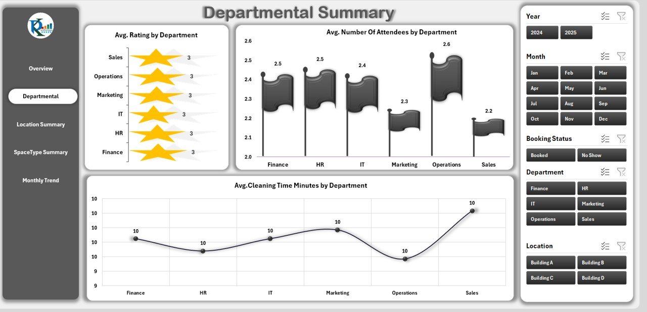
Different teams use space differently. On the Departmental Summary page, the right pane showcases:
Three Pivot Charts:
- Avg. Rating by Department
- Avg. Number of Attendees by Department
- Avg. Cleaning Time (Minutes) by Department
-
Slicers for Departments, Month, and Year
This page helps facility managers identify which departments need additional resources or training on proper room usage.
Location Summary

Whether you operate in one building or multiple sites, location matters. The Location Summary page includes:
Three Pivot Charts:
- Avg. Booking Cost by Location
- Avg. Number of Attendees by Location
- Avg. Preparation Time (Minutes) by Location
-
Slicers for Location, Space Type, and Time period
With this view, you optimize room allocation and adjust cost-sharing models between branches or floors.
Space Type Summary

Different types of spaces—meeting rooms, hot desks, event halls—have unique demand profiles. On the Space Type Summary page, you’ll find:
Three Pivot Charts:
- Avg. Advance Booking Days by Space Type
- Avg. Booking Cost by Space Type
- Avg. Preparation Time (Minutes) by Space Type
-
Slicers for Space Type, Department, and Month
This breakdown shows which space types require more cleaning resources, longer prep, or tend to be booked further in advance.
Click to Purchases Office Space Utilization Dashboard in Excel
Monthly Trend

Finally, the Monthly Trend page highlights how utilization metrics evolve over time. It features:
Two Pivot Charts:
- Avg. Number of Attendees by Month
- Avg. Booking Cost by Month
-
Slicers for Year and Location
By tracking these trends, you forecast future demand, adjust budgets, and plan office layouts proactively.
Advantages of an Office Space Utilization Dashboard
Implementing this Excel-based dashboard delivers numerous benefits:
Cost Savings
Identify underused spaces and right-size your real estate footprint.
Reduce cleaning and preparation expenses by aligning resources with actual usage.
Data-Driven Decisions
Replace anecdotal evidence with hard metrics.
Allocate space based on transparent, objective data.
Improved Employee Experience
Ensure meeting rooms match team needs.
Reduce booking conflicts and wait times by understanding peak periods.
Scalable & Flexible
Use Excel’s familiar environment—no steep learning curve.
Customize charts, KPIs, and filters to match changing business goals.
Rapid Deployment
Simply paste your raw booking data into the “Data” sheet.
The dashboard updates automatically—no manual reconfiguration.
Best Practices for Using Your Dashboard
To get the most from your Office Space Utilization Dashboard, follow these guidelines:
Maintain Clean Data
Ensure date/time fields use proper Excel date formats.
Standardize department and location names via dropdown lists on the Support sheet.
Update Data Regularly
Refresh the pivot tables weekly or monthly.
Archive historical data in a separate file if your dataset grows very large.
Leverage Slicers Effectively
Place slicers for Month, Year, Department, Location, and Space Type on each page.
Group slicers logically to enable multi-criteria filtering.
Customize KPIs as Needed
Add pivot-calculated fields for metrics like “% On-Time Preparation” or “Average Cost per Attendee.”
Highlight key thresholds with conditional formatting on cards.
Share Insights
Export snapshots of each page as images for presentations.
Protect the dashboard sheet to prevent accidental changes, while leaving the Data sheet editable.
Gather Feedback
Poll facility managers and team leads on what additional metrics they need.
Iterate quarterly to ensure the dashboard stays aligned with business goals.
How to Customize the Template
Click to Purchases Office Space Utilization Dashboard in Excel
While the out-of-the-box dashboard covers common needs, you may want to tweak it:
Add New KPI Cards
In the Overview page, insert a new pivot table summarizing your desired metric (e.g., “Total Urgent Bookings”).
Link it to a card-style shape via GETPIVOTDATA formulas.
Customize Chart Types
Swap bar charts for line charts to emphasize trends.
Use combo charts (columns + lines) to compare two metrics on one axis.
Localize Labels & Formats
Change currency symbols and date formats to match your region.
Translate slicer captions for multi-national teams.
Automate Data Refresh
Use Power Query to pull data from a CSV or database for dynamic updates.
Link Power Query output to the Data sheet and refresh with a single click.
Conclusion
An Office Space Utilization Dashboard in Excel empowers organizations to make smart, cost-effective decisions about real estate and resource allocation. By leveraging pivot tables, slicers, and interactive charts, you transform raw booking data into clear visual insights. Whether you manage one office or a global portfolio, this ready-to-use template can revolutionize how you understand space usage—and ultimately drive savings and employee satisfaction.
Frequently Asked Questions
Q1: How often should I update the dashboard data?
Ideally, refresh your data at least once per week. For high-volume environments, consider daily updates. Regular refreshes ensure your insights remain accurate and actionable.
Q2: Can I track additional metrics, like no-shows or cancellations?
Yes. Add a “Status” column in your Data sheet (e.g., Booked, Cancelled, No-Show). Then, create pivot-calculated fields to count or filter by status.
Q3: What file size can Excel handle before performance slows?
Excel comfortably manages up to 100,000 rows in a pivot cache. If you exceed this, consider splitting data by year or using Power Pivot.
Q4: How do I share the dashboard with non-Excel users?
Export each page as a PDF or image. Alternatively, upload the Excel file to SharePoint or OneDrive and grant view-only access.
Q5: Can I integrate this with Power BI later?
Absolutely. Use Power Query to load your Data sheet into Power BI Desktop. Then recreate visuals with advanced formatting and live data connections.
Q6: Do I need VBA macros for this dashboard?
No. The template relies on pivot tables and slicers, so you avoid macro security prompts. However, you can add VBA if you want to automate refresh or navigation.
Q7: How do I handle multiple time zones?
Include a “Time Zone” column in your Data sheet. Use calculated columns to convert all times to a standard zone before analysis.
Q8: Is the template compatible with Excel for Mac?
Yes. Pivot tables, slicers, and charts work the same on Excel Mac (version 16.x and later).
Visit our YouTube channel to learn step-by-step video tutorials