In today’s fast-paced business environment, organizations handle multiple operations across departments, regions, and managers. However, without a structured monitoring system, operational performance often becomes unclear. Numbers remain scattered across files, delays go unnoticed, and cost overruns appear too late. That is exactly where an Operations Dashboard in Excel creates powerful value.
An Operations Dashboard in Excel acts as a centralized performance monitoring system. It transforms raw operational data into meaningful visuals, KPIs, and trends that decision-makers can understand instantly. Moreover, since it runs inside Excel, it remains simple, flexible, and affordable for all business sizes.
In this article, you will learn everything about an Operations Dashboard in Excel, including how it works, what it contains, why it matters, its advantages, best practices, and frequently asked questions. You will also explore each analytical page in detail so that you can apply the same structure in real-world operations.
Click to buy Operations Dashboard in Excel
What Is an Operations Dashboard in Excel?
An Operations Dashboard in Excel is a ready-to-use analytical dashboard designed to track, monitor, and evaluate operational performance metrics using structured Excel data.
Instead of reviewing multiple spreadsheets and manual reports, this dashboard consolidates all key operational KPIs into one interactive view. As a result, managers gain real-time visibility into cost, efficiency, delays, completion rates, and workload distribution.
Because Excel supports formulas, pivot tables, charts, slicers, and automation, the dashboard updates instantly whenever the source data changes. Therefore, organizations improve speed, accuracy, and clarity in operational decision-making.
Why Do Businesses Need an Operations Dashboard in Excel?
Operational efficiency directly impacts profitability. However, many businesses still rely on static reports that fail to highlight problems early. Consequently, leaders react late instead of acting proactively.
An Operations Dashboard in Excel solves this problem by:
- Centralizing operational data
- Highlighting variances instantly
- Comparing planned vs actual performance
- Tracking trends month by month
- Supporting data-driven decisions
Moreover, Excel dashboards remain easy to maintain and scale, even without advanced BI tools.
What Sheets Are Included in the Operations Dashboard in Excel?
This ready-to-use Operations Dashboard in Excel includes multiple sheet tabs. Each sheet focuses on a specific analytical dimension, ensuring clean and structured insights.
Let us explore these sheets one by one.
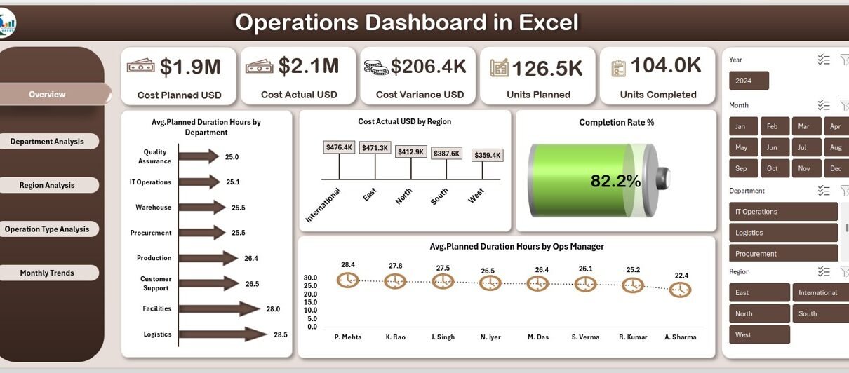
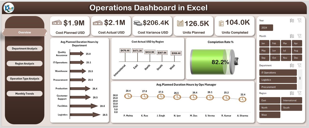
Overview Sheet:
The Overview Sheet acts as the control center of the dashboard. It provides a high-level snapshot of overall operational performance.
Key Metrics Displayed in the Overview Sheet
- Cost Planned USD
- Represents the total planned operational budget.
- Helps measure planning accuracy.
- Cost Actual USD
- Shows actual operational expenditure.
- Enables instant cost tracking.
- Cost Variance USD
- Highlights the gap between planned and actual cost.
- Supports quick corrective actions.
- Units Planned
- Displays the total units scheduled for completion.
- Units Completed
- Shows completed operational output.
- Helps evaluate delivery performance.
- Completion Rate %
- Calculates completion efficiency.
- Allows instant performance benchmarking.
Visual Analysis in the Overview Page
- Avg. Planned Duration Hours by Department
- Compares planning efficiency across departments.
- Cost Actual USD by Region
- Identifies regional cost distribution.
- Avg. Planned Duration Hours by Ops Manager
- Evaluates managerial planning effectiveness.
Because this page summarizes everything at a glance, leadership can immediately identify risks, delays, and overruns.
Click to buy Operations Dashboard in Excel
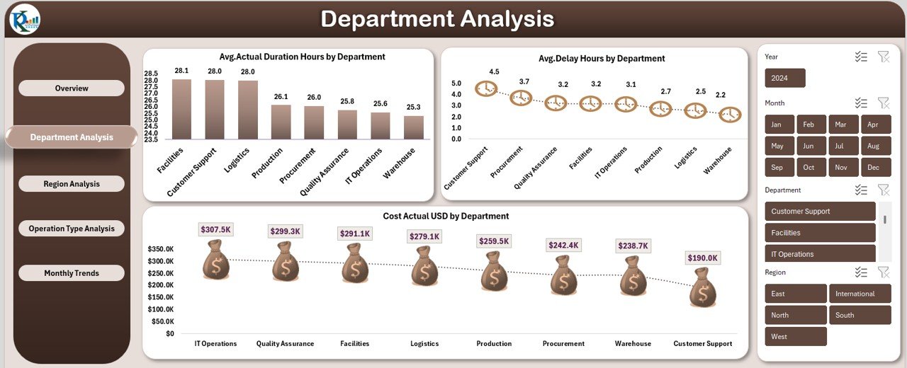
Department Analysis Sheet :
The Department Analysis Sheet focuses exclusively on departmental performance. It allows managers to compare efficiency, cost, and delays across teams.
Metrics Included in Department Analysis
- Avg. Actual Duration Hours by Department
- Tracks execution time for operations.
- Highlights efficiency gaps.
- Avg. Delay Hours by Department
- Shows average delays.
- Helps identify process bottlenecks.
- Cost Actual USD by Department
- Reveals departmental cost consumption.
- Supports budget accountability.
- By comparing these indicators, organizations easily identify high-performing and under-performing departments.
Click to buy Operations Dashboard in Excel
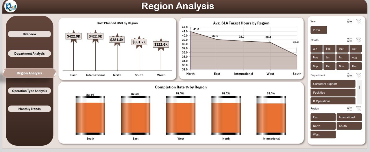
the Region Analysis :
The Region Analysis Sheet evaluates operational performance based on geographic regions. This analysis supports distributed operations and regional benchmarking.
KPIs Covered in Region Analysis
- Cost Planned USD by Region
- Displays budget allocation region-wise.
- Helps balance resources.
- Completion Rate % by Region
- Measures operational success across locations.
- Enables regional performance comparisons.
- Avg. SLA Target Hours by Region
- Evaluates service level adherence.
- Highlights customer service efficiency.
Through regional insights, management can optimize logistics, staffing, and resource deployment.
Click to buy Operations Dashboard in Excel
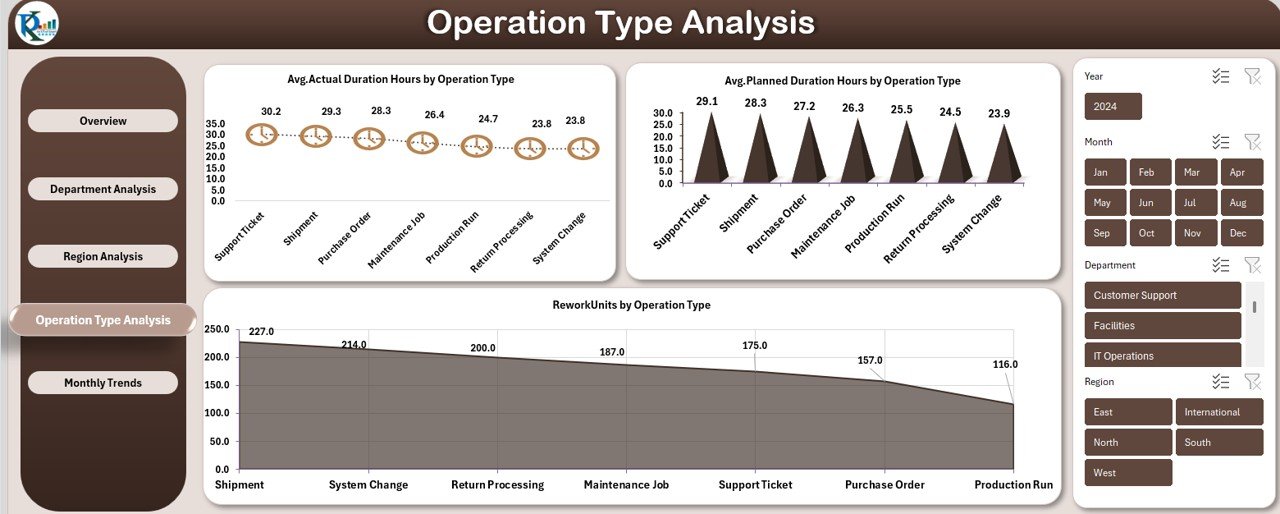
Operation Type Analysis :
Different operation types behave differently. Therefore, analyzing them separately improves clarity and control.
The Operation Type Analysis Sheet focuses on comparing performance across operation categories.
Key Metrics in Operation Type Analysis
- Avg. Actual Duration Hours by Operation Type
- Measures execution time by operation category.
- Avg. Planned Duration Hours by Operation Type
- Shows planning accuracy per operation type.
- Rework Units by Operation Type
- Highlights quality and rework issues.
- Supports process optimization.
This analysis helps organizations standardize best practices across operation types.
Click to buy Operations Dashboard in Excel
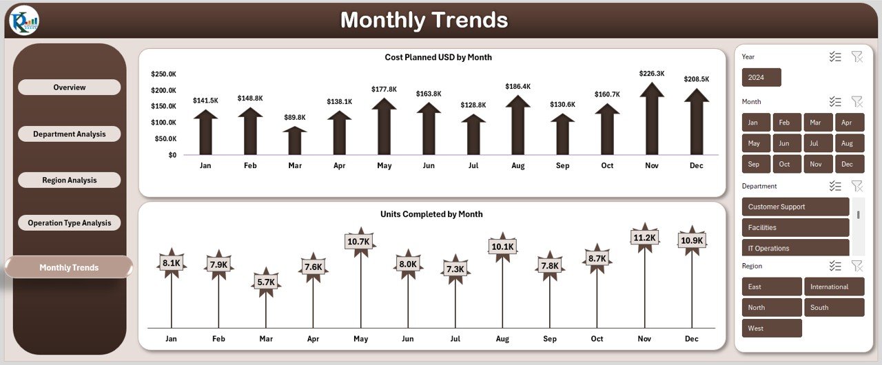
Monthly Trends Sheet :
The Monthly Trends Sheet tracks operational performance month by month. Instead of looking at static numbers, it highlights movement and patterns over time.
Monthly KPIs Included
- Cost Planned USD by Month
- Tracks budget trends.
- Supports forecasting.
- Units Completed by Month
- Displays output trends.
- Shows productivity growth or decline.
By analyzing trends, leaders can anticipate issues before they escalate.
Click to buy Operations Dashboard in Excel
Advantages of Operations Dashboard in Excel
An Operations Dashboard in Excel delivers measurable advantages across all organizational levels.
Key Advantages
- Centralized operational reporting
- Real-time planned vs actual analysis
- Improved cost control
- Faster decision-making
- Clear departmental accountability
- Strong regional performance insights
- Monthly trend visibility
- No dependency on expensive BI tools
- Easy customization and scalability
Because Excel remains widely used, organizations can adopt this dashboard without training overhead.
Opportunities for Improvement in Operations Dashboard in Excel
Even a strong dashboard offers room for optimization. Continuous improvement ensures sustained performance excellence.
Opportunities for Improvement
- Add automation using Power Query
- Integrate data validation rules
- Enhance drill-down capability
- Introduce KPI definitions sheet
- Add alerts for high variance
- Expand trend analysis to YTD metrics
- Include productivity KPIs
By implementing these improvements, the dashboard becomes more intelligent and proactive.
Best Practices for the Operations Dashboard in Excel
Following best practices ensures accuracy, usability, and scalability.
Best Practices
- Maintain clean and structured input tables
- Use consistent units and naming conventions
- Validate data regularly
- Update actuals at fixed intervals
- Use slicers for quick filtering
- Limit excessive charts to maintain clarity
- Keep KPI definitions documented
- Review variance metrics regularly
When teams follow these practices, dashboards remain reliable and actionable.
How Can Operations Teams Use This Dashboard Daily?
Operations teams can:
- Track daily performance
- Identify delays instantly
- Control operational costs
- Compare managers and departments
- Review monthly progress
- Prepare management reports quickly
As a result, operational governance improves significantly.
Who Should Use an Operations Dashboard in Excel?
This dashboard benefits:
- Operations managers
- Project managers
- Regional heads
- Department leaders
- Process improvement teams
- Small and mid-size organizations
- Excel-driven enterprises
Because it adapts easily, it fits various operational environments.
Conclusion: Why Is Operations Dashboard in Excel a Must-Have Tool?
An Operations Dashboard in Excel is not just a reporting template—it is a performance management system. It connects planning with execution, highlights risks early, and improves accountability across departments and regions.
By using structured sheets such as Overview, Department Analysis, Region Analysis, Operation Type Analysis, and Monthly Trends, organizations unlock actionable insights with minimal effort. Moreover, Excel’s familiarity ensures quick adoption and long-term sustainability.
If operational excellence matters to your business, this dashboard becomes an essential tool rather than an optional one.
Frequently Asked Questions About Operations Dashboard in Excel
- What is an Operations Dashboard in Excel used for?
An Operations Dashboard in Excel tracks cost, efficiency, delays, and completion rates across departments, regions, and operation types in one centralized view.
- Can non-technical users use this dashboard?
Yes, the dashboard runs entirely in Excel and requires no technical or coding knowledge.
- How often should the dashboard be updated?
Most organizations update it daily, weekly, or monthly based on operational volume.
- Can this dashboard handle large datasets?
Yes, especially when optimized with Excel tables, pivot tables, and clean data structures.
- Does this dashboard support customization?
Yes, users can easily add KPIs, charts, slicers, and new analysis sheets.
- Is this dashboard suitable for small businesses?
Absolutely. Small businesses benefit greatly due to low cost and simplicity.
- Can the dashboard show trends over time?
Yes, the Monthly Trends sheet highlights performance changes over time.
- Does this dashboard replace BI tools?
It complements BI tools and serves as a powerful standalone solution for Excel-driven operations.
Visit our YouTube channel to learn step-by-step video tutorials
Watch the step-by-step video tutorial:
Click to buy Operations Dashboard in Excel