Managing performance across departments, teams, and business units requires clarity, consistency, and speed. However, many organizations still depend on manual Excel reports, static MIS files, or delayed presentations. As a result, leaders struggle to track targets, identify risks, and take timely action.
That is exactly where a Performance Management KPI Dashboard in Power BI creates measurable impact.
In this detailed guide, you will learn what a Performance Management KPI Dashboard in Power BI is, how it works, its page-wise structure, data model, key features, advantages, best practices, and frequently asked questions. By the end of this article, you will clearly understand how this ready-to-use dashboard helps organizations monitor KPIs efficiently and improve decision-making.
Click to buy Performance Management KPI Dashboard in Power BI
What Is a Performance Management KPI Dashboard in Power BI?
A Performance Management KPI Dashboard in Power BI is a centralized and interactive analytics solution designed to track key performance indicators across business functions.
Instead of reviewing long reports, managers can instantly view MTD (Month-to-Date) and YTD (Year-to-Date) performance, compare actuals with targets, and evaluate trends against previous years.
Moreover, because this dashboard uses Power BI visuals, slicers, and drill-through features, users gain instant clarity without manual calculations.
As a result, performance tracking becomes faster, clearer, and more actionable.
Why Do Organizations Need a Performance Management KPI Dashboard?
Performance management requires more than data collection. It demands visibility, accuracy, and context.
Without a structured dashboard:
- Teams spend hours preparing reports
- Leaders miss early warning signs
- Targets remain disconnected from actual performance
- KPI discussions become subjective
However, a Performance Management KPI Dashboard in Power BI solves these issues by:
- Centralizing all KPIs in one place
- Showing MTD and YTD performance clearly
- Highlighting target achievements and misses visually
- Enabling data-driven decisions
Therefore, organizations gain control, confidence, and consistency in performance tracking.
How Does a Performance Management KPI Dashboard in Power BI Work?
This dashboard works by combining Excel-based input data with Power BI visual analytics.
First, users update KPI data in Excel input sheets. Then, Power BI automatically refreshes and converts the data into interactive visuals.
Because the logic remains predefined, users focus on insights instead of calculations.
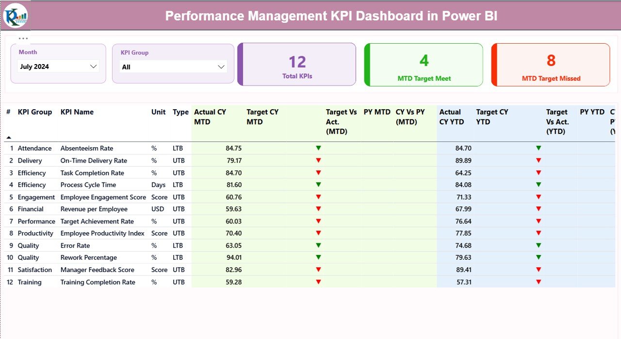
What Are the Key Pages in the Performance Management KPI Dashboard?
This ready-to-use dashboard contains three well-structured pages, each designed for a specific purpose.
Summary Page
The Summary Page acts as the central performance control panel.
Key Elements on the Summary Page
At the top of the page, users can see:
- Month Slicer – to analyze performance month-wise
- KPI Group Slicer – to filter KPIs by category
Additionally, three KPI cards provide an instant overview:
- Total KPIs Count
- MTD Target Met Count
- MTD Target Missed Count
As a result, leadership immediately understands overall performance status.
What Information Does the KPI Table Show?
Below the KPI cards, a detailed table displays structured KPI information.
The table includes:
- KPI Number – sequential KPI identification
- KPI Group – department or category
- KPI Name – specific metric name
- Unit – unit of measurement
- Type – LTB (Lower the Better) or UTB (Upper the Better)
Furthermore, performance metrics appear clearly:
MTD Performance Columns
- Actual CY MTD
- Target CY MTD
- MTD Status Icon (▲ green or ▼ red)
- Target vs Actual (MTD %)
- Previous Year MTD
- CY vs PY (MTD %)
YTD Performance Columns
- Actual CY YTD
- Target CY YTD
- YTD Status Icon
- Target vs Actual (YTD %)
- Previous Year YTD
- CY vs PY (YTD %)
Because of these visuals, users instantly spot trends and gaps.
Click to buy Performance Management KPI Dashboard in Power BI
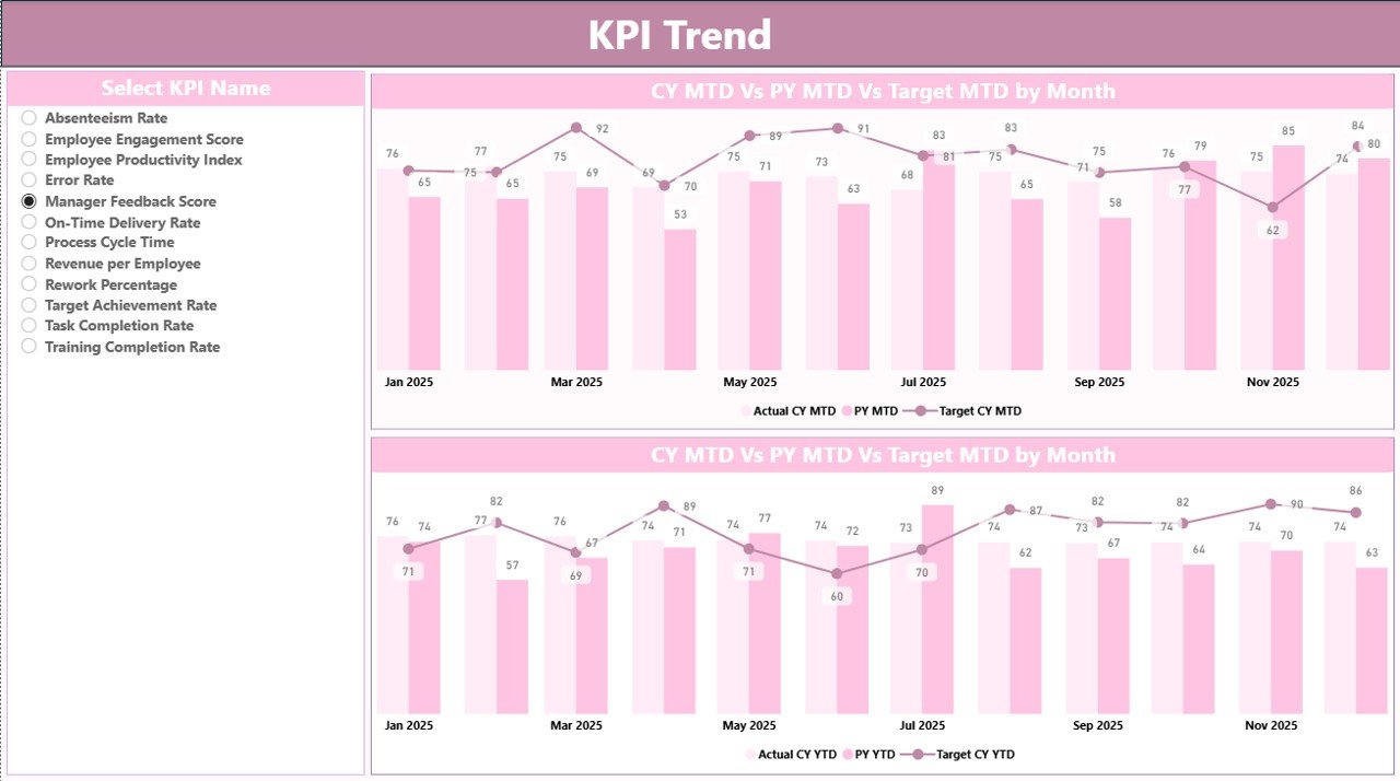
KPI Trend Page
The KPI Trend Page focuses on trend analysis and historical comparison.
On this page:
- Users select a KPI Name from a slicer
- Two combo charts appear automatically
Charts Display:
- Current Year Actual
- Previous Year Actual
- Target Values
Moreover, the dashboard shows both MTD and YTD trends, which helps users:
- Identify growth or decline patterns
- Compare performance year-over-year
- Understand seasonal behavior
As a result, teams gain deeper insight into KPI movement instead of just static numbers.
Click to buy Performance Management KPI Dashboard in Power BI
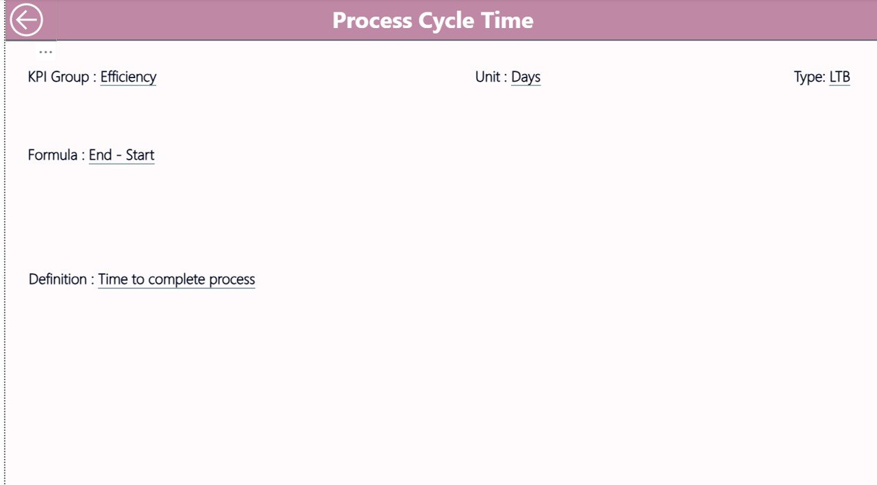
KPI Definition Page
The KPI Definition Page acts as a reference and documentation layer.
This page remains hidden and works as a drill-through page.
From the Summary Page, users can drill through any KPI to view:
- KPI Formula
- KPI Definition
- KPI Type
- Unit of Measurement
Because this page stays hidden, the dashboard remains clean while still offering full transparency.
Click to buy Performance Management KPI Dashboard in Power BI
How Does Drill-Through Improve Dashboard Usability?
Drill-through eliminates confusion.
Instead of asking stakeholders for definitions, users can directly view:
- What the KPI means
- How calculations work
- Why a KPI behaves in a certain way
Additionally, a Back Button on the top-left corner allows easy navigation to the Summary Page.
What Excel Data Is Required for This Dashboard?
The dashboard uses a structured Excel data source with three worksheets.
Input_Actual Sheet
This sheet captures actual performance data.
Users need to fill:
- KPI Name
- Month (first date of the month)
- MTD Actual Value
- YTD Actual Value
Because the format remains simple, data entry stays quick and error-free.
Click to buy Performance Management KPI Dashboard in Power BI
Input_Target Sheet
This sheet stores target values.
Users need to fill:
- KPI Name
- Month (first date of the month)
- MTD Target Value
- YTD Target Value
As a result, Power BI automatically calculates variances and percentages.
KPI Definition Sheet
This sheet defines the KPI structure.
It includes:
- KPI Number
- KPI Group
- KPI Name
- Unit
- Formula
- Definition
- Type (LTB or UTB)
Therefore, governance and standardization remain intact.
Advantages of Performance Management KPI Dashboard in Power BI
Using this dashboard delivers multiple business benefits.
Key Advantages
- Centralized KPI tracking in one dashboard
- Clear MTD and YTD performance visibility
- Automated calculations and comparisons
- Visual alerts using icons and colors
- Faster and data-driven decision-making
- Reduced manual reporting effort
- Easy Excel-based data updates
- Scalable across departments and industries
Because of these advantages, organizations gain stronger performance control.
Who Can Use a Performance Management KPI Dashboard?
This dashboard suits multiple roles:
- Senior Management
- Business Heads
- Operations Managers
- HR and Finance Teams
- Strategy and PMO Teams
- Analysts and MIS Teams
Additionally, it works across industries such as:
- Corporate Enterprises
- Consulting Firms
- Staffing & Executive Search
- Manufacturing
- IT & Services
-
Healthcare and Education
Best Practices for the Performance Management KPI Dashboard in Power BI
Following best practices ensures long-term success.
Best Practices
- Define KPIs clearly before implementation
- Maintain consistent KPI definitions
- Update Excel input sheets monthly
- Use realistic and aligned targets✔ Review MTD trends weekly
- Analyze YTD trends quarterly
- Limit KPIs to what truly matters
- Train users on drill-through features
- Refresh Power BI data regularly
When teams follow these practices, the dashboard delivers maximum value.
How Does This Dashboard Support Strategic Decision-Making?
This dashboard connects daily performance with strategic goals.
Because it shows:
- Target achievement
- Growth trends
- Year-over-year comparison
Leaders can:
- Adjust targets proactively
- Identify underperforming KPIs early
- Allocate resources more effectively
- Improve accountability
As a result, performance management becomes proactive instead of reactive.
Conclusion
A Performance Management KPI Dashboard in Power BI transforms how organizations track, analyze, and act on performance data.
Instead of manual reports and delayed insights, this dashboard delivers real-time visibility, structured KPIs, and actionable trends.
Because it uses Excel as a data source and Power BI as a visualization layer, it remains flexible, scalable, and easy to maintain.
Ultimately, this dashboard empowers leadership teams to make confident, data-driven decisions and continuously improve performance.
Frequently Asked Questions (FAQs)
What is a Performance Management KPI Dashboard in Power BI?
It is an interactive Power BI dashboard that tracks KPIs using MTD, YTD, target, and historical comparisons.
Can I update the data without changing Power BI?
Yes. You only need to update the Excel input sheets. Power BI refreshes automatically.
What does LTB and UTB mean?
LTB means Lower the Better, while UTB means Upper the Better.
Can this dashboard work for any industry?
Yes. You can customize KPI groups and definitions for any industry.
Does this dashboard support drill-through?
Yes. Users can drill through to view KPI formulas and definitions.
Is technical Power BI knowledge required to use it?
No. End users only need to update Excel data and use slicers.
How often should I refresh the dashboard?
You should refresh it monthly or whenever new data becomes available.
Click to buy Performance Management KPI Dashboard in Power BI
Visit our YouTube channel to learn step-by-step video tutorials
Watch the step-by-step video tutorial: