Pilgrimage tourism continues to grow across the world. Millions of visitors travel every year to sacred destinations like Mecca, Vatican City, Varanasi, and Tirupati Balaji Temple. As a result, pilgrimage destinations handle massive crowds, complex logistics, seasonal demand, and strict compliance requirements.
However, many tourism boards, temple trusts, and religious travel operators still rely on manual reports and scattered spreadsheets. Therefore, they struggle to track visitor growth, donation trends, occupancy rates, safety metrics, and service quality.
That is exactly why a Pilgrimage Tourism KPI Dashboard in Excel becomes essential.
In this detailed guide, you will learn:
-
What a Pilgrimage Tourism KPI Dashboard in Excel is
-
Why pilgrimage destinations need KPI tracking
-
Complete worksheet structure of the dashboard
-
Key features and functionality
-
Advantages of the dashboard
-
Best practices for implementation
-
Frequently Asked Questions
By the end, you will clearly understand how this ready-to-use Excel template helps you improve operational efficiency, visitor satisfaction, and financial performance.
What Is a Pilgrimage Tourism KPI Dashboard in Excel?
A Pilgrimage Tourism KPI Dashboard in Excel is a structured and interactive performance tracking system designed to monitor key metrics related to religious tourism.
Instead of reviewing multiple reports, you can:
-
Track monthly and yearly visitor numbers
-
Monitor donation collections
-
Measure accommodation occupancy
-
Analyze crowd management efficiency
-
Compare actual performance against targets
-
Review previous year comparisons
Moreover, this ready-to-use Excel template converts raw data into visual insights using charts, KPI cards, and conditional formatting.
As a result, decision-makers can take faster and smarter actions.
Why Do Pilgrimage Destinations Need KPI Tracking?
Pilgrimage tourism involves high emotional value and operational complexity. Therefore, managers must ensure smooth services, safety, and transparency.
Without KPI tracking:
-
You miss seasonal demand patterns
-
You cannot control overcrowding
-
You struggle to track donation performance
-
You fail to compare current vs previous year trends
-
You lose visibility over service efficiency
On the other hand, when you use a KPI dashboard:
-
You identify performance gaps quickly
-
You improve resource planning
-
You increase transparency
-
You enhance visitor experience
Therefore, a KPI dashboard is not optional anymore. It is a management necessity.
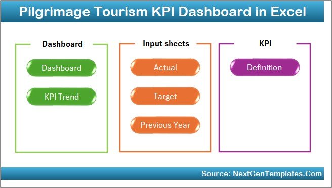
📊 Structure of Pilgrimage Tourism KPI Dashboard in Excel
This ready-to-use template includes 7 structured worksheets. Each sheet plays a specific role.
1️⃣ Home Sheet – Navigation Control Center
The Home Sheet works as an index page.
Here, you get:
-
6 navigation buttons
-
One-click jump to respective sheets
-
Structured layout for easy movement
As a result, users can navigate quickly without confusion.
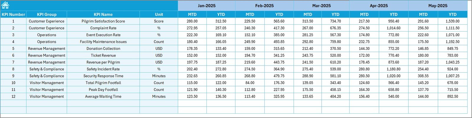
2️⃣ Dashboard Sheet – Main KPI Performance View
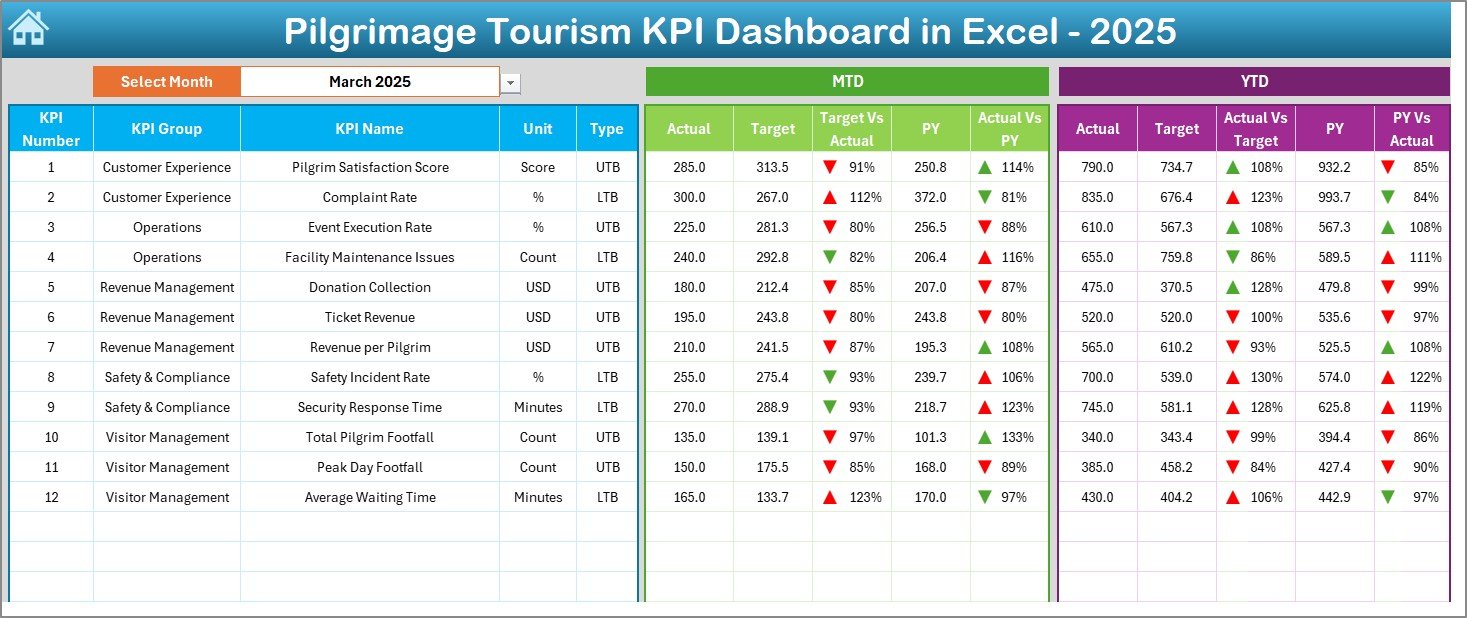
This is the heart of the template.
On cell D3, you can select the Month from a drop-down list. Once you select a month, the entire dashboard updates automatically.
What Does This Dashboard Show?
For each KPI, you can view:
✅ MTD (Month-To-Date)
-
Actual
-
Target
-
Previous Year
-
Target vs Actual
-
PY vs Actual
✅ YTD (Year-To-Date)
-
Actual
-
Target
-
Previous Year
-
Target vs Actual
-
PY vs Actual
Moreover, the dashboard uses:
-
Conditional formatting
-
Up and down arrows
-
Color indicators
Therefore, you instantly know whether performance improves or declines.
3️⃣ KPI Trend Sheet – Performance Movement Analysis
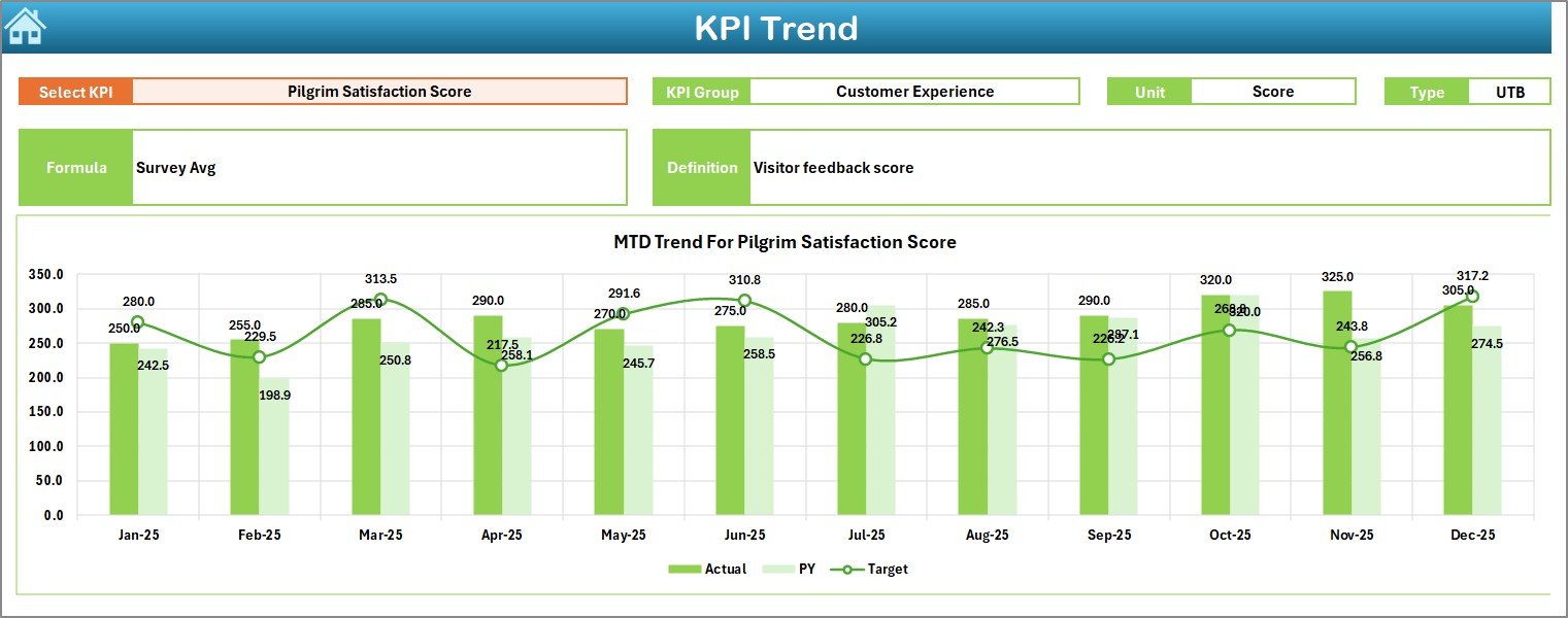
The KPI Trend Sheet provides deep insights.
On cell C3, you can select a KPI from the drop-down list.
The sheet displays:
-
KPI Group
-
KPI Unit
-
KPI Type (Lower the Better / Upper the Better)
-
KPI Formula
-
KPI Definition
In addition, it shows:
-
MTD Trend Chart (Actual vs Target vs PY)
-
YTD Trend Chart (Actual vs Target vs PY)
As a result, managers can analyze movement patterns and seasonal trends easily.
4️⃣ Actual Numbers Input Sheet – Data Entry Section
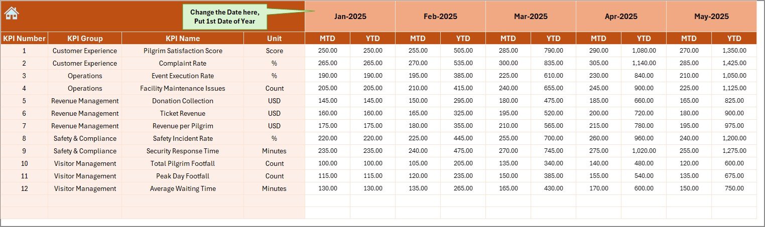
This sheet allows you to enter actual performance data.
You can:
-
Change month from cell E1
-
Enter MTD values
-
Enter YTD values
Simply enter the first month of the year in cell E1. After that, update numbers month by month.
Therefore, the dashboard automatically reflects updated performance.
5️⃣ Target Sheet – Goal Setting Module
In this sheet, you enter:
-
Monthly MTD target values
-
Monthly YTD target values
By setting clear targets, you can measure progress accurately.
Without targets, performance tracking has no direction.
6️⃣ Previous Year Numbers Sheet – Historical Comparison
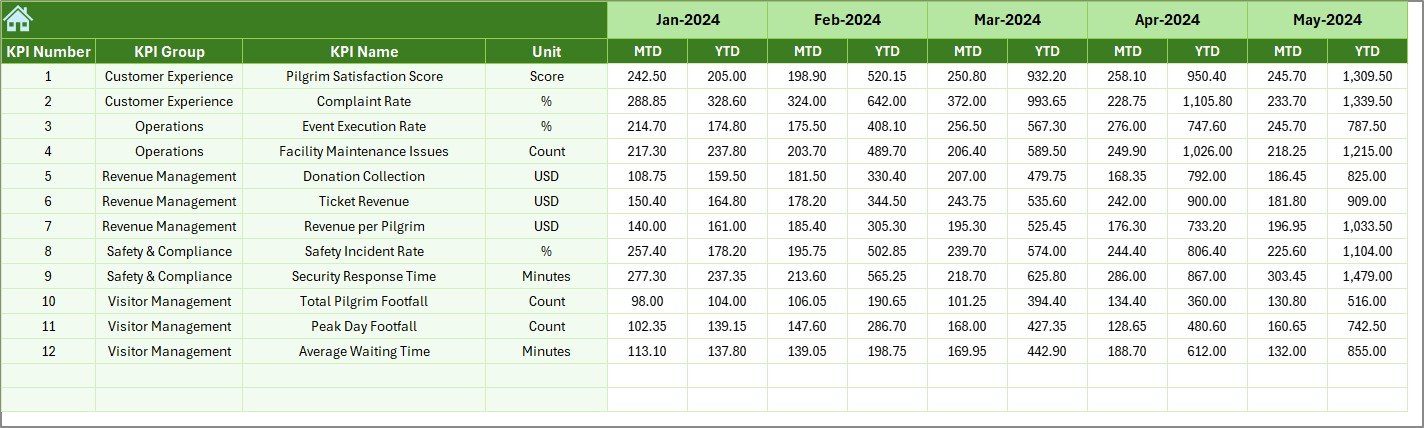
Here, you enter last year’s numbers.
You enter data in the same format as current year.
Therefore, you can:
-
Compare growth percentage
-
Identify improvement trends
-
Measure year-over-year performance
Historical comparison strengthens strategic planning.
7️⃣ KPI Definition Sheet – KPI Framework Documentation
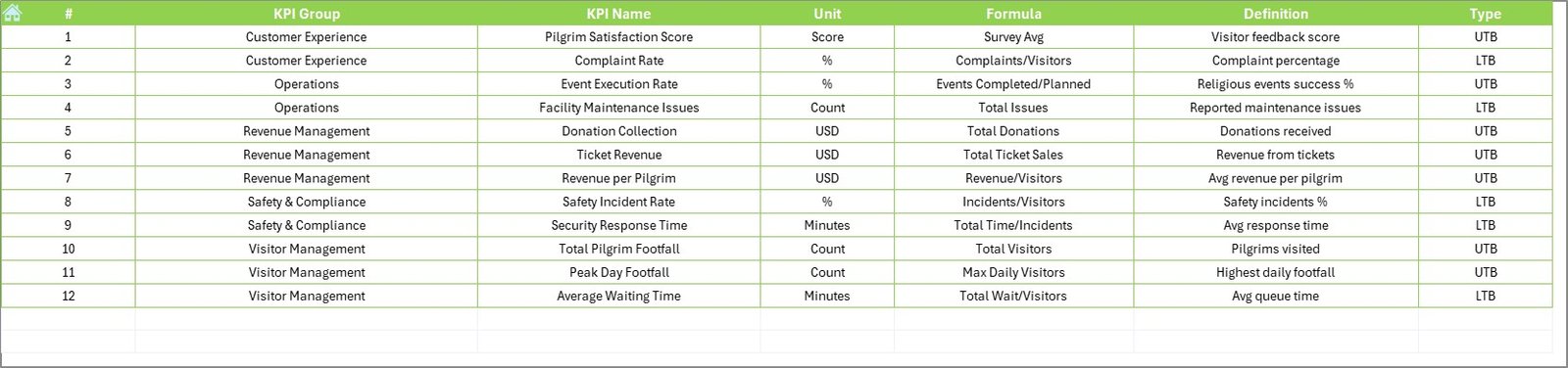
This sheet contains:
-
KPI Name
-
KPI Group
-
Unit
-
Formula
-
KPI Definition
Because of this sheet, the entire dashboard becomes structured and standardized.
Everyone understands:
-
What to measure
-
How to measure
-
Why to measure
📌 Important KPIs for Pilgrimage Tourism
You can include the following KPIs in your dashboard:
Visitor Metrics
-
Total Pilgrim Footfall
-
Average Daily Visitors
-
Peak Day Visitors
-
International Visitors %
Financial Metrics
-
Total Donations Collected
-
Average Donation per Visitor
-
Ticket Revenue
-
Accommodation Revenue
Operational Metrics
-
Queue Waiting Time
-
Staff-to-Visitor Ratio
-
Security Incident Rate
-
Cleanliness Score
Service Quality Metrics
-
Visitor Satisfaction Index
-
Complaint Resolution Time
-
Online Review Rating
How Does the Dashboard Improve Decision-Making?
The dashboard improves decision-making in several ways.
Firstly, it centralizes data.
All KPIs stay in one place.
Secondly, it provides comparison.
You compare:
-
Actual vs Target
-
Current vs Previous Year
Thirdly, it visualizes performance.
Visual charts help leaders understand trends instantly.
Finally, it supports proactive planning.
You detect underperformance early.
Advantages of Pilgrimage Tourism KPI Dashboard in Excel
Using this dashboard provides multiple benefits.
1️⃣ Better Crowd Management
You monitor visitor trends. Therefore, you allocate staff and security properly.
2️⃣ Improved Financial Transparency
You track donations and revenue clearly. As a result, financial reporting becomes accurate.
3️⃣ Data-Driven Planning
You identify seasonal peaks. Therefore, you prepare accommodation and transport resources in advance.
4️⃣ Performance Accountability
Each KPI has defined targets. Consequently, teams stay responsible for results.
5️⃣ Easy Customization
Since Excel powers the dashboard, you can modify it easily.
6️⃣ Cost-Effective Solution
You do not need expensive software. Excel already exists in most organizations.
Best Practices for the Pilgrimage Tourism KPI Dashboard in Excel
To maximize value, follow these best practices.
1️⃣ Define Clear KPIs
Choose KPIs that align with your goals.
2️⃣ Update Data Monthly
Update numbers regularly. Otherwise, reports lose accuracy.
3️⃣ Set Realistic Targets
Set achievable targets. Unrealistic goals reduce motivation.
4️⃣ Review Trends Quarterly
Analyze trends every quarter. Identify performance gaps.
5️⃣ Train Your Team
Ensure that your team understands:
-
Data entry process
-
KPI definitions
-
Dashboard interpretation
6️⃣ Use Conditional Formatting Smartly
Color coding improves readability.
Who Should Use This Dashboard?
This dashboard helps:
-
Temple Trust Management
-
Religious Tourism Boards
-
Pilgrimage Travel Agencies
-
State Tourism Departments
-
Shrine Committees
If you manage pilgrimage destinations, this template will simplify performance tracking.
How to Implement the Dashboard Step-by-Step?
Follow these steps:
-
Enter KPI definitions
-
Set targets
-
Enter previous year numbers
-
Input actual data monthly
-
Select month from dashboard
-
Review performance
-
Take corrective actions
This simple workflow ensures smooth implementation.
Conclusion
Pilgrimage tourism requires structured monitoring. Without performance tracking, management decisions become reactive.
However, the Pilgrimage Tourism KPI Dashboard in Excel transforms raw data into clear insights. It provides MTD and YTD tracking, target comparison, previous year analysis, and structured KPI documentation.
Therefore, you gain:
-
Better visibility
-
Improved accountability
-
Stronger financial control
-
Enhanced visitor satisfaction
If you want to manage pilgrimage tourism professionally, you should implement this dashboard today.
Frequently Asked Questions (FAQs)
1. What is a Pilgrimage Tourism KPI Dashboard in Excel?
It is an Excel-based template that tracks key performance indicators related to pilgrimage tourism.
2. Can I customize the KPIs?
Yes. You can modify KPI definitions and formulas easily.
3. Do I need advanced Excel skills?
No. Basic Excel knowledge is enough.
4. Can I track multiple pilgrimage sites?
Yes. You can create separate KPI groups for each site.
5. Does the dashboard support year-over-year comparison?
Yes. It includes a Previous Year sheet for comparison.
6. How often should I update the data?
You should update data monthly for accurate reporting.
Visit our YouTube channel to learn step-by-step video tutorials