Ports and harbors serve as the backbone of global trade. Every day, thousands of vessels move goods from one country to another. Because of this huge movement, port authorities need a strong method to monitor performance, track delays, measure productivity, and improve cargo flow. A Ports and Harbors KPI Dashboard in Power BI solves this challenge. It offers a clean, fast, and powerful view of operations.
In this article, you learn everything about this dashboard. I explain each page, every feature, and all key KPIs. I also include advantages, best practices, and a set of frequently asked questions.
Click to Purchases Ports and Harbors KPI Dashboard in Power BI
What Is a Ports and Harbors KPI Dashboard in Power BI?
A Ports and Harbors KPI Dashboard in Power BI is a ready-to-use reporting solution that helps maritime teams track critical operational KPIs. It connects to an Excel data source, transforms numbers into visuals, and presents detailed insights across vessel traffic, cargo movement, port efficiency, turnaround time, and more.
Because the dashboard runs in Power BI, every update appears instantly. Maritime teams learn how each part of the port performs, and they take timely decisions that improve overall port productivity.
This dashboard contains three main pages:
-
Summary Page
-
KPI Trend Page
-
KPI Definition Page (Drill-Through)
Let us explore each page in detail.
Why Ports Need a KPI Dashboard
Ports manage many activities at the same time. Cargo handling, container movement, vessel scheduling, berth allocation, fuel usage, and equipment productivity change every day. Without a strong visibility system, delays grow quickly. Slow decisions hurt port capacity, revenue, and customer satisfaction.
A dashboard solves these problems because:
-
It shows real-time operational performance
-
It highlights delays early
-
It gives clarity for every KPI
-
It supports faster decision-making
-
It improves communication across departments
-
It helps reduce operational bottlenecks
-
It lowers manual reporting effort
With Power BI, port teams stay aligned and respond to issues early.
Click to Purchases Ports and Harbors KPI Dashboard in Power BI
Key Features of the Ports and Harbors KPI Dashboard in Power BI
This dashboard includes powerful features designed for maritime operations. Below are the main details.
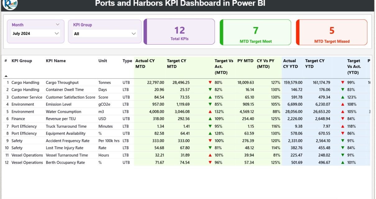
1. Summary Page – The Main View of Port Operations
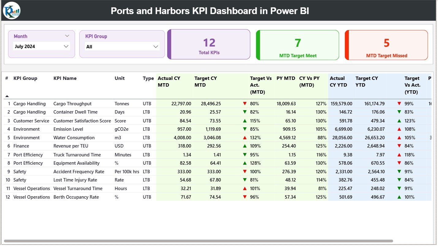
The Summary Page gives a complete view of KPIs across all port departments. Users understand performance within seconds because the layout stays clean and structured.
Slicers at the Top
You get two slicers:
-
Month Slicer
-
KPI Group Slicer
These slicers help users choose any month or KPI category and refresh the whole dashboard instantly.
KPI Cards
Just below the slicers, you see three cards:
-
Total KPIs Count
-
MTD Target Meet Count
-
MTD Target Missed Count
These cards show the overall performance of the port for the selected month.
-
Green ▲ = KPI meets the target
-
Red ▼ = KPI misses the target
This table brings clarity to all port KPIs.
2. KPI Trend Page – Track Operational Movement
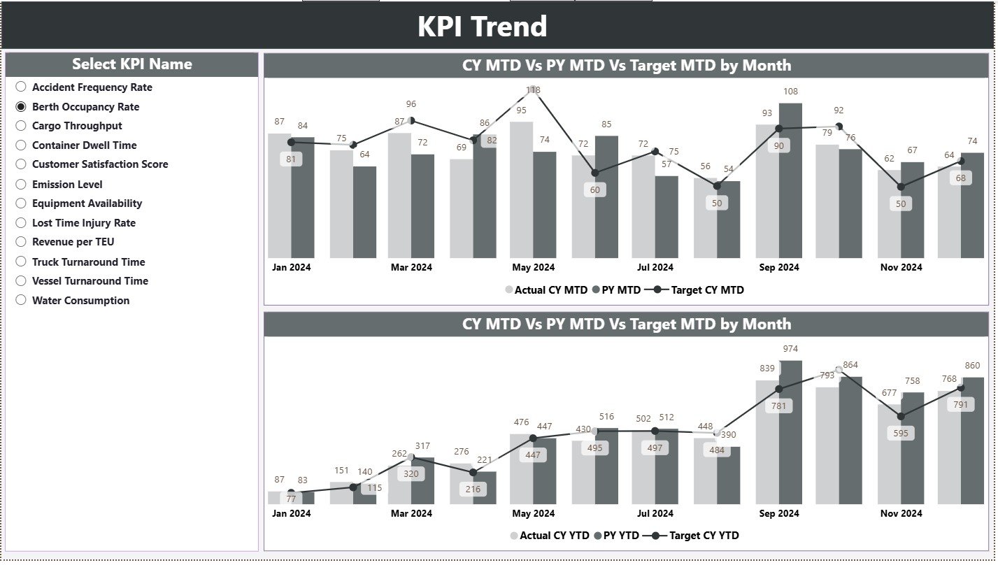
The second page shows how port KPIs move across months. It includes two combo charts:
Combo Chart 1
Shows:
-
Current Year MTD Actual
-
Previous Year MTD Actual
-
MTD Targets
Combo Chart 2
Shows:
-
Current Year YTD Actual
-
Previous Year YTD Actual
-
YTD Targets
You also get a slicer on the left to choose the KPI name.
Trend analysis helps port leaders monitor:
-
Vessel turnaround pattern
-
Cargo handling efficiency
-
Berth occupancy changes
-
Fuel usage trends
-
Equipment productivity
When they see changes early, they fix issues faster.
3. KPI Definition Page – Drill-Through for KPI Explanation
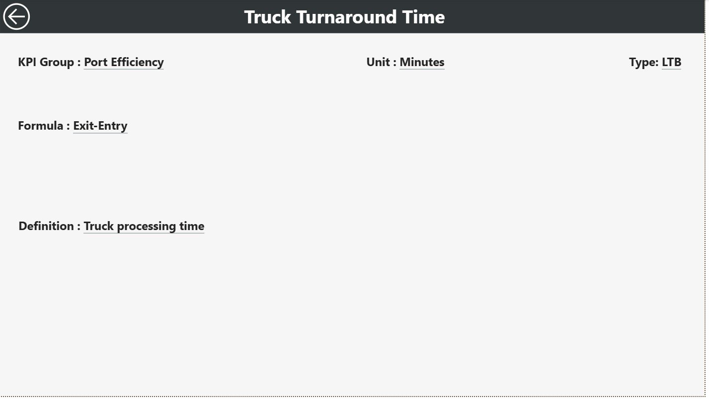
This is a hidden page, accessible only through drill-through action.
When a user selects a KPI on the Summary Page and drills through, they reach the KPI Definition Page. It shows:
-
KPI Number
-
KPI Group
-
KPI Name
-
Unit
-
Formula
-
Definition
-
Type (LTB or UTB)
This page works like documentation. Every stakeholder understands what each KPI means, why it matters, and how the formula works.
A Back Button on the top left helps users return to the Summary Page.
Click to Purchases Ports and Harbors KPI Dashboard in Power BI
Excel Data Structure for the Dashboard
This dashboard uses a simple Excel file with three sheets. This makes it easy to update the data.
1. Input_Actual Sheet
Fill:
-
KPI Name
-
Month (use the first date of each month)
-
MTD Actual
-
YTD Actual
These numbers show real port performance.
2. Input_Target Sheet
Fill:
-
KPI Name
-
Month
-
MTD Target
-
YTD Target
These numbers help compare planned and actual performance.
3. KPI Definition Sheet
Fill:
-
KPI Number
-
KPI Group
-
KPI Name
-
Unit
-
Formula
-
Definition
-
KPI Type (UTB or LTB)
This sheet becomes the dictionary of KPIs.
Advantages of Ports and Harbors KPI Dashboard in Power BI
1. Clear Visibility of Port Performance
Teams track vessel traffic, cargo handling, equipment usage, fuel consumption, and more from one place.
2. Faster Decision-Making
When issues appear in real time, teams act quickly.
3. Targets vs Actual Clarity
MTD and YTD views help teams monitor progress clearly.
4. Better Trend Analysis
The KPI Trend Page highlights seasonal patterns and operational cycles.
5. Improved Resource Planning
Insights help leaders plan labor, cranes, dock equipment, and berths efficiently.
6. High Efficiency
Green and red icons help identify performance instantly.
7. Strong Transparency
All departments see the same data and work smoothly.
8. Easy to Update
The Excel-based data source keeps everything simple.
Click to Purchases Ports and Harbors KPI Dashboard in Power BI
Best Practices for Using a Ports and Harbors KPI Dashboard
1. Update Data Monthly
Always update MTD and YTD numbers at the start of each month.
2. Keep KPI Names Clean
Short names help users understand them quickly.
3. Maintain Consistent Units
Use the same measurement units across all categories.
4. Analyze Trends Frequently
Understand why performance increases or decreases.
5. Use KPI Groups Effectively
Group KPIs by department for better clarity.
6. Review Targets Annually
Adjust targets if port performance changes significantly.
7. Train All Teams
When everyone understands the dashboard, operations run better.
8. Monitor Missed KPIs Immediately
Red ▼ icons show early warnings. Fix issues right away.
How This Dashboard Improves Port Operations
This dashboard helps teams make decisions faster because it highlights performance at every level. When port leaders track KPIs regularly, they improve cargo movement speed, reduce vessel delays, optimize equipment usage, and reduce operational waste.
Since it includes trend charts, teams understand month-wise patterns clearly. The drill-through feature helps them view KPI formulas and definitions without searching in multiple documents.
This strong visibility improves:
-
Turnaround time
-
Cargo productivity
-
Berth allocation efficiency
-
Fuel and resource usage
-
Labor planning
-
Equipment scheduling
The dashboard becomes a complete operational system for every maritime team.
Conclusion
A Ports and Harbors KPI Dashboard in Power BI brings strong visibility to port operations. It improves efficiency, supports strategic decision-making, and builds a powerful data-driven culture. With Summary Page insights, trend charts, target comparisons, and drill-through definitions, every maritime team works with clarity and confidence.
Whether you manage cargo handling, vessel scheduling, or harbor maintenance, this dashboard helps transform your operations with clean data and smart analytics.
Click to Purchases Ports and Harbors KPI Dashboard in Power BI
Frequently Asked Questions (FAQs)
1. What does the Ports and Harbors KPI Dashboard track?
It tracks cargo movement, vessel operations, turnaround time, berth utilization, and port resource efficiency.
2. Who uses this dashboard?
Port managers, harbor authorities, cargo supervisors, maintenance teams, and maritime planners.
3. Do I need advanced technical skills to use it?
No. The visuals and slicers make it easy for beginners.
4. How do I update the dashboard?
You only update the Excel sheets: Actual, Target, and KPI Definition.
5. Can I add more KPIs?
Yes. Add them to the Excel file and refresh the report.
6. Can I track month-wise trends?
Yes. The KPI Trend Page shows patterns across months.
7. What does UTB and LTB mean?
UTB = Upper the Better
LTB = Lower the Better
8. Why does the dashboard use icons?
Green and red icons show whether performance meets or misses targets.
Click to Purchases Ports and Harbors KPI Dashboard in Power BI
Visit our YouTube channel to learn step-by-step video tutorials