Public health programs improve community well-being, reduce disease risks, and strengthen healthcare outcomes. However, teams often struggle to track activities, budgets, beneficiaries, and performance indicators in one place. Reports stay scattered across multiple files, and decision-makers lose the insights they need. Because of this, many health departments look for a simple and reliable reporting system.
A Public Health Programs Dashboard in Excel solves this problem with ease. It brings all key metrics into a single structured view. It also provides instant insights into budget use, beneficiary reach, outcome rating, delays, and program status. With clear visuals and slicers, teams understand program performance in seconds. As a result, decision-makers act faster, reduce delays, and improve community outcomes.
In this detailed guide, you will explore how this dashboard works, what each page includes, and how public health teams use it for daily and strategic monitoring. You will also learn the key advantages, best practices, and answers to common questions.
Click to Purchases Public Health Programs Dashboard in Excel
What Is a Public Health Programs Dashboard in Excel?
A Public Health Programs Dashboard in Excel is a ready-to-use reporting solution that tracks all program activities in a structured and visual format. It shows everything—program progress, allocated and used budget, outcome rating, monthly performance, delays, and beneficiaries. You select any month or program group from a slicer, and the entire dashboard refreshes immediately.
Because Excel works offline and supports easy customization, health departments use this dashboard without needing advanced tools. The design stays simple, fast, and friendly for both technical and non-technical users.
Why Do Public Health Teams Need a Dashboard?
Public health programs cover many activities such as disease prevention, maternal health, nutrition, sanitation, vaccination drives, and community awareness. Each program creates large amounts of data every month. Teams must track:
-
Beneficiaries
-
Allocated and utilized budget
-
Program status
-
Delays and risks
-
District-wise performance
-
Monthly variations
-
Outcome rating
Spreadsheets alone cannot communicate insights clearly. But a visual dashboard delivers everything at a glance. It also increases accuracy and speed because the dashboard updates instantly when the data sheet changes.
Key Features of the Public Health Programs Dashboard in Excel
The dashboard includes a left-side Page Navigator, which helps users switch between different analytical pages smoothly. Each page highlights a specific perspective of program performance.
The Excel file contains five major pages:
-
Overview
-
Program Type Analysis
-
Funding Source Analysis
-
District Analysis
-
Month Analysis
Let us explore each page in detail.
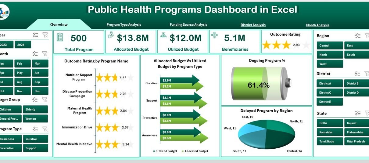
1. Overview Page – How Does It Help?
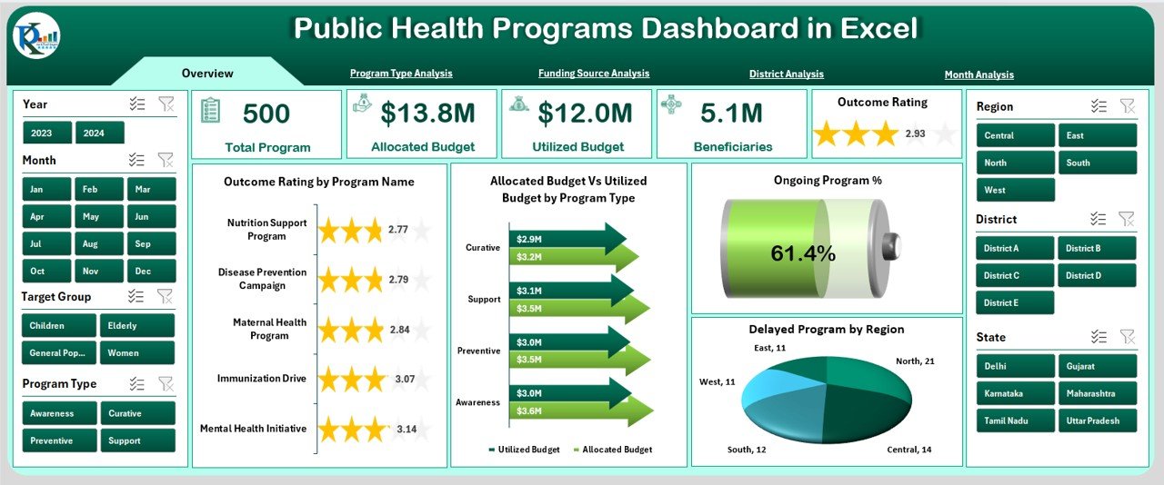
The Overview Page acts as the main control center of the dashboard. You see the full summary of program performance as soon as you open the file.
Key Components on This Page
✔ Right-Side Slicer Panel
The slicer allows filtering by Program Type, District, Month, or Funding Source. When you change any slicer option, the entire page updates immediately.
✔ Five KPI Cards
These cards help users review the most important metrics instantly:
-
Total Programs
-
Ongoing Programs
-
Delayed Programs
-
Completed Programs
-
Total Beneficiaries
Each card uses a clean design so decision-makers read data quickly.
✔ Visual Charts
The page includes four powerful charts:
-
Outcome Rating by Program Name
Shows the quality and effectiveness of each program. -
Allocated Budget vs. Utilized Budget by Program Type
Helps leaders understand fund usage patterns. -
Ongoing Program Percentage
Displays how many programs remain active. -
Delayed Programs by Region
Highlights problem areas for immediate action.
This page gives leaders a quick snapshot of public health program performance. It also identifies areas that need more attention.
2. Program Type Analysis – What Insights Does It Provide?
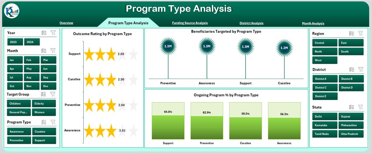
Every public health program belongs to a specific type such as Nutrition, Maternal Care, Immunization, Disease Prevention, or Sanitation. This page shows how each program type performs.
Right-Side Slicer Panel
Filters help users compare one program type with another.
Charts Included in This Page
-
Outcome Rating by Program Type
Shows which type of program delivers better results. -
Beneficiaries Targeted by Program Type
Helps managers understand service reach. -
Ongoing Program Percentage
Displays the percentage of active programs for each category.
Program managers use this page to plan resources and distribute budgets correctly. Because the page reveals trends quickly, teams act faster to improve performance.
3. Funding Source Analysis – Why Is It Important?
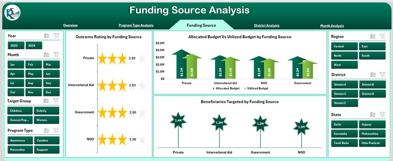
Public health programs receive funds from many sources such as government budgets, NGOs, private partners, or international agencies. Because each source follows its own reporting needs, a clear view of fund usage becomes essential.
Right-Side Slicer Panel
Helps filter performance by program type, district, or month.
Charts Included
-
Outcome Rating by Funding Source
Shows which funding sources support high-performing programs. -
Beneficiaries Targeted
Compares how many people benefit under each funding source. -
Allocated Budget vs. Utilized Budget by Funding Source
Displays fund usage, efficiency, and gaps.
This page helps financial teams track fund performance and compliance. It also supports better planning for future funding cycles.
Click to Purchases Public Health Programs Dashboard in Excel
4. District Analysis – How Does It Support Field Teams?
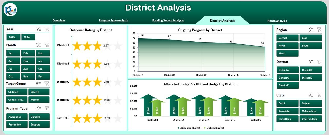
Different districts show different performance trends based on resources, population, and local challenges. The District Analysis page highlights these variations clearly.
Right-Side Slicer Panel
Filters allow analysis by month, program type, or funding.
Charts Included
-
Outcome Rating by District
Shows which districts perform well. -
Ongoing Programs by District
Tracks coverage and current activities. -
Allocated Budget vs. Utilized Budget by District
Displays fund use and financial discipline.
Public health officers use this page to support weaker districts and share best practices from stronger ones.
5. Month Analysis – What Does It Reveal?
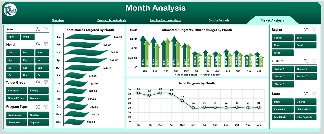
Every month brings new activities and challenges in public health programs. Monthly analysis shows seasonal trends, beneficiary reach, and fund usage patterns.
Right-Side Slicer Panel
Allows filtering by district, program, or funding.
Charts Included
-
Beneficiaries Targeted by Month
Shows how program reach changes every month. -
Allocated Budget vs. Utilized Budget by Month
Helps identify months with high or low spending. -
Total Programs by Month
Highlights program growth or drop.
Monthly insights support better planning and early detection of deviations.
Support Sheets in the Dashboard
Data Sheet
This sheet contains all raw program data including:
-
Program Name
-
Program Type
-
Funding Source
-
District
-
Month
-
Allocated Budget
-
Utilized Budget
-
Beneficiaries Targeted
-
Outcome Rating
-
Program Status
The dashboard pulls all results from this sheet automatically. When you update the data sheet, all visuals refresh instantly.
Advantages of a Public Health Programs Dashboard in Excel
A dashboard offers many benefits to public health organizations. Let us explore the most important ones.
⭐ 1. Faster Decision-Making
Leaders see clear insights within seconds. Because the visuals highlight what matters, teams make quick and correct decisions.
⭐ 2. Better Tracking of Funds
Budget allocation and usage stay visible at all times. This improves transparency and accountability.
⭐ 3. Clear View of Program Performance
Outcome ratings, beneficiaries, delays, and monthly trends stay easy to read.
⭐ 4. Stronger Monitoring Across Districts
Decision-makers compare districts quickly and take targeted action.
⭐ 5. Easy to Use and Customize
Excel makes the dashboard simple for any user. Teams adjust charts or add new data without difficulty.
⭐ 6. Real-Time Updates
The dashboard refreshes instantly when the data sheet changes.
⭐ 7. Zero Dependence on Complex Tools
No coding or Power BI knowledge is required. Excel handles the entire reporting system.
Best Practices for Using the Public Health Programs Dashboard in Excel
To get the best results, public health teams follow these practices:
✔ Keep the Data Sheet Clean
Use structured tables and correct formatting. Clean data produces accurate visuals.
✔ Update the Dashboard Every Month
Fresh data helps teams monitor performance without delays.
✔ Use Slicers for Deep Analysis
Filters help users understand performance by funding source, district, or program type.
✔ Compare Budget and Utilization Regularly
This reveals under-utilized or over-utilized programs.
✔ Review Outcome Ratings Every Cycle
This helps teams improve service quality and impact.
✔ Encourage District Teams to Share Insights
Local officers provide valuable feedback that improves strategies.
✔ Maintain a Version Control System
This prevents data loss or reporting errors.
Click to Purchases Public Health Programs Dashboard in Excel
Conclusion
A Public Health Programs Dashboard in Excel simplifies reporting and strengthens program monitoring. It shows all essential information—beneficiaries, budgets, delays, outcome rating, district trends, and monthly performance—in a single visual file. Because the dashboard stays user-friendly and flexible, public health teams adopt it quickly and improve their decision-making process.
When health officers track and understand program performance clearly, communities receive better care, better services, and faster solutions.
Frequently Asked Questions (FAQs)
1. What is a Public Health Programs Dashboard in Excel?
It is a ready-made tool that tracks all public health program activities such as budget, beneficiaries, outcomes, and delays using charts and slicers.
2. Who can use this dashboard?
Health officers, district teams, government departments, NGOs, funding partners, and monitoring teams use this dashboard.
3. Can beginners use the dashboard easily?
Yes. The dashboard uses simple Excel features and clear charts. Anyone with basic Excel knowledge can use it.
4. Does the dashboard update automatically?
Yes. When you update the data sheet, the visuals refresh instantly.
5. Can I add more programs or indicators later?
Yes. You can expand the data sheet or create new charts based on your needs.
6. Why should I track outcome rating?
Outcome rating shows program effectiveness. It helps teams improve impact and quality.
7. Is Excel enough for public health reporting?
Yes. Excel works well because it offers speed, flexibility, and full control without complex software.
8. Can I customize the dashboard design?
Yes. You can change colors, add new pages, or modify visuals based on your organization’s style.
9. How often should I update the dashboard?
Monthly updates work best. However, weekly or quarterly updates also work based on your data collection process.
10. Does this dashboard replace manual reports?
Yes. It reduces manual work and delivers clear insights faster.
Visit our YouTube channel to learn step-by-step video tutorials