Public health programs shape the well-being of communities. Governments, NGOs, and healthcare authorities invest massive budgets into vaccination drives, maternal health schemes, nutrition programs, disease control initiatives, and awareness campaigns. However, without clear visibility into performance, even the most well-funded programs struggle to deliver results.
That is exactly why a Public Health Programs Dashboard in Power BI becomes essential.
This detailed and SEO-friendly guide explains what a Public Health Programs Dashboard in Power BI is, why organizations need it, how it works, its page-wise structure, key advantages, best practices, and frequently asked questions. Moreover, the article uses simple language, strong transitions, and practical explanations to ensure clarity and usability.
Click to Purchases Public Health Programs Dashboard in Power BI
hat Is a Public Health Programs Dashboard in Power BI?
A Public Health Programs Dashboard in Power BI is a centralized, interactive analytics solution designed to monitor, evaluate, and optimize public health initiatives using real-time data.
Instead of managing multiple spreadsheets, static reports, and delayed summaries, this dashboard brings all program metrics into one dynamic view. As a result, decision-makers gain instant insights into program progress, funding utilization, beneficiary coverage, and outcome ratings.
Because the dashboard is built using Microsoft Power BI, it offers high performance, interactive filtering, visual storytelling, and enterprise-grade scalability. Therefore, public health authorities can track performance confidently and act faster.
Why Do Public Health Programs Need a Dashboard?
Public health programs operate at scale. They involve multiple regions, funding sources, stakeholders, and timelines. However, manual tracking introduces delays, errors, and blind spots.
A Public Health Programs Dashboard in Power BI solves these challenges effectively.
Key Reasons Dashboards Matter in Public Health
-
Public health data comes from multiple sources and formats
-
Program managers need real-time visibility into outcomes
-
Funding agencies demand transparency and accountability
-
Regional disparities require focused intervention
-
Leadership expects data-driven decisions, not assumptions
Therefore, a well-designed Power BI dashboard transforms raw health data into actionable intelligence.
How Does a Public Health Programs Dashboard in Power BI Work?
The dashboard works by connecting structured datasets—usually from Excel, databases, or health information systems—to Power BI. After data modeling, calculations, and visualization design, the dashboard updates automatically whenever data changes.
Because Power BI supports slicers and filters, users can analyze performance by:
-
Program type
-
Funding source
-
District or region
-
Month or time period
As a result, teams explore data intuitively without technical complexity.
What Are the Core KPIs Tracked in a Public Health Programs Dashboard?
Although KPIs vary by country and program, most dashboards focus on these critical metrics:
-
Total number of public health programs
-
Ongoing program percentage
-
Delayed program percentage
-
Beneficiaries targeted vs achieved
-
Outcome rating by region
-
Allocation budget vs utilized budget
-
Monthly program trends
These KPIs ensure both operational and financial visibility.
Page-Wise Structure of a Public Health Programs Dashboard in Power BI
A strong dashboard structure improves usability and storytelling. This Public Health Programs Dashboard in Power BI contains five well-organized pages, each serving a specific analytical purpose.
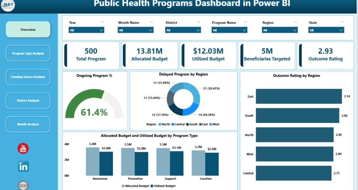
1. Overview Page: How Can Leaders See the Big Picture Instantly?
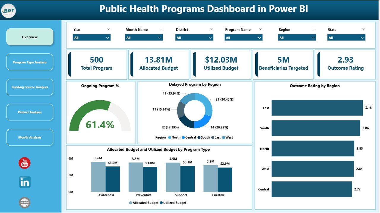
The Overview Page acts as the executive summary of the entire dashboard. It provides a high-level snapshot of program performance across regions and categories.
Key Elements of the Overview Page
Click to Purchases Public Health Programs Dashboard in Power BI
Interactive Slicers
-
Filter data by region, program type, funding source, or time period
KPI Cards
-
Total number of programs
-
Ongoing program percentage
-
Delayed program percentage
-
Average outcome rating
Charts and Visuals
-
Ongoing Program %
-
Delayed Program by Region
-
Outcome Rating by Region
-
Allocation Budget vs Utilized Budget by Program Type
Because everything appears on one screen, leadership quickly identifies risks, gaps, and success areas.
2. Program Type Analysis: Which Health Programs Perform Better?
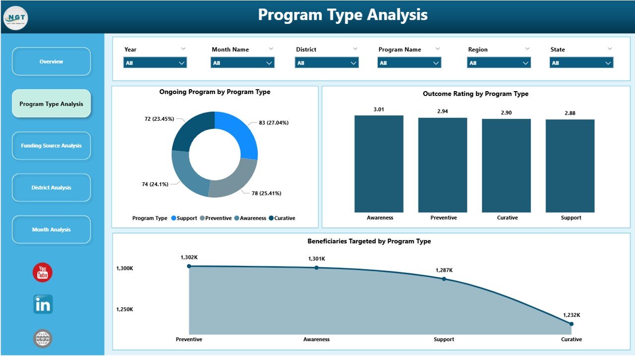
Different public health programs deliver different outcomes. Therefore, program-wise analysis becomes crucial.
The Program Type Analysis page focuses on performance comparison across various health initiatives.
Charts Included in Program Type Analysis
-
Ongoing Programs by Program Type
-
Outcome Rating by Program Type
-
Beneficiaries Targeted by Program Type
This page helps policymakers answer questions such as:
-
Which program types achieve better outcomes?
-
Which programs face delays?
-
Where should funding increase or reallocation happen?
As a result, resource optimization becomes easier and more data-driven.
3. Funding Source Analysis: How Effectively Is Funding Utilized?
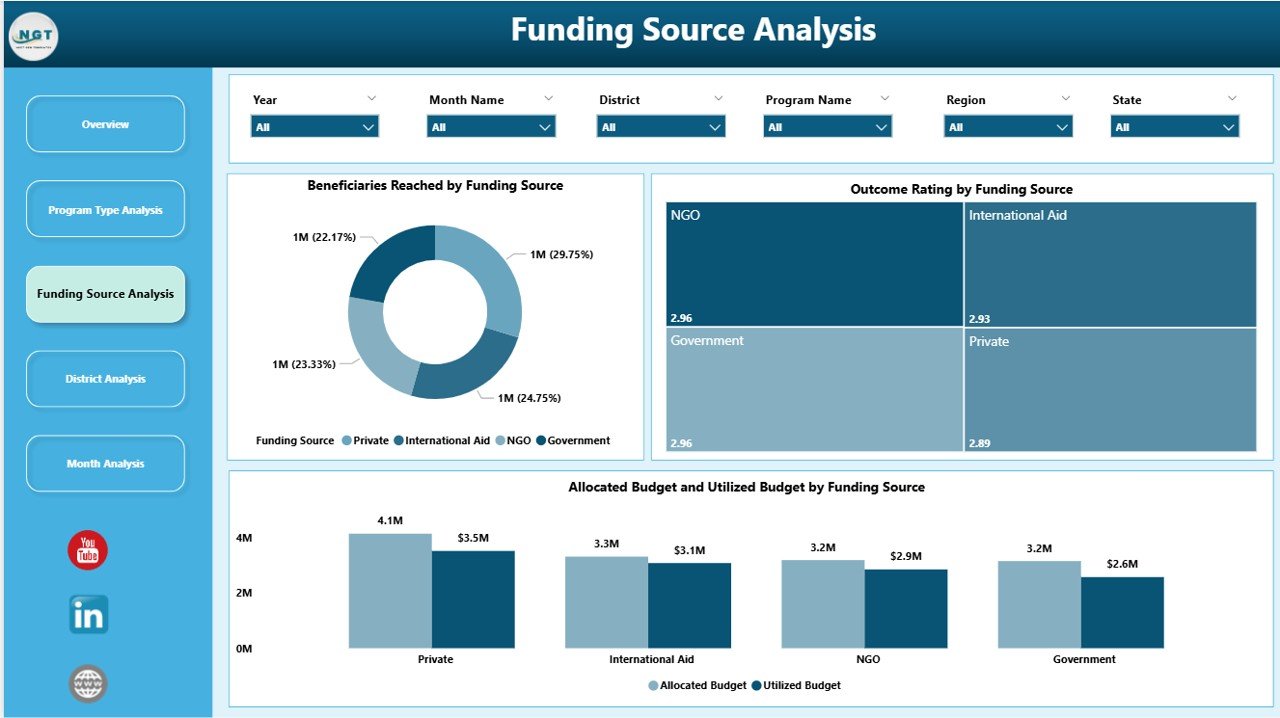
Public health programs often receive funding from governments, international agencies, NGOs, and private partners. Therefore, transparency in funding utilization becomes non-negotiable.
The Funding Source Analysis page addresses this need clearly.
Key Charts on the Funding Source Analysis Page
-
Beneficiaries Targeted by Funding Source
-
Outcome Rating by Funding Source
-
Allocation Budget vs Utilization Budget by Funding Source
This analysis helps stakeholders understand:
-
Which funding sources deliver higher impact
-
Where budget utilization remains inefficient
-
How outcomes correlate with funding patterns
Consequently, funding decisions improve significantly.
4. District Analysis: Which Regions Need Immediate Attention?
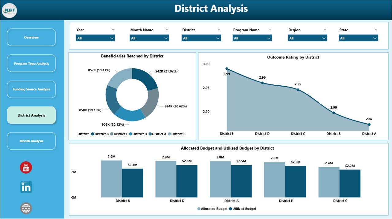
Public health performance varies across districts due to infrastructure, awareness, and access issues. Therefore, district-level analysis becomes essential.
The District Analysis page highlights regional disparities and opportunities.
Visuals Included in District Analysis
-
Beneficiaries Targeted by District
-
Outcome Rating by District
-
Allocation Budget vs Utilization Budget by District
This page enables administrators to:
-
Identify underperforming districts
-
Prioritize interventions geographically
-
Allocate resources based on real need
As a result, health equity improves across regions.
5. Monthly Trends: How Do Public Health Programs Perform Over Time?
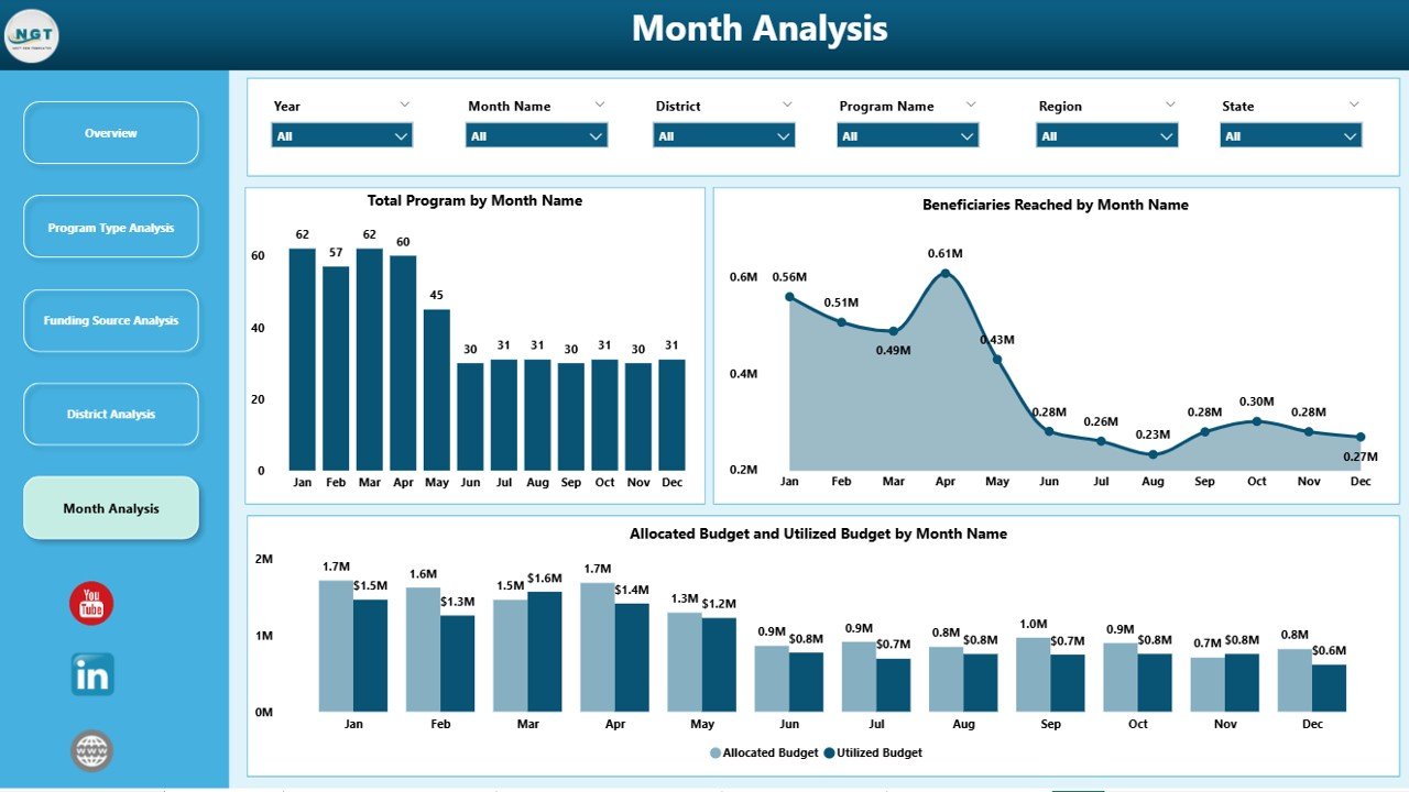
Static views limit understanding. Therefore, trend analysis becomes critical.
The Monthly Trends page reveals how programs evolve over time.
Charts on the Monthly Trends Page
-
Beneficiaries Targeted by Month
-
Total Programs by Month
-
Allocation Budget vs Utilization Budget by Month
This page helps teams:
-
Detect seasonal trends
-
Monitor progress against timelines
-
Forecast future demand and funding needs
Hence, planning becomes proactive rather than reactive.
Advantages of Public Health Programs Dashboard in Power BI
A Public Health Programs Dashboard in Power BI delivers strategic and operational value simultaneously.
Key Advantages
-
📊 Centralized Visibility: View all health programs in one place
-
⏱️ Real-Time Insights: Monitor performance instantly
-
💰 Budget Transparency: Track allocation vs utilization clearly
-
🗺️ Regional Clarity: Identify district-level gaps and strengths
-
📈 Trend Analysis: Understand performance over time
-
🎯 Outcome Focus: Measure impact, not just activity
-
🤝 Stakeholder Trust: Improve reporting and accountability
Because of these advantages, public health organizations achieve better outcomes with fewer delays.
Click to Purchases Public Health Programs Dashboard in Power BI
Who Can Benefit from a Public Health Programs Dashboard?
This dashboard serves a wide range of stakeholders.
Primary Users
-
Government health departments
-
Public health administrators
-
Program managers
-
Funding agencies and donors
-
NGOs and international organizations
-
Policy analysts and researchers
Each user gains tailored insights through interactive filters and visuals.
Best Practices for the Public Health Programs Dashboard in Power BI
Even the best dashboard fails without proper design and governance. Therefore, following best practices ensures long-term success.
Best Practices You Should Follow
-
✔️ Define KPIs clearly before building visuals
-
✔️ Use consistent naming conventions
-
✔️ Validate data regularly to maintain accuracy
-
✔️ Limit visuals per page to avoid clutter
-
✔️ Use slicers wisely for flexibility
-
✔️ Align charts with decision-making needs
-
✔️ Document metrics for transparency
-
✔️ Review dashboards periodically for relevance
When teams follow these practices, dashboards remain trusted and impactful.
How Does This Dashboard Improve Decision-Making?
This dashboard turns complex datasets into clear stories. Because leaders see performance instantly, they act faster. Moreover, data-driven insights reduce guesswork and bias.
As a result:
-
Programs receive timely intervention
-
Budgets get optimized
-
Outcomes improve measurably
Therefore, public health strategies become more effective.
How Secure Is a Public Health Programs Dashboard in Power BI?
Power BI supports enterprise-level security. Organizations can apply:
-
Role-based access control
-
Data-level security by region or role
-
Secure cloud or on-premise deployment
Thus, sensitive health data remains protected.
Can This Dashboard Be Customized?
Yes, customization remains one of the biggest strengths of Power BI dashboards.
Organizations can:
-
Add new KPIs
-
Modify visuals
-
Integrate additional data sources
-
Align branding and color themes
Because Power BI offers flexibility, the dashboard grows with program needs.
Conclusion: Why Should You Use a Public Health Programs Dashboard in Power BI?
Public health programs demand transparency, efficiency, and impact. Manual reporting no longer supports these expectations. Therefore, a Public Health Programs Dashboard in Power BI becomes a critical tool.
This dashboard provides:
-
Clear performance visibility
-
Strong financial control
-
Regional and temporal insights
-
Faster, data-driven decisions
Ultimately, it helps organizations deliver healthier outcomes for communities while using resources responsibly.
Frequently Asked Questions (FAQs)
1. What is a Public Health Programs Dashboard in Power BI used for?
It tracks, analyzes, and visualizes public health program performance, budgets, beneficiaries, and outcomes in one interactive platform.
2. Can non-technical users use this dashboard?
Yes. Power BI dashboards use intuitive visuals and slicers, so non-technical users explore data easily.
3. Does this dashboard support multiple funding sources?
Yes. The Funding Source Analysis page compares allocation and utilization across funding sources.
4. Can the dashboard show district-level performance?
Absolutely. The District Analysis page highlights beneficiaries, budgets, and outcomes by district.
5. How often does the dashboard update?
The dashboard updates automatically whenever connected data sources refresh.
6. Is Power BI suitable for large public health datasets?
Yes. Power BI handles large datasets efficiently and scales well for enterprise use.
7. Can this dashboard support policy reporting?
Yes. It improves transparency, accountability, and evidence-based policymaking.
Visit our YouTube channel to learn step-by-step video tutorials