Introduction
The Cardiology Institutes Dashboard is a powerful ready-to-use tool designed to help cardiology centers monitor and analyze their performance metrics with ease. By simply updating your data in the Data sheet and refreshing the dashboard in Excel, you gain instant access to comprehensive insights that aid in smarter decision-making.
Click to Purchases Cardiology Institutes Dashboard in Excel
Key Features of Cardiology Institutes Dashboard
- Dynamic and interactive dashboard with slicers for quick filtering.
- Multiple dashboard pages catering to different analytic needs.
- High-level summary cards displaying key performance indicators such as Total Revenue and Total Patients.
- Ready-to-use pivot tables and charts that update automatically upon data refresh.
- Comprehensive visualization covering financial, operational, patient analytics, and quality metrics.
Dashboard Pages Explanation
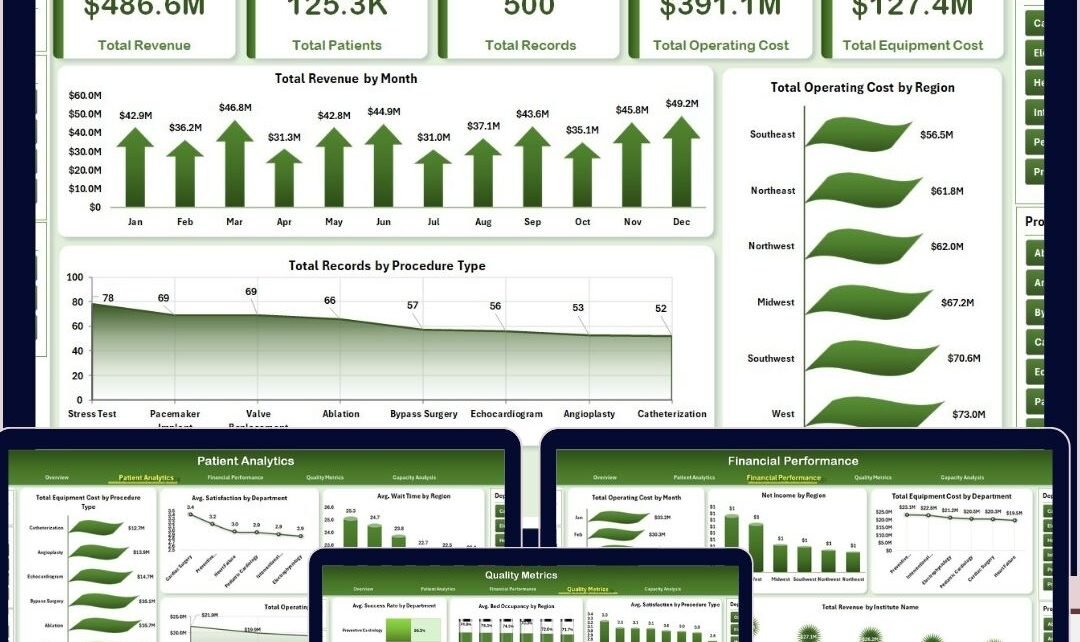
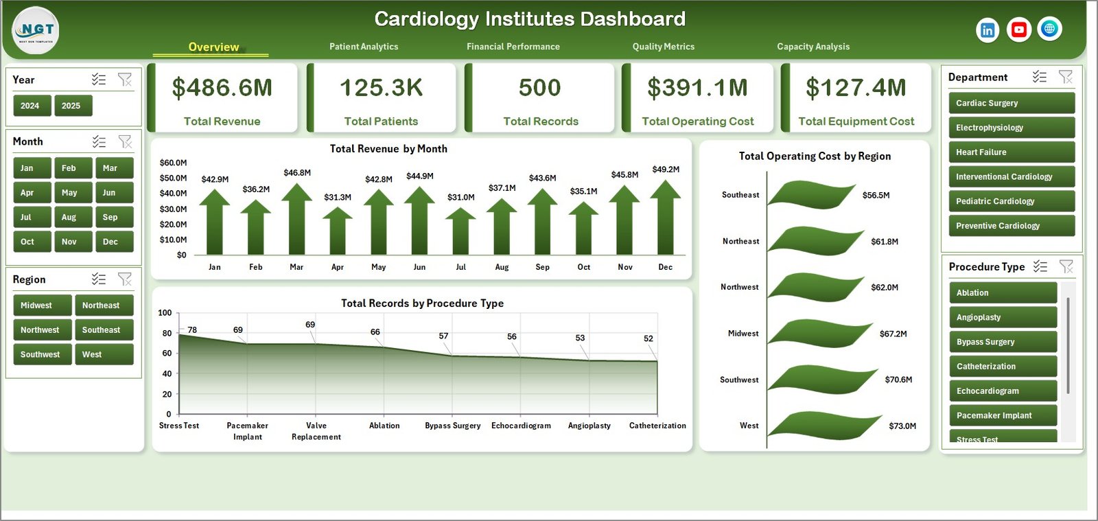
1. Overview Page
The Overview Page delivers a high-level snapshot of your cardiology institute’s performance. At the top, you will find summary cards displaying:
- Total Revenue: Highlights the aggregate income generated across all institutes.
- Total Patients: Shows the cumulative number of patients served.
- Total Records: Indicates the total number of patient medical records processed.
- Total Operating Cost: Aggregates costs involved in daily operations.
- Total Equipment Cost: Reflects expenditures incurred for medical equipment.
Below these cards, various charts assist in detailed analysis with slicers to filter data interactively.
- Total Revenue by Month: Visualizes monthly revenue trends helping identify peak periods.
- Total Operating Cost by Region: Highlights variations in operating costs across different geographical areas.
- Total Records by Procedure Type: Illustrates distribution of medical records categorized by procedure.
-
Click to Purchases Cardiology Institutes Dashboard in Excel
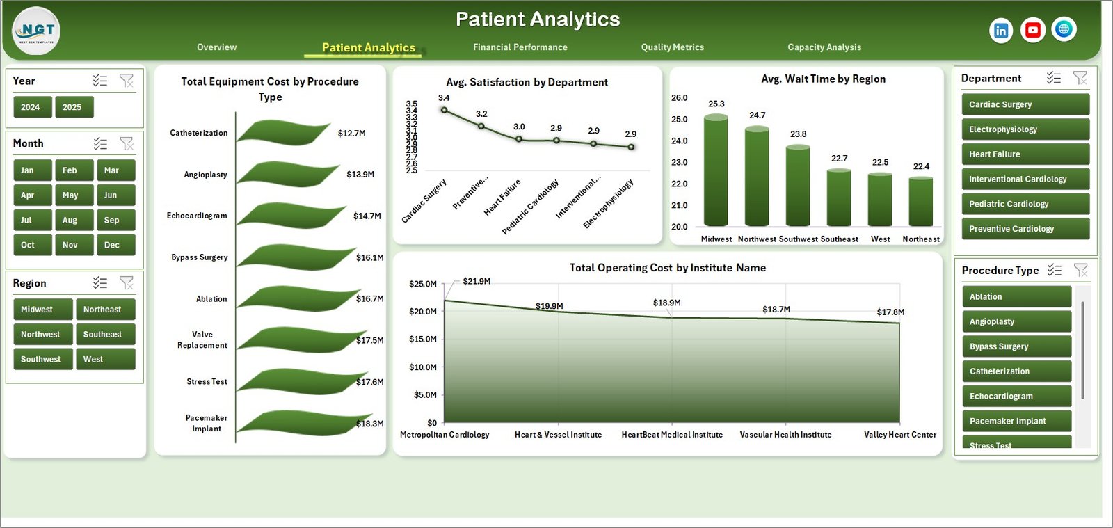
2. Patient Analytics
This page dives deeper into patient-centered analytics to streamline service quality and operational efficiency.
- Total Equipment Cost by Procedure Type: Shows how equipment costs vary with different procedures.
- Avg. Satisfaction by Department: Displays patient satisfaction scores segmented by departments.
- Avg. Wait Time by Region: Highlights patient wait times across various regions to identify bottlenecks.
- Total Operating Cost by Institute Name: Compares operating costs institution-wise for budgeting insights.
Patient Analytics
3. Financial Performance
This page offers comprehensive financial insights to track revenue generation and cost management effectively.
- Total Operating Cost by Month: Visualizes monthly variations in operating expenses.
- Net Income by Region: Summarizes profitability across geographic locations.
- Total Equipment Cost by Department: Breaks down equipment spending per department.
- Total Revenue by Institute Name: Compares revenue streams among different institutes.
-
Click to Purchases Cardiology Institutes Dashboard in Excel
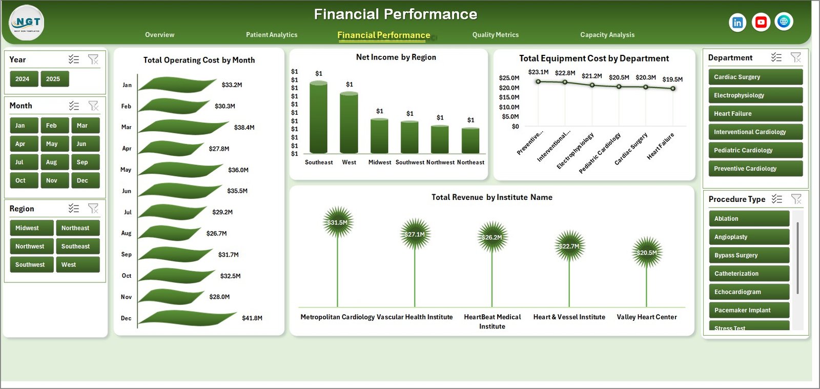
Financial Performance
4. Quality Metrics
The Quality Metrics page focuses on key performance indicators related to patient and service quality.
- Avg. Success Rate by Department: Tracks treatment success rates for each department.
- Avg. Bed Occupancy by Region: Measures bed usage efficiency across regions.
- Avg. Satisfaction by Procedure Type: Displays patient satisfaction ratings based on procedure.
- Total Records by Accreditation Status: Categorizes records by institute accreditation.
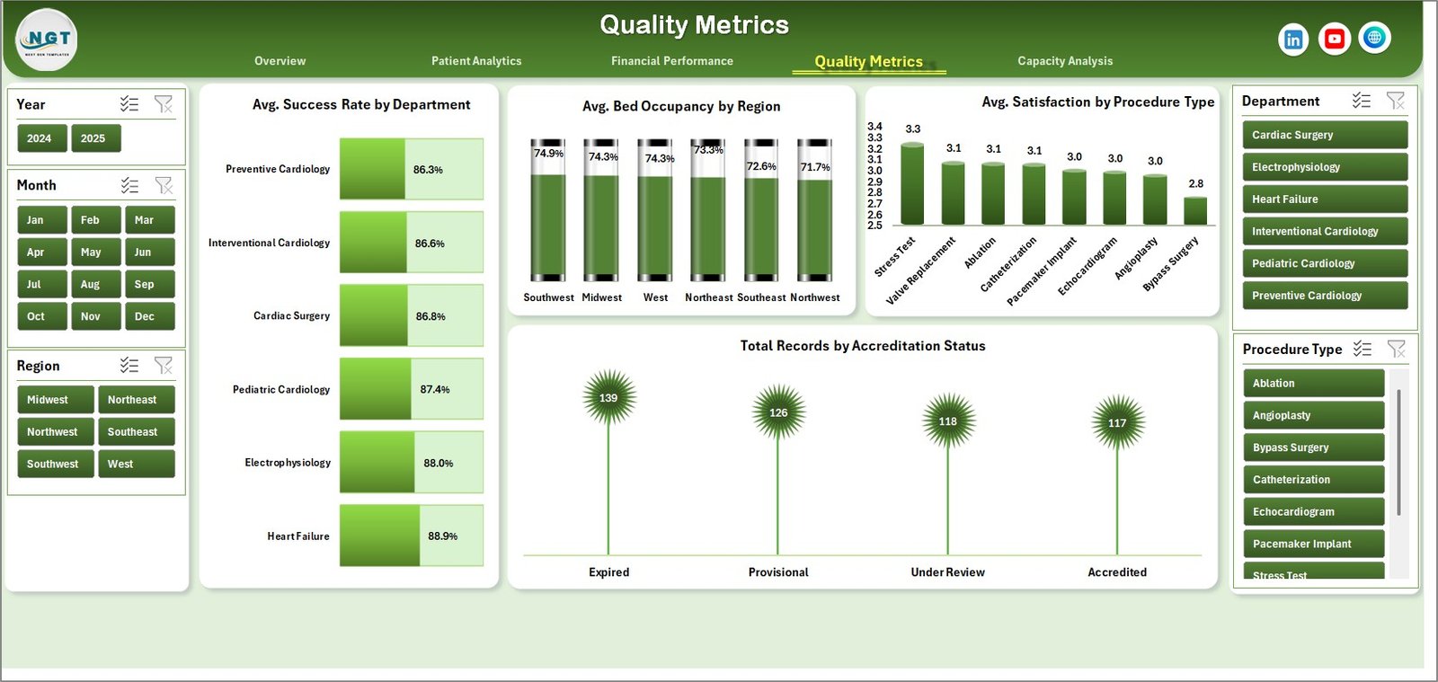
Quality Metrics
5. Capacity Analysis
This page evaluates efficiency and resource allocation to optimize cardiology institute capacity.
- Total Revenue by Region: Compares revenue performance by geographic area.
- Avg. Wait Time by Department: Analyzes wait times to identify delays in departments.
- Avg. Wait Time by Institute Name: Tracks patient wait times across institutes.
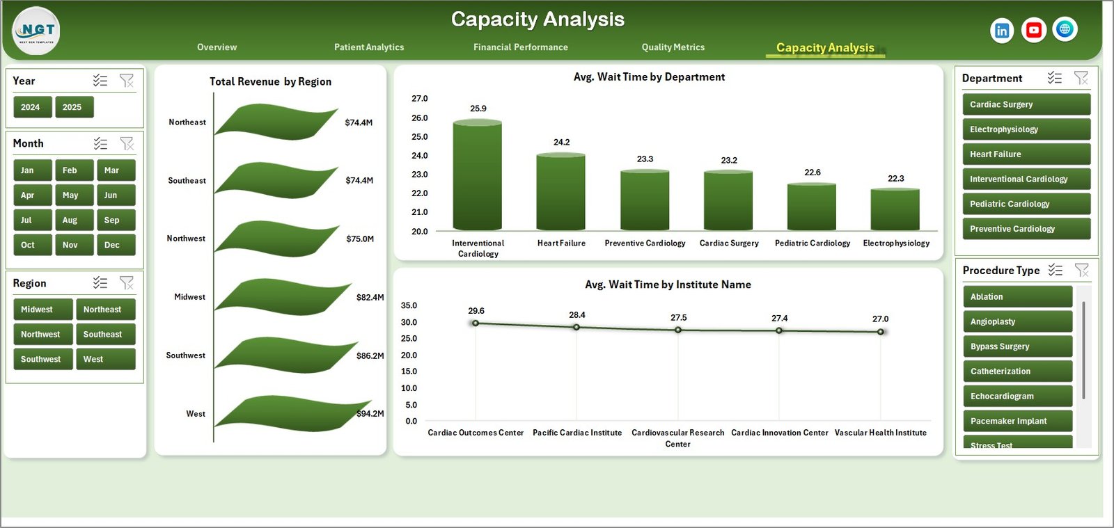
Capacity Analysis
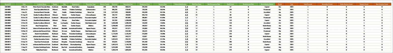
6. Data Sheet Tab
This is the master data sheet where users input or update their raw data in the specified format. The dashboard automatically updates its visuals based on the latest data upon refreshing.

7. Support Sheet Tab
The Support Sheet houses multiple pivot tables that dynamically power the dashboard visualizations. After updating the Data sheet, clicking ‘Refresh All’ in Excel’s Data tab will update all pivots and charts. This sheet can be hidden to prevent accidental edits.
Advantages of Cardiology Institutes Dashboard
- Ease of use: Intuitive interface with slicers enables quick filtering without technical expertise.
- Comprehensive Insights: Multiple perspectives covering finance, patient analytics, quality, and capacity.
- Time-saving: Automated pivot refresh accelerates reporting tasks.
- Customizable: Data-driven and fully updateable to reflect real-time information.
- Supports Data-Driven Decisions: Helps identify trends, inefficiencies, and improvement areas.
Opportunities for Improvement
- Incorporate predictive analytics to forecast patient inflow and revenue.
- Add drill-down options in charts for granular insights.
- Include benchmarking features against industry standards.
- Integrate with external EMR or hospital management systems for automatic data feed.
-
Click to Purchases Cardiology Institutes Dashboard in Excel
Best Practices
- Always backup your data before updating the Data sheet.
- Maintain consistent data formats to avoid refresh errors.
- Use slicers actively to analyze specific segments.
- Regularly review pivot tables in Support sheet for any necessary adjustments.
- Schedule monthly updates to keep the dashboard relevant and actionable.
FAQs
- Can I customize the dashboard visuals?
Yes, you can modify charts and pivot tables but ensure underlying data integrity. - How often should I update the data?
Regular updates aligned with data availability, preferably monthly or quarterly. - Is the dashboard compatible with all Excel versions?
It works best on Excel versions supporting slicers and pivot table refresh functionalities. - Can I share this dashboard with my team?
Yes, simply share the Excel file, ensuring data confidentiality is maintained.
Conclusion
In summary, the Cardiology Institutes Dashboard offers a robust and user-friendly way to track critical metrics across financial, operational, and quality domains. With its flexible and updateable nature, cardiology centers can monitor performance efficiently and drive continuous improvement. Whether you are a healthcare administrator, clinical manager, or financial analyst, this dashboard is tailored to meet your analytic needs seamlessly.
For further assistance and to see this dashboard in action, visit Microsoft’s official Excel support page.
Visit our YouTube channel to watch the demo.
Click to Purchases Cardiology Institutes Dashboard in Excel